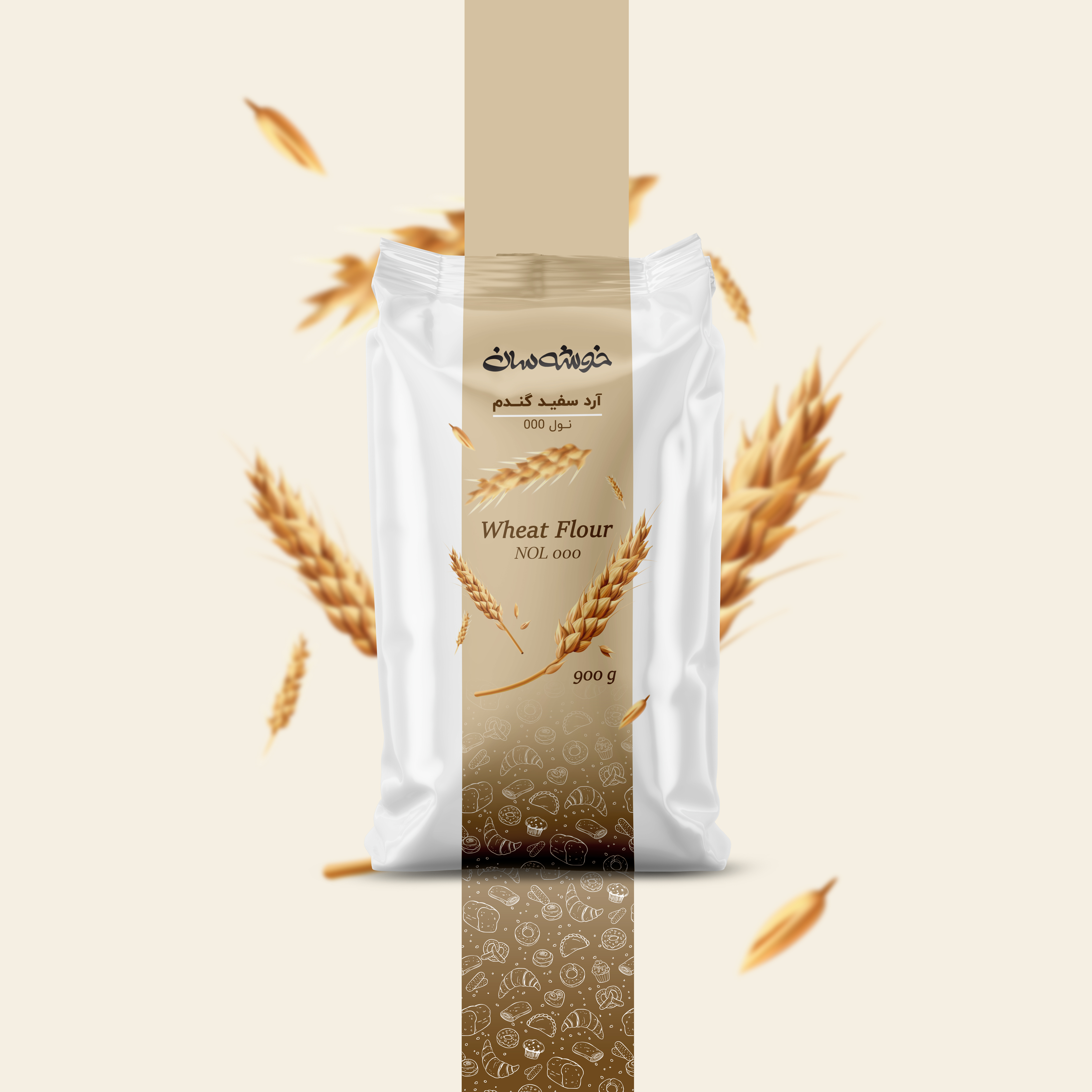

Design Concept & Inspiration
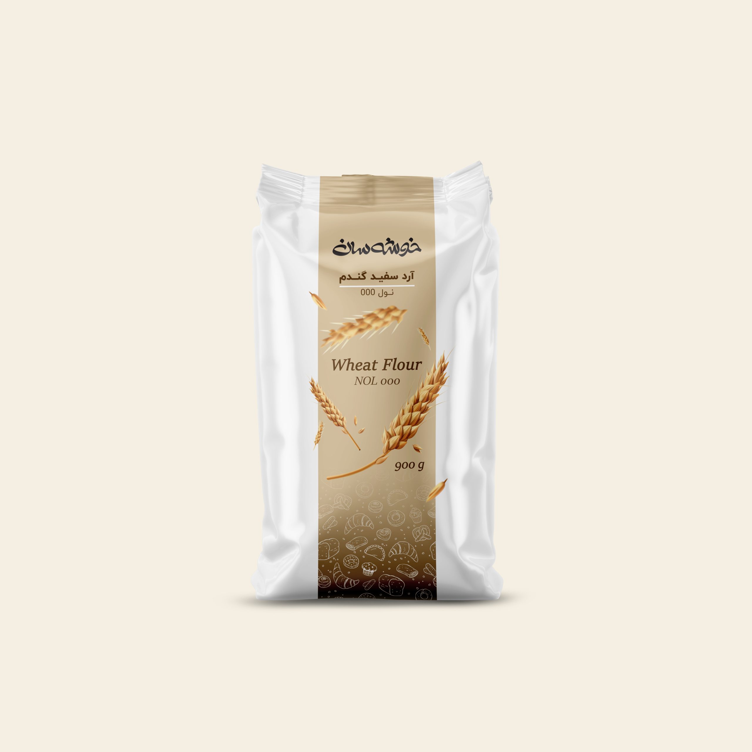
This packaging design is developed based on the brand identity of Khoosheh San, with the core concept inspired directly by the form and symbolism of a wheat ear. As a representation of quality, authenticity, and natural raw materials, the wheat ear serves as the central visual element of the design and is intentionally integrated into the overall structure of the packaging.
Color Palette & Consumer Communication
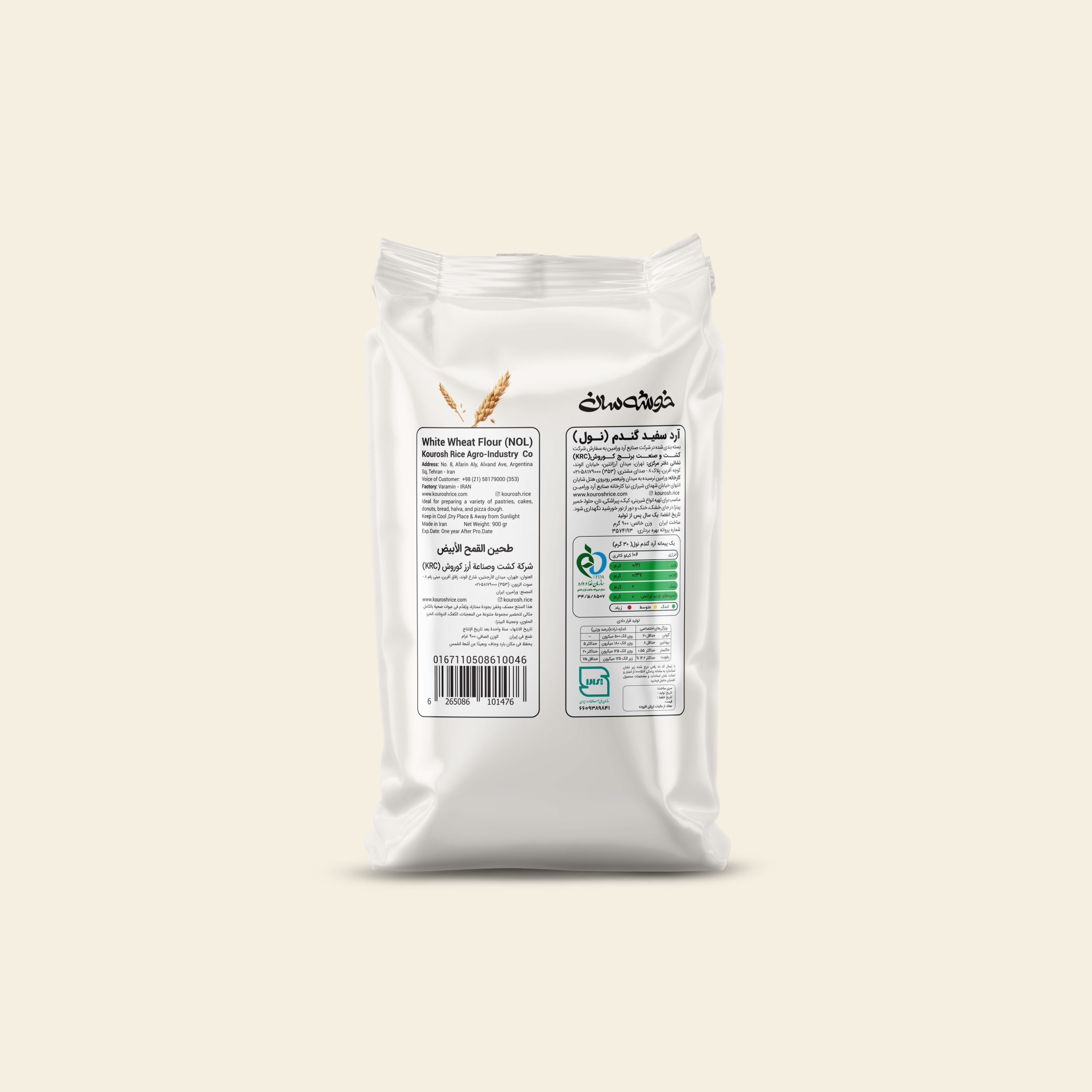
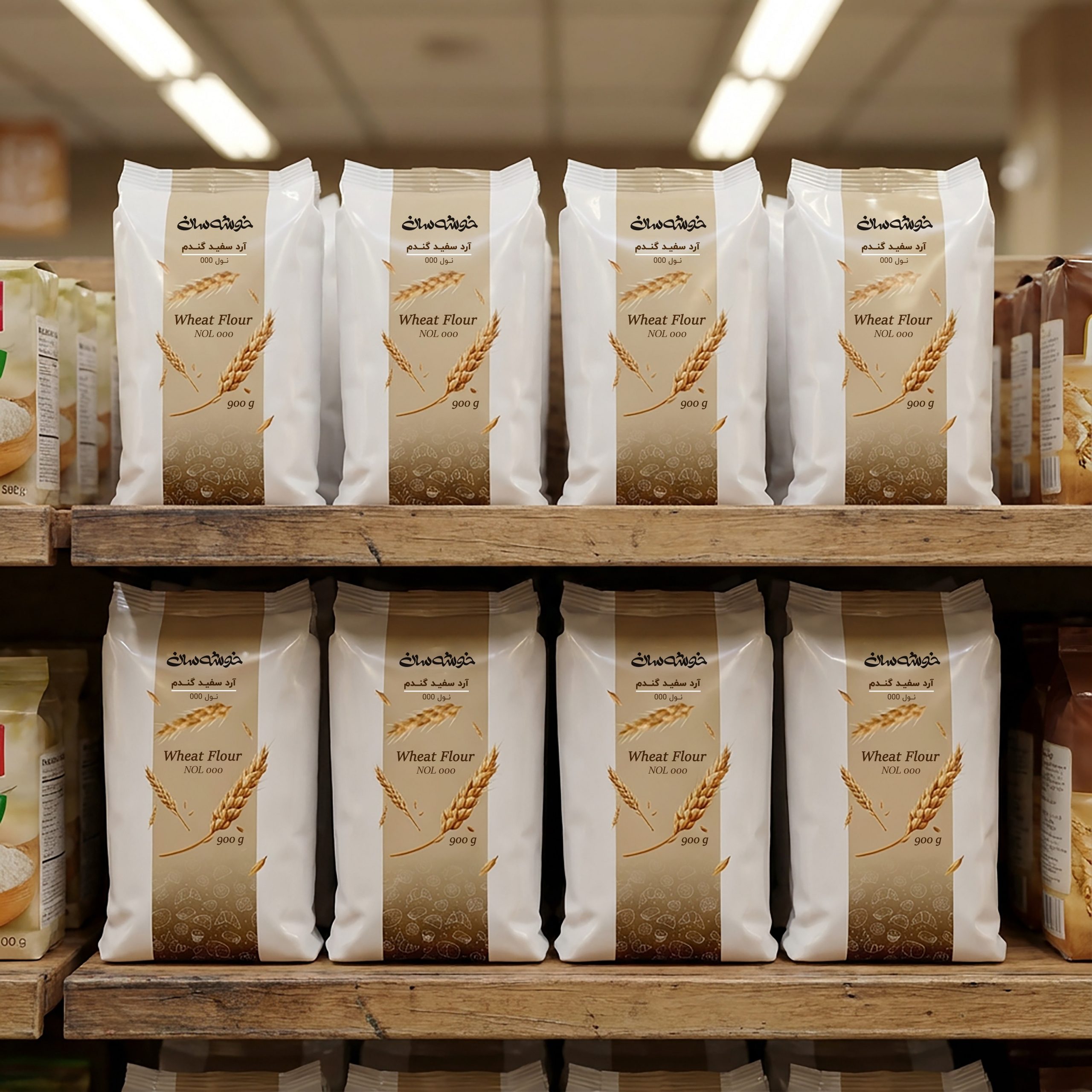
The selected color palette consists of creamy, beige, and brown tones, which are closely associated with cakes, cookies, and confectionery products. These colors convey a sense of warmth, freshness, and homemade quality. Additionally, patterns inspired by sweets and baked goods are used to further strengthen the product identity and create an emotional connection with the consumer. Clear, bilingual typography in both Persian and English ensures immediate readability, allowing the product type and flour application to be easily understood at first glance, with the ultimate goal of attracting attention and encouraging purchase.

 Up-Brands
 Almighty
 Desember Design Studio
 Daria Levina
 Yuliya Likhacheva
 carola matalinares
 daniitenaa
 StudioMordius
 Simon Pendry Creative
 Sti&Co Design
 Yasmin Sherif
 Roberto De Simone
 aseelstudio
 Rabia zouina
 UPRISE
 HazelBishop
 Qianyu Liu
 siyajacob
 Rohan Barwal | D2C Brand Identity, Logo & Packaging Designer
 Karen Salem
 omarchafik
 nastyaabeketova
 Roberto Núñez Studio