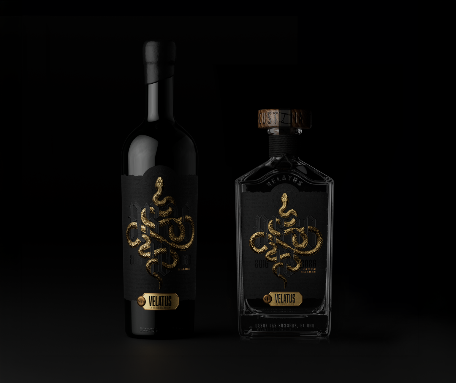

Legend tells that the Argo was not built for a fleeting voyage, but to defy time itself. For ten winters, her timbers groaned beneath seas found on no map, until at last her keels touched the sands of Colchis, a land where the air weighs like bronze and silence seems absolute.
There, in the half-light of an ancestral forest, remains the Guardian: a colossal serpent, covered in scales with the cold gleam of ancient metal. Yet its most terrifying trait is not its size, but its sleepless gaze. A creature untouched by the relief of sleep, with eyes that have never closed since the dawn of time.
Coiled in eternal vigilance, it guards a treasure reserved only for those who have survived so many years of crossing. The prize waits at the center of its labyrinth of scales; the watch never ends, because glory belongs to those who understand that true worth is forged through constancy.
The treasure was not extraordinary despite its guardian. It was extraordinary precisely because of it. What deserves to be guarded with such ferocity is worth every year of the journey.
Ten years of vigilance. The watch never ends.
_________ Story based on the myth of Jason and the Argonauts __________________
The Label Lab ’26 ✨
Today we are sharing the process and development of an extraordinary project we were proud to be a part of: The Label Lab ’26. This creative laboratory, powered by Fedrigoni Self-Adhesives, was designed to promote visual innovation, highlight the value of design, and celebrate the indissoluble synergy between paper, printing, and the graphic arts industry.
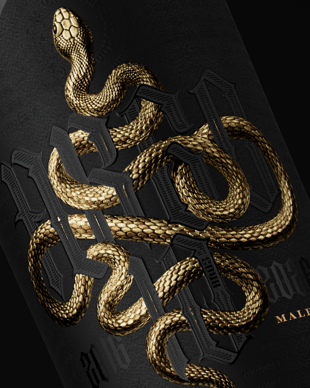
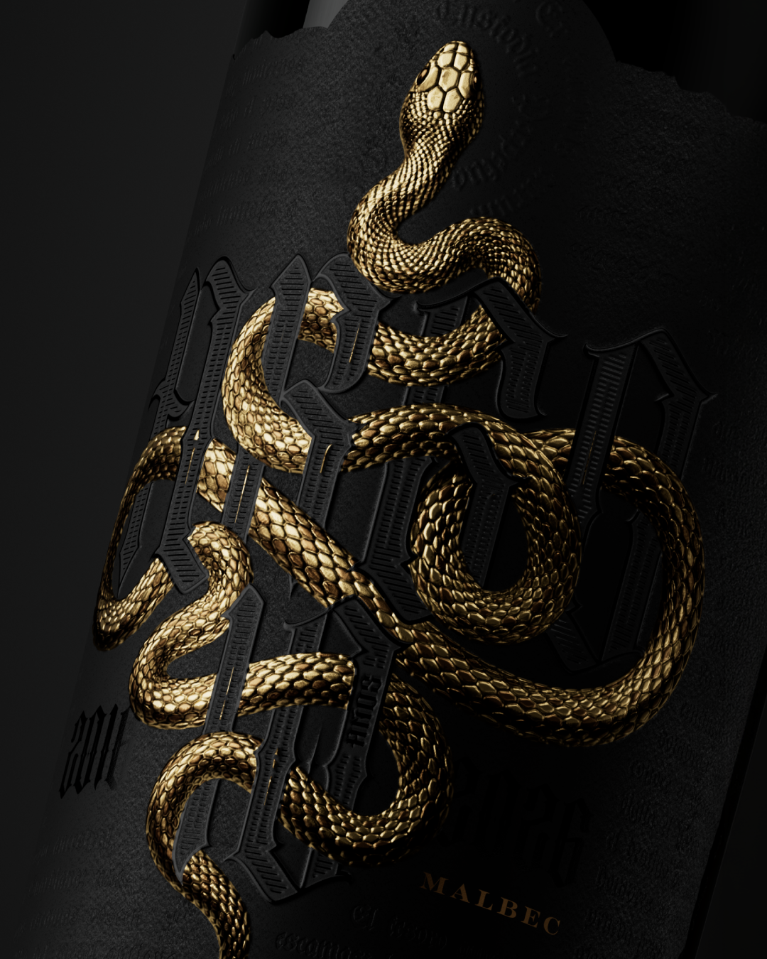
Raw Material as Inspiration The soul of our proposal was born from the material provided by Fedrigoni: COTONE BIANCO ULTRA WS paper. Its impressive weight and noble character allowed us to play with and accentuate the snake reliefs on the label in an exceptional way, achieving unparalleled depth and precision.
It is a true honor to have been part of this initiative that celebrates local talent with no creative limits.
Curator’s Insight
The strength of this design is in how much weight it gets from restraint in color and excess in texture. Everything outside the gold serpent stays close to black, so the only real event on the bottle is the relief itself, embossed deeply enough that it reads as sculpture rather than print. That decision to spend the entire visual budget on one material effect, rather than splitting attention across multiple design elements, gives the bottle a sense of density that a busier label could not achieve.
The wax seal cap does more structural work than it first appears to. Carrying the same coiled motif as the front label means the closure is not an afterthought bolted onto a finished bottle, it is a continuation of the same narrative device, so the object reads as a single thought from cap to base rather than a label applied to generic glass. That kind of consistency between structural packaging and print design is difficult to pull off, since caps and stoppers are often treated as pure hardware.
Choosing a heavyweight cotton stock for the embossing is also a quieter but important decision. Paper substrate is rarely visible in the final read of a design like this, but it is doing the physical work that makes the depth of the relief possible in the first place, which says something about how much of premium packaging perception actually comes from material choice rather than surface graphics alone.




 Studio Zak
 Ander Sanchez
 Atipus
 Widarto Impact
 hovski
 Ohmybrand
 CreativeWise
 Rauf Karaev
 Hooperstudio
 La Nube de Ideas
 Modern Theory
 Akim Melnik Design Studio
 preflightcreative
 Seyf El Haq Menouer
 Badraddine Attik
 Samriddhi Ravi
 Alessandro Ammaturo
 Amblr Studio
 vladlenalevit
 Sis Tsarukyan
 monther al omari
 alchimistestudioParis
 designsbysukaina
 About House of Ta
 Amjad Battal