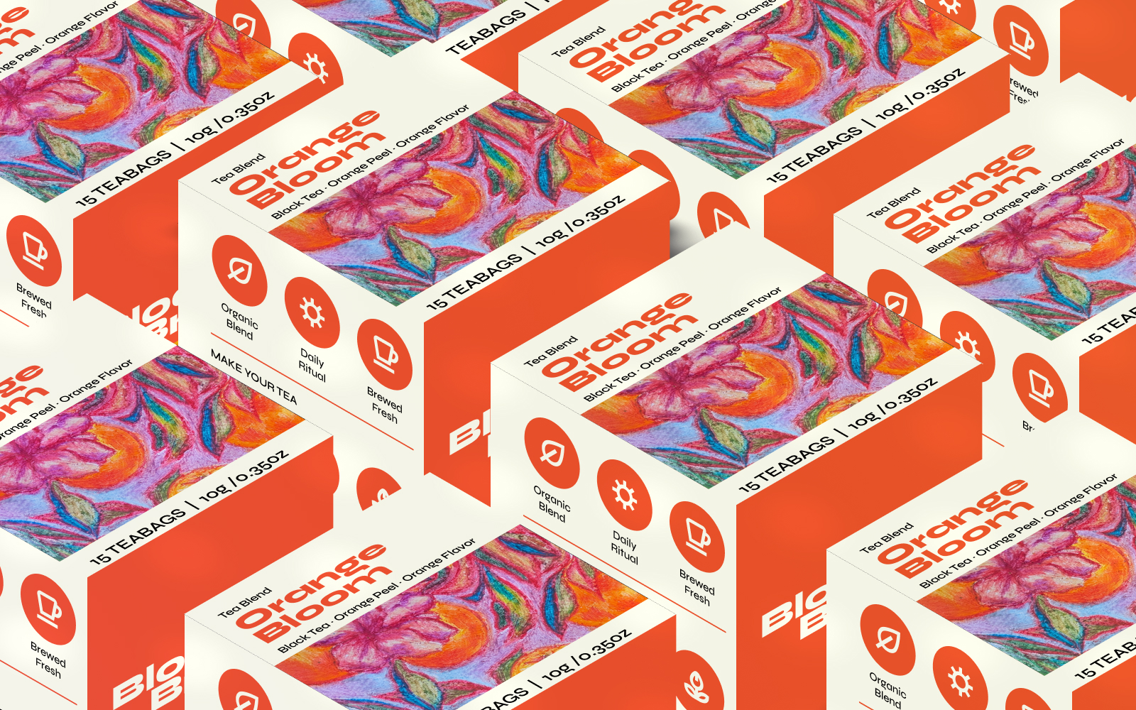

TEA BOX PACKAGING DESIGN
PROJECT OBJECTIVE
This work was developed as a student academic project in Packaging Design. The aim was to create a tea packaging concept from the initial visual idea through to the final packaging presentation, exploring how illustration, colour, typography and structure can work together to create a distinctive product identity.
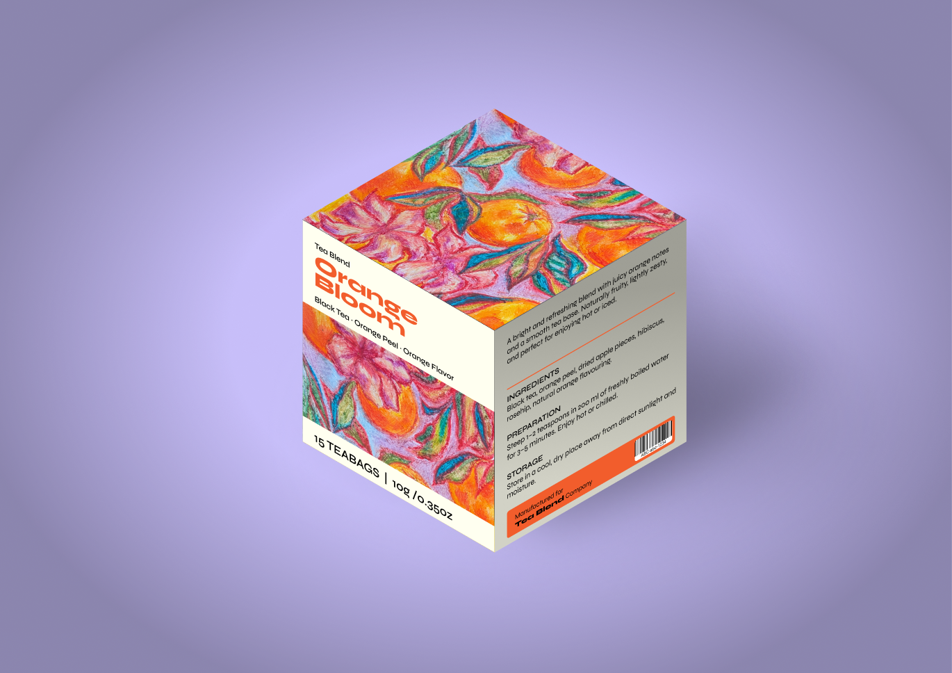
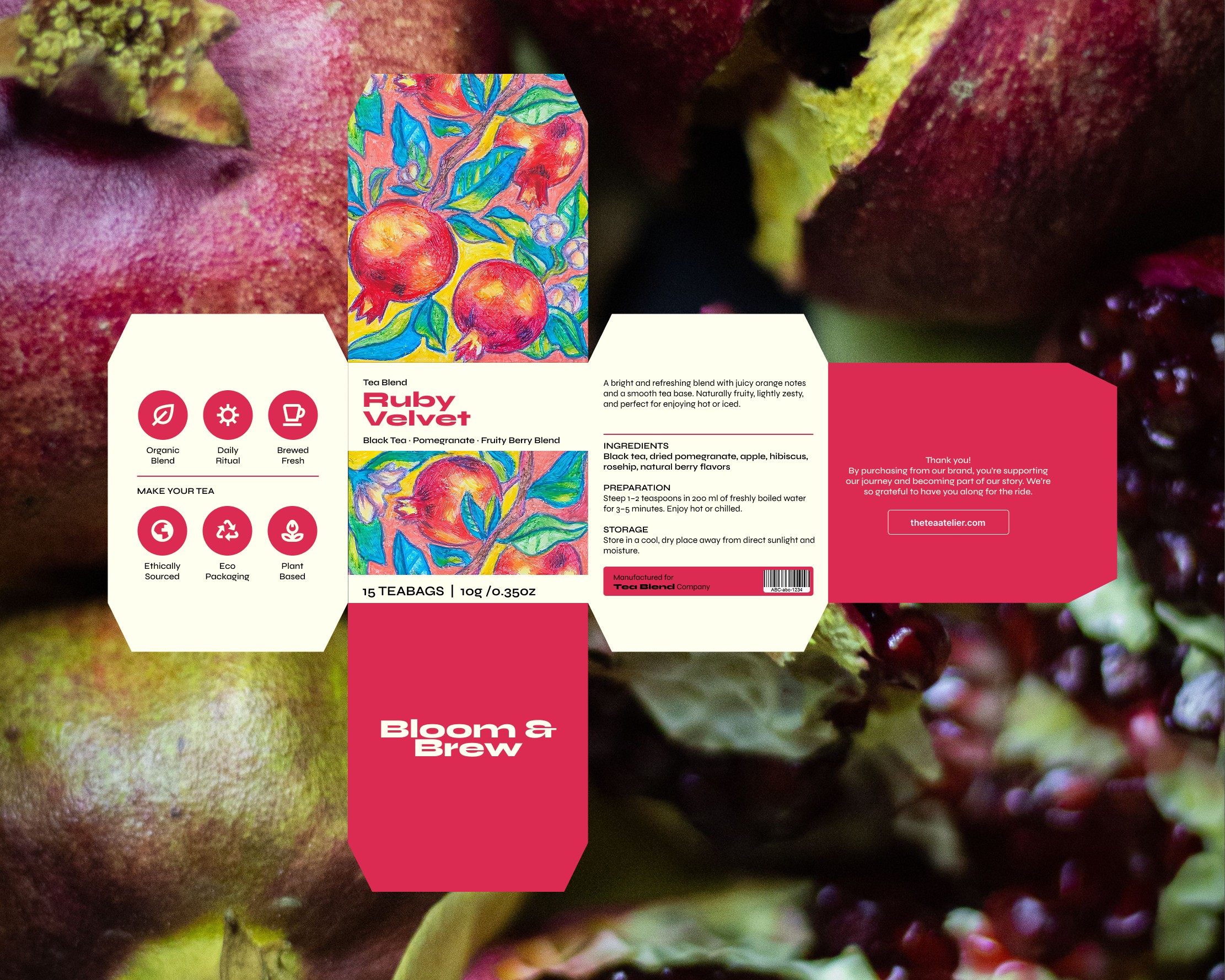
The concept focuses on a vibrant and refreshing tea range inspired by the natural qualities of fruit. Bright hand-drawn fruit illustrations form the main visual element of the packaging, creating a playful and expressive character while maintaining a refined and premium feel.
TARGET AUDIENCE
The packaging is aimed at young adults who are drawn to natural products with a contemporary and visually expressive identity. The design is intended to appeal to consumers who appreciate colourful, creative packaging while still looking for a sense of quality and sophistication.
VISUAL CONCEPT
The visual identity is built around vibrant colours and hand-drawn fruit illustrations. The organic quality of the illustrations gives the packaging a natural and personal feel, while the carefully balanced composition and refined details introduce a subtle sense of luxury.
The combination of playful imagery and an elegant visual direction creates a packaging concept that feels fresh, energetic and premium without becoming overly formal.
SYSTEMIC COHERENCE
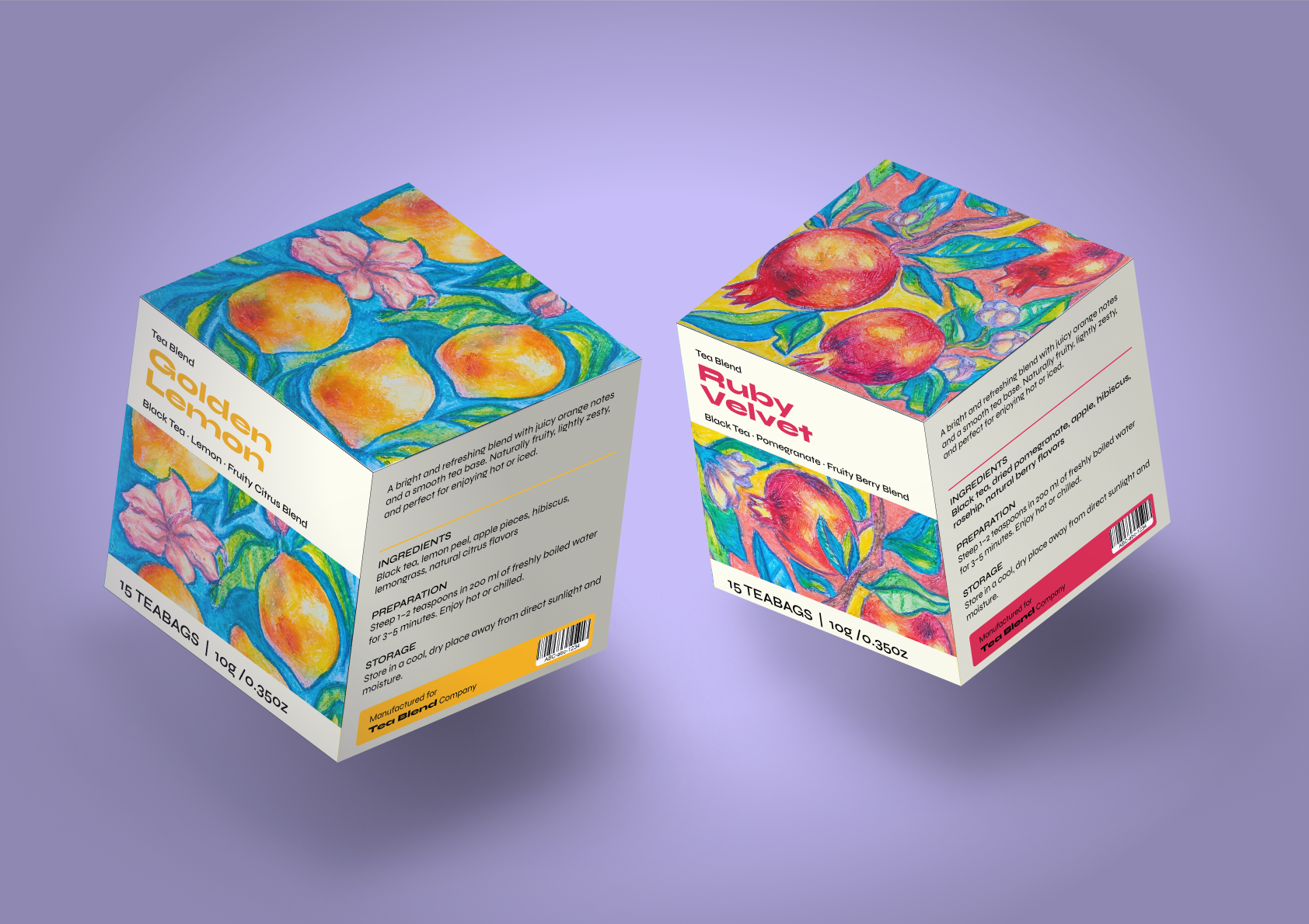
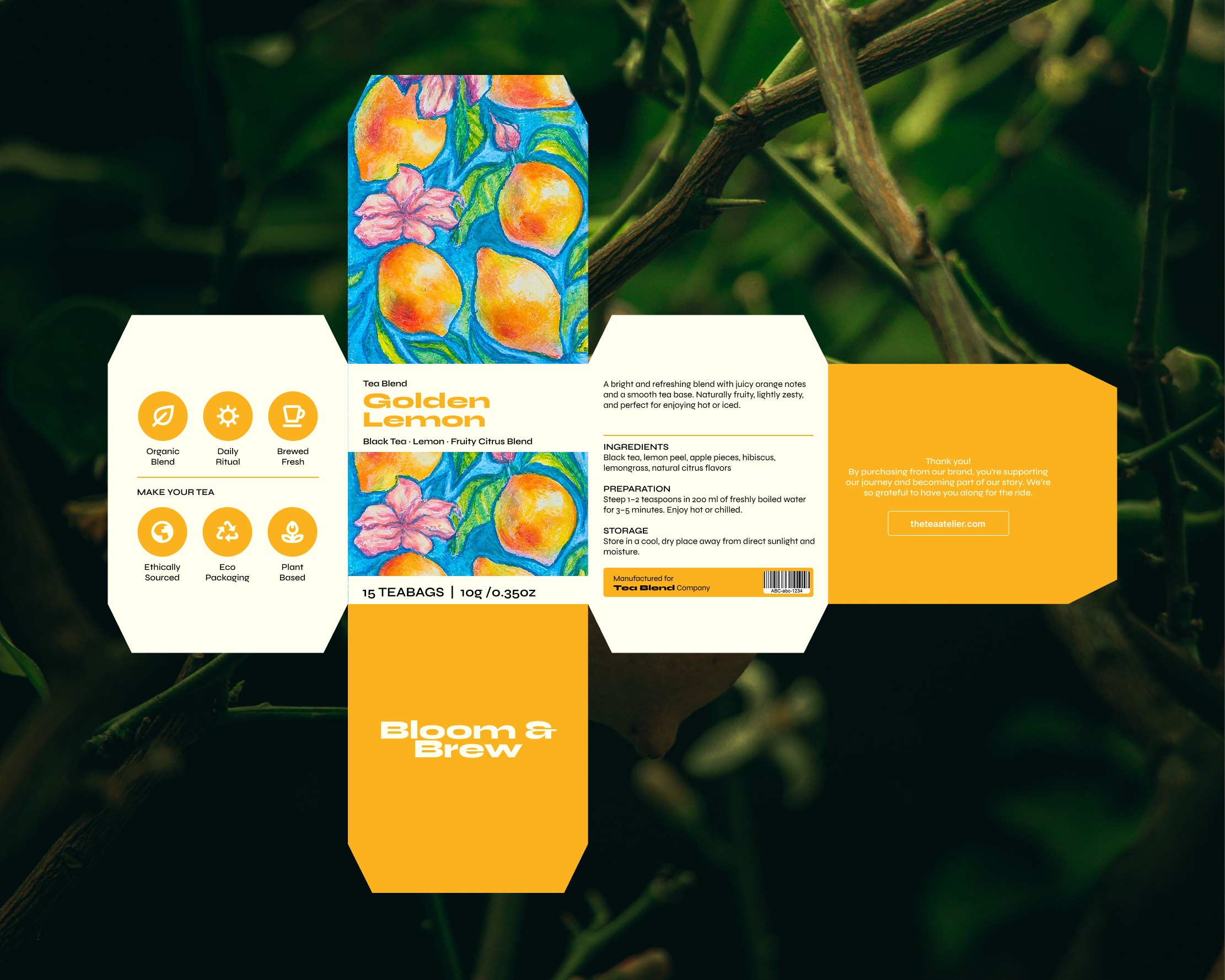
The design was developed as a cohesive packaging system, with the same visual language applied across the different elements of the product. The fruit illustrations, colour palette, typography and graphic details work together to create a recognisable and consistent identity.
Overall, the project explores how a tea package can communicate freshness, natural ingredients and vibrant energy while also creating a sophisticated and desirable presence on the shelf.
 Up-Brands
 Almighty
 Desember Design Studio
 Daria Levina
 Yuliya Likhacheva
 carola matalinares
 daniitenaa
 StudioMordius
 Simon Pendry Creative
 Sti&Co Design
 Yasmin Sherif
 Roberto De Simone
 aseelstudio
 Rabia zouina
 UPRISE
 HazelBishop
 Qianyu Liu
 siyajacob
 Rohan Barwal | D2C Brand Identity, Logo & Packaging Designer
 Karen Salem
 omarchafik
 nastyaabeketova
 Roberto Núñez Studio