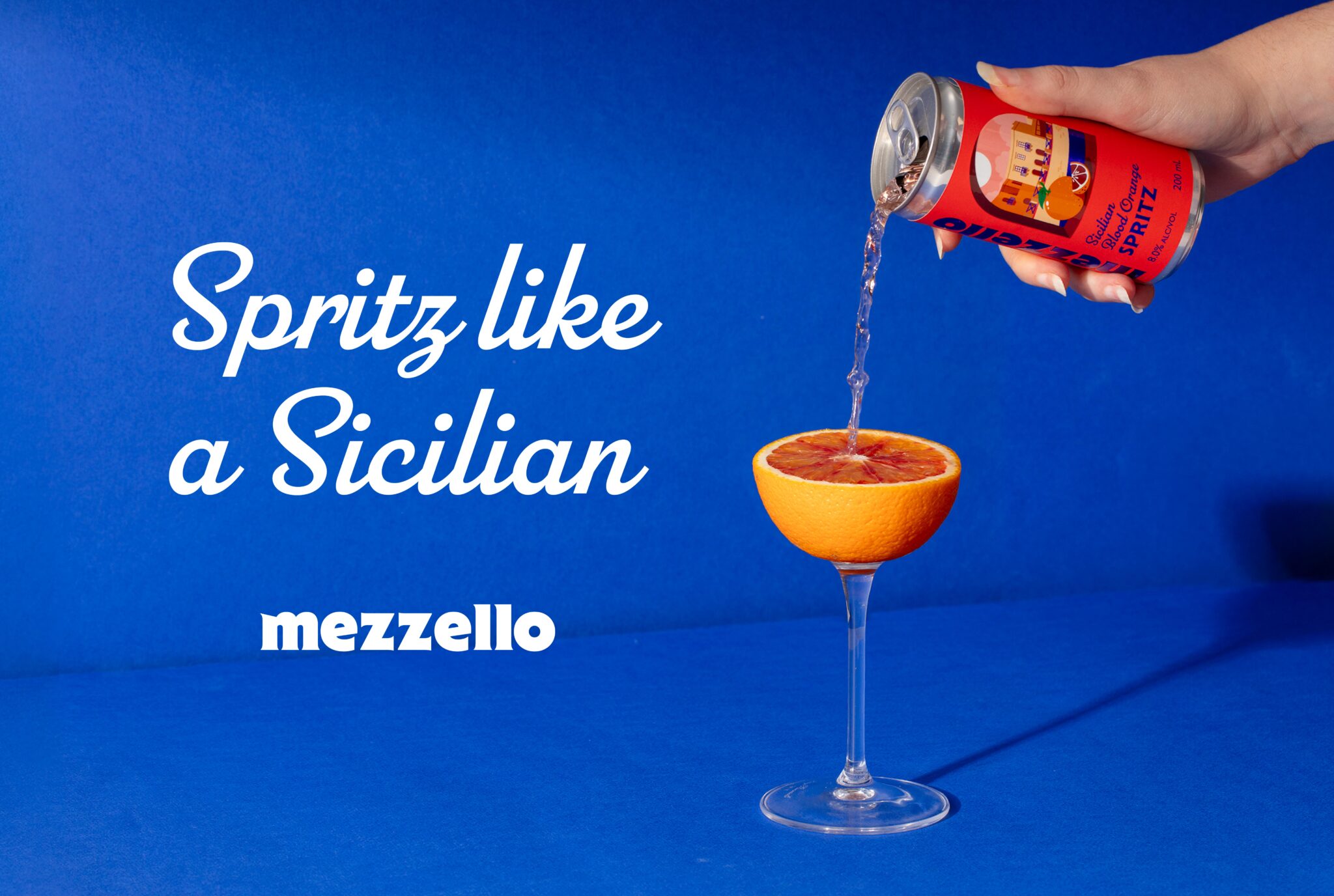

Our lovely client Michelle Lush, at Luxe Liquor Co, had a vision: a wine-based citrus spritzer that would bottle the colours, flavours and laid-back spirit of the Mediterranean for a new generation of Australian drinkers. Not another same-same seltzer, but something with soul, a drink that felt like a memory of somewhere sun-warmed, salty and slow.
Introducing Mezzello Spritz, inspired by sun-soaked coastlines, long lunches, golden-hour aperitivo hours and the simple pleasure of slowing down. The name “Mezzello” is a fusion of “Mediterranean” and “Limoncello,” capturing the brand’s playful, memorable and distinctly European character. Mezzello Spritz was created to transport you to your favourite Euro Summer holiday with no passport, no jet lag, no six-hour layover in Dubai required.
Each flavour in the range takes you to a different corner of the Mediterranean, drawing inspiration from the local citrus fruit, the shape of the coastline and the character of the people who call it home. Think a cool blood orange spritz on a beach in Sicily, a zesty limoncello while sunbathing in Sorrento, or a juicy mandarin aperitif on a vacay in Valencia.
Mezzello is brought to life through vibrant illustration and premium finishes, creating a visual identity built on bright citrus colours, playful storytelling and bold, confident typography. The result is a distinctive range designed to stand out on the shelf, feel genuinely fresh in the glass, and connect with young Aussie drinkers looking for an excuse to make any afternoon feel like a holiday.
Curator’s Insight
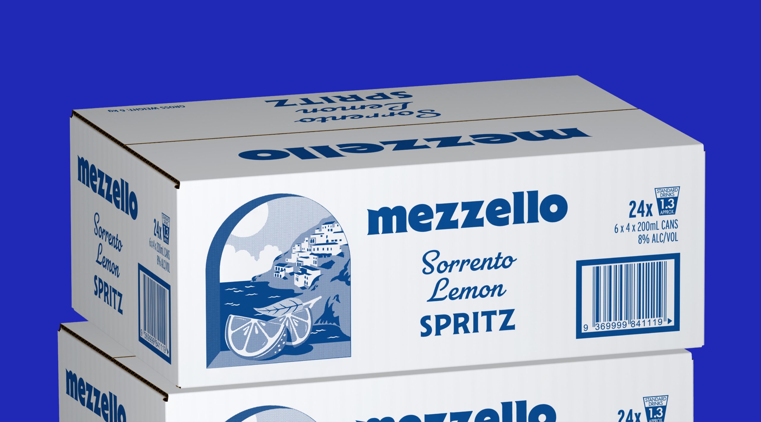
The most telling decision in this system sits outside the can entirely, in the shift between packaging tiers. The four-pack carrier and single can lean on full colour illustration: sunlit archways, hand-rendered fruit, a confident script for each flavour name. The outer case abandons that palette almost completely, rendering the same scenes in a single tone of blue ink on white stock. It is a considerable bet. Most multi-pack systems either shrink the retail graphics down for the case or drop illustration altogether in favour of flat brand blocking. Mezzello instead asks its artwork to survive a stress test: can the scene still read as Sorrento, Sicily or Valencia once colour is stripped away and only line weight and composition remain? It can, largely because the illustrations were built with enough tonal contrast and figure-ground clarity from the outset, the arch, the roofline and the fruit all staying legible in monochrome.
There is a quieter piece of engineering worth noting on the carrier itself. The die-cut circles exposing the can tops are not just a shipping or grip convenience, they double as a compositional device, punctuating the top of the box like portholes and letting a sliver of the can’s own colour show through before a shopper even lifts the pack.




 Stefano Bracci
 monther al omari
 Widakk Design
 Studio Garces
 宏洛图品牌设计HONGLT
 DN Designs
 alchimistestudioParis
 BoldCrest
 Maruf Nishat
 Oksana
 Dozen Agency
 erandy
 Leyma Design
 aabnasserr
 Palashcc
 habiba gomaa
 AntaPetrenco1
 Packart Bd
 sophioc
 Marta Wasilewska
 House of Thought
 Krithika Chakkaravarthy
 Reema
Reema