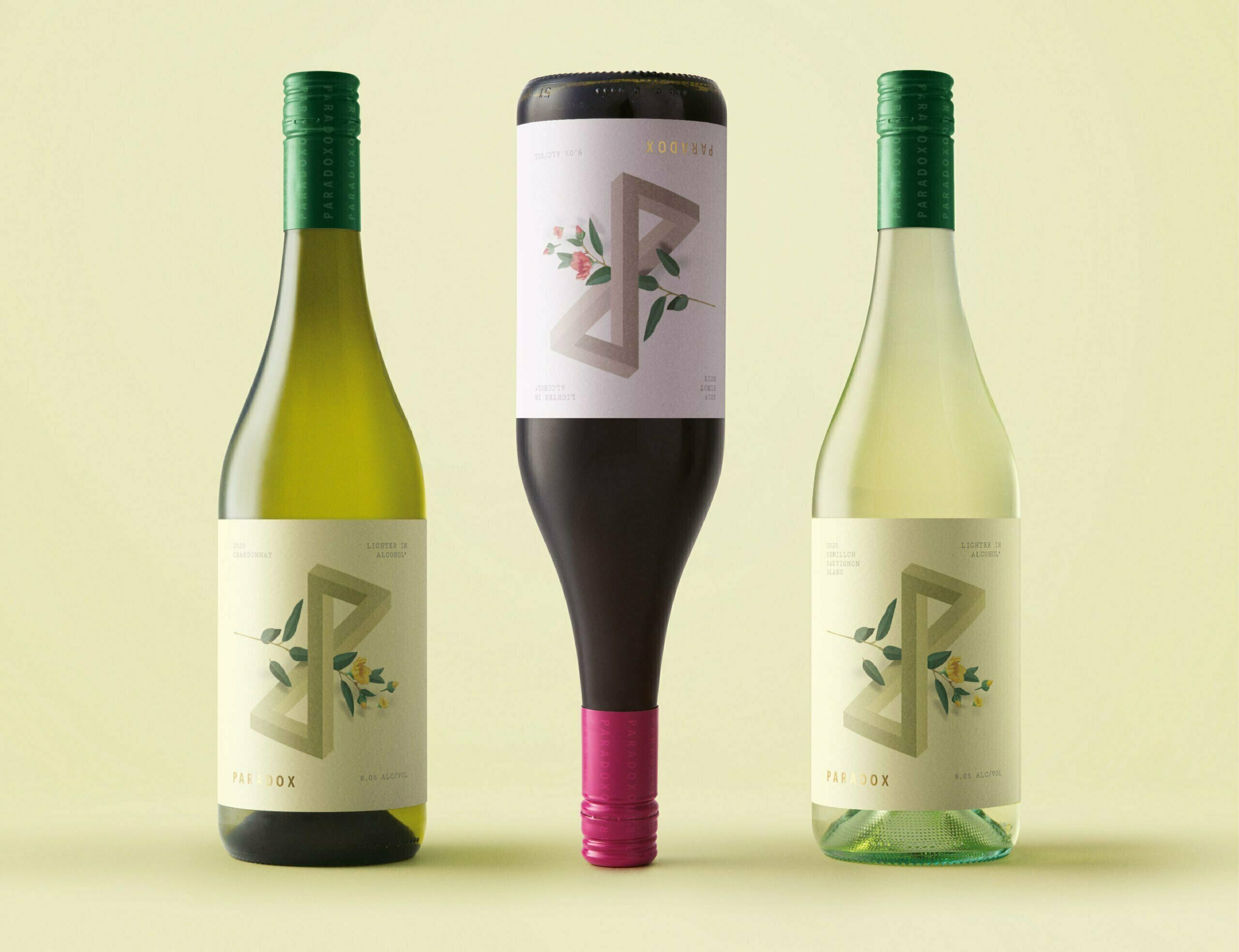
Branding and packaging for a new, low alcohol wine which challenges consumer perceptions of what wine should be.
With ‘better for you’ trends shifting to lower alcohol products, we needed to create a way to express a uniquely lighter feeling without losing the boldness and complexity of flavours that you would normally be used to in a wine. This thought became the idea of Paradox wines.
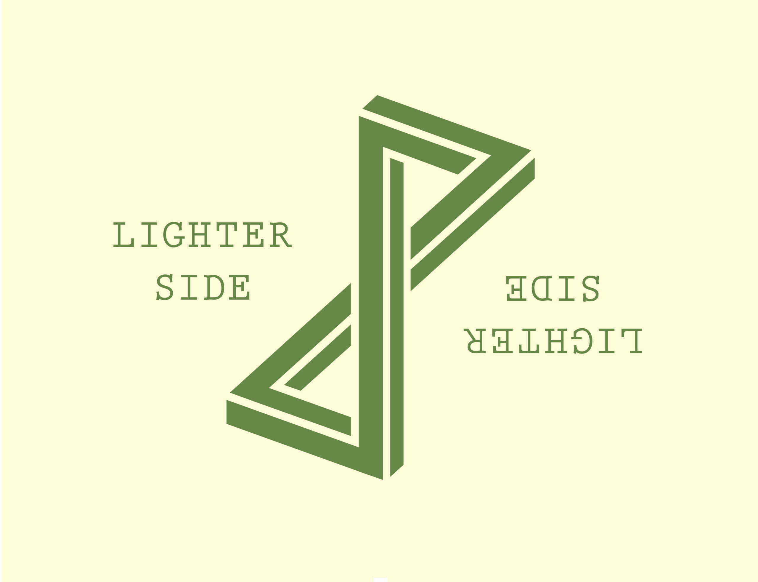
We used an impossible ‘P’ shape which plays with perspective, balanced with floating floral elements to emphasise the lighter alcohol content and a sense of mystery.
The brand architecture has been designed to be flexible and work across all varietals and move with wine trends. Each varietal simply changes with colour whilst the bold impossible ‘P’ device creates an icon to allow customers to find their wine in amongst hundreds of busy labels.
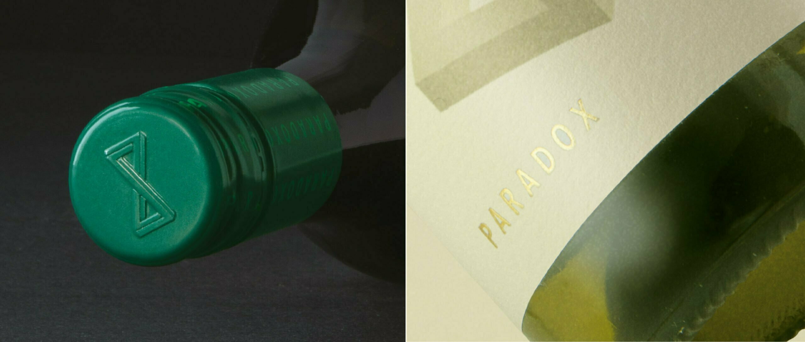
The natural textured stock works with the bold textures of the illustrative stone and foiled logo type for some premium touches.
Like the Paradox of life, an infinite mystery, these wines are like no other. Seemingly bold, yet irresistibly delicate. Paradox wines flare from the glass with a boldness atypical of their varietals – so don’t be fooled by the lower alcohol.