Logotype | Packaging design
Supplement brand | NUTRIPEAK
Company
NUTRIPEAK was founded to revolutionize wellness with high-quality, science-backed supplements. Focused on simplicity, transparency, and sustainability, the brand supports modern health needs with products that empower individuals to achieve peak performance. The brand reflects commitment to holistic health and innovation.
Logotype
The NUTRIPEAK logo represents the journey to optimal wellness. The modern, lowercase sans-serif font conveys approachability, while the bold “peak” symbolizes achievement. An accent in the “i” of “Nutri” reflects growth and nature. Designed for versatility, the logo ensures strong brand recognition across all platforms.
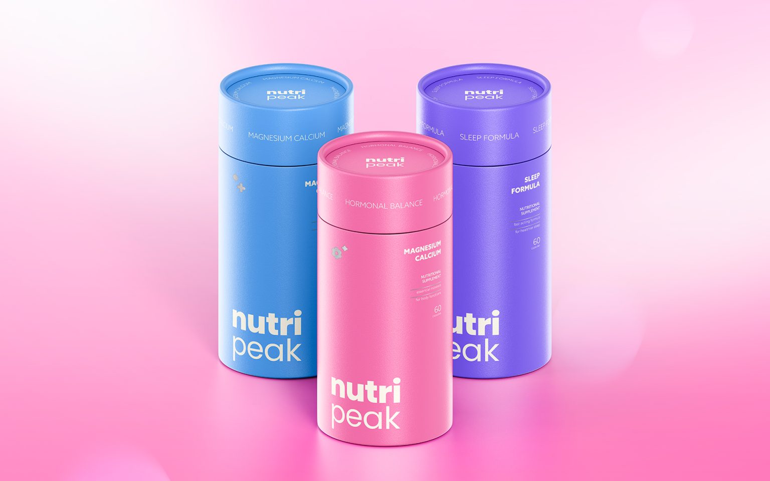
Packaging
NUTRIPEAK’s cylindrical packaging exudes elegance and simplicity. Each product uses unique colors—purple for calmness, pink for hormonal balance, orange for multifunctionality and blue for stability—reflecting their purpose. Clean typography and meaningful icons (e.g., a crescent moon for sleep) enhance usability. Eco-friendly materials and a matte finish deliver a premium, sustainable touch, making the design both functional and visually striking.


