Logotype | Packaging design
Pet supplement brand | POWER PAWZ
Company
Power Pawz is a new and innovative pet supplement brand dedicated to enhancing the health and well-being of dogs. The company’s mission is to provide top-quality, scientifically formulated supplements that support the vitality and longevity of furry friends.
Logotype
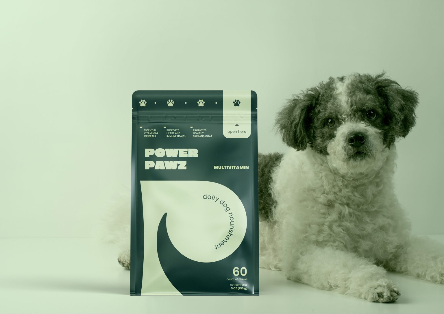
The logo design for Power Pawz featured a clean, modern “P” with the outline of a dog’s tail seamlessly integrated into the loop of the letter. This clever design element not only highlighted the brand’s focus on dogs but also added a playful and recognizable touch to the logo. I chose a green color palette for the logo, with varying shades to add depth and visual interest. The primary green symbolized nature and vitality, while the lighter shades added a fresh, energetic feel.
Packaging
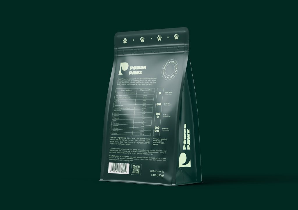
The packaging for Power Paws was designed to be eye-catching and informative. I used the green color palette to maintain brand consistency, with a focus on vibrant, fresh shades that conveyed health and vitality. To ensure the packaging was user-friendly, I included clear and concise information about the product’s benefits, ingredients, and usage instructions. Icons and infographics were used to highlight key points, making it easy for customers to understand the value of the supplement at a glance.


