
LADERAS
ABOUT
Laderas — Spanish for “slopes” — takes its name from the area where part of Bodegas El Villar’s vineyards grow: a mid-altitude site with a gentle gradient that the village has always called simply that. The winery wanted to modernise one of its main brands without unsettling the people who already buy it.
SOLUTION
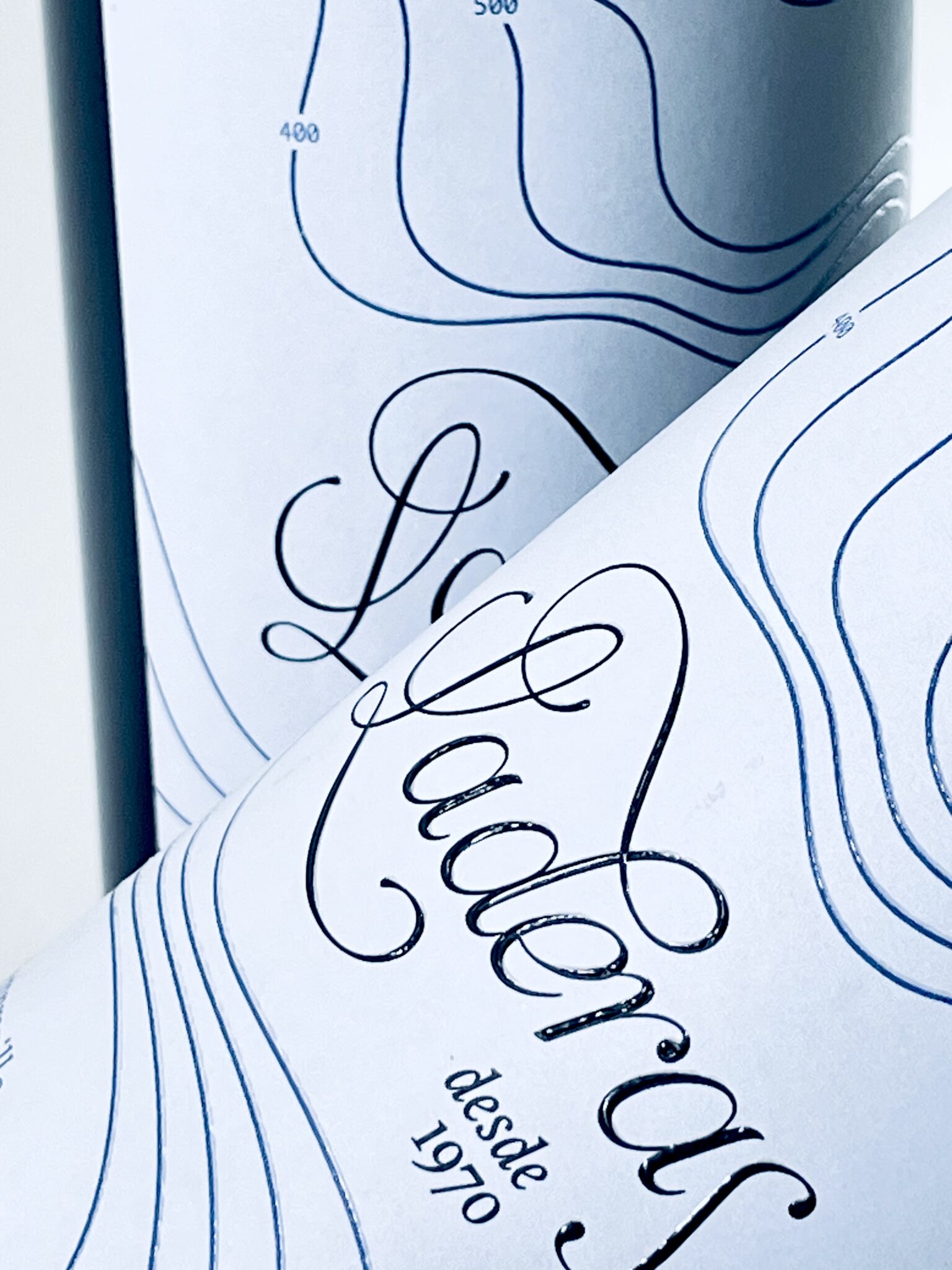
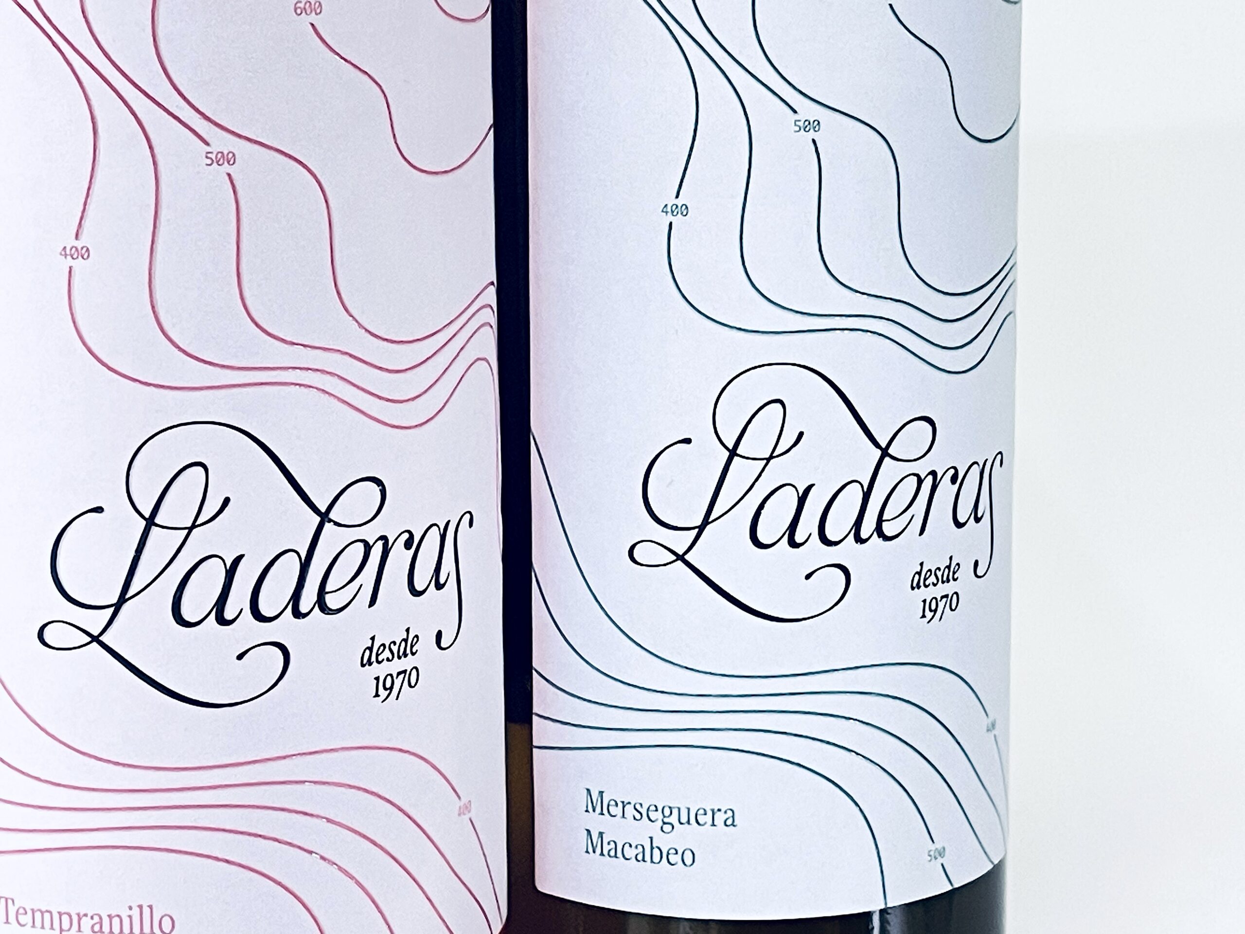
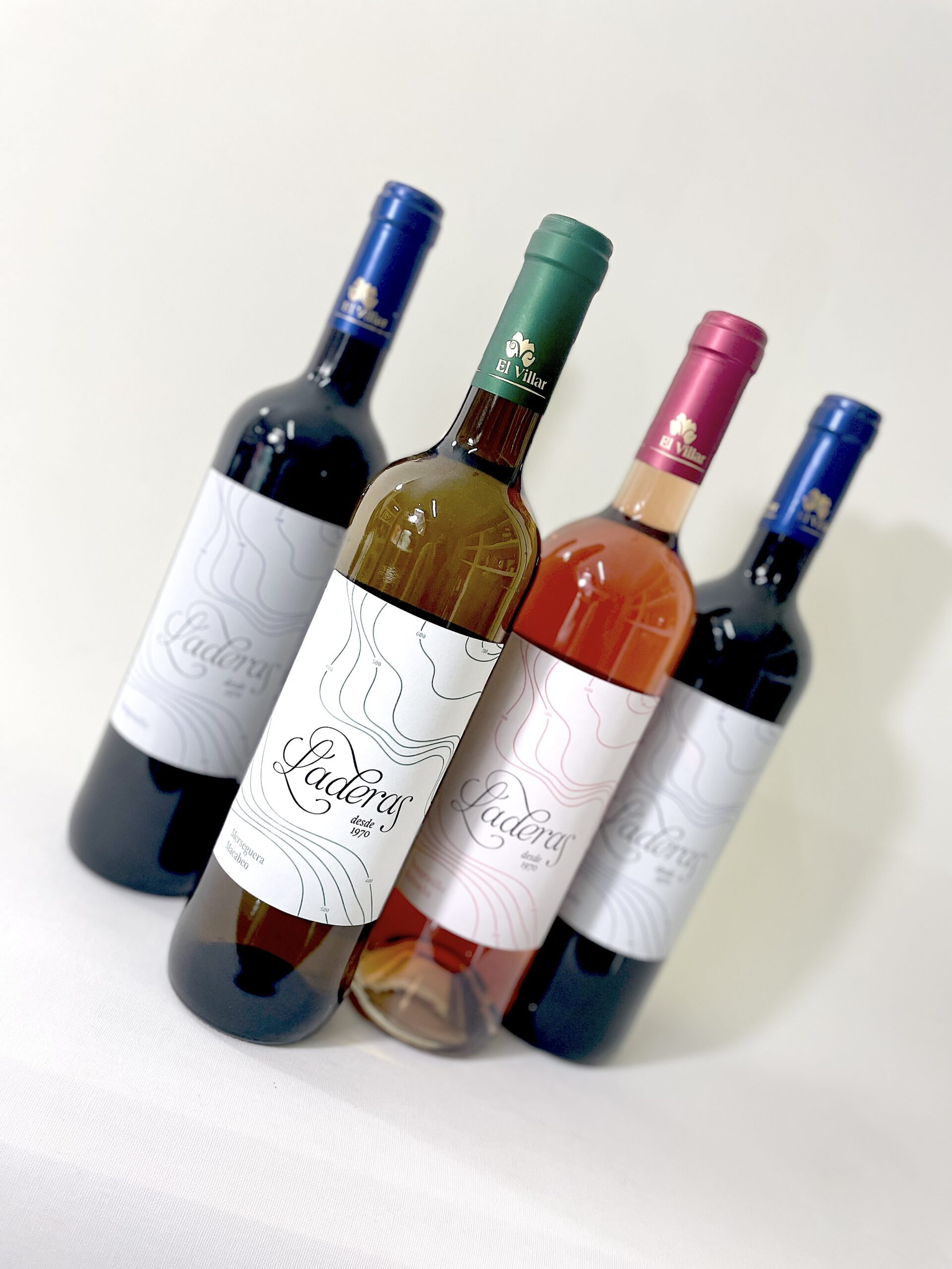
The first rounds went openly contemporary and pulled the wine away from what it actually is, so the direction was reset. The one that worked came from the site visit: the way the owner described the gradient of the land while walking it. Soft contour lines cross the label like a topographic map, raised in screen-printed varnish so the terrain can be felt before it is read. The typography holds the other half of the brief — a chancery italic, reworked to carry the classical weight the winery was after — set against an otherwise empty field. Nothing on the label illustrates wine. The only image is the shape of the ground it comes from.
RESULT
A clean label in a classic register, where the modernisation happens through restraint rather than styling. Regular buyers still recognise the brand, and the wine now sits comfortably next to more contemporary labels on the same shelf.





 Studio Zak
 Ander Sanchez
 Atipus
 Widarto Impact
 hovski
 Ohmybrand
 CreativeWise
 Rauf Karaev
 Hooperstudio
 Modern Theory
 Akim Melnik Design Studio
 preflightcreative
 Seyf El Haq Menouer
 Badraddine Attik
 Samriddhi Ravi
 Alessandro Ammaturo
 Amblr Studio
 vladlenalevit
 Sis Tsarukyan
 monther al omari
 alchimistestudioParis
 designsbysukaina
 About House of Ta
 Amjad Battal
 UPRISE