
One of the most important things in design is having unlimited freedom to create. And that was exactly what inspired me when I received a bread packaging design project.
The client had no preferred brand name or specific color palette, which gave me complete creative freedom.
After researching the industry, I wanted to create packaging that would evoke positive emotions and take customers back to their childhood, when we enjoyed the warmest, most delicious bread.
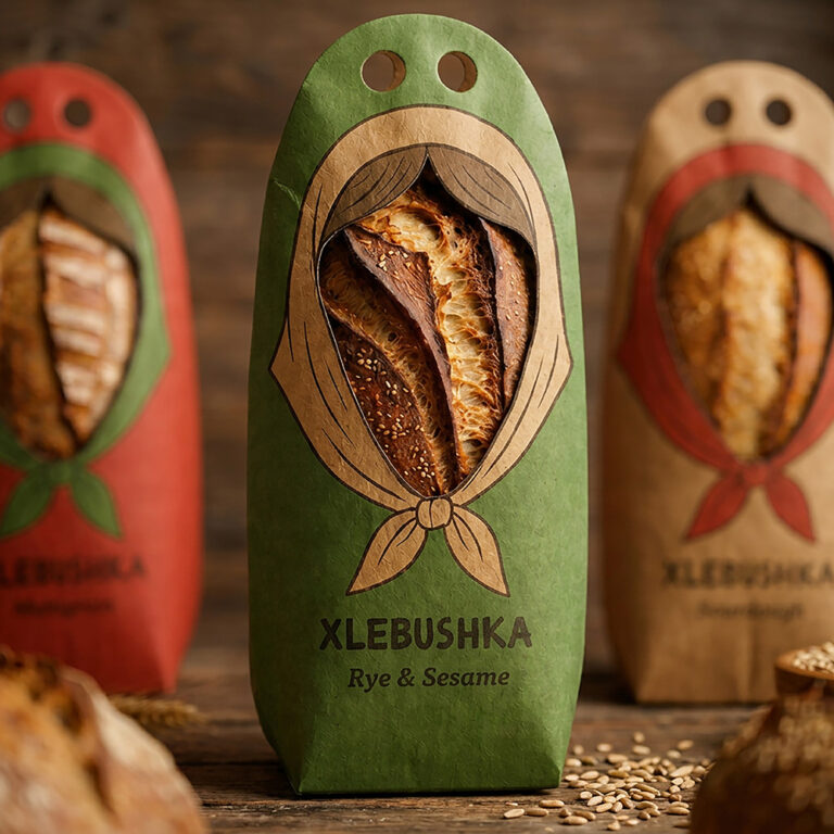
That’s when I decided to build the packaging concept around one of our favorite childhood toys — the Matryoshka doll. I wanted the shape of the box itself to resemble this iconic toy.
With the visual concept already in mind, I started thinking about the name. It also needed to have a connection to Matryoshka.
Since Matryoshka is a traditional Russian toy, I wanted the name to have a Russian feel. The Russian word for bread is “хлеб” (khleb), so I decided to combine it with Matryoshka-inspired wording.
And that’s how Xlebushka was born.
Once the brand name was finalized, I started working on the packaging design.
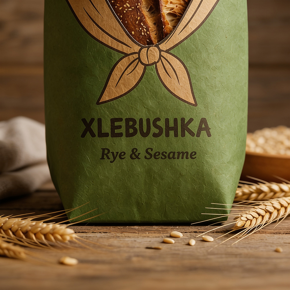
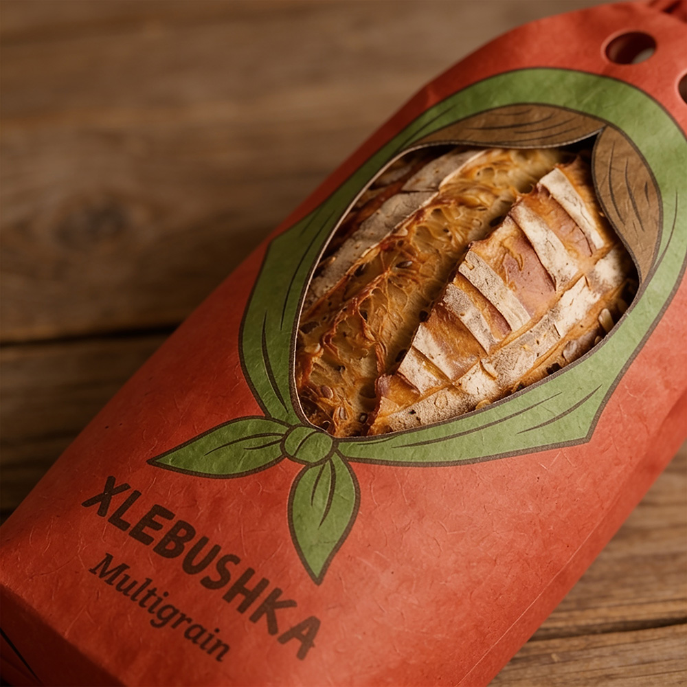
Since the bread would be divided into three categories based on its type, I decided to distinguish them through three different colors: beige, green, and red.
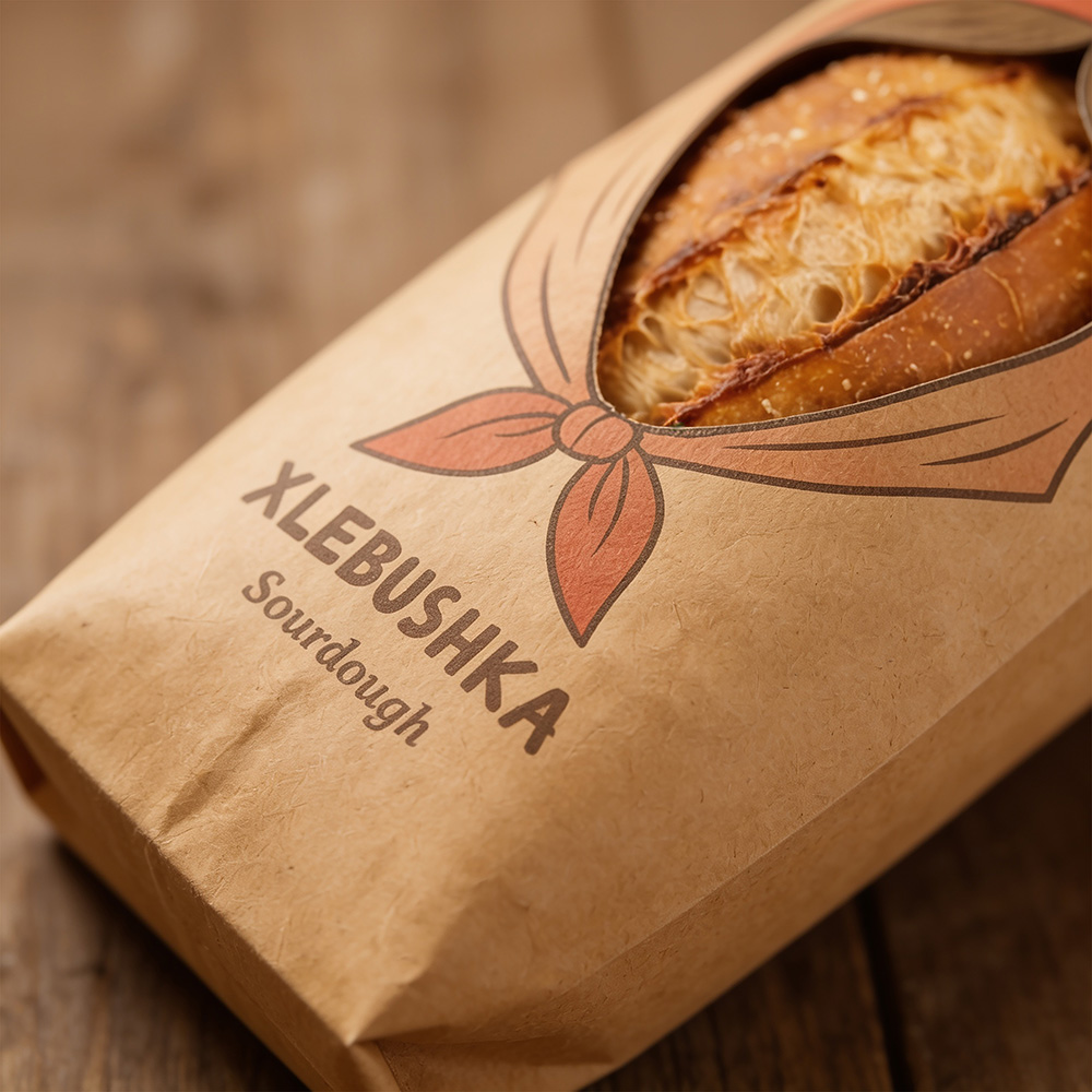
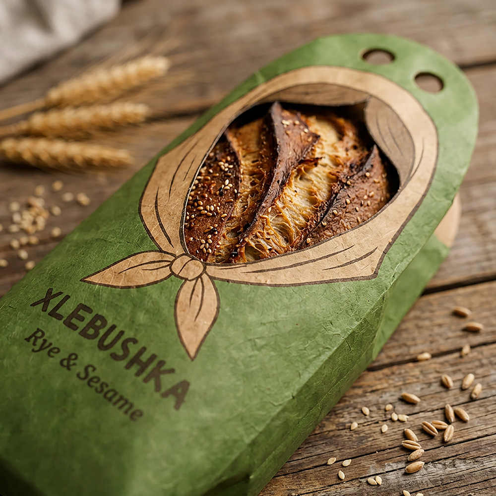
The packaging also featured a headscarf-inspired detail, making it resemble a traditional Matryoshka doll even more.
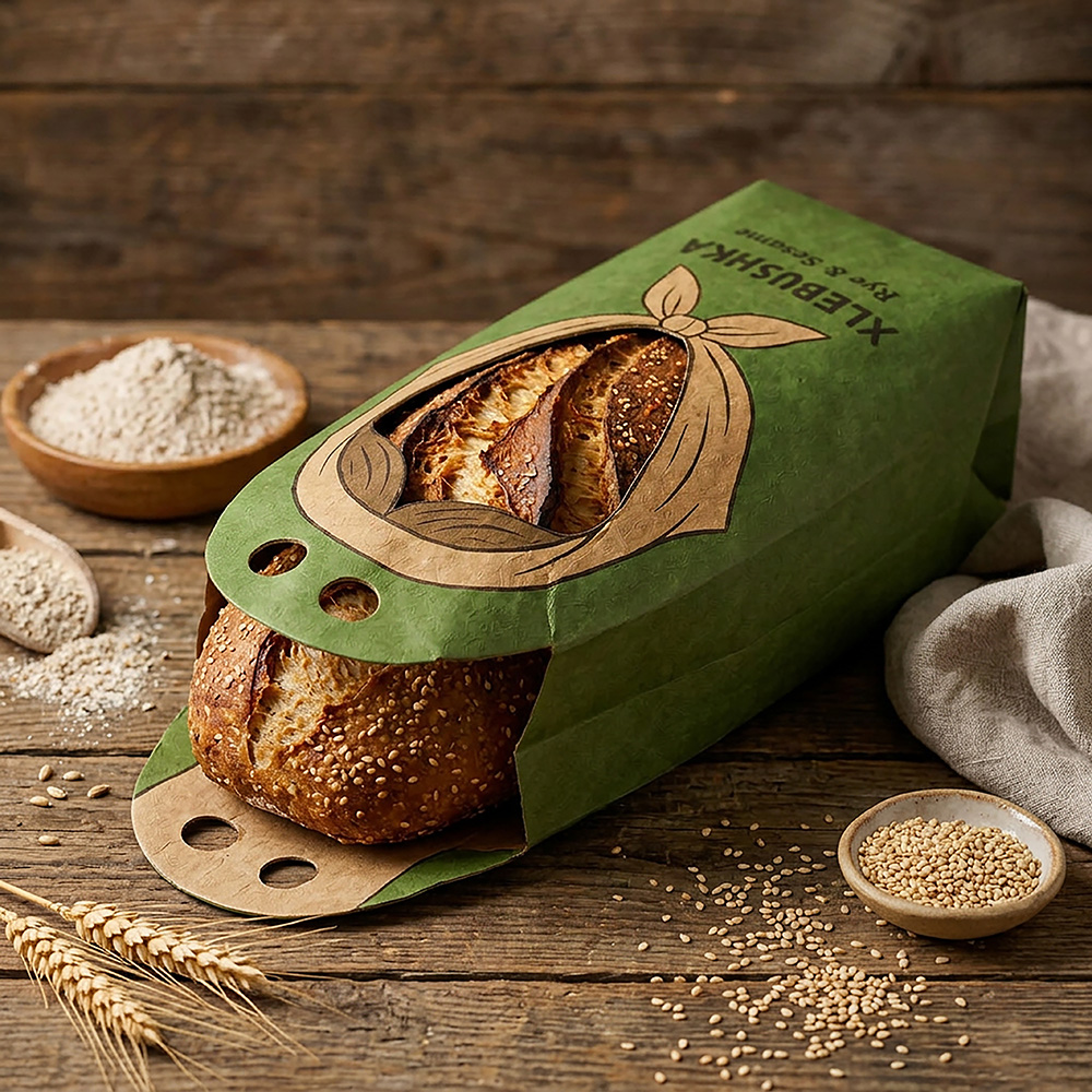
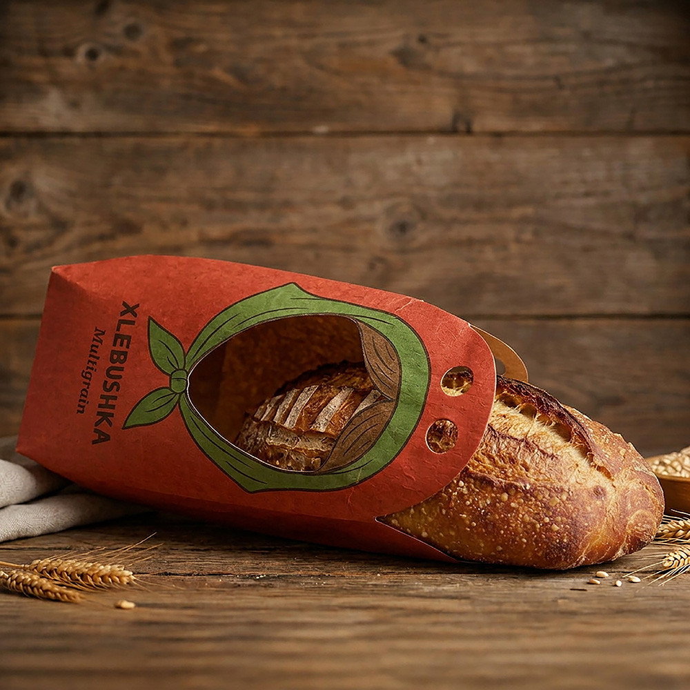
I added a cutout where the doll’s face would normally be, allowing customers to see the bread inside.
The box also featured specially designed handles with openings for fingers, making it easy and comfortable to carry.
Every detail was carefully considered to create packaging that would not only make buying bread a delightful experience but also ensure that carrying it was practical and convenient.
 butterflyhunters
 monther al omari
 Asprey Creative
 About House of Ta
 Up-Brands
 KJS CRAFT
 hello ocean
 PG Branding
 CF Napa Brand Design
 booouuuche
 Hyejung Choi
 Abbydraw Designs Unique Conceptual Branding & Packaging Designing Ideas
 Hollóka Grafikai Műhely / Graphic Design Studio
 Minim Brand Design
 saerom81
 YNL
 bilel tkouri
 vitoramockup
 Lampra
 Sanavala
 www.branding.uz
 alchimistestudioParis
 Estudio Argo
 Modern Theory