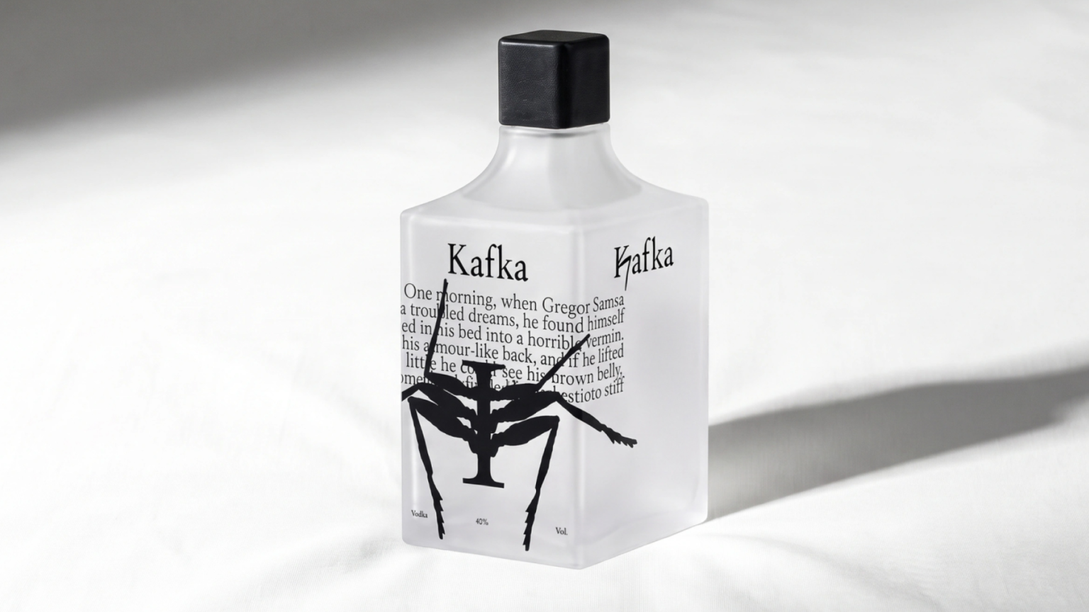

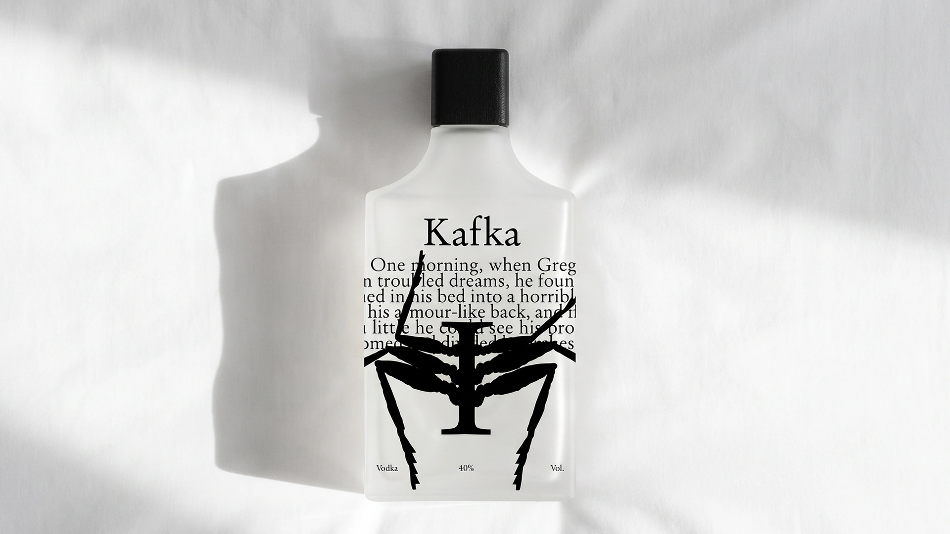
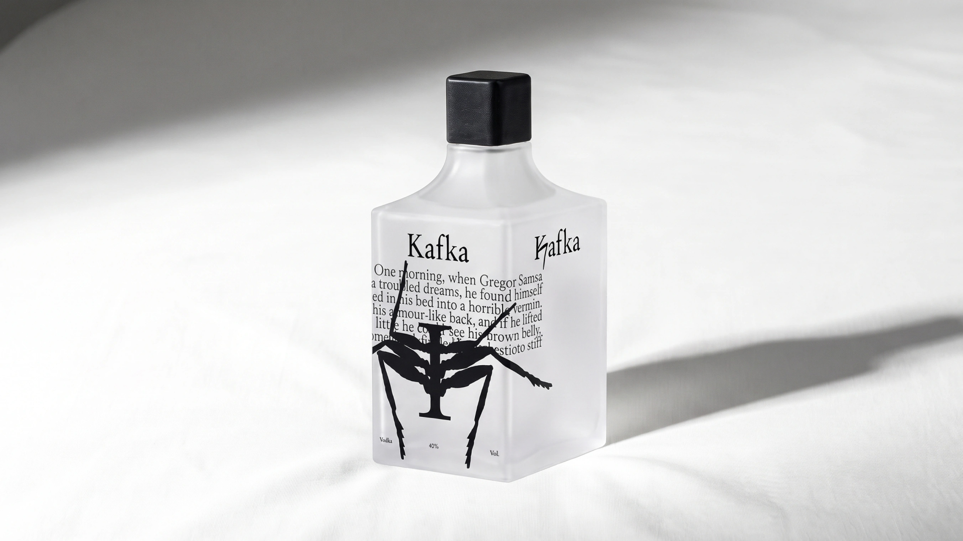
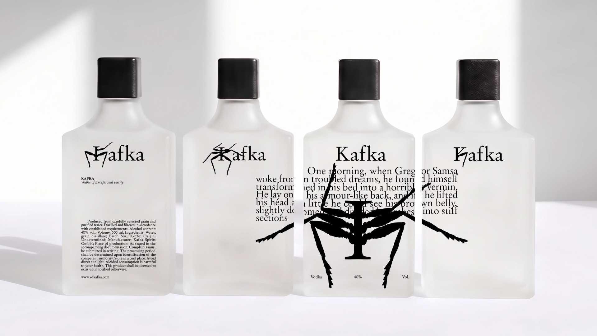
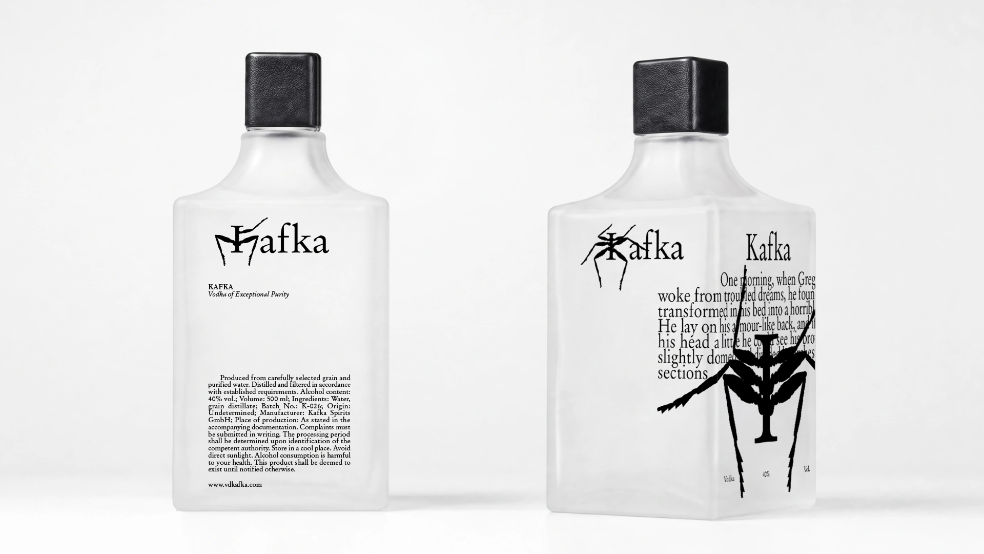
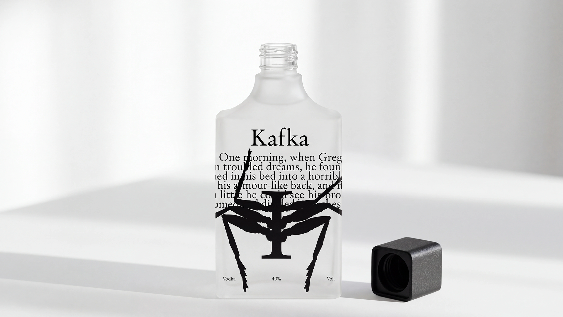
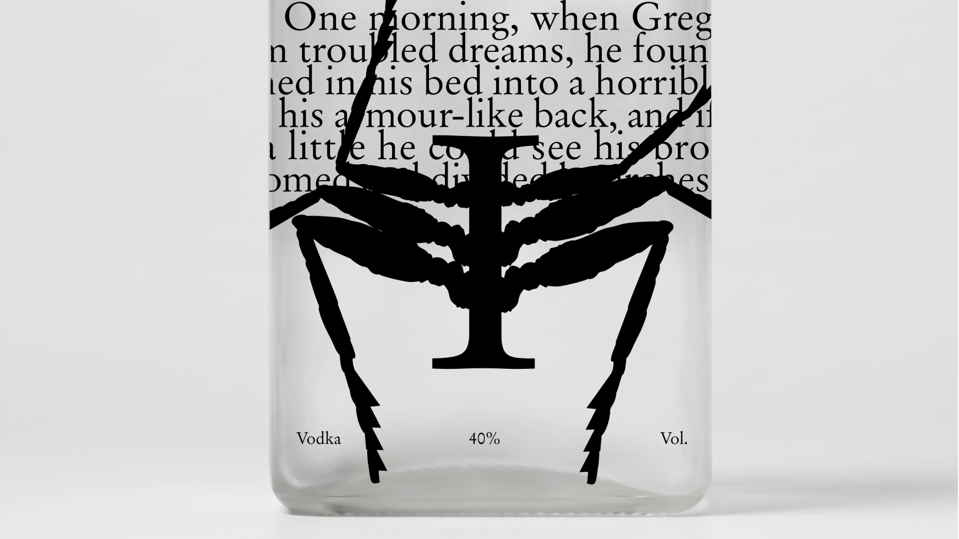
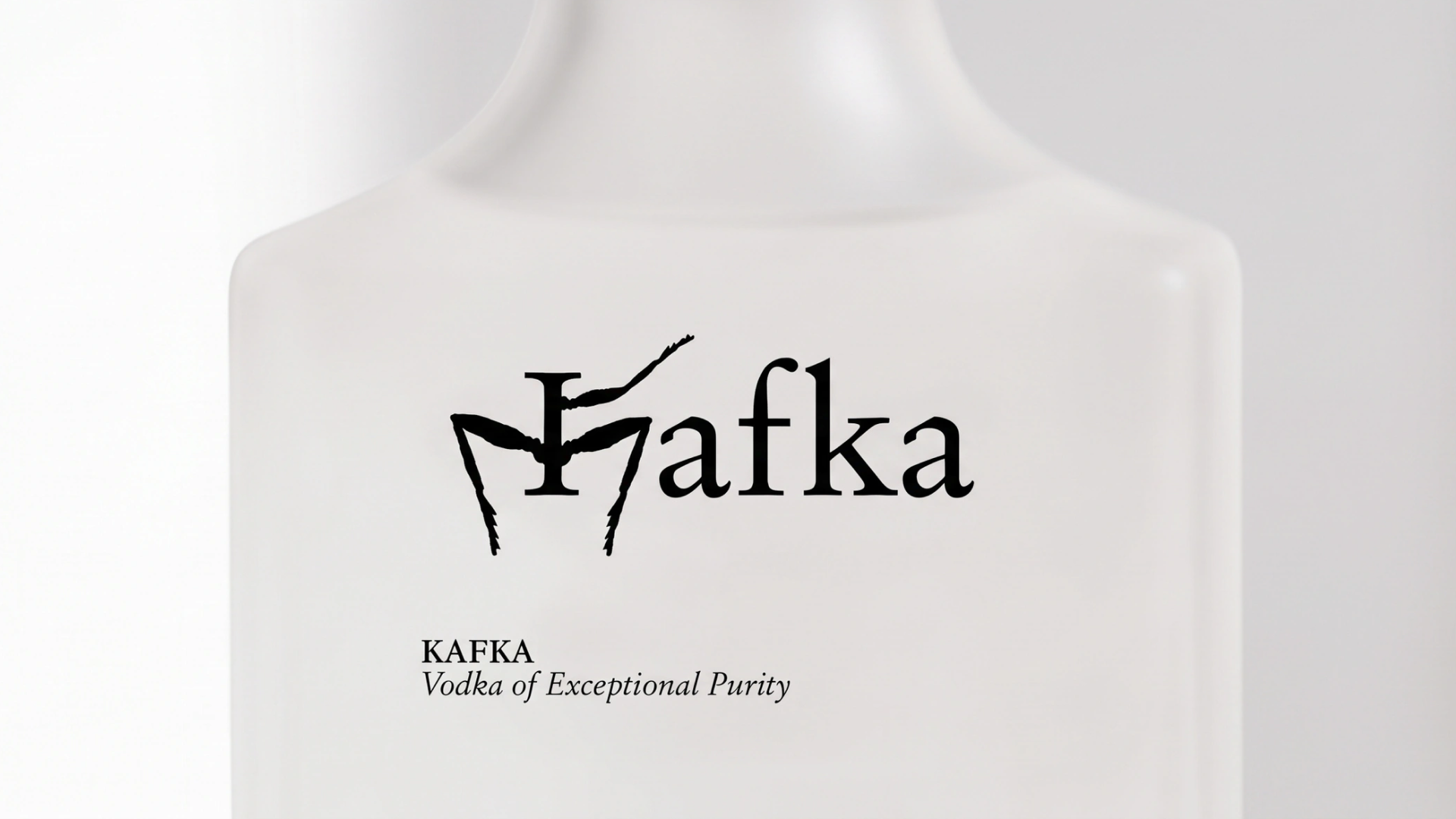
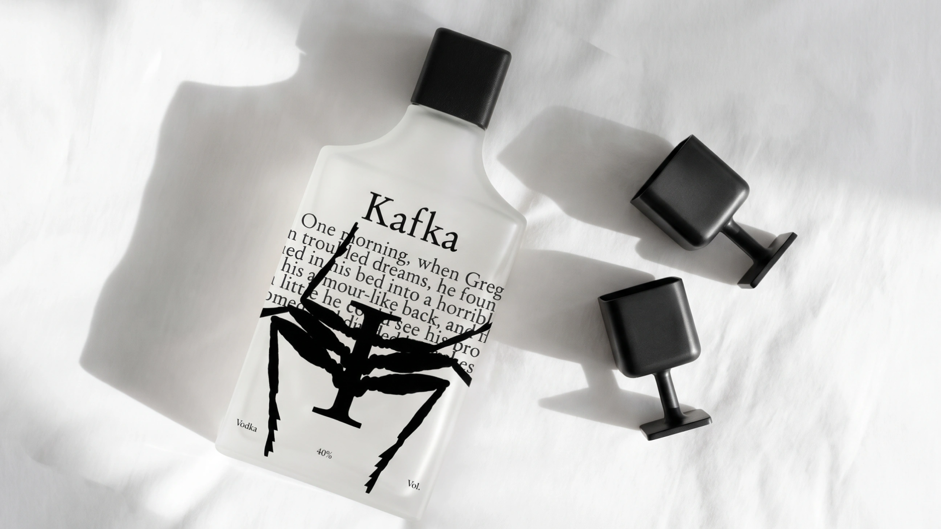
The project is based on the idea of packaging as a book, with each side of the bottle becoming a separate page and a stage in the transformation. As the bottle turns, the graphic symbol undergoes a gradual mutation: the letter “K” transforms into the image of an insect.
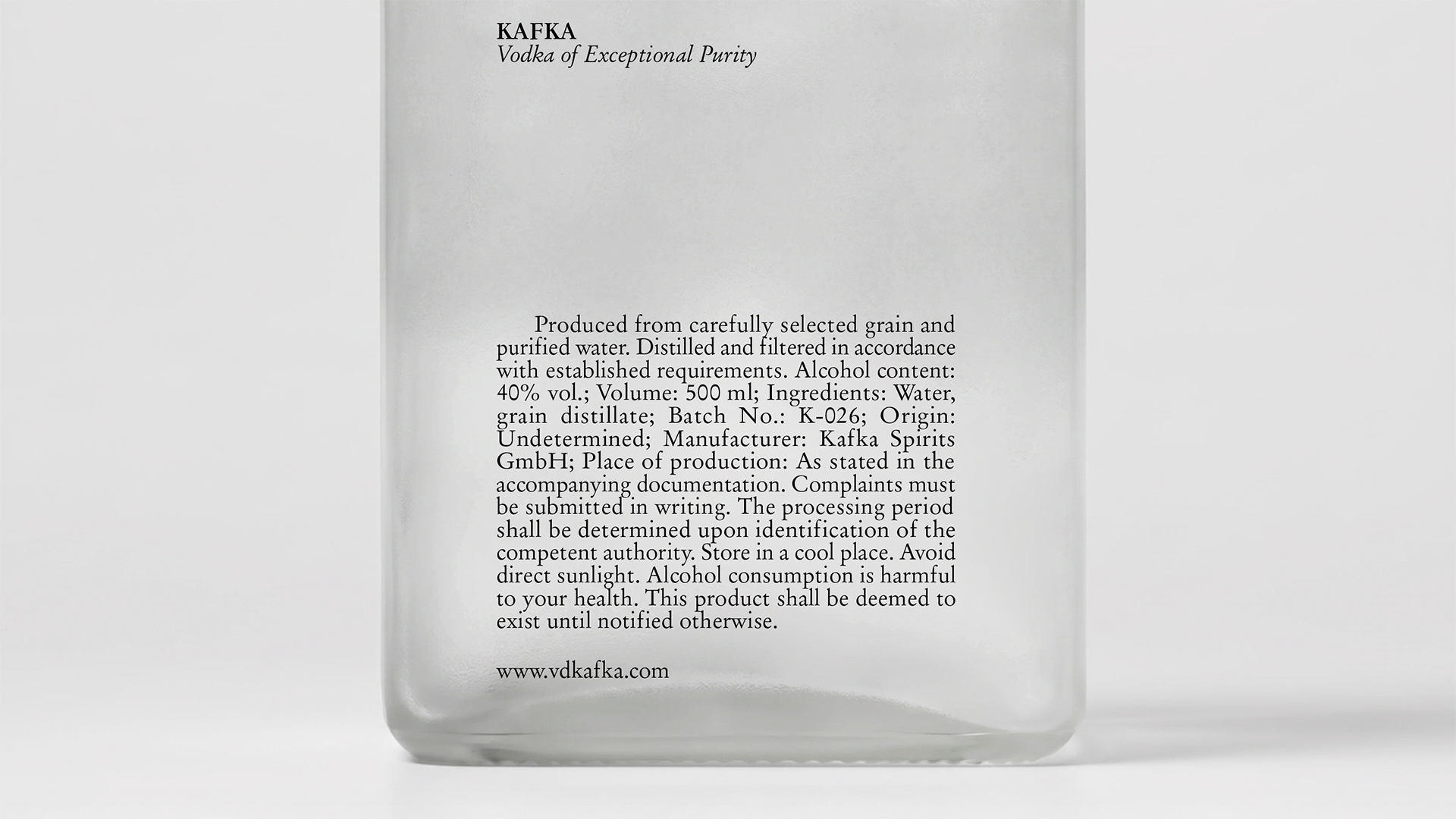
The translucent white glass evokes the delicate pages of a book, creating a sense of fragility and visual ambiguity. The text and graphics interact with the shape of the bottle like fragments of a narrative that gradually unfolds.
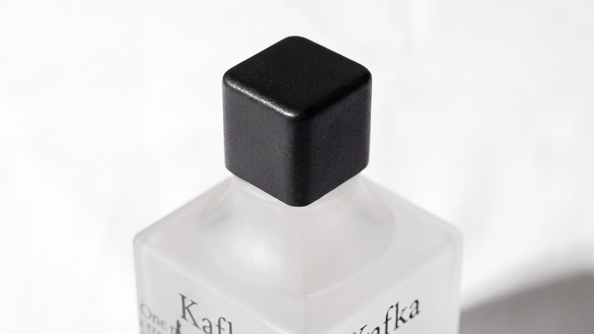
The cap plays a particularly important role as the point of closest physical contact with the object. Its leather texture introduces an additional tactile dimension to the project. Evoking the surface of living skin, the leather intensifies the biological quality of the object and creates an unsettling contrast between the cold glass and a material reminiscent of human skin.
The packaging becomes more than a vehicle for visual identity: it becomes a physical experience of metamorphosis — a story of losing one’s familiar form.
Curator’s Insight
Vodka is a category built on sameness, so the challenge here is giving a clear spirit a character without adding a label. The solution is to build the creature out of the identity itself. The stem of the K becomes the insect’s spine, so the monogram is never replaced, only grown into something else. The text is set large enough to read as a printed page, and the insect crosses it, covering the very words that describe it. Because the sentence is cut by the bottle’s edges, you have to turn the bottle to follow it, which turns handling into reading. When a mark has to become a character, it is often stronger to extend a letterform you already own than to introduce an illustration.

 VERONIKA KISELEVA
 al margen
 Jasgul
 Abhijith Madhu
 mariee
 Modern Theory
 Tancybox
 WINK®DESIGN
 impprintz
 Chainhouse
 rufydesign
 White Candy Design
 Just Design
 alchimistestudioParis
 bmd group
 Laurie Offer
 medok4r
 Nouna design
 CreativeWise
 ANNA ONISHCHENKO
 Denomination
 VANESA GARCÍA ESTUDIO
 Julia Persuk