
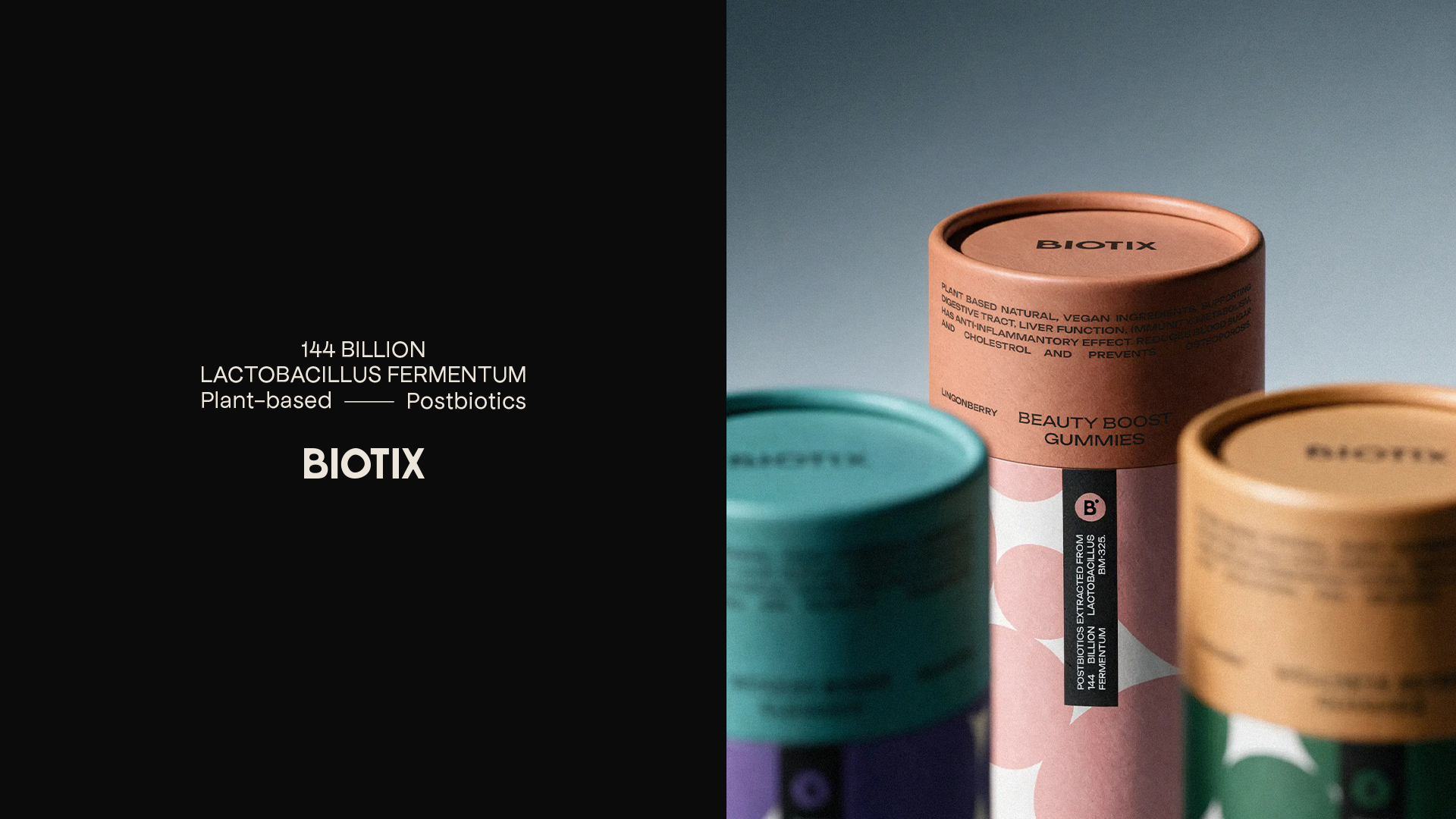
Postbiotics are preparations made from inanimate microorganisms and/or their components. BIOTIX’s postbiotic can be incorporated into different foods without changing their flavour, placing the brand in an interesting space between health and food.
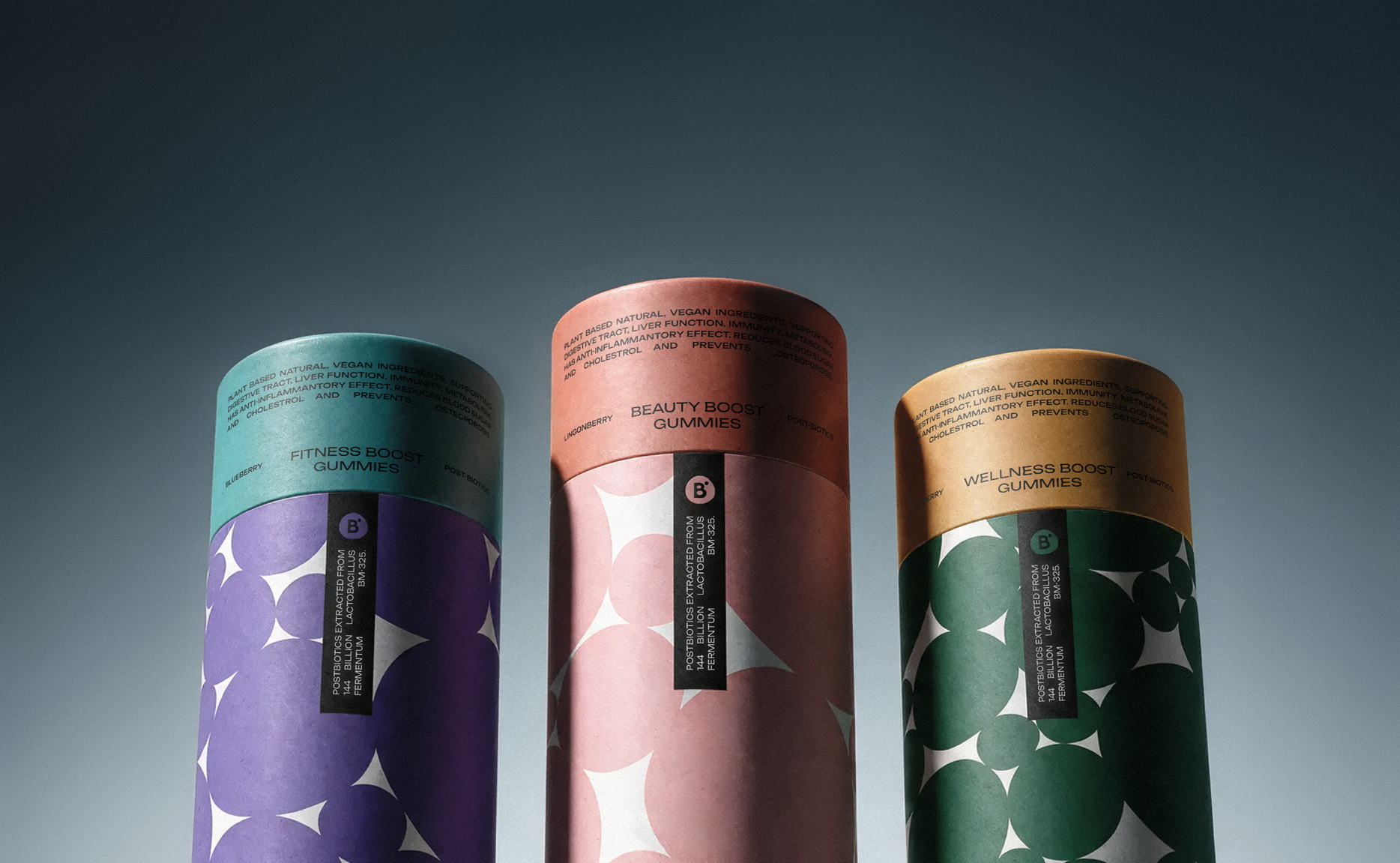
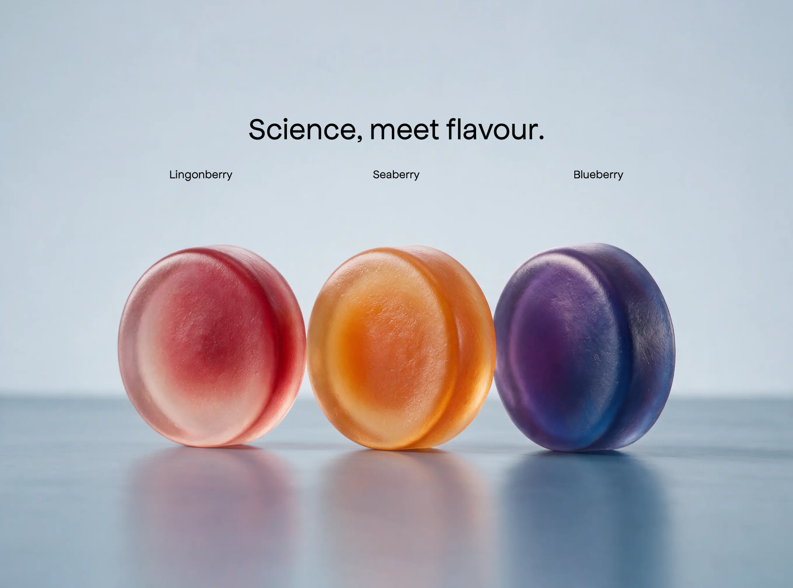
BIOTIX already offers blueberry, lingonberry and seaberry variants. Its connection to research and health is important, but the way the product can become part of familiar foods gives the brand another side to work with: flavour, colour and appetite.
We created a new visual identity for BIOTIX and built a flexible graphic system around it. The gummy packaging concept became one way to show how that identity could work on a physical product, using BIOTIX’s existing flavour range.
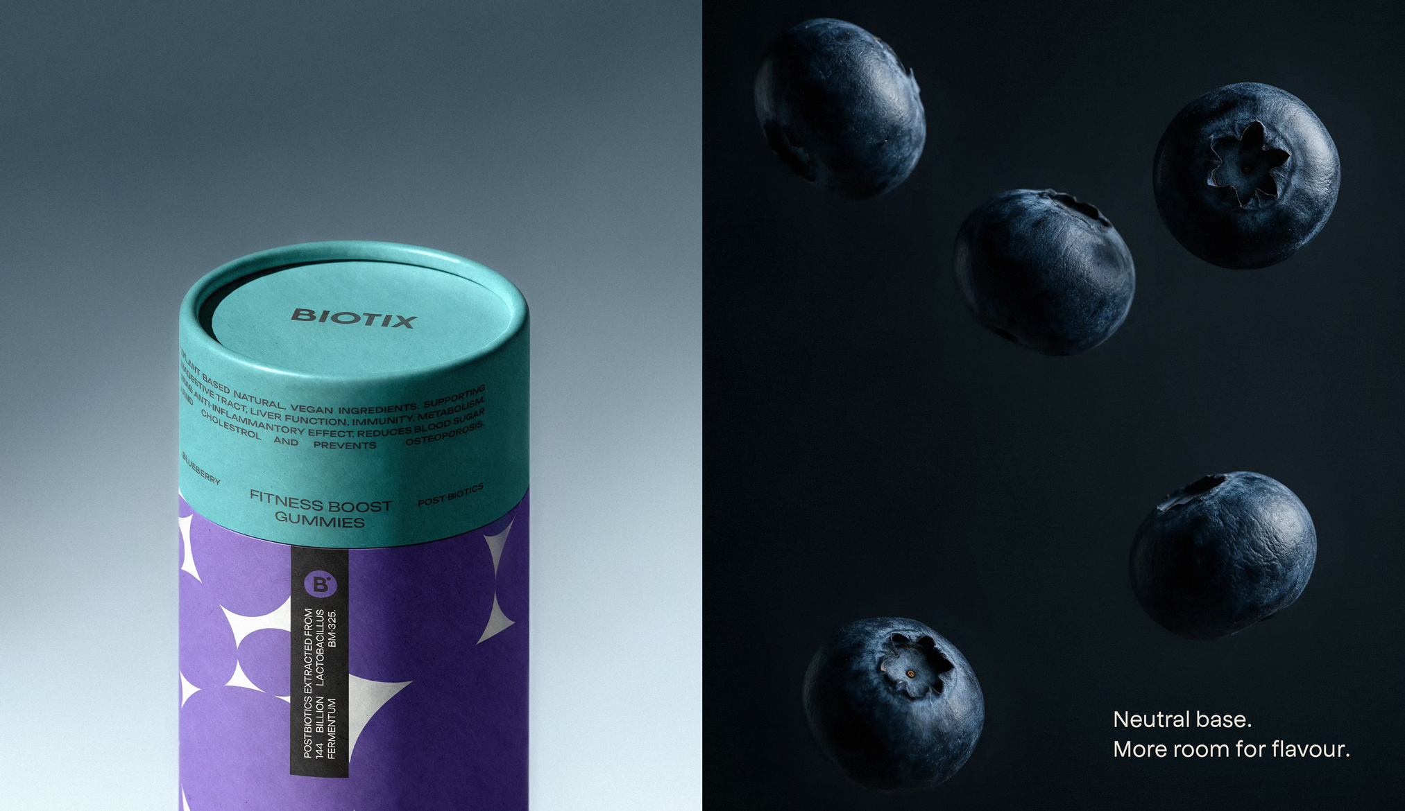
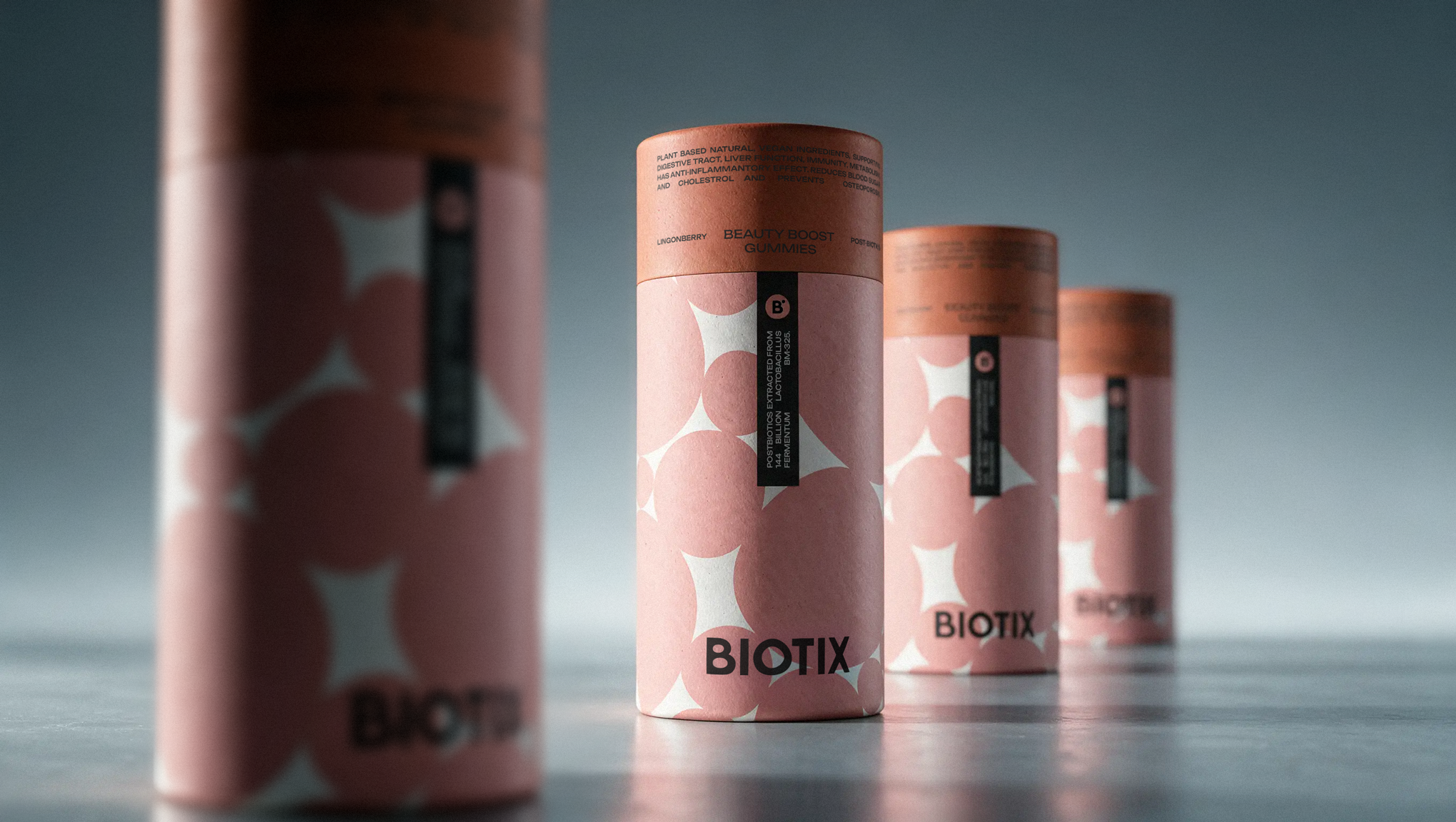
The identity begins with the O in the BIOTIX wordmark. Its slightly irregular form softens the otherwise precise geometry of the logo and subtly references the microorganisms behind postbiotics. Repeated across the packaging, that same shape forms a pattern reminiscent of microscopic imagery. Through colour, it takes on another role, suggesting blueberry, lingonberry and seaberry without literal fruit imagery or pushing the pack too far toward confectionery.
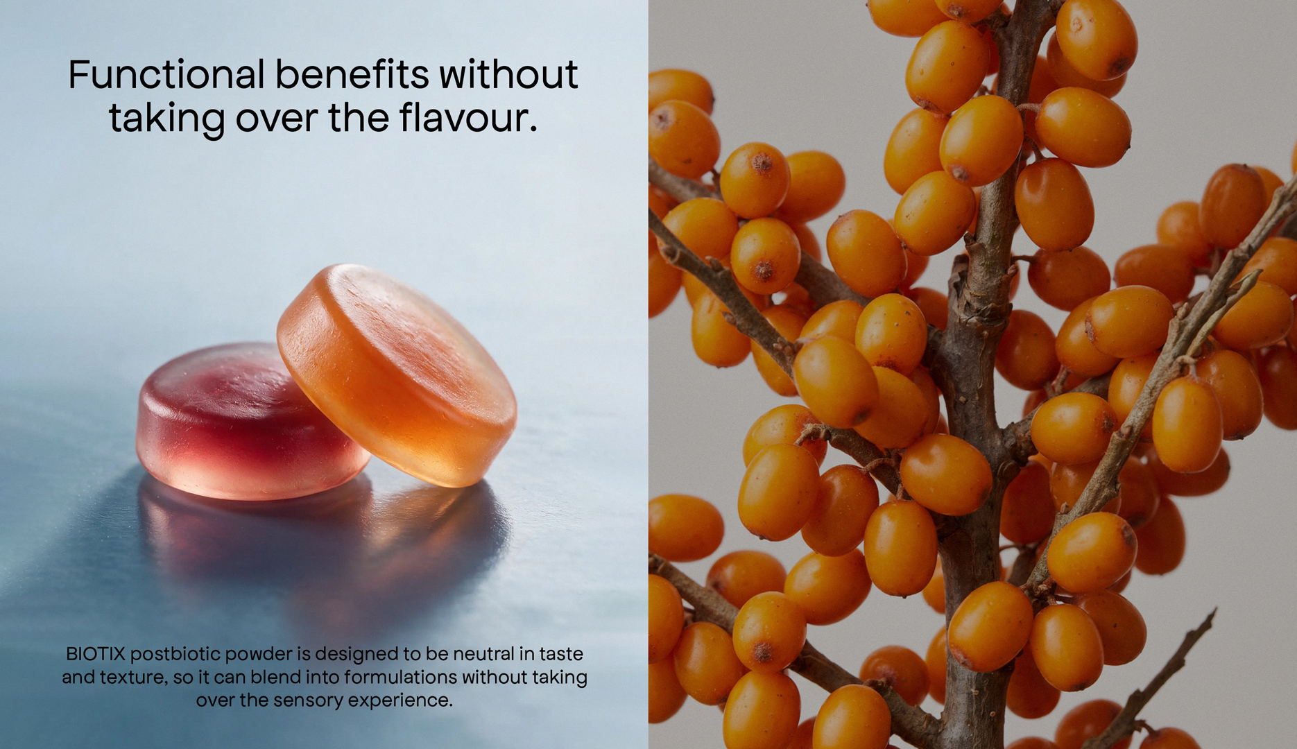
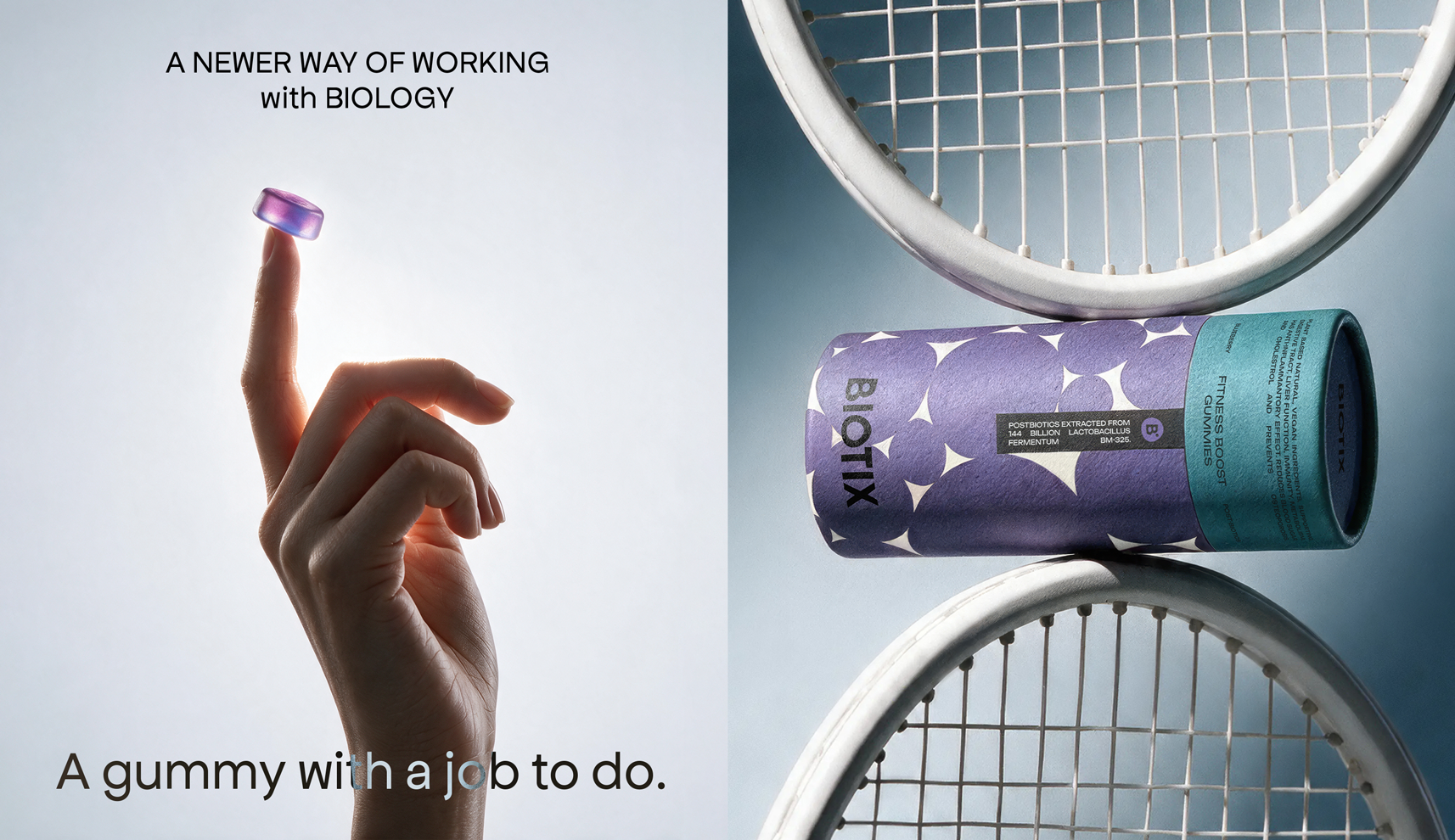
The gummy shape was kept simple and functional, while translucent gradient colours bring in the character of each flavour. This gives the product visual appeal without pushing it too far into confectionery.
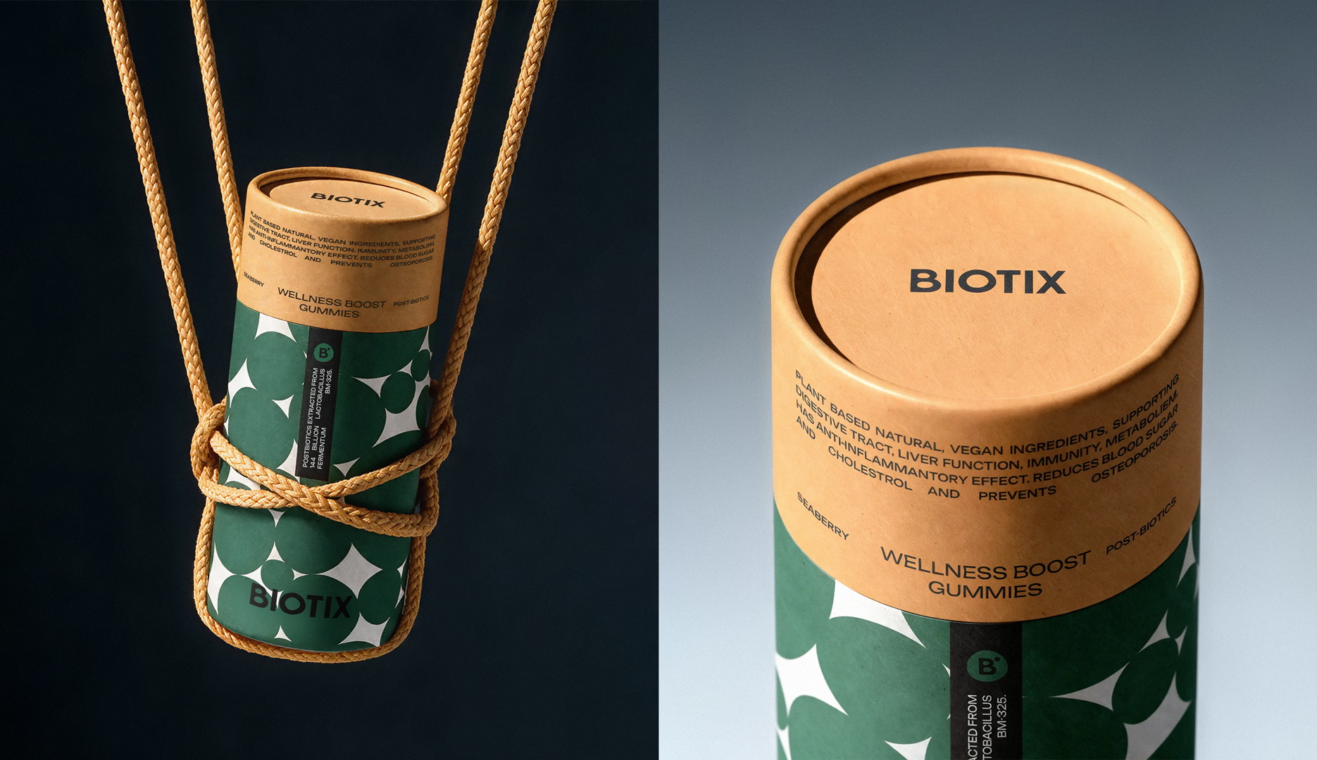
The larger format treats the gummy as a multi-serve product rather than a small, single-occasion snack. A cylindrical paperboard pack makes it easy to keep, store and return to, while the continuous surface allows the graphic system to wrap around the pack rather than sit on a flat front label.
The photography was designed to give BIOTIX a sense of quality and substance. Minimal compositions, precise lighting and close-up details create a controlled, confident image of the product, helping the gummy feel like something with functional value behind it rather than simply something visually appealing.
BIOTIX does not ask health and flavour to take turns. The same identity carries both.
 Up-Brands
 Almighty
 Daria Levina
 Yuliya Likhacheva
 carola matalinares
 daniitenaa
 StudioMordius
 Simon Pendry Creative
 Sti&Co Design
 Yasmin Sherif
 Roberto De Simone
 aseelstudio
 Rabia zouina
 UPRISE
 HazelBishop
 Qianyu Liu
 siyajacob
 Rohan Barwal | D2C Brand Identity, Logo & Packaging Designer
 Karen Salem
 omarchafik
 nastyaabeketova
 Roberto Núñez Studio
 ZarifGraphic