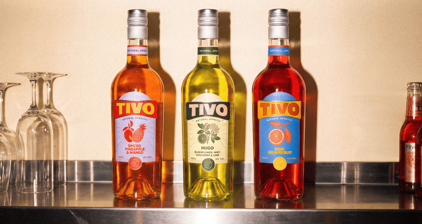

Tivo is a bold new British aperitif brand created to bring a fresh perspective to a category dominated by tradition. With three distinctive flavours and a vibrant personality, Tivo was designed to stand out, spark curiosity, and make every drinking occasion feel a little more exciting.
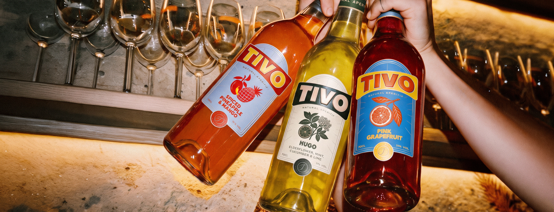
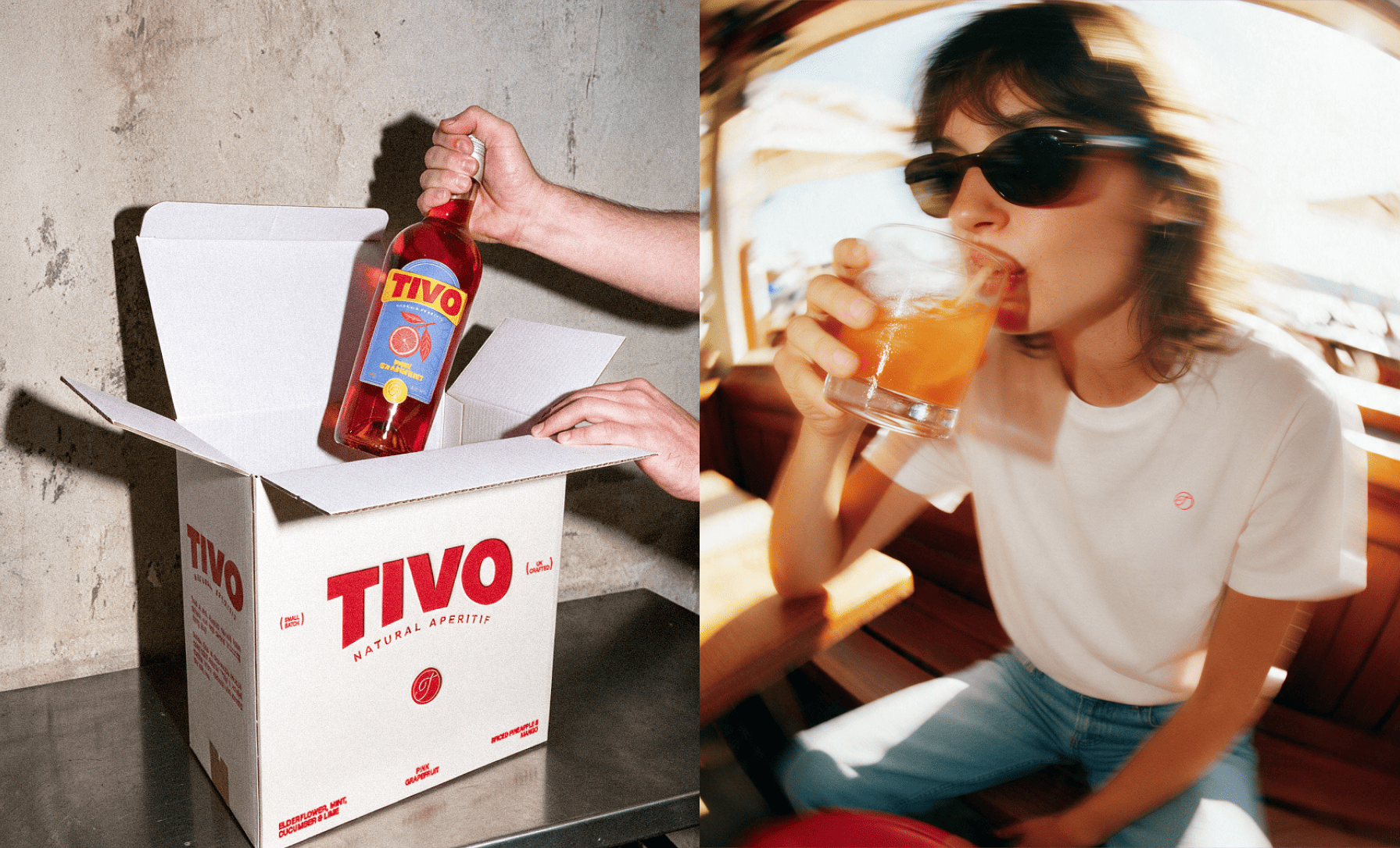
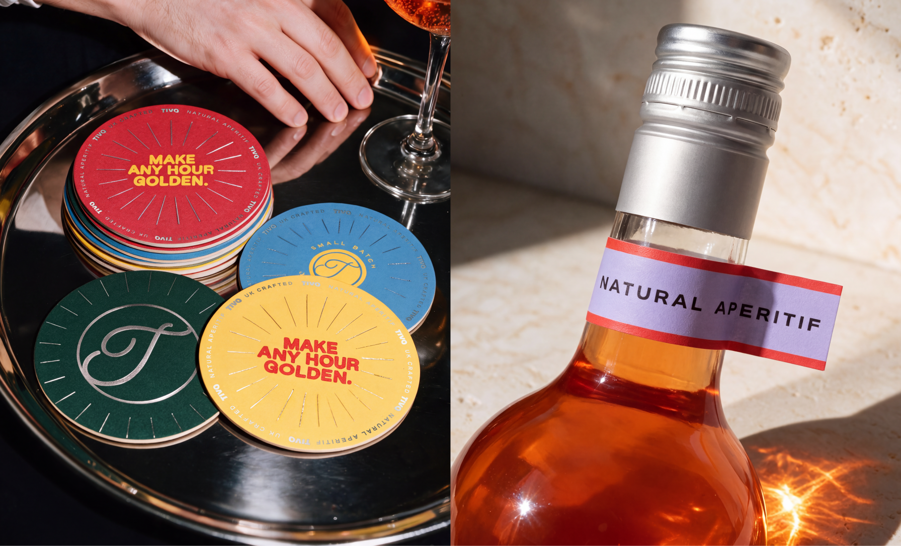
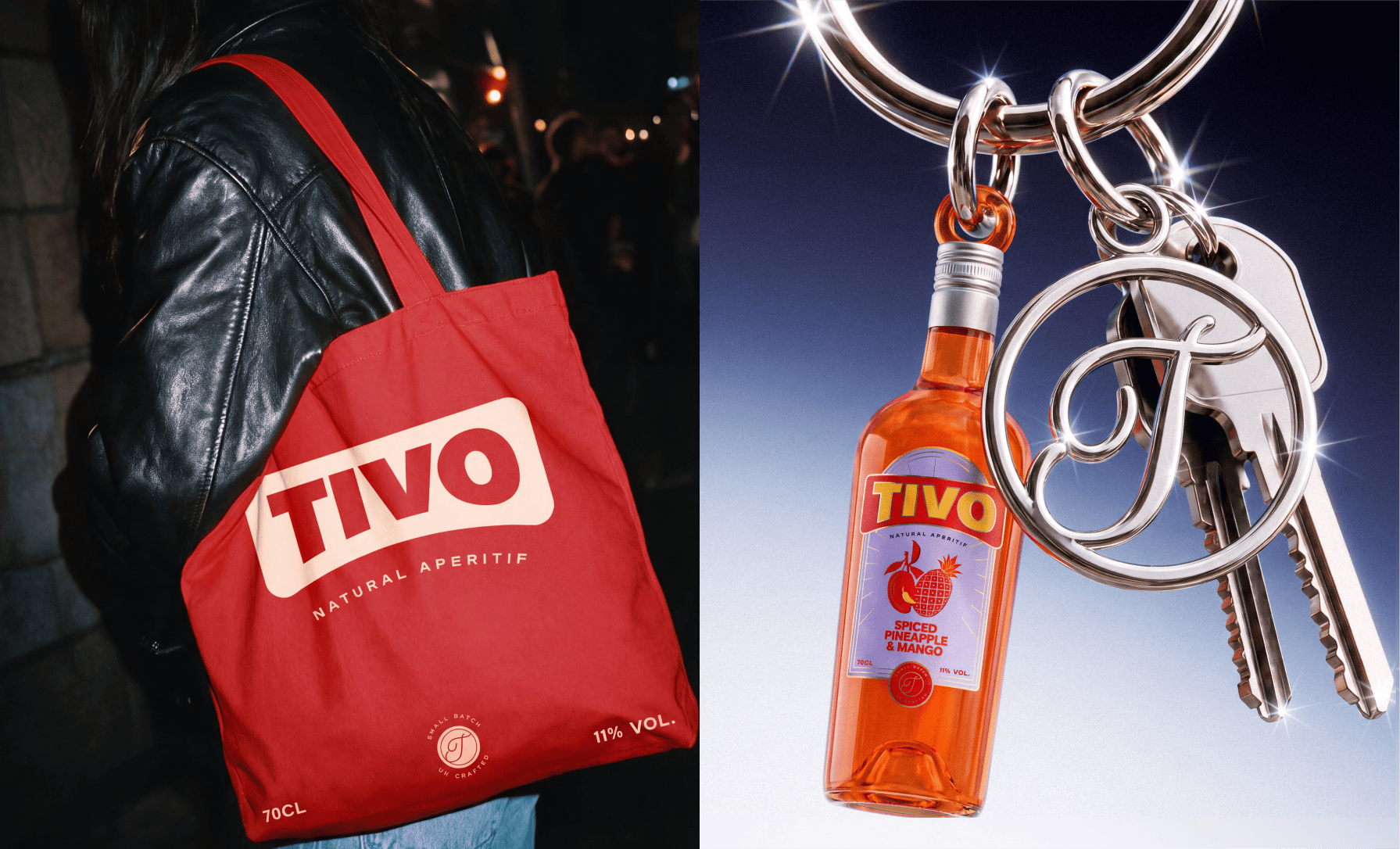
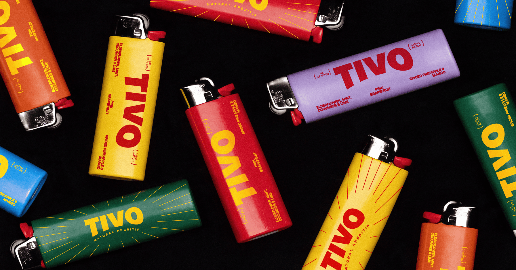
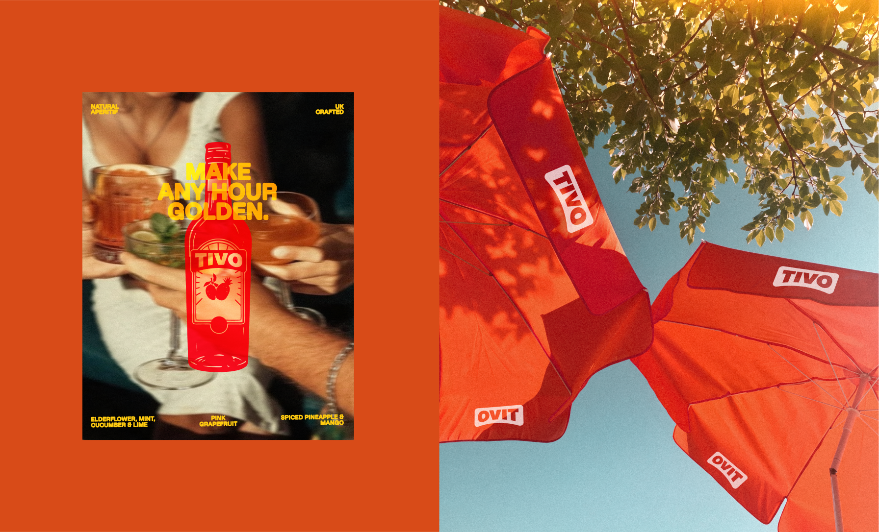
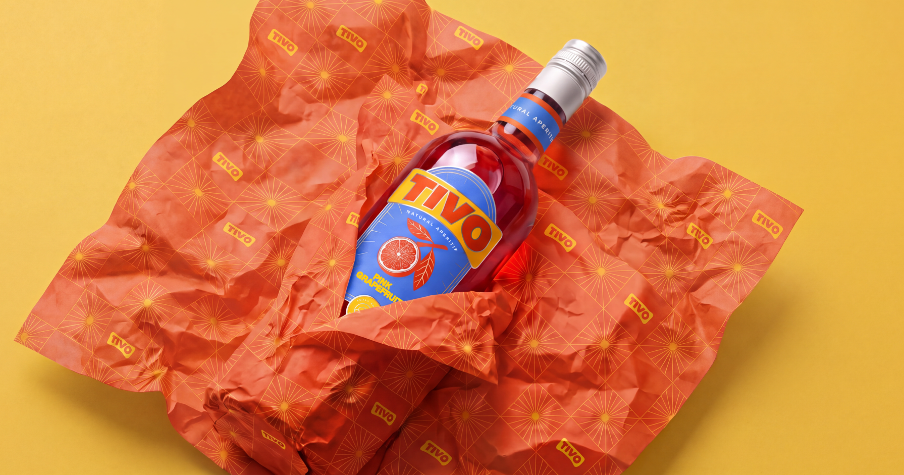
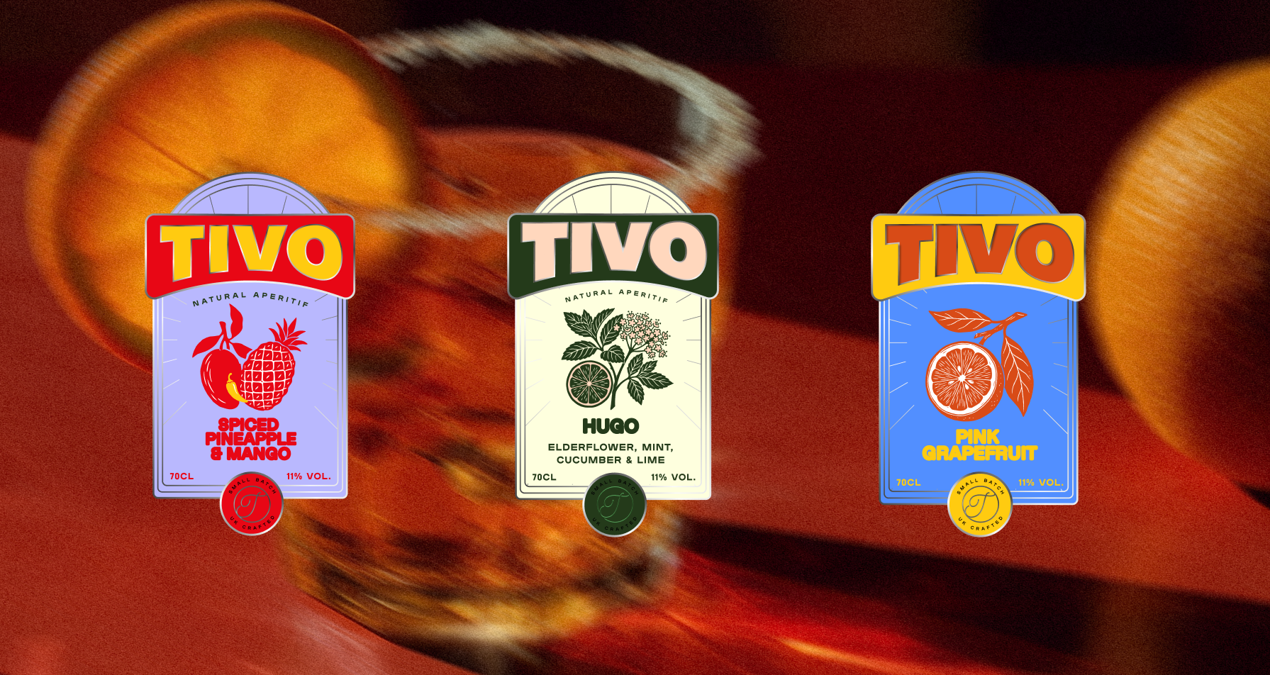
At CreativeWise, we developed a visual identity and packaging system that gives each flavour its own personality while maintaining a strong, cohesive brand presence. A confident, standalone wordmark anchors the design, while expressive colours and a distinctive label system create a playful yet contemporary aesthetic.
The result is a striking packaging collection that balances simplicity with personality, bringing a fresh burst of colour to the aperitif shelf and establishing Tivo as a brand made to be noticed.
Curator’s Insight
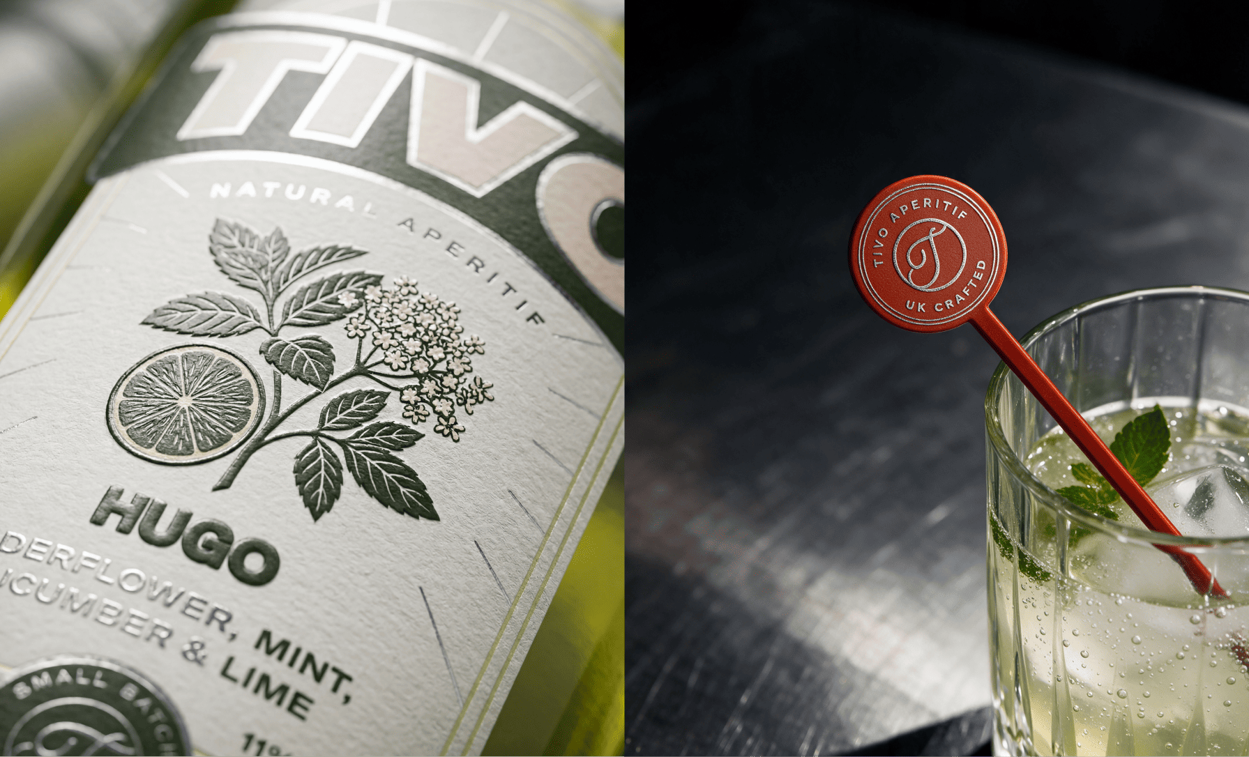
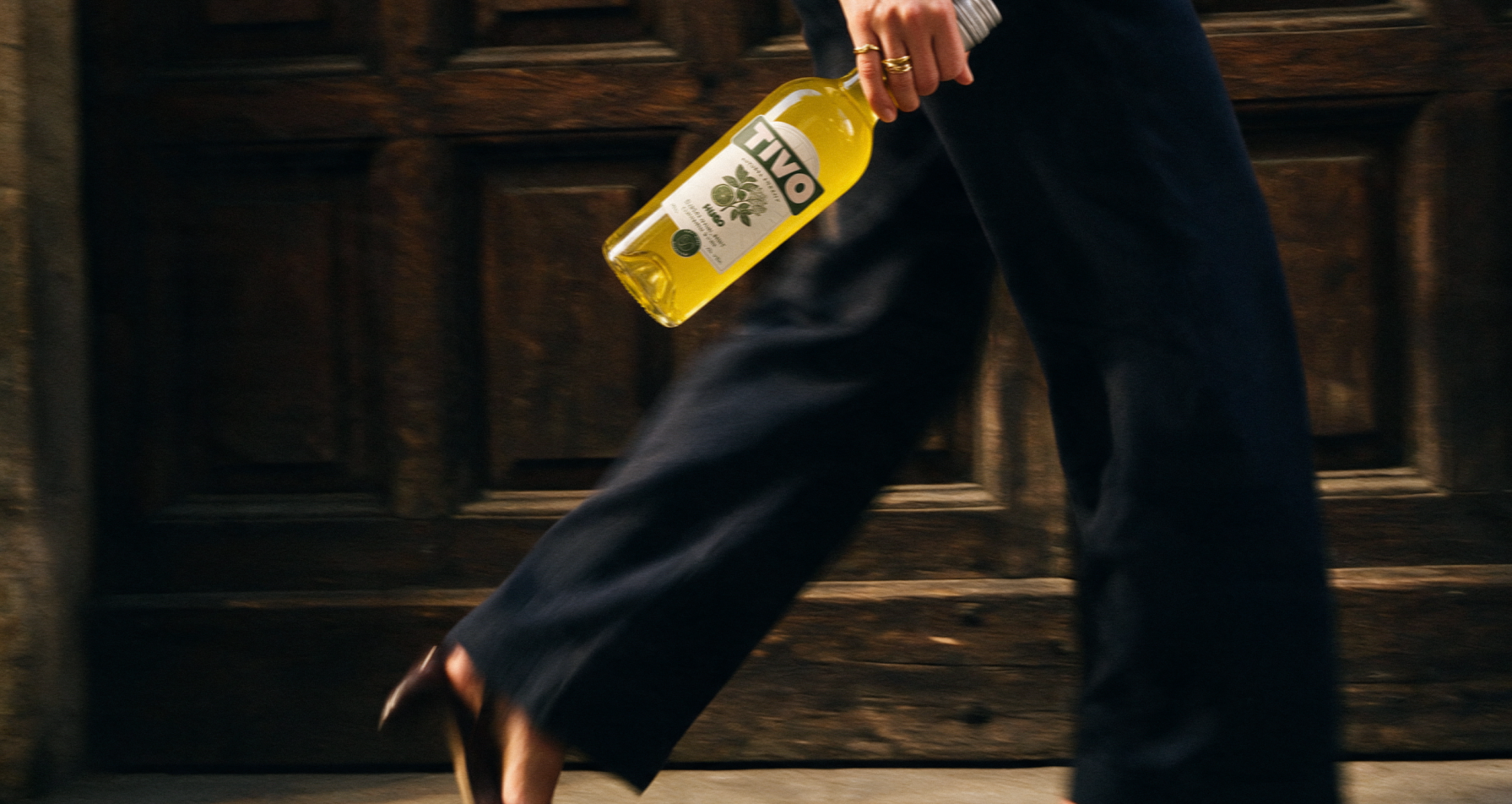
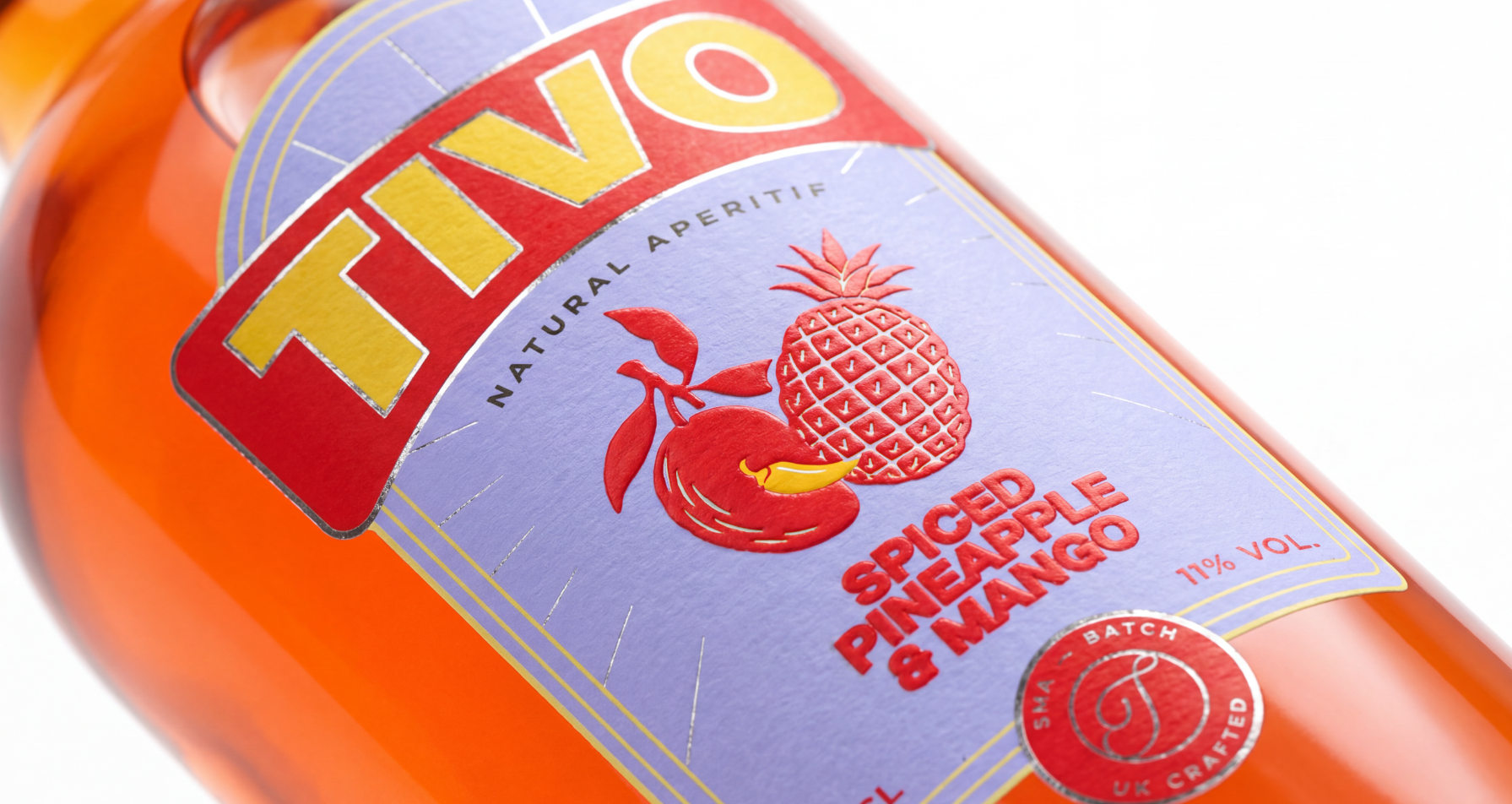
The smartest move here is treating the liquid as part of the palette. Each label ground sits opposite its contents: lavender against amber orange, blue against red, and a pale cream against yellow-green, so the colour of the drink reads as a deliberate accent rather than something to be covered up. The wordmark banner changes colourway per flavour, which keeps the logo as the constant and the colour as the variable. Illustration style shifts with the flavour too. The Hugo label leans on a botanical engraving, while the fruit on the others is flat and graphic, with raised red detail and a single yellow chilli curling at the mango as a quiet nod to the spice. The arched label with foil rays gives a vintage cue without copying the heritage language of the category.
 VERONIKA KISELEVA
 al margen
 Jasgul
 Abhijith Madhu
 mariee
 Modern Theory
 Tancybox
 WINK®DESIGN
 impprintz
 Chainhouse
 rufydesign
 White Candy Design
 Just Design
 alchimistestudioParis
 bmd group
 Laurie Offer
 medok4r
 Nouna design
 ANNA ONISHCHENKO
 Denomination
 VANESA GARCÍA ESTUDIO
 Julia Persuk
 Kingdom & Sparrow