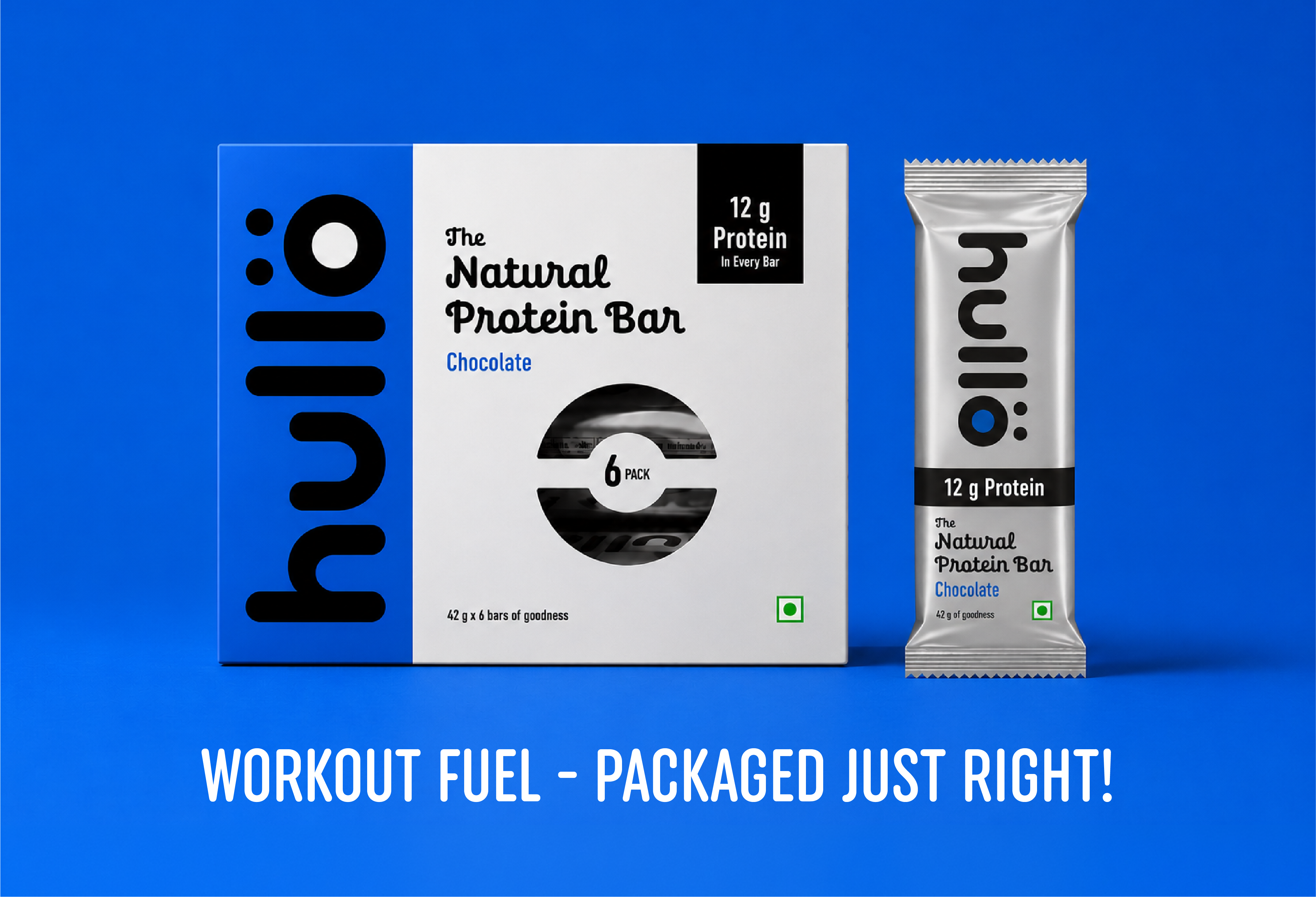

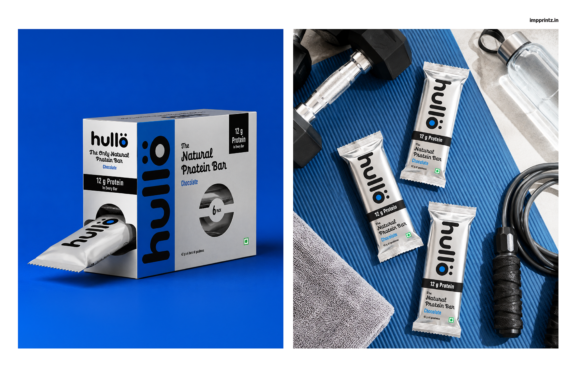
The nutritional proposition is led by the prominent 12g Protein claim, positioned confidently on the front panel. For a compact 42g bar, the message is immediate and unambiguous, allowing consumers to understand the product’s primary benefit at a glance. The information hierarchy was carefully considered to reduce cognitive effort and support quick decision-making at the shelf.A die-cut window on the front of the carton introduces a tactile dimension to the experience, revealing the individually wrapped bars inside while creating a subtle moment of interaction before the pack is opened. More than a functional feature, it reinforces the brand’s commitment to transparency by allowing the product itself to become part of the presentation.
Not relying on decorative graphics or excessive messaging, the packaging lets material, typography and proportion define the identity. Every element has a purpose, reflecting the same philosophy of thoughtful restraint that shapes the product itself. The substrate becomes the design, creating a visual system that feels confident, contemporary and unmistakably Hullo.
The result is a packaging system that balances functionality with strong shelf presence, building trust through clarity rather than visual noise. By translating the product’s philosophy into every design decision, the packaging transforms an everyday protein bar into a brand experience that feels honest and memorable.
 VERONIKA KISELEVA
 al margen
 Jasgul
 Abhijith Madhu
 mariee
 Modern Theory
 Tancybox
 WINK®DESIGN
 Chainhouse
 rufydesign
 White Candy Design
 Just Design
 alchimistestudioParis
 bmd group
 Laurie Offer
 medok4r
 Nouna design
 CreativeWise
 ANNA ONISHCHENKO
 Denomination
 VANESA GARCÍA ESTUDIO
 Julia Persuk
 Kingdom & Sparrow