Chipnana – Banana Chips Packaging Design & Branding
Project Background
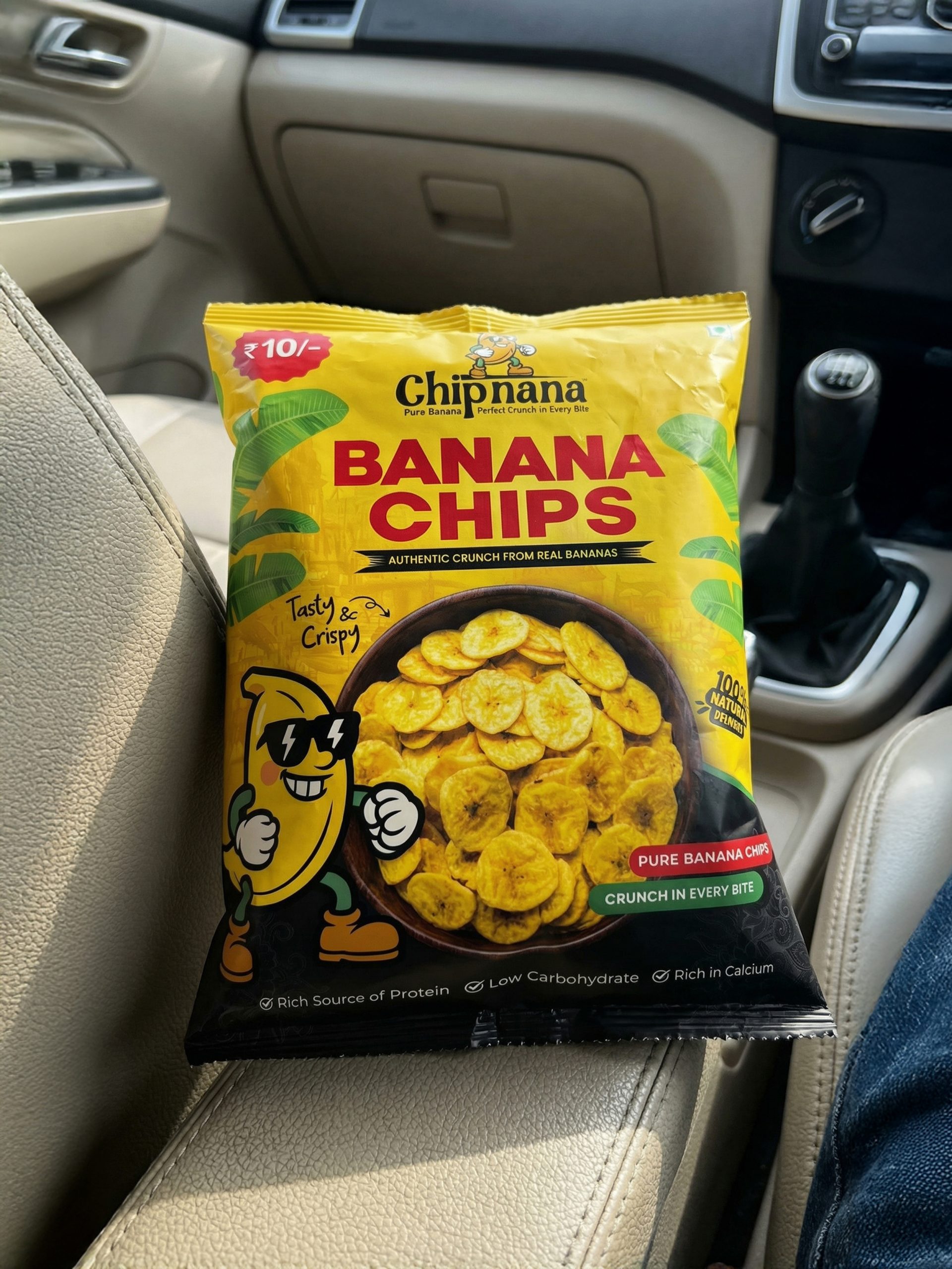
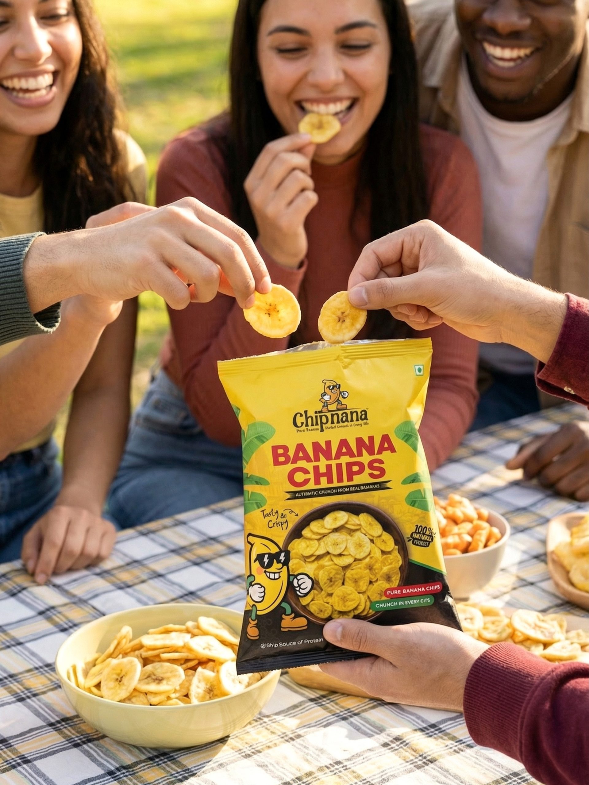
Chipnana is a banana chips brand created for the mass-market snack category, where products compete in highly crowded retail spaces. Most banana chips packs in the local market look similar, lack strong branding, and fail to grab attention from a distance. The challenge was to design a packaging that could stand out instantly, communicate value clearly, and work effectively on a small ₹10 pouch size.
This project focuses on solving real packaging problems faced in everyday retail environments.
The Problem
The main problems identified during the research stage were:
- Low shelf visibility
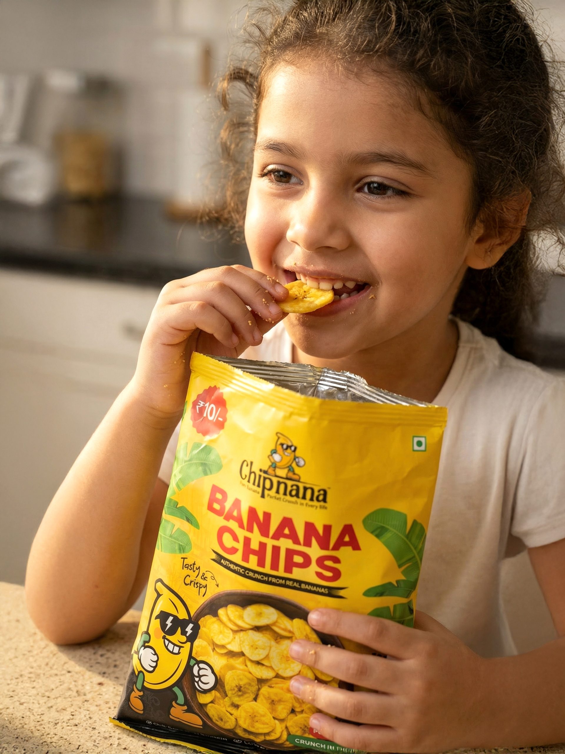
Small snack packs are often ignored because they do not stand out among many colorful competitors. - Lack of emotional connection
Many banana chips packs look generic and boring, offering no personality or brand recall. - Limited space
A ₹10 pouch provides very little space to communicate brand name, product, price, and benefits clearly. - Quick buying behavior
Most customers make decisions in just a few seconds, so the packaging must be easy to understand at first glance.
The Design Goal
The goal was to create a packaging design that:
-
- Attracts attention from a distance
- Communicates crunch, taste, and affordability instantly
- Builds a friendly and memorable brand identity
- Works practically on a small retail pouch
Concept & Solution
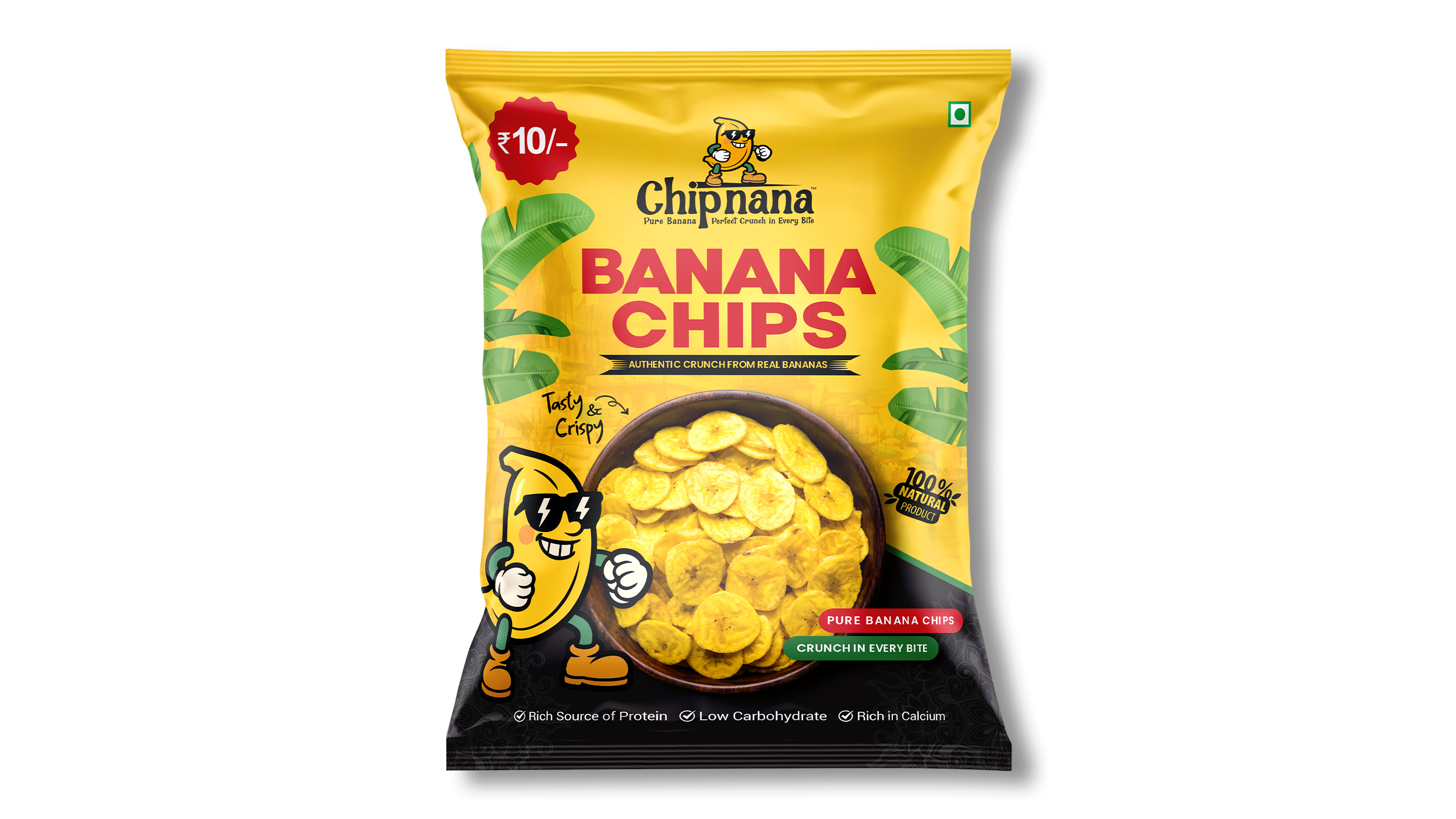
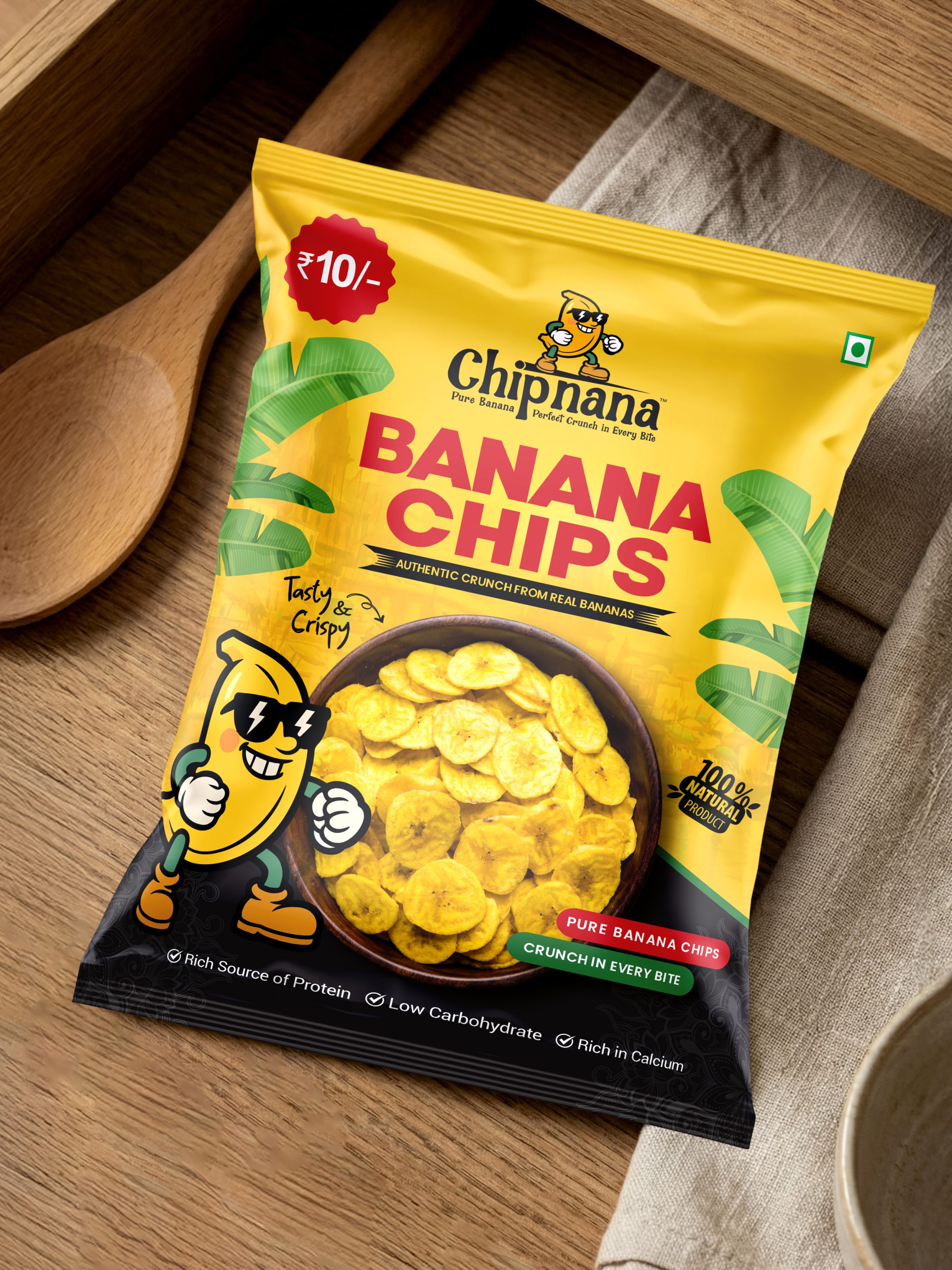
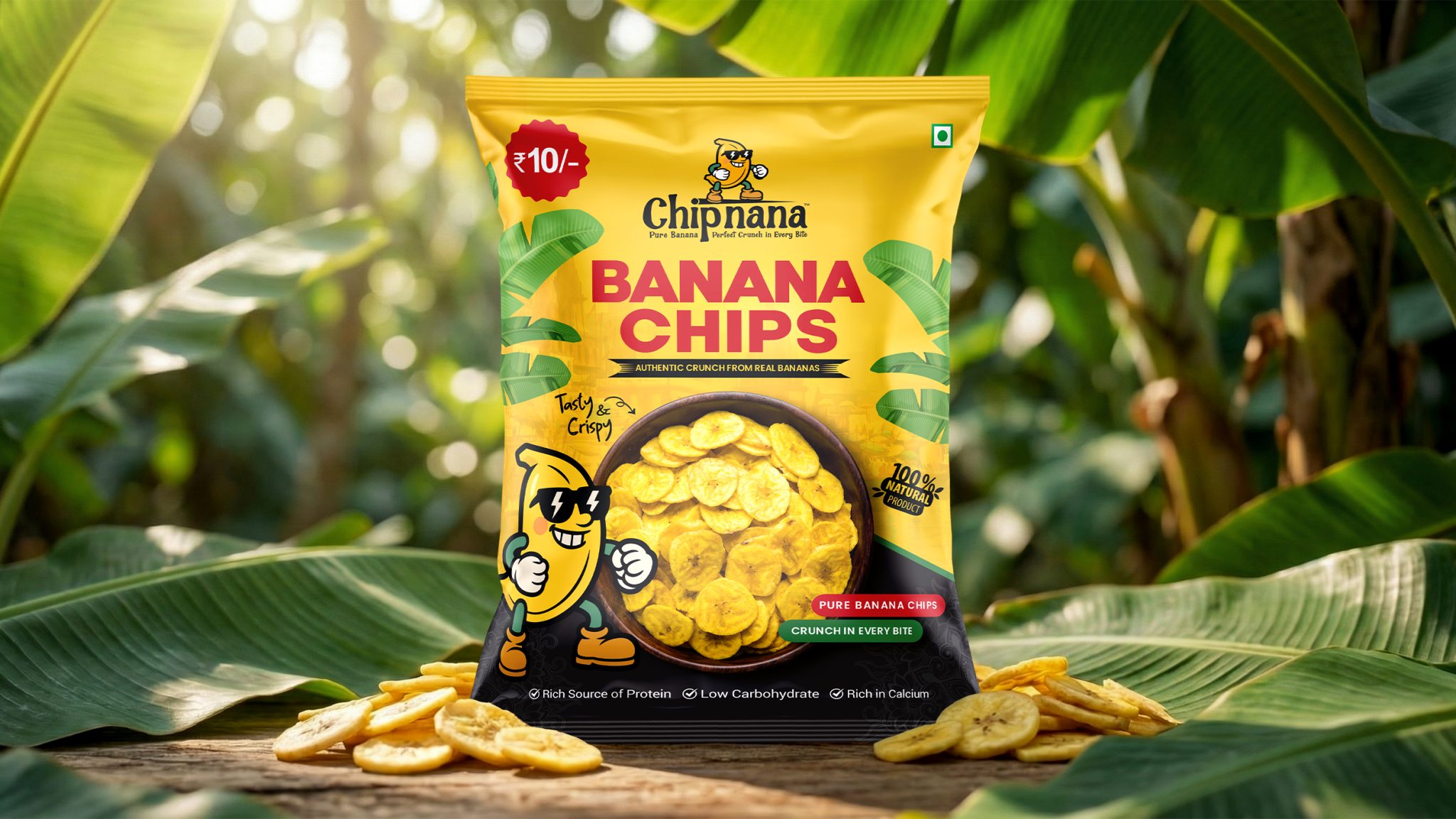
The core idea of the design is “Perfect Crunch in Every Bite.”
To solve the problem of brand recall and engagement, a playful banana mascot was introduced. The mascot gives the brand a friendly face and creates an emotional connection with the audience, especially kids and young buyers. It also helps the brand feel fun, confident, and approachable.
To build trust and show product quality, a realistic bowl image of banana chips was placed prominently on the front. This clearly tells the customer what they are buying without confusion.
Color Strategy
Color played a key role in solving the shelf visibility problem.
- Yellow was chosen as the primary color to represent banana freshness, energy, and positivity. It also helps the pack stand out strongly in the snack aisle.
- Red accents are used to highlight the product name and ₹10 price point, guiding the eye quickly to the most important information.
- A black base section was added to create contrast, improve text readability, and balance the bright colors.
This high-contrast color approach ensures the pack remains visible even in crowded retail conditions.
Typography & Layout
The typography is bold, simple, and highly legible, designed for fast reading from a distance. The product name “Banana Chips” is kept large and clear to avoid confusion.
The layout is structured in a way that supports quick scanning:
- Brand identity at the top
- Product name clearly visible
- Product image centered for trust
- Price and benefits placed for instant recognition
Every element was carefully positioned to make the most of the limited space available on a small pouch.
Practical Packaging Thinking
This design was not created just for visual appeal but for real-world usage:
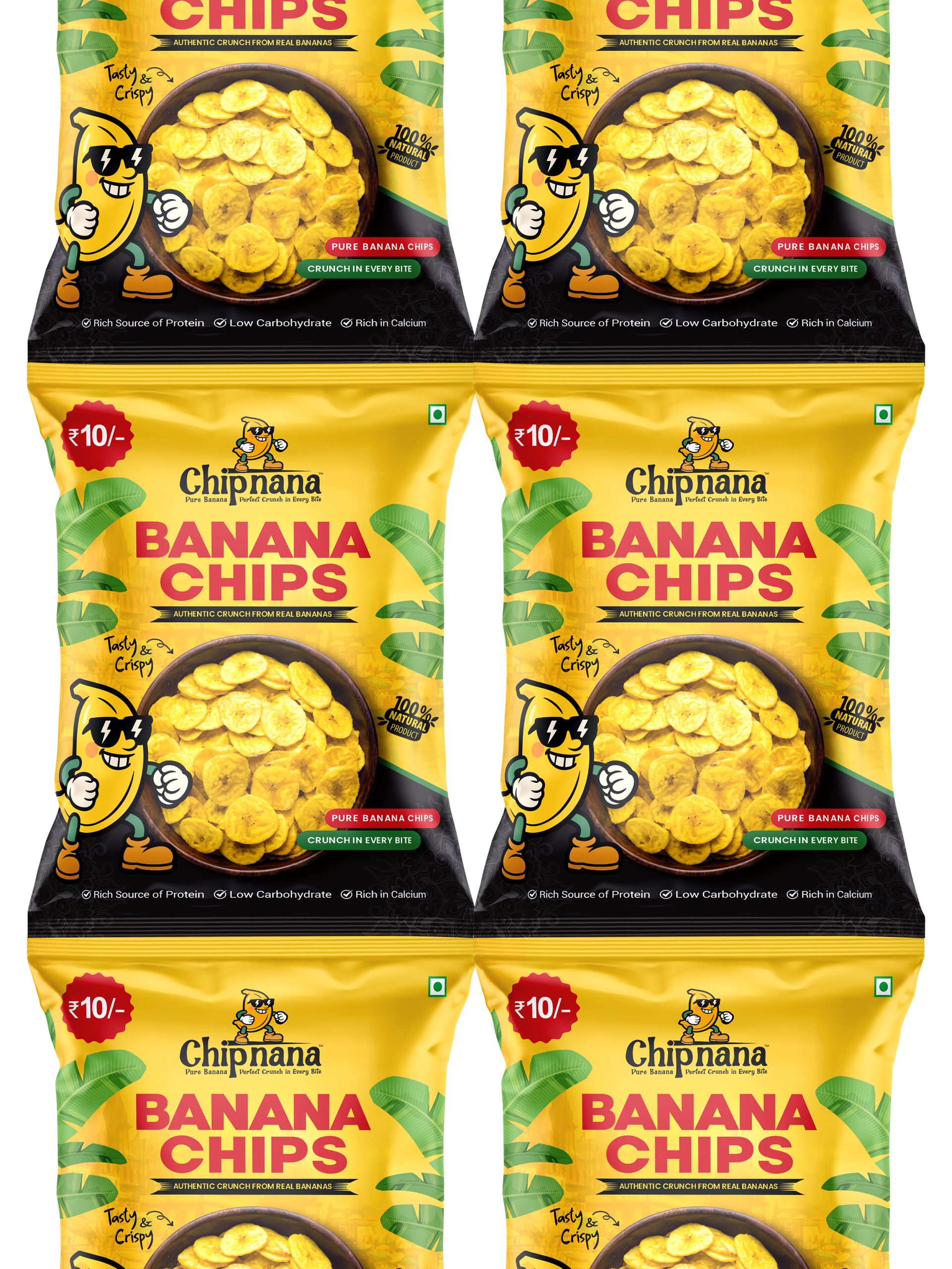
- Optimized for small-size production
- Suitable for local and mass retail stores
- Clear communication for impulse buyers
- Cost-effective and easy to reproduce
Final Result
The final packaging delivers:
- Strong shelf impact
- Clear and friendly branding
- Better product recognition
- A balance between playful design and commercial practicality
Chipnana’s packaging successfully transforms a simple snack product into a memorable retail experience, proving that good packaging design is about solving problems, not just decoration.