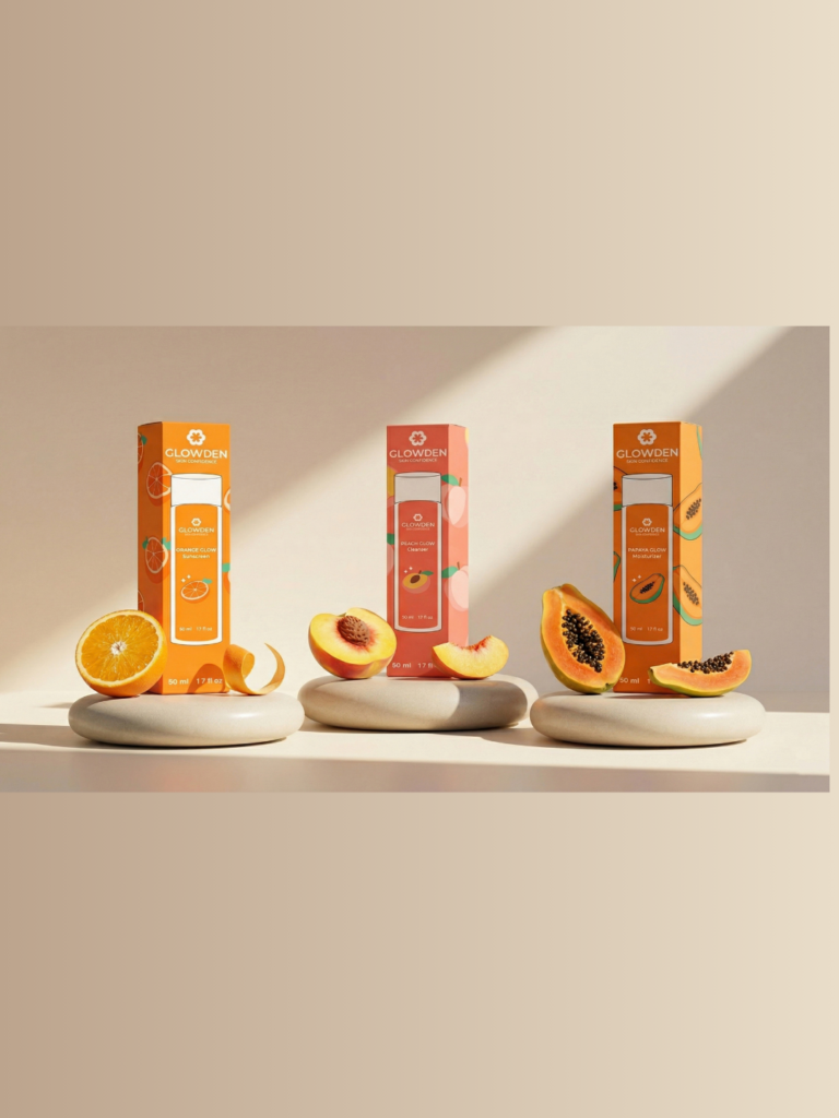

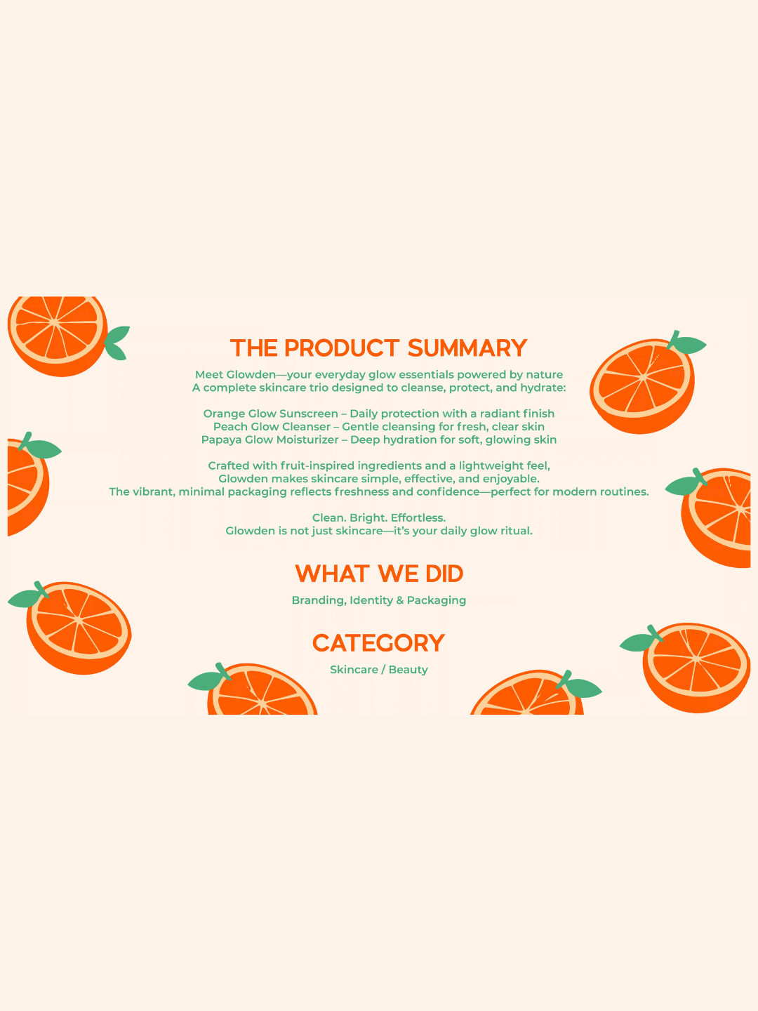
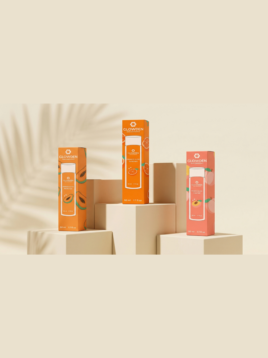
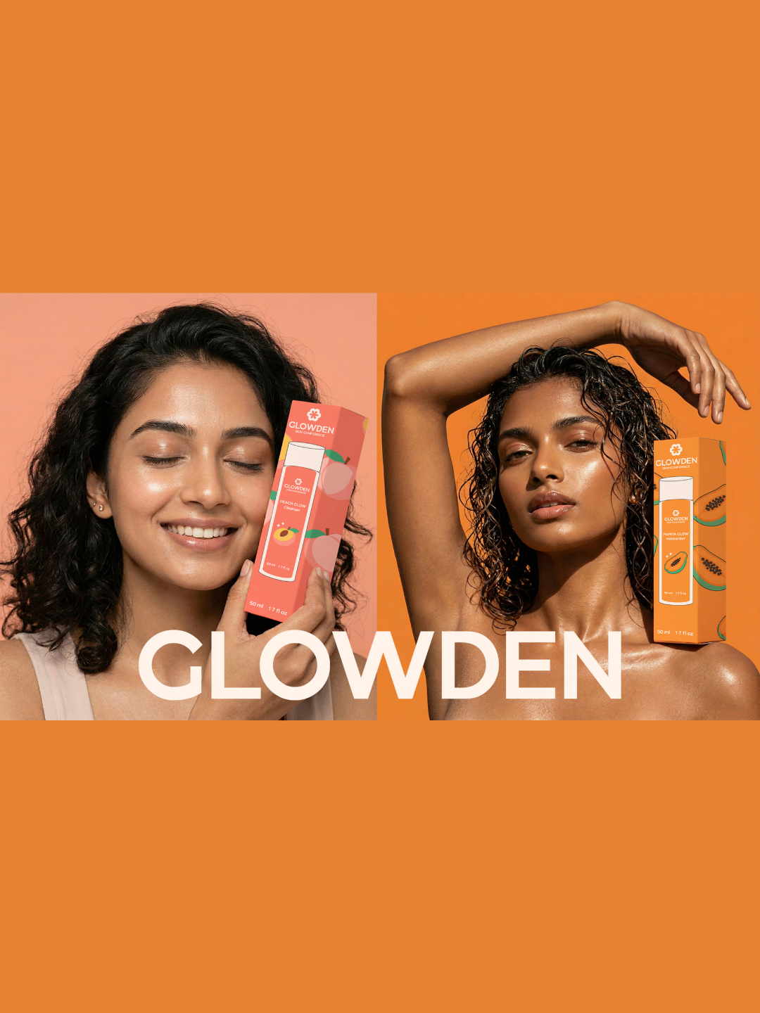
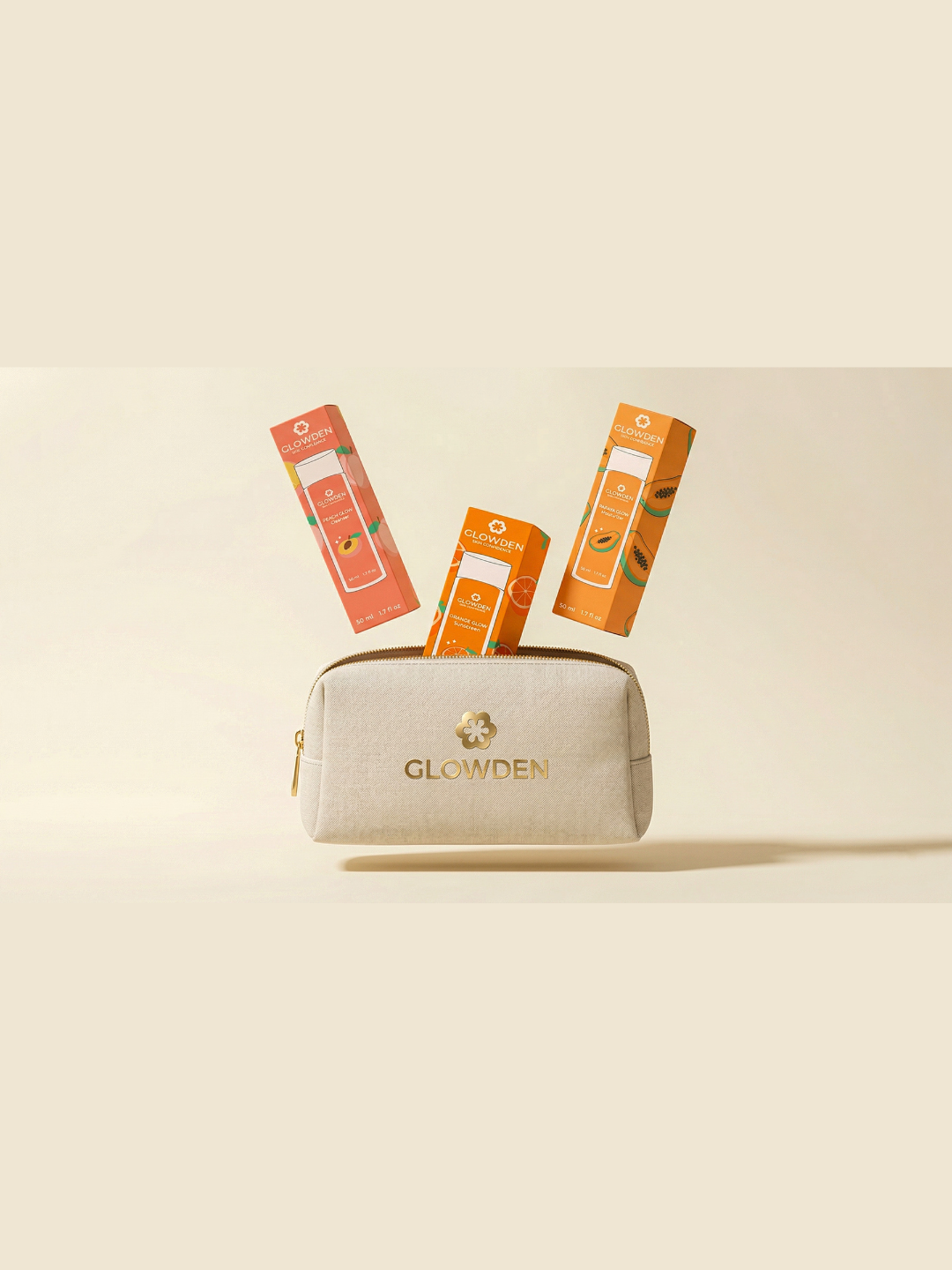
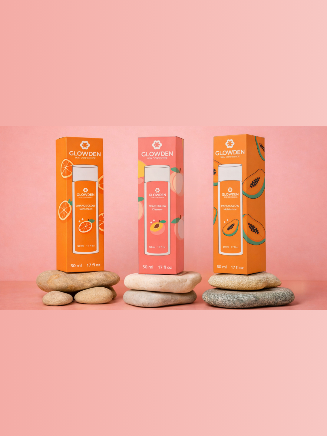
GLOWDEN is a contemporary skincare brand created to make everyday self-care feel fresh, simple and confidence-building. The complete skincare trio includes Orange Glow Sunscreen for daily protection, Peach Glow Cleanser for gentle cleansing and Papaya Glow Moisturizer for deep hydration.
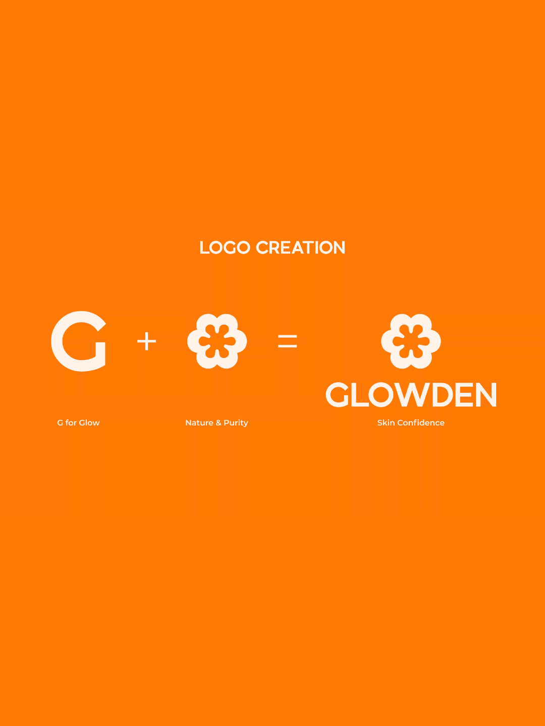
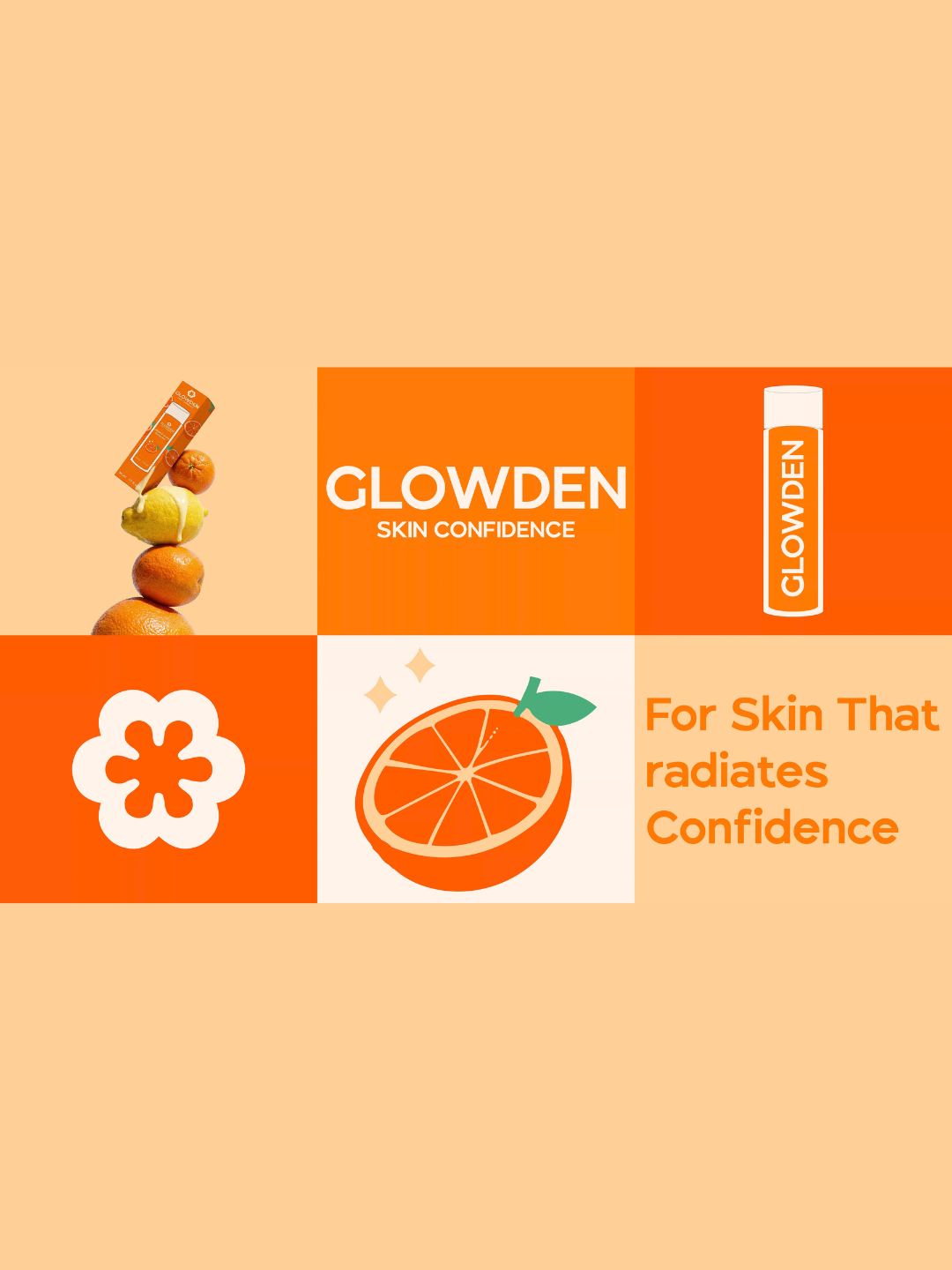
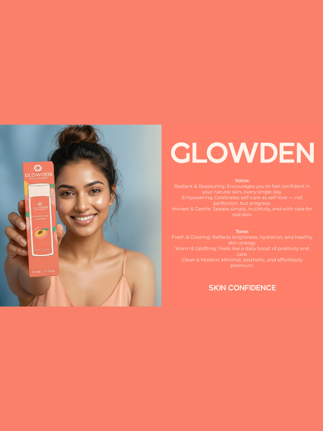
The identity is built around the idea of “Skin Confidence.” A clean wordmark, cheerful flower-inspired symbol and vibrant fruit-led colour palette give the brand a youthful, positive and approachable personality.
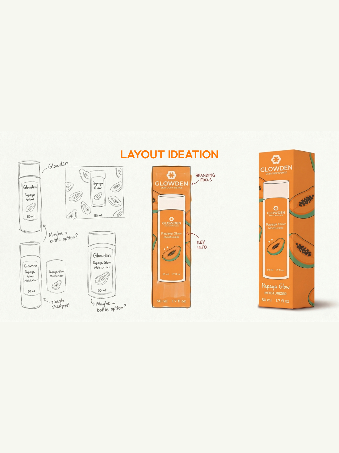
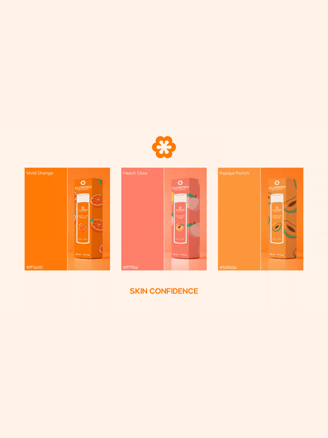
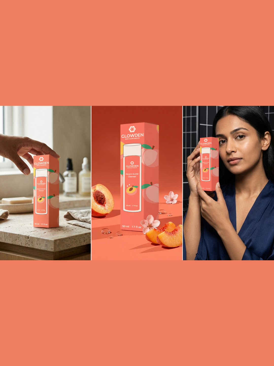
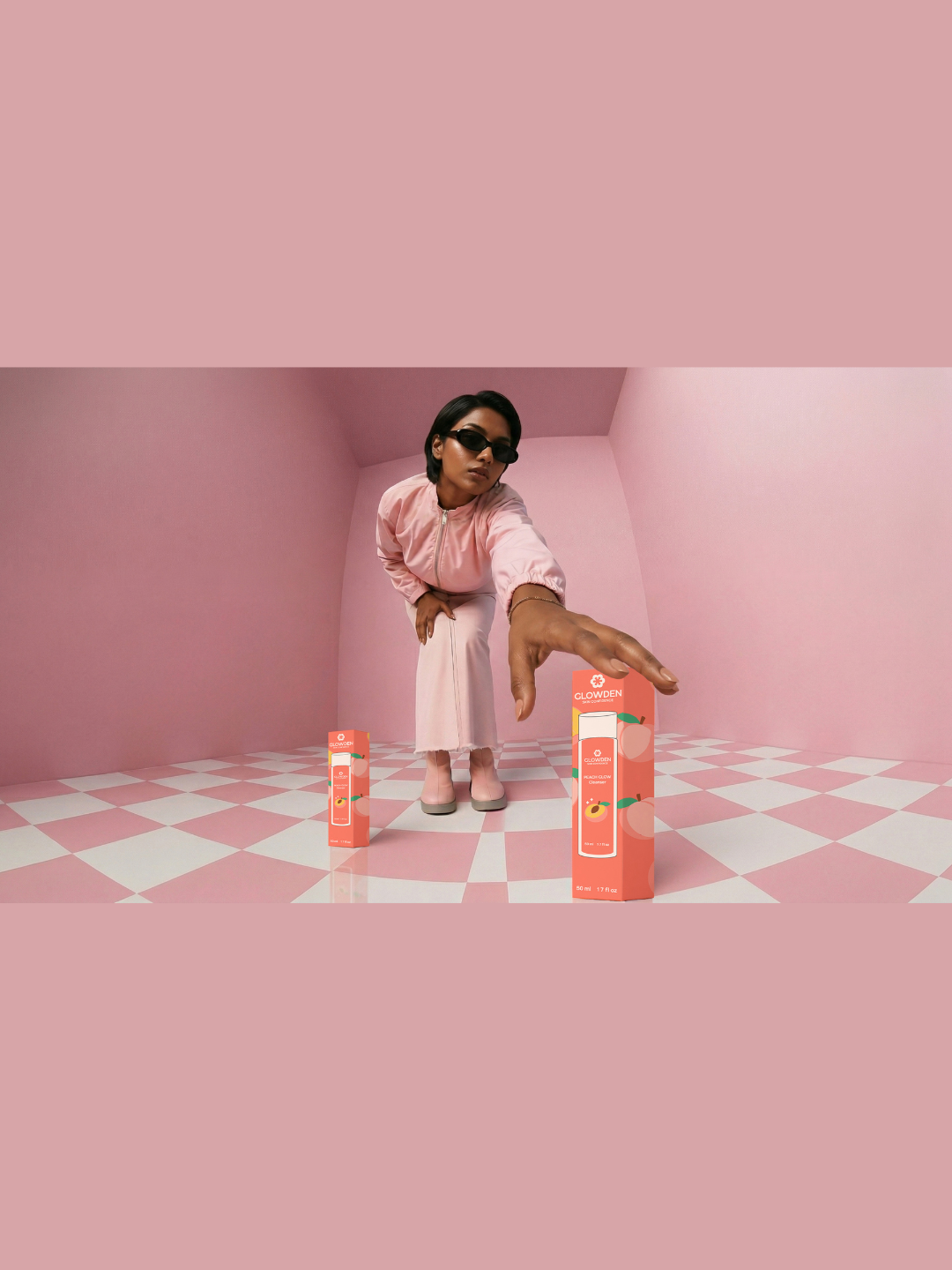
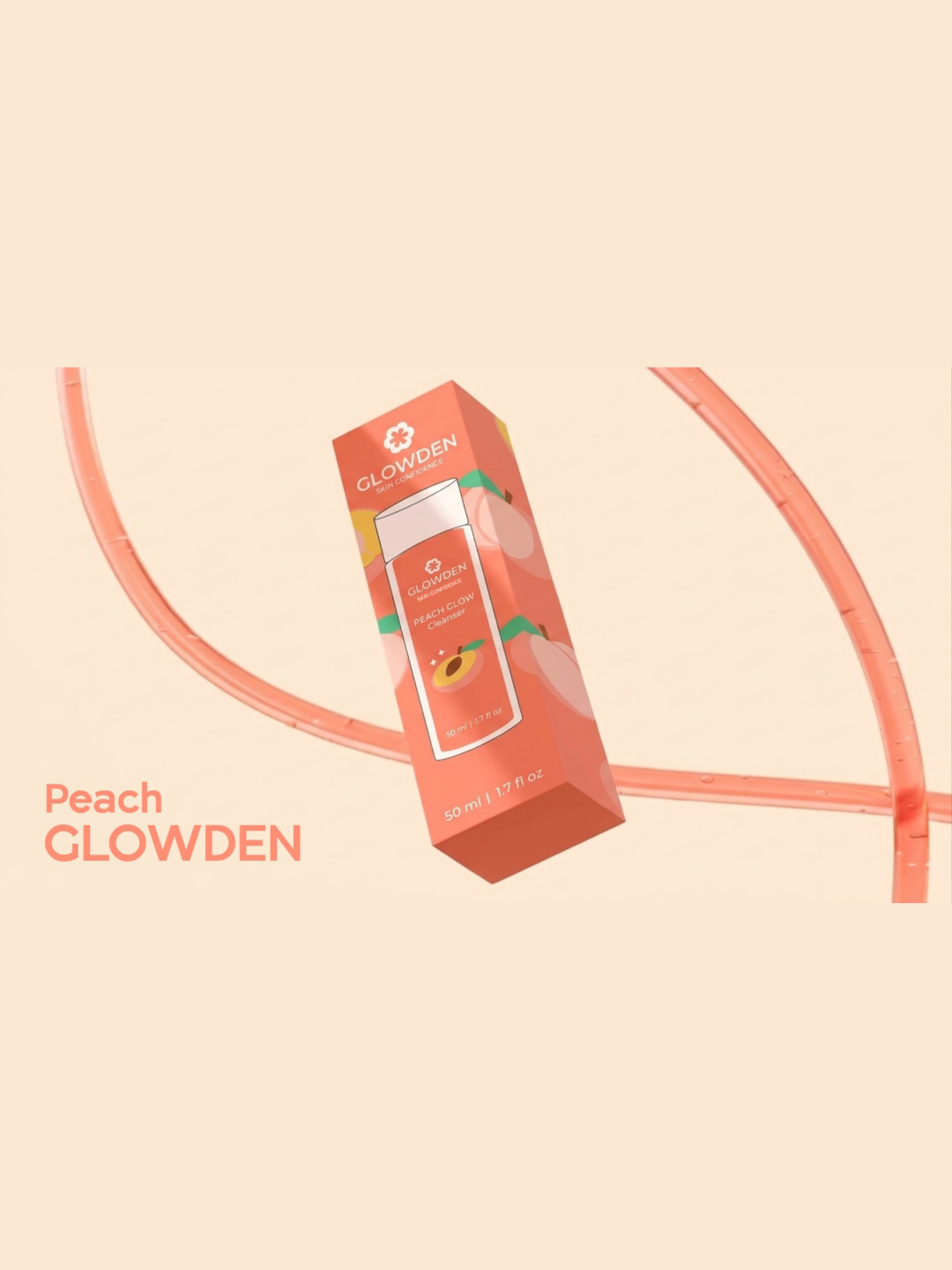
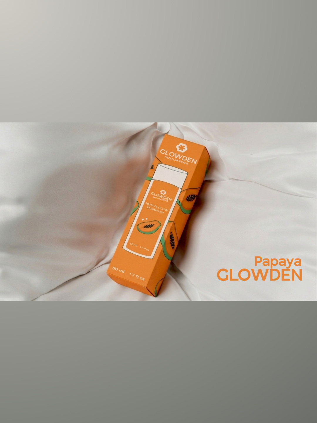
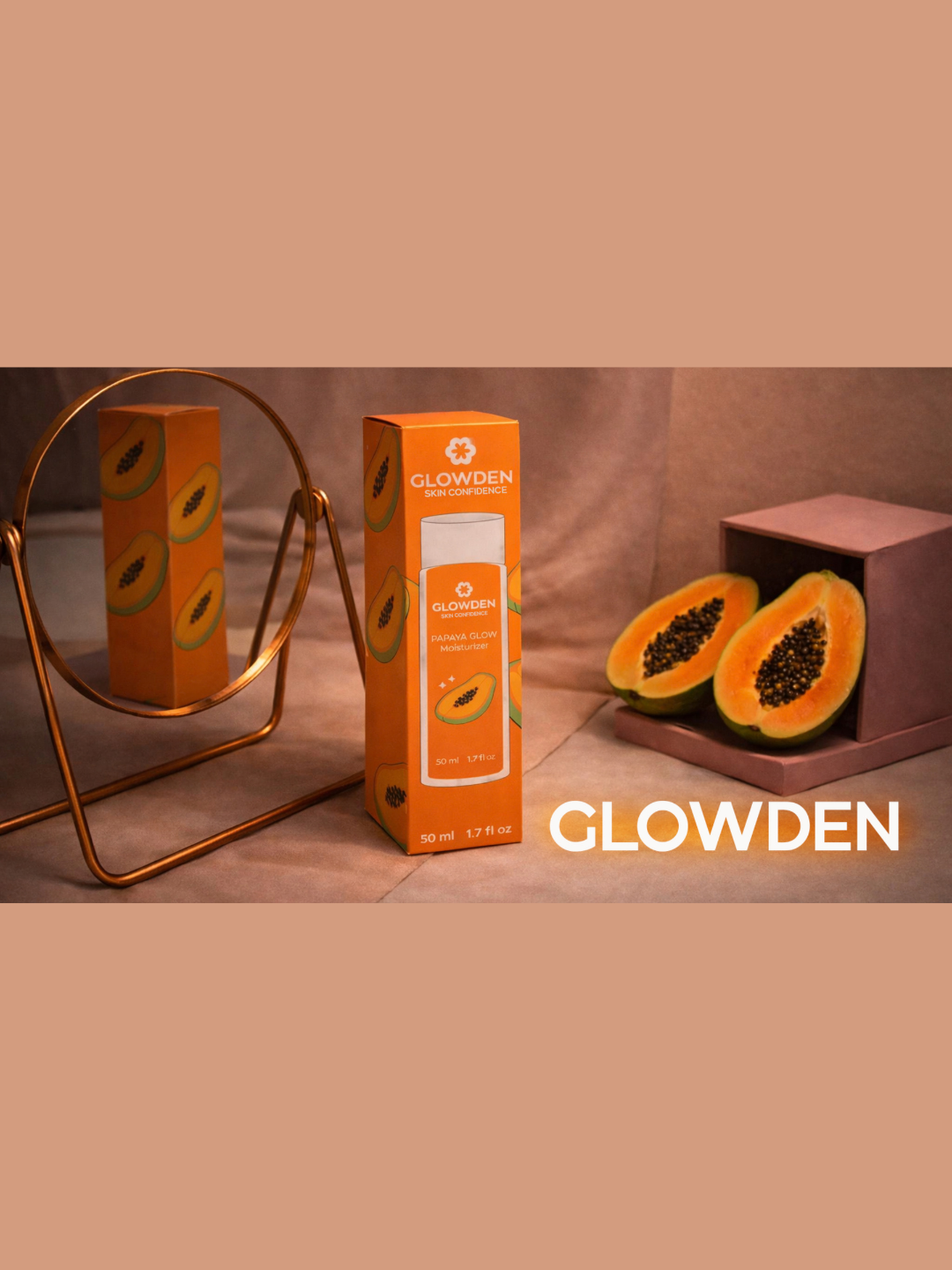
Each product uses distinctive colour coding and ingredient-inspired illustrations to support quick identification. Vivid orange represents the sunscreen, soft peach distinguishes the cleanser and warm papaya tones identify the moisturizer. The packaging combines clean typography, clear product information and playful fruit graphics to create strong visual consistency across the complete range.
The tall rectangular cartons provide a structured and modern shelf presence, while the transparent product windows introduce openness and allow the inner bottles to become part of the packaging experience. This balance of bold colour, minimal layout and functional hierarchy makes the products easy to recognise and enjoyable to use.
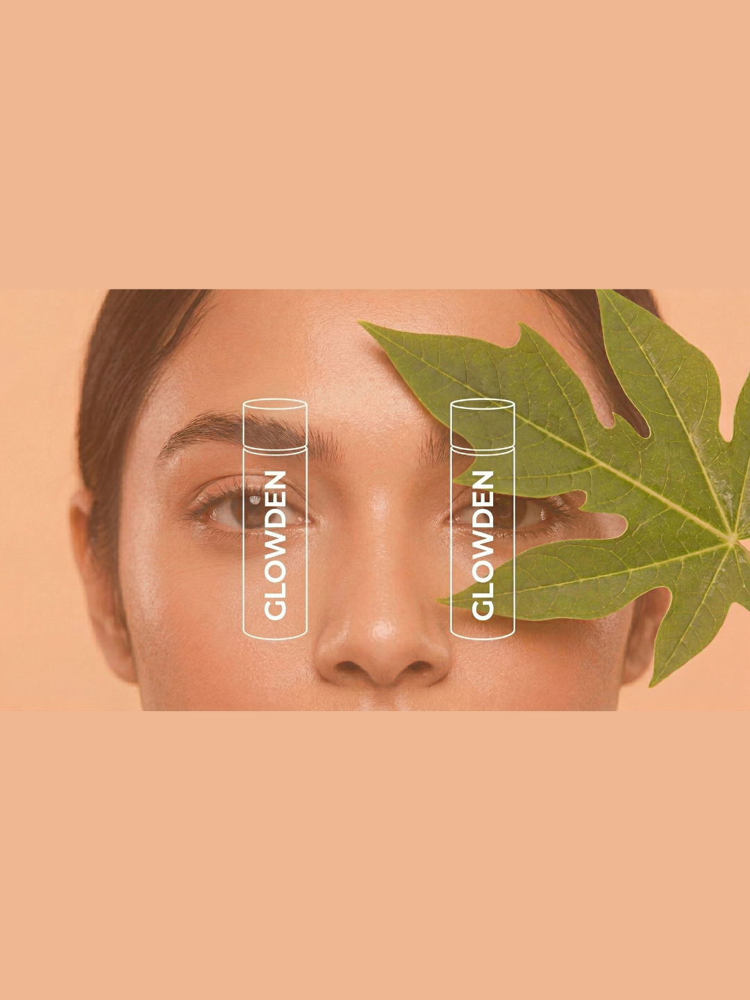
Designed around the message “Clean. Bright. Effortless.”, GLOWDEN turns a daily skincare routine into a vibrant glow ritual. The identity extends naturally across product photography, advertising, social media, travel accessories and lifestyle campaigns.

 Up-Brands
 Almighty
 Desember Design Studio
 Daria Levina
 Yuliya Likhacheva
 carola matalinares
 daniitenaa
 StudioMordius
 Simon Pendry Creative
 Sti&Co Design
 Yasmin Sherif
 Roberto De Simone
 aseelstudio
 Rabia zouina
 UPRISE
 HazelBishop
 Qianyu Liu
 siyajacob
 Rohan Barwal | D2C Brand Identity, Logo & Packaging Designer
 Karen Salem
 omarchafik
 nastyaabeketova
 Roberto Núñez Studio