GOUGAH WATERFALL – BRAND ORIGIN & CORE SPIRIT
Geographical Origin & Flow – “The Essence of Formation”
Gougah Waterfall (also known as O Ga Waterfall) is formed by the Da Nhim River, flowing across the Lam Vien Plateau, accumulating natural energy before encountering a geological fault in Phu Hoi and descending approximately 30 meters.
This is not an abrupt outburst of water, but a flow that is accumulated, guided, and finally released.
The water passes through basalt strata rich in minerals and natural ions — a factor directly linked to the quality of La Gougah’s water source.
From a brand-spirit perspective, Gougah represents:
Controlled strength
Transformation from raw origin to purity
A convergence of historical, geological, and natural flows
La Gougah does not simply sell water
It “awakens a forgotten origin”
The brand assumes the role of preserving – continuing – regenerating original values
The spirit of La Gougah, rooted in Gougah Waterfall, can be distilled into three core pillars
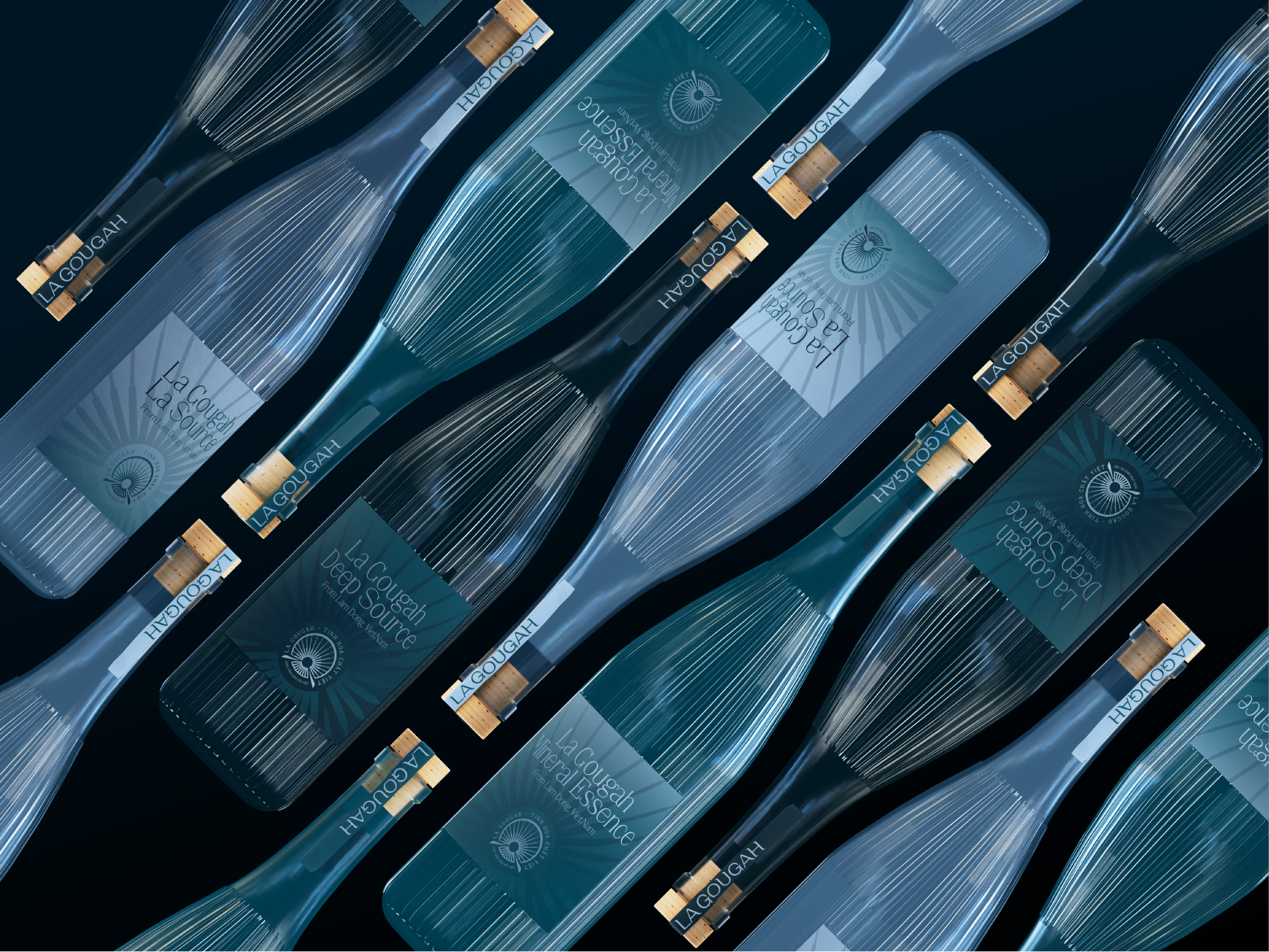
Original Source
Water is not “manufactured”, but guided directly from nature
The name La Gougah carries strong geographical significance
Intersection (Nature × Technology)
Natural water flow – enclosed Green Technology
The process does not disrupt the natural structure of water, but filters it to preserve its most valuable properties
Trust by Process
Clear origin
Transparent process
Commitment to mineral content and natural ions
LA GOUGAH BRAND TYPEFACE DESCRIPTION
The La Gougah typeface is a custom-designed font, directly inspired by the flowing movement of Gougah Waterfall and the multilayered geological structure of the Lam Dong highlands — the birthplace of the natural mineral water source.
Overall Spirit
The typeface embodies a harmonious balance between softness and solidity, accurately reflecting the brand philosophy:
An original water source — where pristine nature meets modern technology.
Fluid like water flowing continuously through time.
Solid like ancient geological layers accumulating valuable minerals.
Stroke Language
Rounded curves are delicately crafted to evoke flowing water — organic, pure, dynamic, and full of vitality.
These are contrasted with strong vertical strokes and straight lines, symbolizing rock strata, basalt layers, and the enduring geological structure of the Central Highlands.
This combination delivers a sense of stability, trust, and longevity, particularly suitable for the beverage and health industries.
Proportions and Stroke Weight
The typeface employs variable stroke weights:
Thick and thin strokes represent layered geological formations through which groundwater has been naturally filtered over thousands of years.
This approach adds visual depth, brand weight, and memorability.
Overall, the letterforms feel dense and grounded — neither fragile nor overly rigid.
Emotional Expression & Messaging
The La Gougah typeface is not merely a visual identifier; it tells a story:
Originality — understated, unembellished, faithful to the natural essence of mineral water.
Quiet strength — like underground water veins, silent yet persistently sustaining life.
Trust and safety — aligned with commitments to purity, health benefits, and modern green technology standards.
Brand Positioning Alignment
The La Gougah typeface is especially suited for:
Natural mineral water brands with clearly defined geological origins.
Premium positioning beyond conventional purified water, emphasizing minerals, natural ions, and health value.
The message: “Where pristine nature intersects with modern technology.”
Design as a “Geological Stratification”
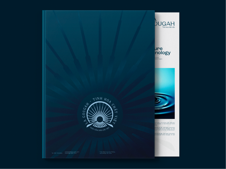
Logo & Visual Identity Design Direction
Fractured forms – layered structures – flowing movements (geology, tectonic rupture of Gougah)
Typography that is solid and restrained, conveying reliability – technical precision – natural integrity
CORE LOGO CONCEPT – STRATEGICALLY ALIGNED
The logo does not depict “water” — it tells the story of the “source”
Rather than directly illustrating nature, the logo abstracts geological layers, water flow, and depth. This reflects a high-end branding mindset focused on essence rather than surface imagery.
Central symbol: the structure of “geological layers and converging flow”
Vertical “columns” — geological strata with three different thicknesses representing varying depths.
The vertical rhythm conveys technical precision, control, reliability, and a guided flow rather than an uncontrolled burst.
This accurately expresses the brand spirit: controlled strength and selective purification. The central circle — the point of convergence, filtration, and refinement.
It represents the mineral-rich underground water core — the “heart” of the water source.
This is a highly valuable conceptual detail, giving the logo philosophical depth and allowing it to scale up or down without losing meaning. The supporting base — resembling hands or a pedestal.
This element is emotionally significant: not merely a structural base, but a gesture of care and preservation.
It aligns perfectly with the message that water is not exploited, but protected and responsibly guided.
OVERALL FORM – LOGO EVALUATION
Circular structure: a highly appropriate choice
The circle carries layered meanings: eternity, trust, and natural cycles. It is also associated with premium branding, as many luxury brands adopt circular forms.
In contrast, sharp-edged logos feel overly industrial, while overly organic forms risk becoming generic lifestyle symbols.
La Gougah positions itself precisely between art and engineering, reinforcing its intended brand positioning.
Proportion and rhythm
The evenly distributed vertical elements create a sense of balance with no redundant details.
The logo remains highly legible even at small sizes (e.g., bottle caps), embossed finishes, or single-color applications — a strong advantage in commercial usability.
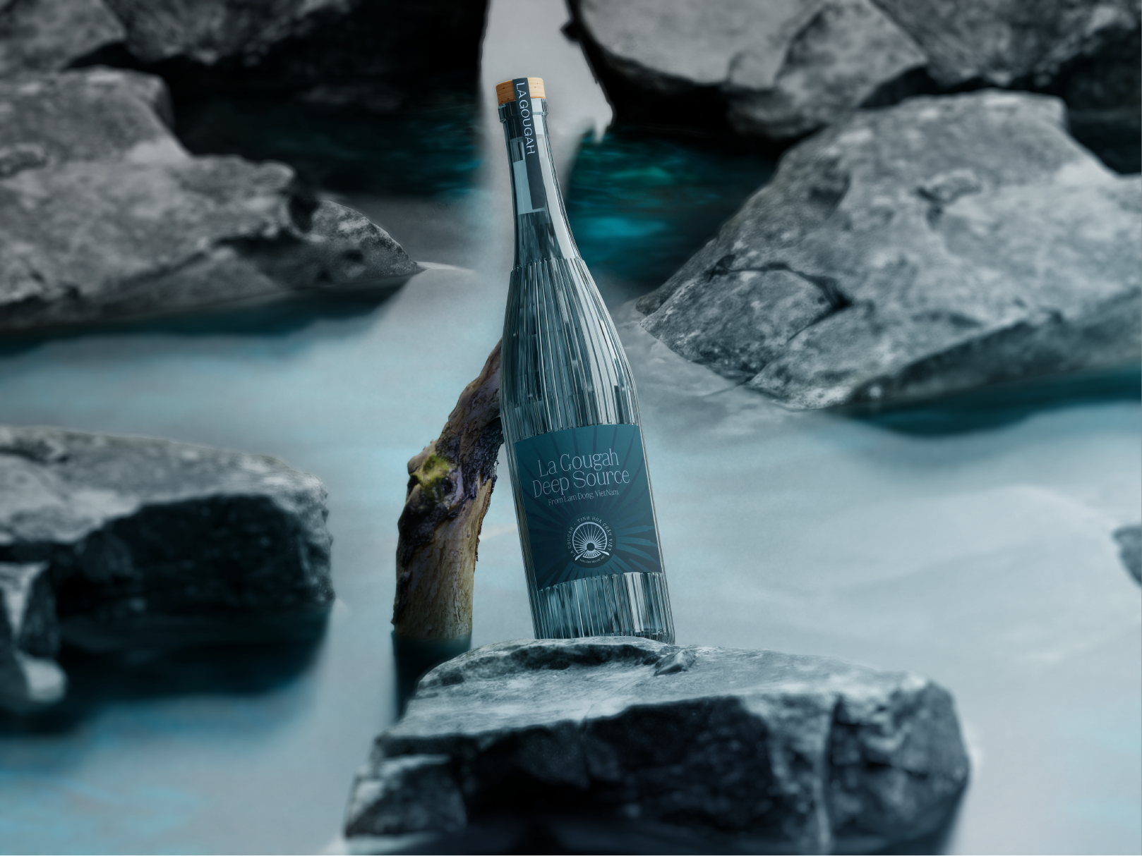
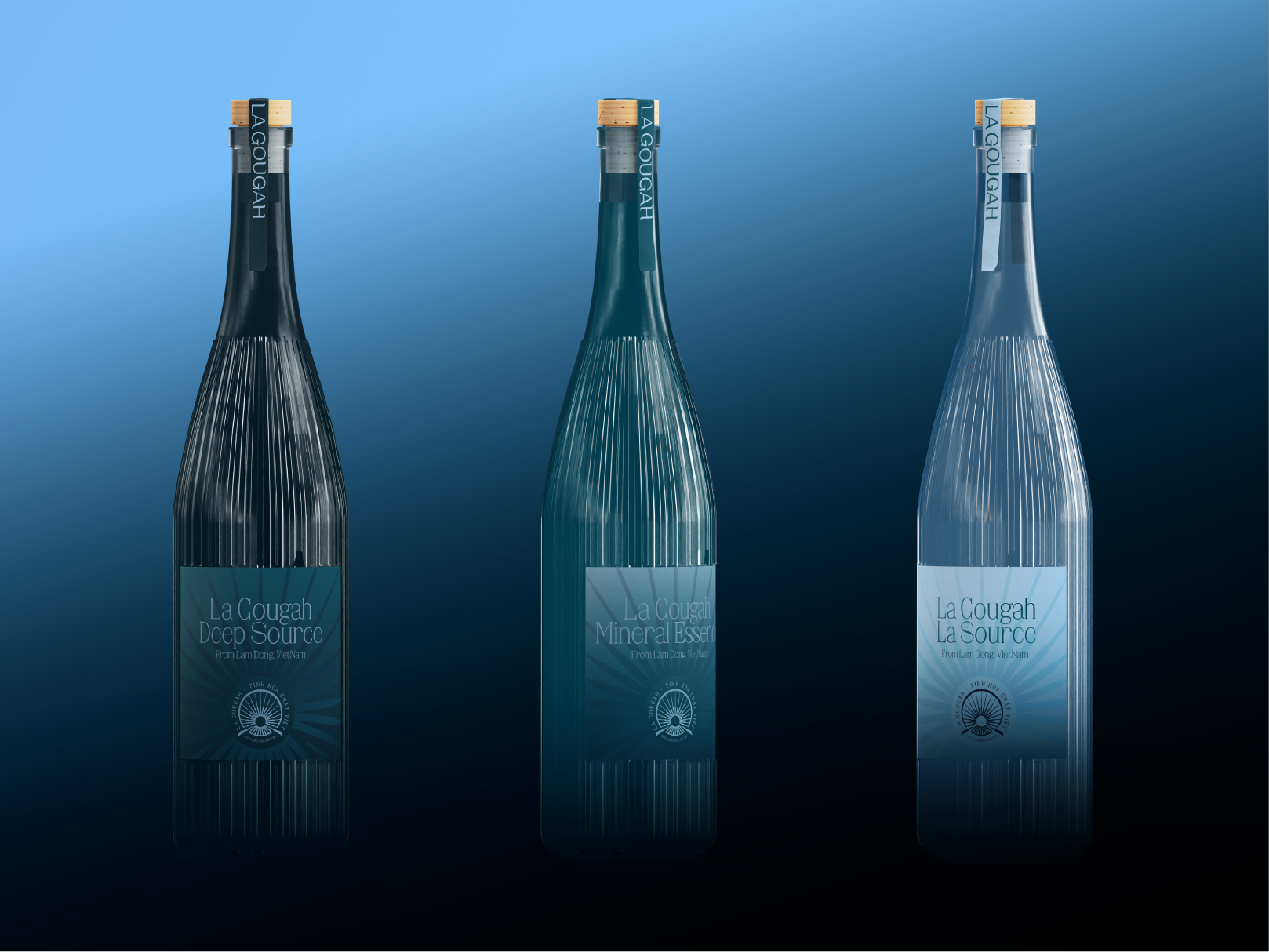
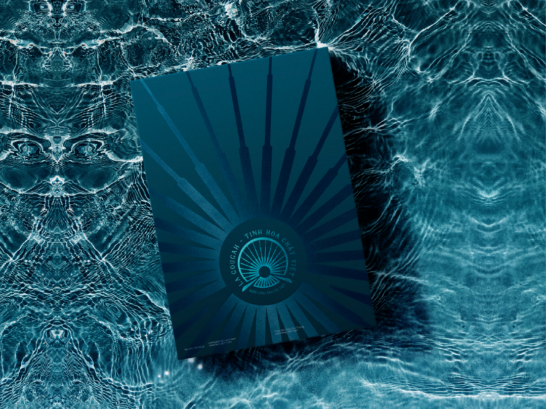
COLOR – ONE OF THE MOST INTELLIGENT DECISIONS
Teal / deep teal tone
This color bridges blue — associated with water and trust — and green — linked to minerals, forests, and the Central Highlands.
It clearly differentiates La Gougah from light industrial blues (Aquafina, LaVie) and modern neon palettes (Ocany).
Color meaning for La Gougah
Pure yet not cold; premium yet approachable; natural yet intellectually deep.
This palette is particularly suitable for refined lifestyle contexts such as hospitality, restaurants, and high-end living.
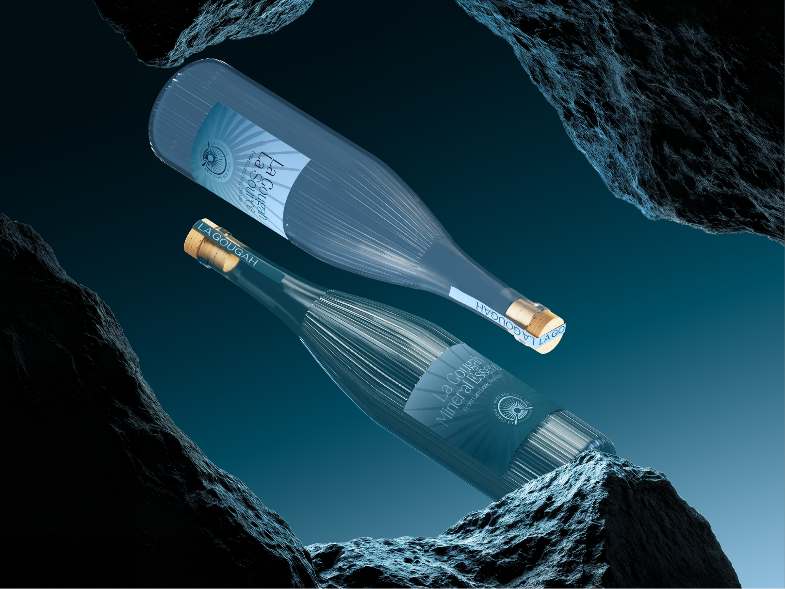
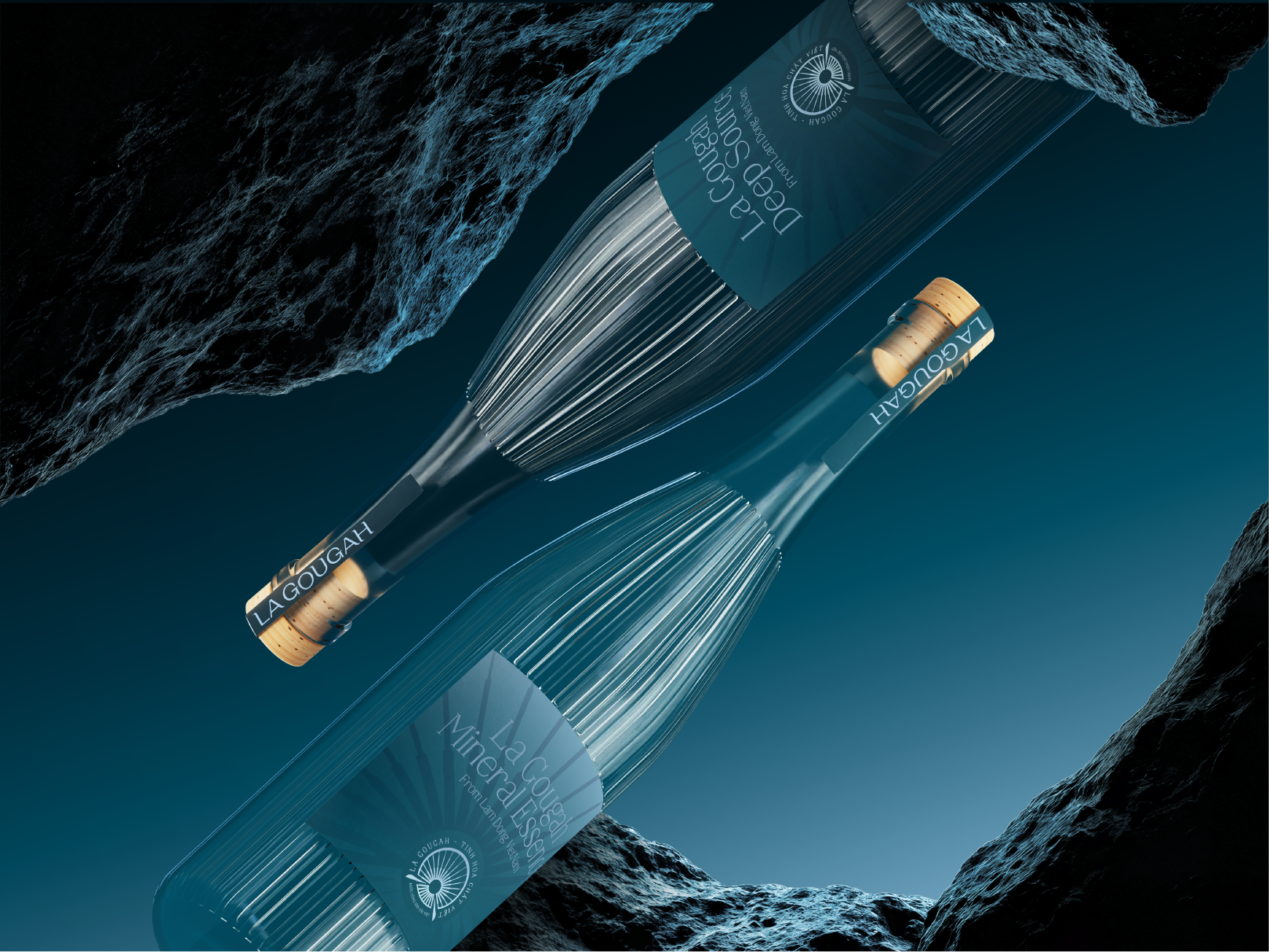
CIRCULAR SYMBOL – USABILITY & FLEXIBILITY OF THE LA GOUGAH LOGO
The circular symbol of La Gougah is designed for multi-platform and multi-material application, ensuring optimal
performance across all communication contexts — from print and digital media to immersive brand environments.
Circle as an optimal identity structure
The circle is a stable, balanced, and complete geometric form, easily recognizable at any scale.
It is not dependent on horizontal or vertical orientation, ensuring layout stability and visual coherence even in complex
backgrounds. This is especially suitable for a mineral water brand positioned around longevity, sustainability, and purity.
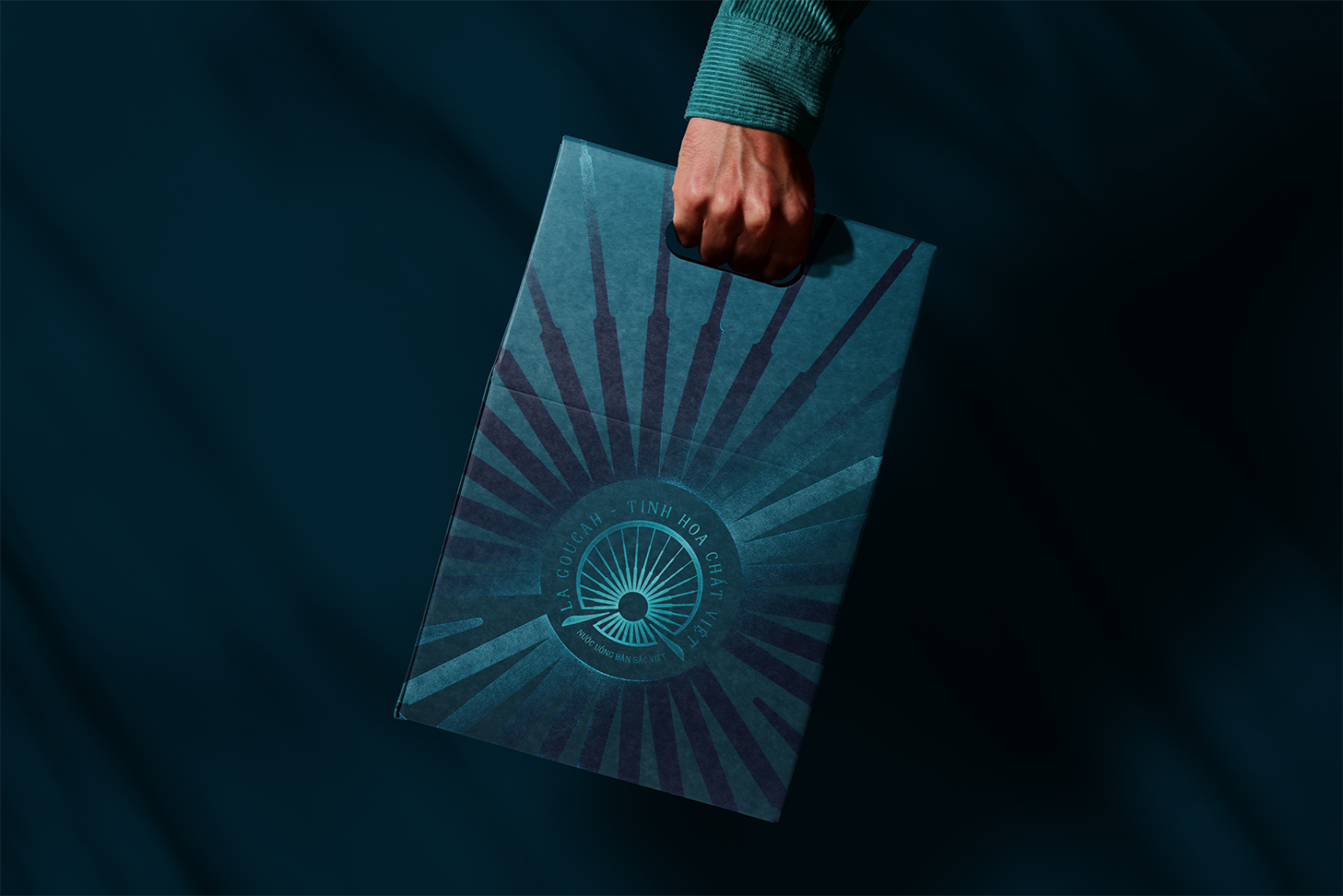
Optimal appearance across all backgrounds
The La Gougah symbol can stand alone on solid backgrounds (light, dark, gradient) or be integrated into natural
imagery such as stone, water, and light.
It performs effectively across labels, packaging, POSM, digital banners, and stage backdrops, maintaining clarity
even on visually dense surfaces.
Flexibility in 3D design and events
With its clear geometric construction and linear rhythm, the symbol is ideal for 3D logo installations, suspended
structures, illuminated elements, light mapping, animation, and motion graphics.
It can be engraved, CNC-cut, embossed, edge-lit, or rendered in various materials (metal, stone, acrylic, glass) while preserving its core identity.
Adaptability as a “brand background”
Beyond functioning as a logo, the La Gougah symbol can act as a central pattern, a visual framing device, or a brand anchor within spatial design.
This allows for scaling, cropping, layering, and background integration without visual clutter or forced presence.
Narrative symbolism
Beyond functionality, the circle conveys deeper meanings: the cyclical nature of water, closed-loop natural flows,
mineral accumulation over time, and the connection between nature and technology.
This aligns seamlessly with the positioning:
“An original water source — where pristine nature intersects with modern technology.”
MODULE GRID SYSTEM – 3×3 STRUCTURE
The 3×3 Module Grid System of La Gougah is derived directly from the brand’s origin story: the approximate 30-meter depth of the underground water veins of Gougah Falls. The number three is adopted as a foundational unit, symbolizing depth, stability, and controlled balance, mirroring the way water travels through geological layers before reaching its most refined state.
The three-column by three-row structure forms a balanced grid of nine modules, enabling clear organization, visual rhythm, and a high level of consistency across multiple applications, including letterheads, magazines, posters, and social media layouts. In letterhead design, the grid provides a disciplined framework for positioning the logo, information, and negative space, conveying a sense of professionalism and trust. For communication materials such as posters or social content, the 3×3 grid functions as a visual guide that ensures imagery, typography, and messaging are consistently aligned, preserving the brand’s core values of clarity, purity, and refinement, regardless of format or scale.
More than a layout tool, the 3×3 Module Grid serves as a visual expression of La Gougah’s philosophy: every element is guided, controlled, and balanced—much like water that is selectively purified from deep within the Central Highlands’ geological foundation.
STRATEGY – MINIMALISM WITH A DISTINCTIVE SIGNATURE
La Gougah’s brand strategy is built upon a principle of intentional minimalism, in which the logo serves as the primary visual anchor across all design applications. Rather than relying on decorative or complex graphic elements, the brand adopts a restrained approach that allows the structural integrity and rhythmic geometry of the logo to function as the core identifier.
When combined with a deep, nuanced color palette, the logo transcends its role as a mere mark and becomes a refined visual signature, capable of capturing attention through subtlety and precision. This strategy enables La Gougah to communicate sophistication, modernity, and artistic depth, while maintaining a strong and memorable identity without visual excess.
MAIN DESIGN & VISUAL SYSTEM – LOGO AS A VISUAL FOUNDATION
The primary design and visual system of La Gougah positions the logo as the foundational element of the visual language, from which all layout structures and applications are derived. Beyond functioning as an isolated emblem, the logo is expanded into background elements, graphic patterns, and layered visual textures,
ensuring a coherent and unified expression across stationery, posters, editorial layouts, and social media assets. This approach directs visual focus toward the refined details of the logo, while preserving clarity, hierarchy, and compositional discipline. Through the deliberate interplay of logo, negative space, and color, La Gougah’s visual system establishes a calm, depth-oriented, and controlled aesthetic, faithfully reflecting the brand’s core values of purity, clarity, and trust, where every element is intentionally guided and precisely placed.