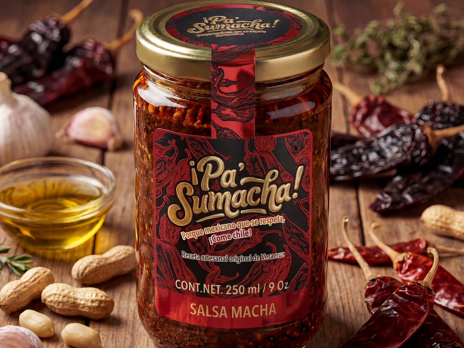

Pa´Sumacha was born from a popular expression from Veracruz, Mexico — a spontaneous exclamation said in the exact moment when something is intensely spicy. It is a reaction that blends surprise, respect, and heat. That everyday phrase, spoken between laughter and burning bites, became the starting point for building a salsa macha brand rooted in real cultural experience rather than invented storytelling. We adapted this oral expression into the gastronomic universe, transforming it into an identity: what was once a reaction becomes a declaration.
The naming preserves its colloquial origin while evolving graphically into Pa´SuMacha, introducing rhythm, structure, and brand character. Merging the words and intentionally using capital letters was a strategic decision — turning a spoken phrase into a distinctive, memorable mark without losing its Veracruz roots. The result is a name with phonetic strength, cultural authenticity, and strong shelf presence.
From a graphic design perspective, the identity intentionally avoids folkloric clichés or stereotypical Mexican symbols. Instead of relying on traditional imagery, the brand is built around typography as the primary visual element. The custom lettering conveys organic energy, artisanal character, and contemporary editorial sophistication. The color palette — deep reds, bold blacks, and warm contrasts — directly references the ingredients of salsa macha: dried chiles, golden oil, toasted seeds. Texture and line work evoke artisanal printing techniques, reinforcing authenticity without falling into predictable rustic aesthetics.
The visual system extends into the packaging, where jar, lid, and label function as a cohesive unit. The vertical band connecting the lid to the main label creates visual continuity and strong point-of-sale recognition. The tagline, “Because a Mexican who respects himself eats chile!”, acts not as decoration but as a cultural statement — reinforcing pride and positioning the brand within a broader gastronomic identity.
Pa´Sumacha does not simply sell salsa macha; it captures a regional expression, reinterprets it, and transforms it into a contemporary brand language. It is tradition reframed, heat translated into design, and popular speech elevated into identity.
 habiba hatem
 Up-Brands
 sayadworks
 Kingdom & Sparrow
 furtgoods
 Si me preguntas
 Narrow House Packaging Branding & Design
 Clever Branding
 About House of Ta
 Hossam khalifa
 Valentyna Hradova
 Backbar Studios
 Holy Studio
 Prime
Prime Naeema Raashid
 Buddy Creative
 ezgidesignstudio
 Minim Brand Design
 Nenad Došen Studio
 Atyan
Atyan Massimo Lo Cascio
 Carreto Concepts Design Studio
 Charles Mason
 Pinot Agency