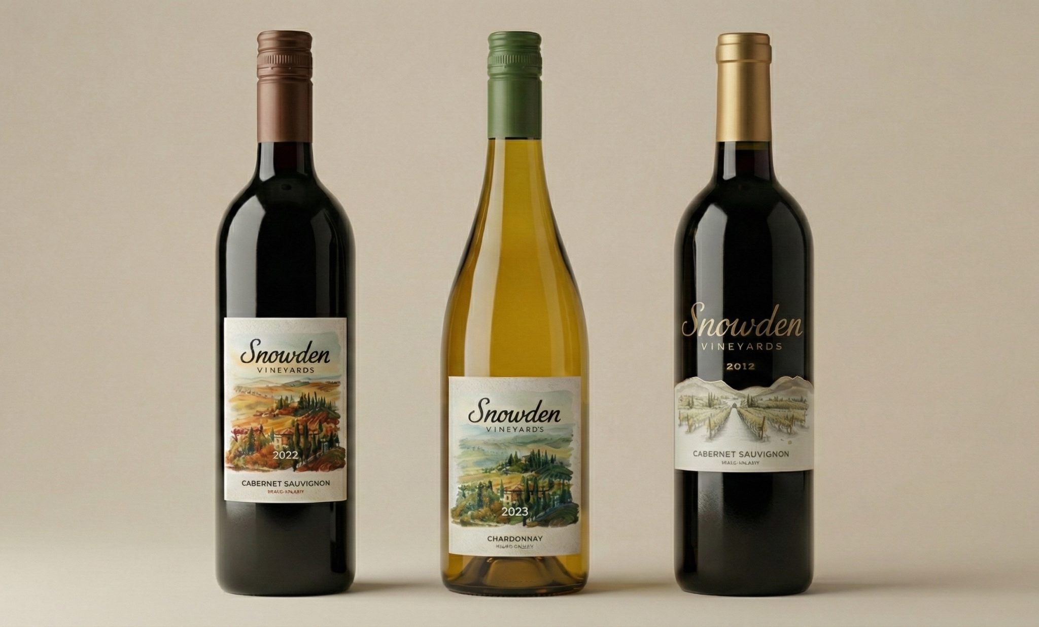
Snowden Vineyards Packaging Design System
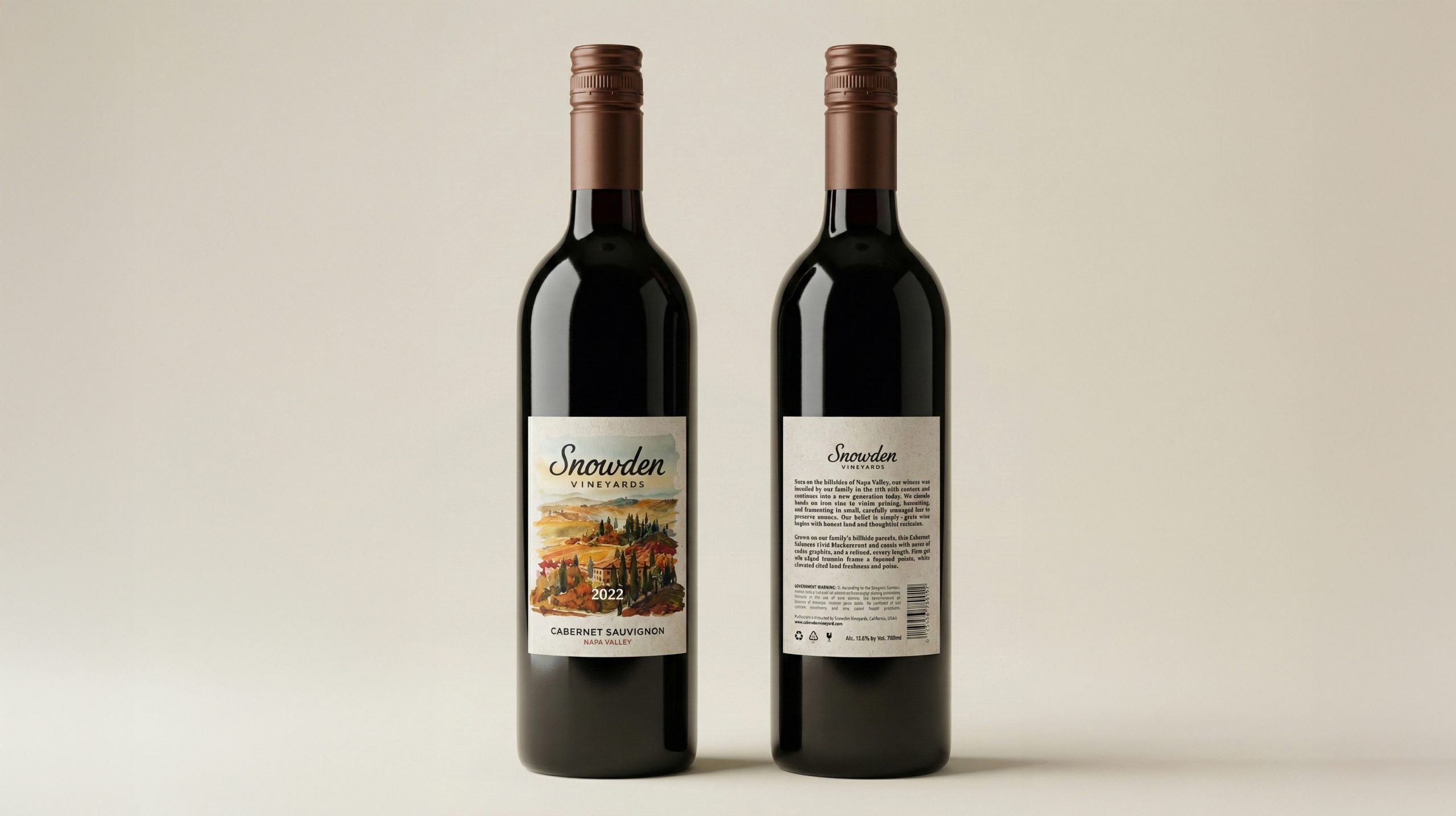
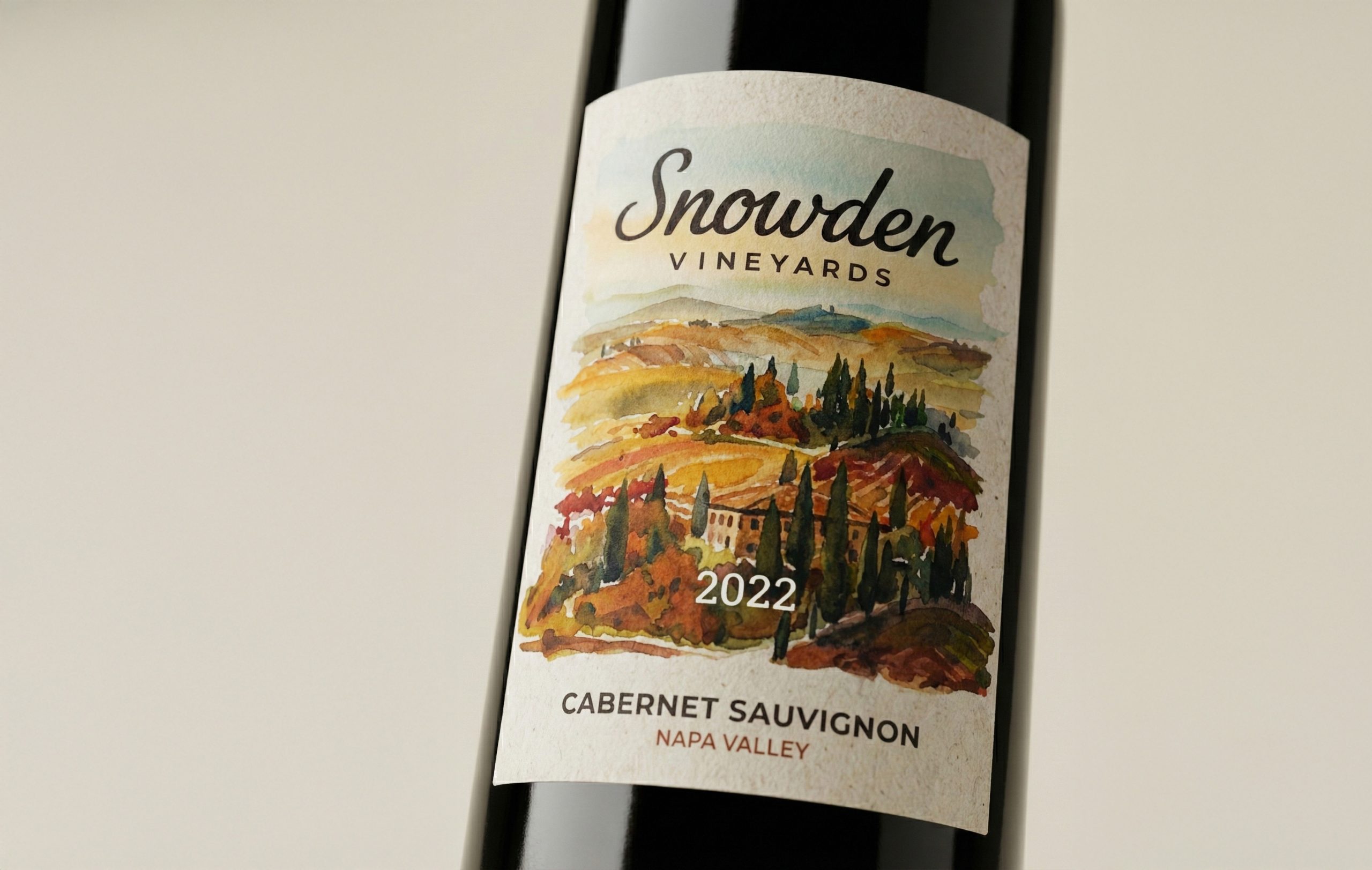
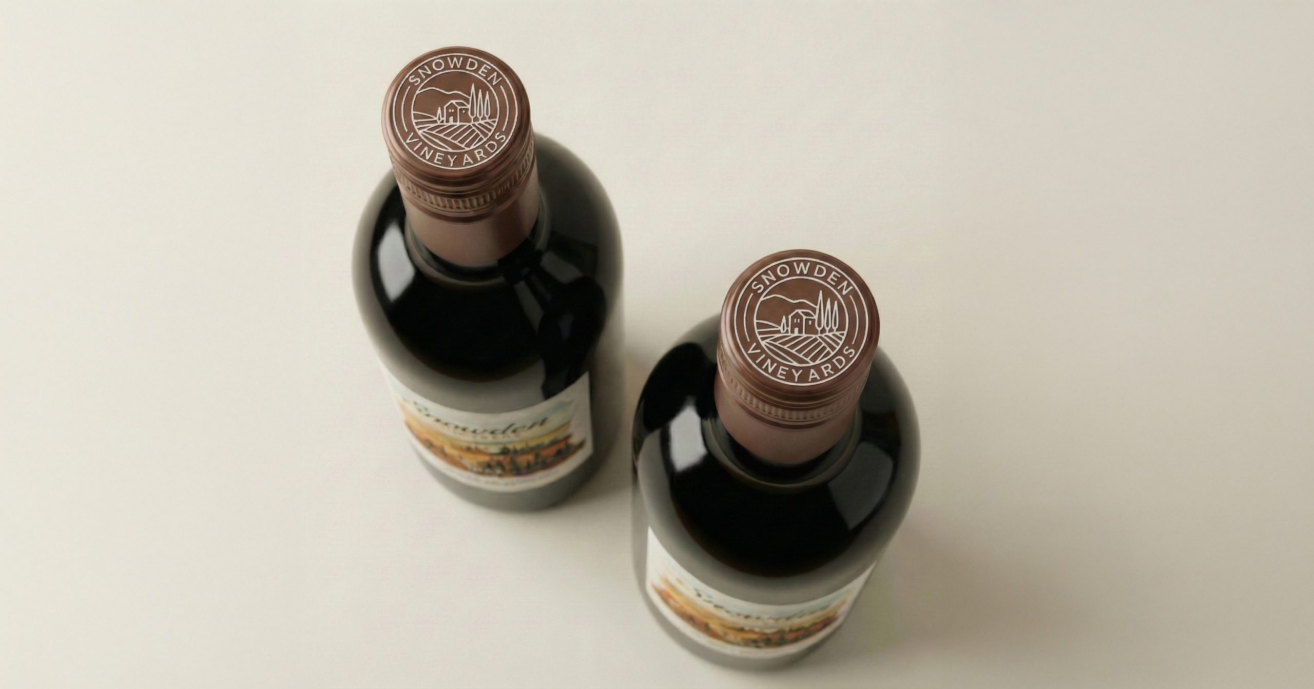
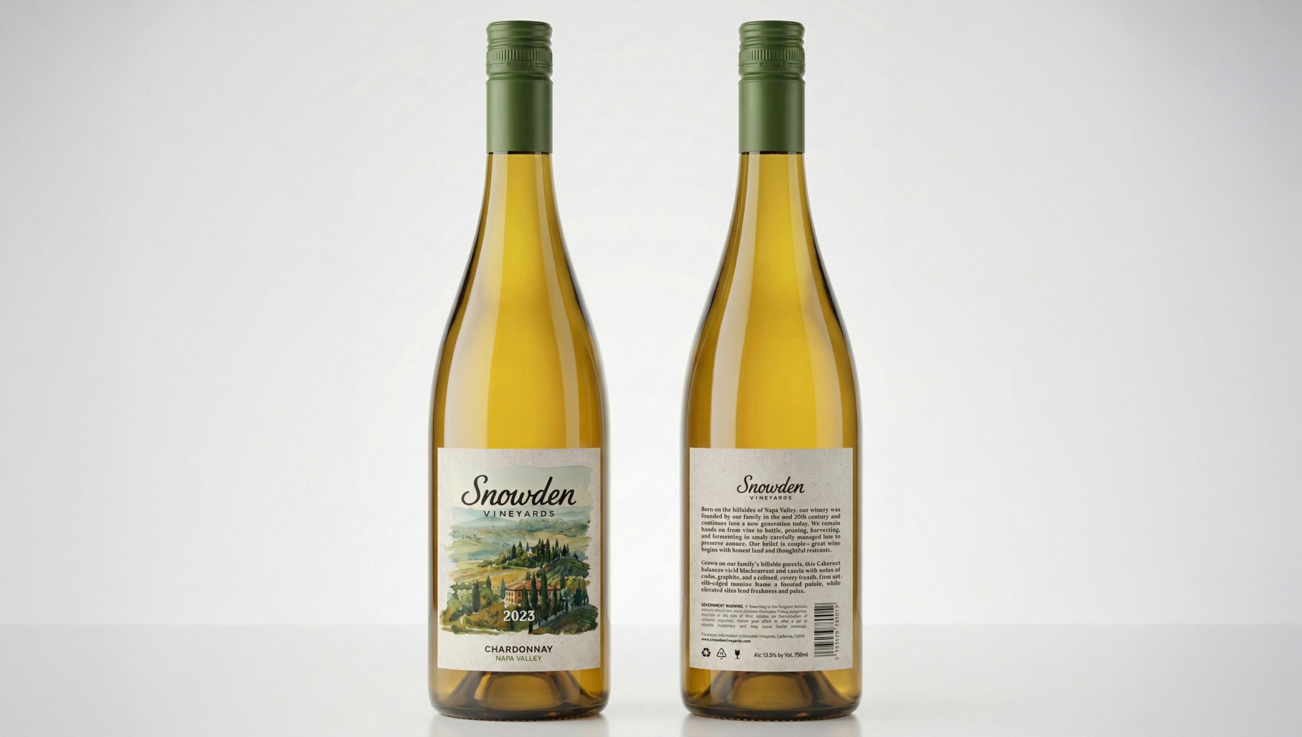
This project explores tiered wine packaging design for Snowden Vineyards, a Napa Valley estate brand rooted in land, heritage, and quiet prestige. The visual identity is built around a hand-drawn estate map, refined typography, and architectural landscape symbols, positioning the vineyard itself as the core storytelling element. Rather than relying on decorative excess, the system communicates value through restraint, terroir, and spatial authenticity.
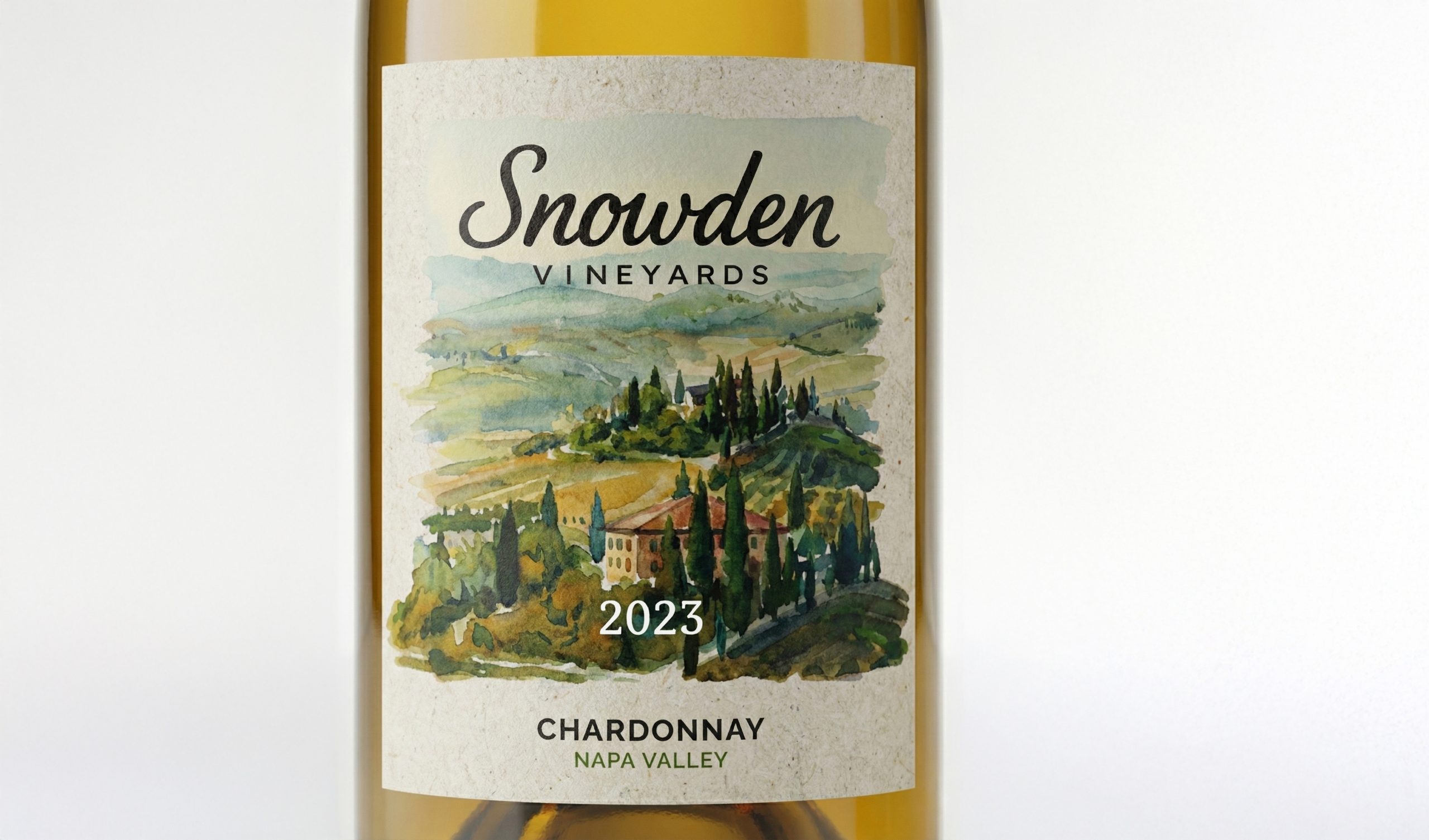
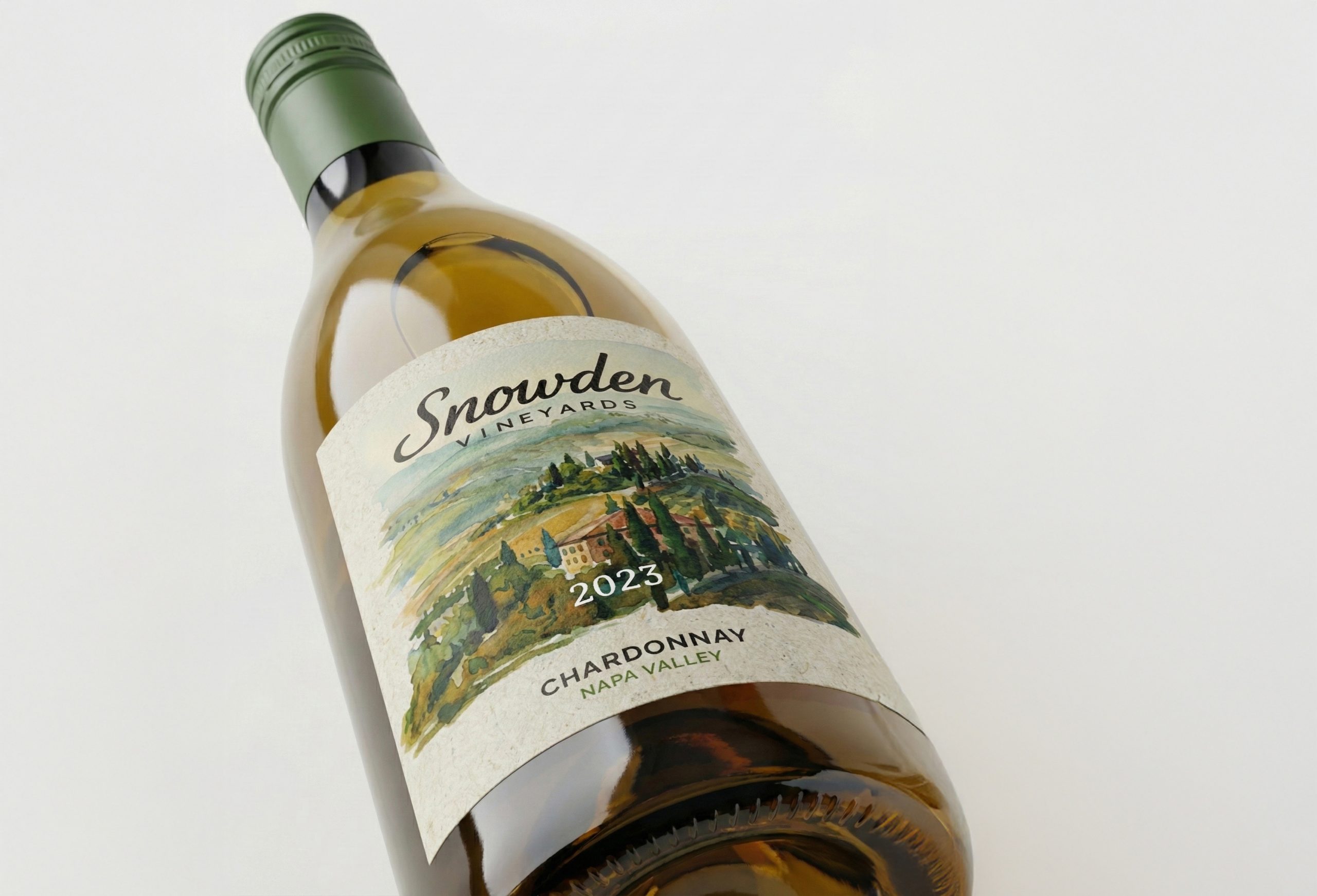
$20 Tier — Accessible Estate Expression
This lower-priced wine emphasizes clarity, accessibility, and brand recognition. The design utilizes watercolor and textured printing techniques, ensuring production efficiency while preserving the terroir’s character and credibility. The goal at this tier is trust and drinkability — the packaging signals real vineyard roots without intimidating the consumer. It invites everyday enjoyment while still carrying the visual language of estate-grown quality.
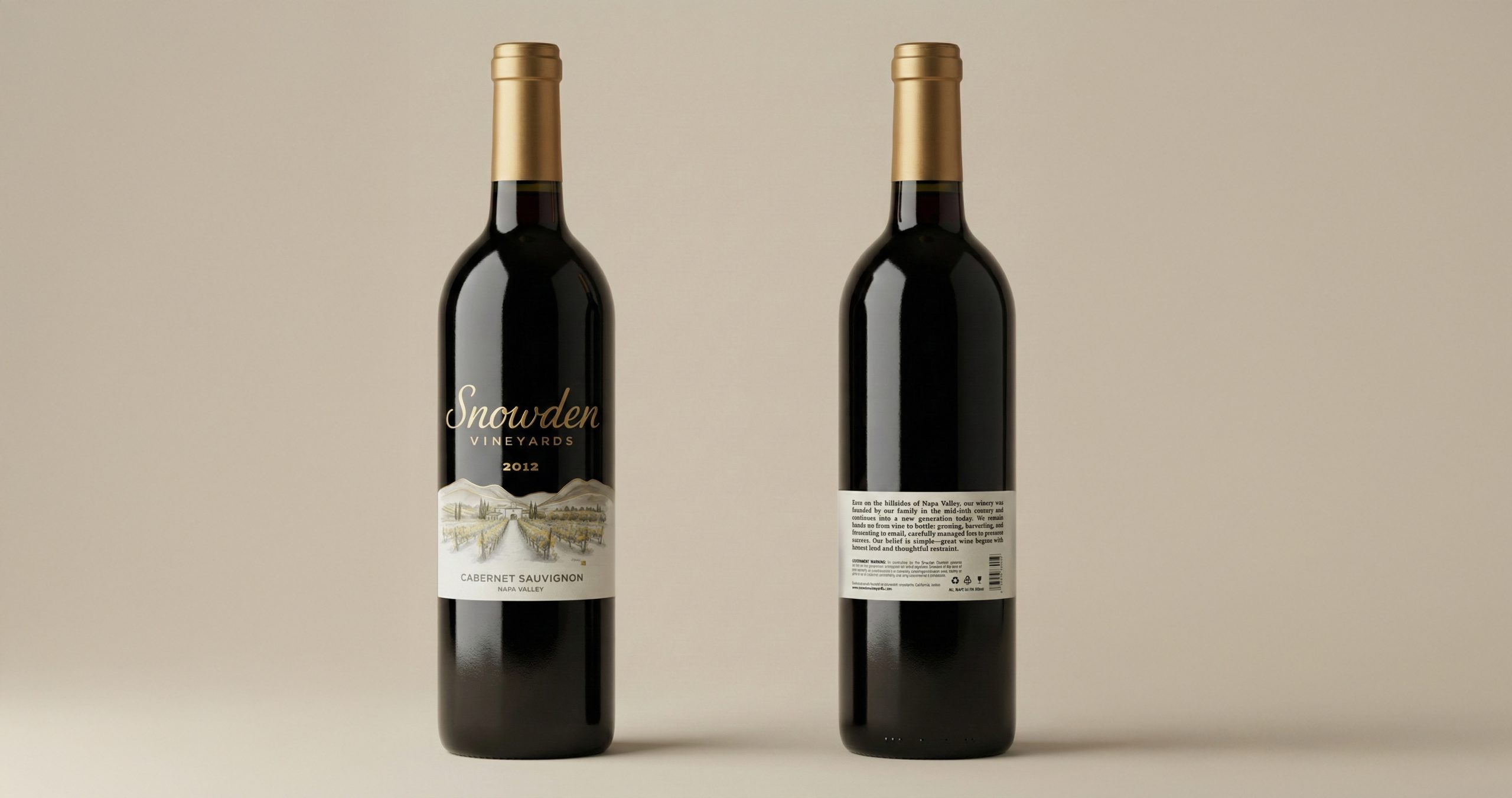
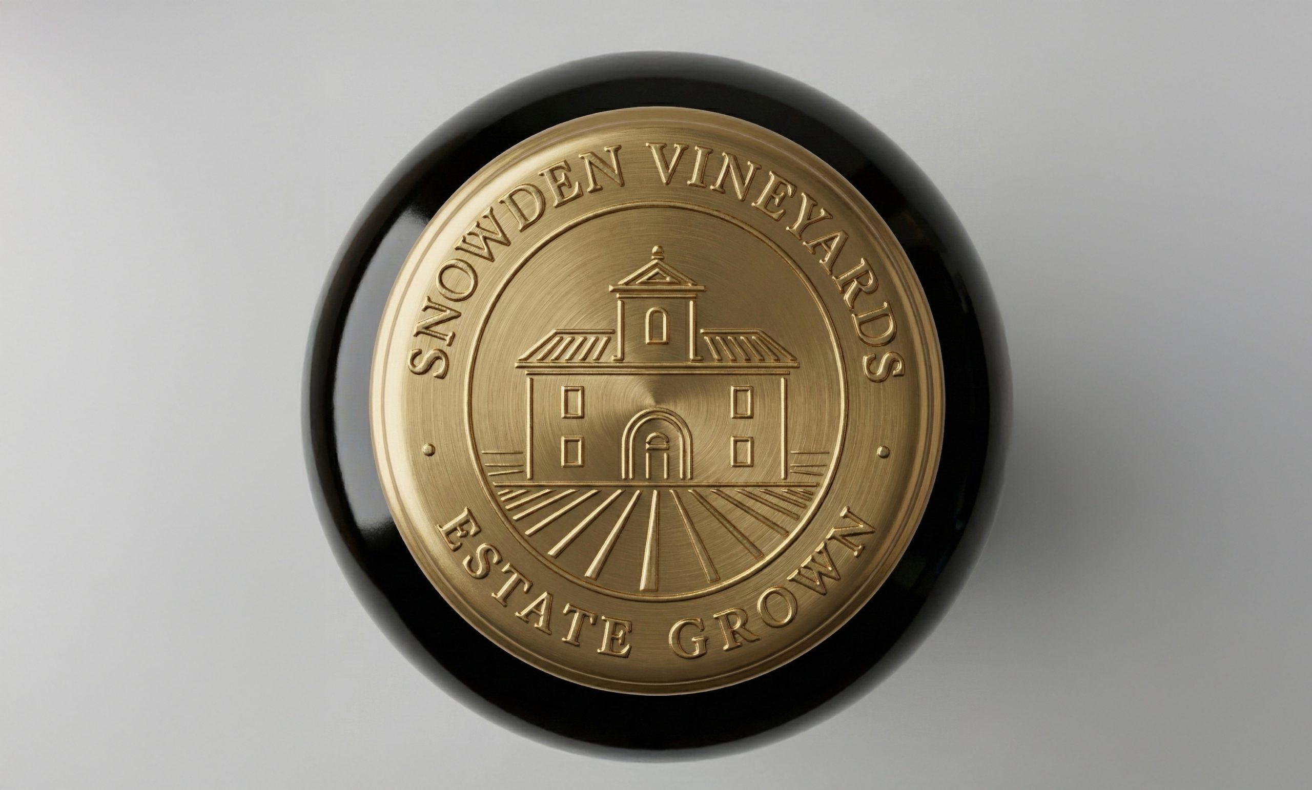
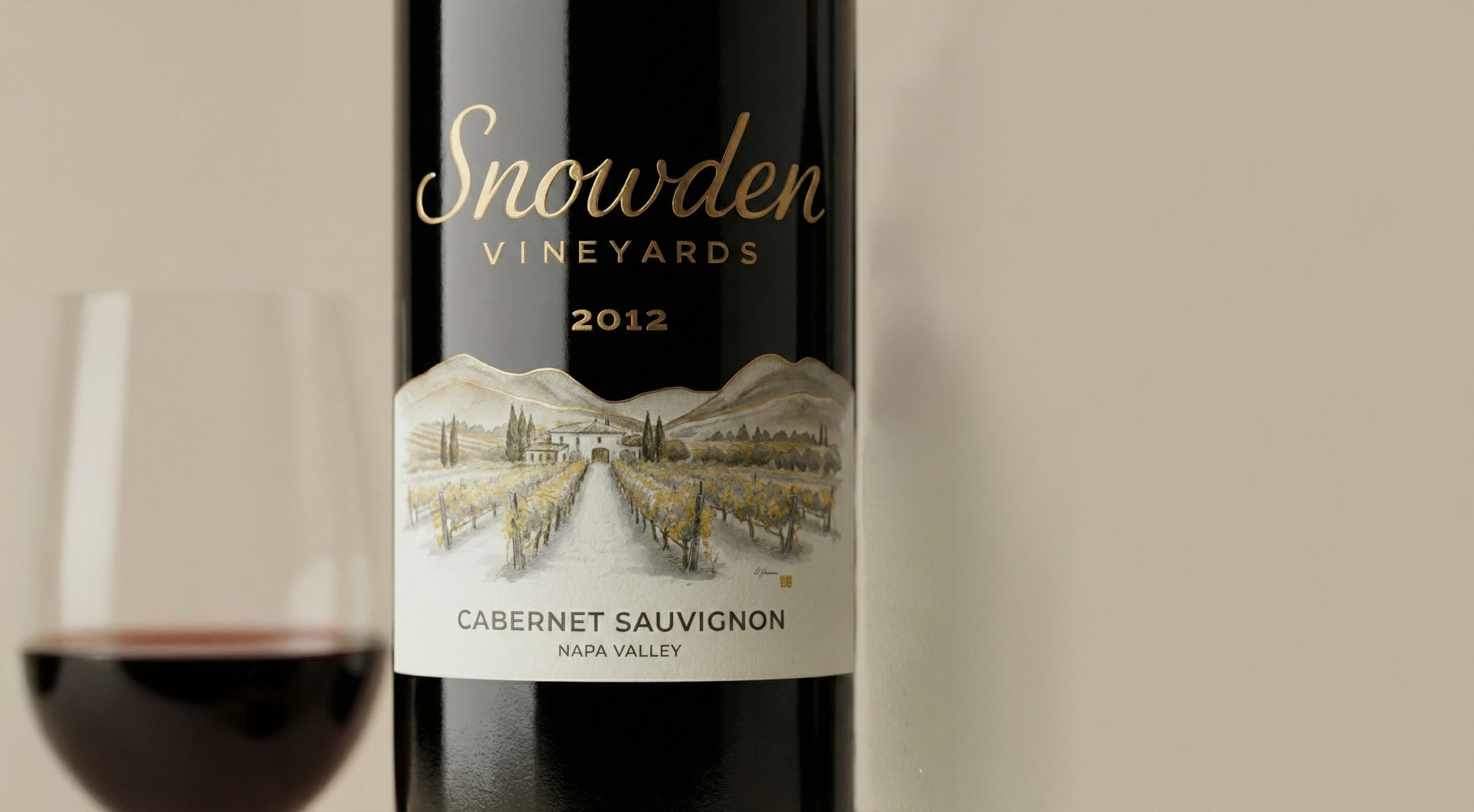
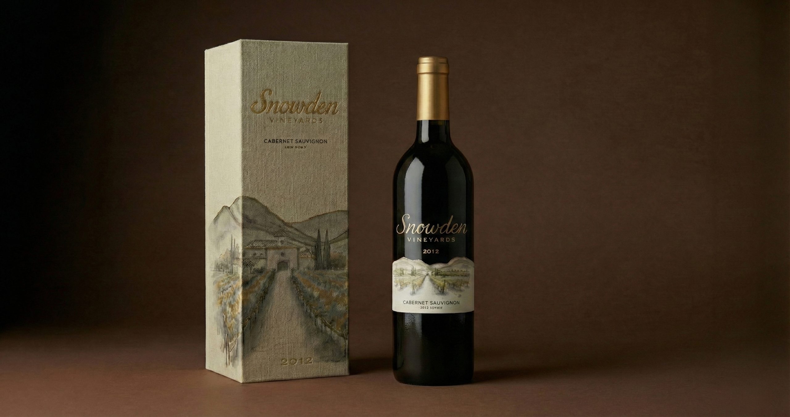
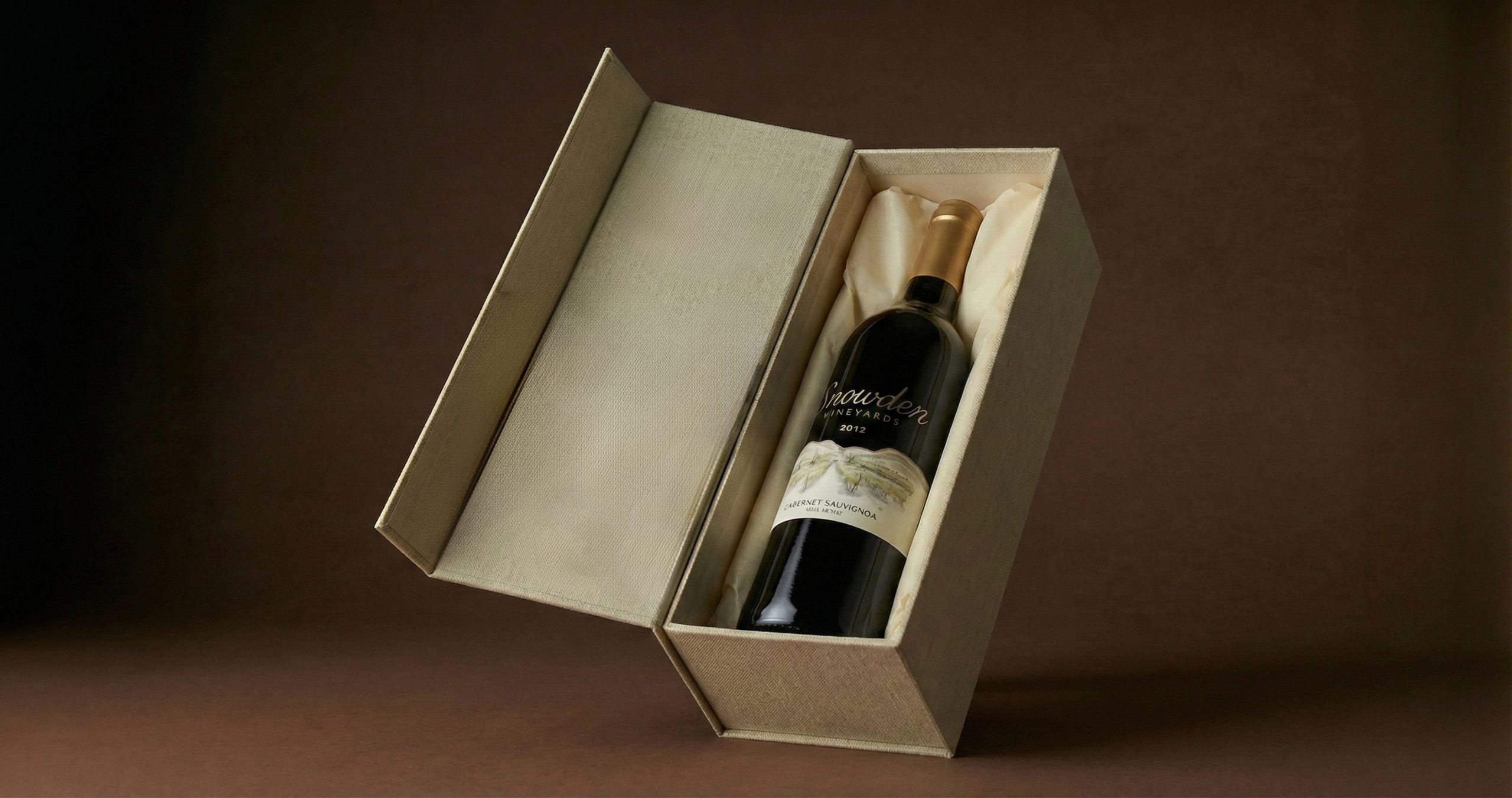
$120 Tier — Collector-Level Terroir Narrative
The premium tier elevates the same core visual system through materiality and detail. Finer linework, metallic or foil accents, tactile paper stock, and more spacious composition transform the label into an artifact rather than just information. Here, the map becomes symbolic rather than descriptive — representing legacy, elevation, and craftsmanship. The design principle shifts from accessibility to heritage preservation, positioning the bottle as something to gift, cellar, or collect. Luxury is expressed through precision, balance, and silence, not ornament.