

Liquid Fire is a healthy energy drink created to ignite a new way of understanding fitness through packaging that feels explosive, fresh and impossible to ignore. Designed as a healthy pre-workout, the brand combines energy, flavor and attitude for active people who want more than physical results. It speaks to a community driven by hunger, focus and zero excuses: a shark mindset.
The challenge was to design packaging for a healthy energy brand without making it look like another healthy product, while also moving away from the dark, hypermasculine and repetitive codes of traditional fitness. Instead of softening the product, the packaging turns its main contradiction into the core concept: a paradoxical brand.
Acidic, aggressive and irreverent on the outside. Honest, balanced and free from false promises on the inside.
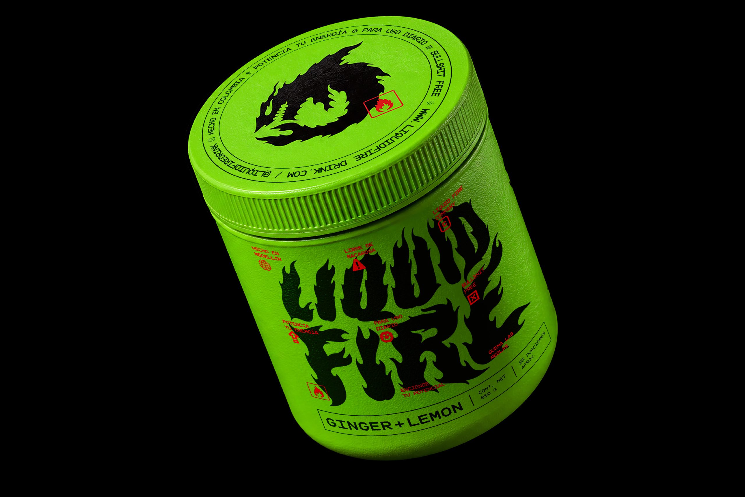
From this idea, we developed a fully custom visual identity built to live strongly across the packaging system. The logo was drawn by hand from scratch to express combustion, movement and speed. The shark became a symbol of instinct, focus and ambition, giving each container a clear attitude and a recognizable visual anchor.
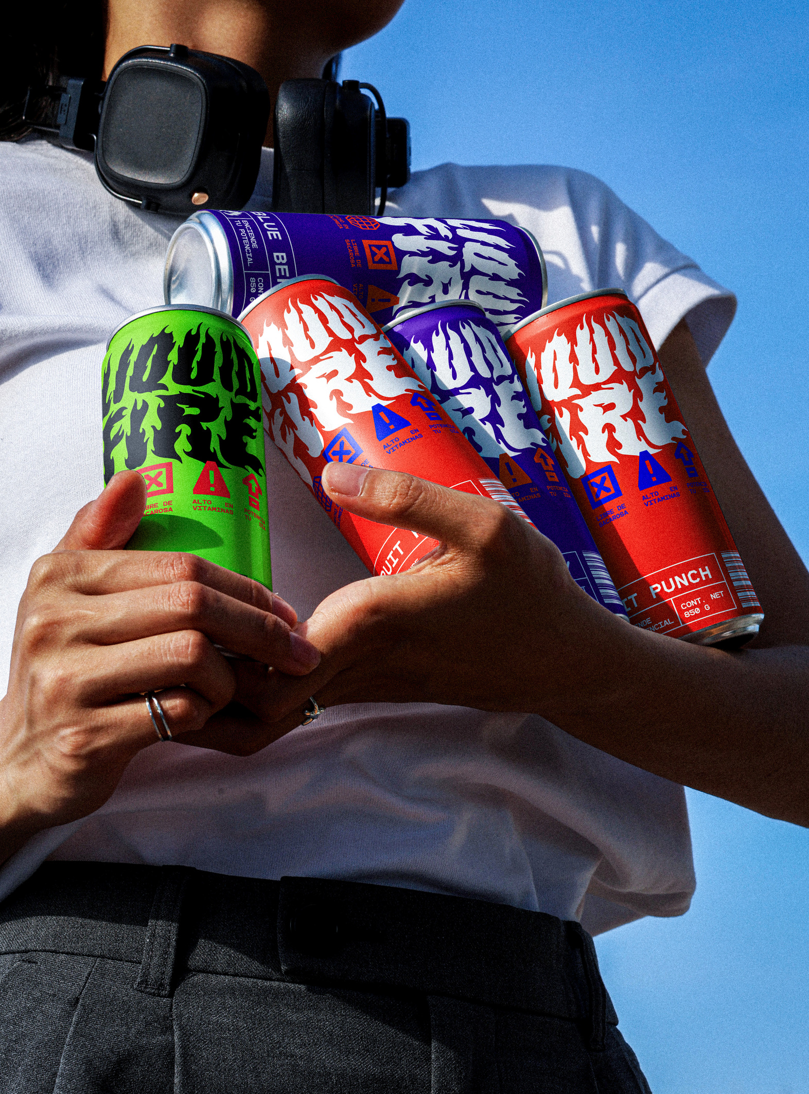
The color palette follows the same contradiction. Cold, refreshing tones, especially blue, are used to communicate fire, heat and energy. This creates a visual language that feels unexpected within the category and helps Liquid Fire stand apart from conventional pre-workout and energy drink brands on the shelf.
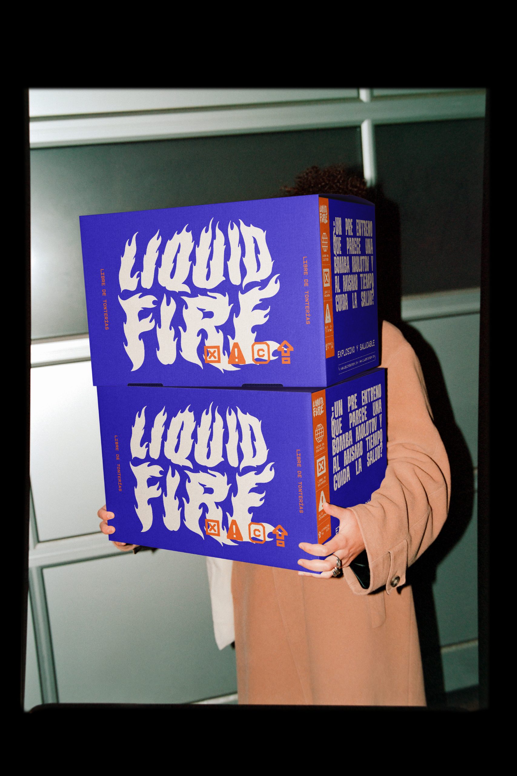
The packaging brings the complete universe together in an object that does not ask for permission. Electric colors, symbols, warnings, microcopy, flavor cues and an intense composition turn each container into a statement of attitude. Every detail was designed to reinforce the same idea: a product that looks dangerous, but protects your health.
The result is a packaging identity that breaks the rules of the category without lying about the product. Explosive and healthy.
Curator’s Insight
What makes Liquid Fire work is the refusal to pick a lane. Most challenger energy brands solve the “healthy but exciting” problem by choosing one side, either leaning into clinical wellness cues or doubling down on aggressive gym iconography. This system does neither. It builds contradiction directly into the color logic, using cool tones (acid green, electric blue, deep purple) to carry the sensory promise of heat and combustion, which is a genuinely counterintuitive move in a category where red and black have become shorthand for intensity.
The hand-drawn flame wordmark does double duty here. It’s illegible enough at a glance to function as pure texture and shelf noise, but resolves into the brand name at close range, rewarding a second look rather than front-loading everything into the first three seconds. That’s a deliberate bet: the packaging is designed for someone already curious enough to pick it up, not just someone scanning from three feet away.
The regulatory-style microcopy (warning icons, allergen flags, blunt callouts) is doing something sharper than decoration. It borrows the visual authority of hazard labeling and repurposes it as attitude, which lets the brand claim danger and rebellion without ever making an unsafe or misleading health claim. It’s a clever way to have the aesthetic argue for intensity while the actual language stays honest.
The transferable principle: when a category has calcified around one visual code, contradiction (in color, in tone, in structure) can be a more durable differentiator than refinement. Liquid Fire doesn’t out-design its competitors on polish. It out-positions them by holding two opposing ideas, danger and health, in the same object without flinching.



 monther al omari
 43oz
43oz Thirst
 Carreto Concepts Design Studio
 M&A CREATIVE AGENCY
 pastellofactory
 Omar Altayeb
 Cocoon Prague
 古戈品牌
古戈品牌 Pascal Riviere Design
 ZIMO Studio
 alchimistestudioParis
 Valérie Colace
 Platon Ivantsov
 Leyma Design
 Dina Gamal eldin
 clermentza
 Redlana
 anushrishah
 Natania Doshi
 NewFolderStudio
 francapovilla
 Mother Tongue Design
 CJMartins