Design: 43oz.com – Design Studio
Location: Moldova
Project Type: Produced
Product Launch Location: Russia
Packaging Contents: Vodka
Packaging Substrate / Materials: Glass bottle, Paper Label, Paper Neck Label
Printing Process: Digital printing, foil stamping, tactile varnish
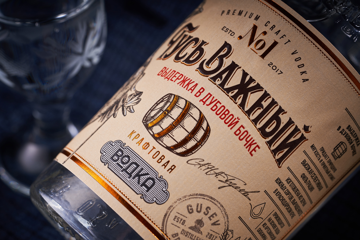
The creation of craft vodka in Russia is undoubtedly a responsible task, given the historical aspect and popularity of this drink. And it’s not less important to create a visual presentation for such a product. Therefore, when Gusev Brothers Distillery approached us with the task of creating a design for vodka aged in oak barrels called Гусь Важный (Important Goose), we took this project seriously, despite some lightheartedness of the trademark itself. This is how we developed the bottle and label design for a new Russian craft vodka.
The overall aesthetics of the packaging design for craft vodka Гусь Важный keeps a vintage style that refers to the original pre-revolutionary recipes and distillation experiments. From a visual point of view, this involves heavy use of vintage graphic elements reinforced with modern post-printing techniques and paper. A stylized illustration of a goose, on the other hand, complements the overall picture and acts as a direct reference to the brand name. Thus, the packaging of the product is more reminiscent of old covers and posters, which offers originality and makes it easier to attract the customer’s attention.


