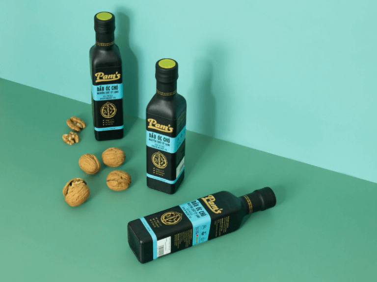
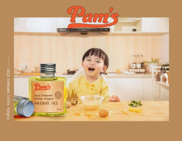
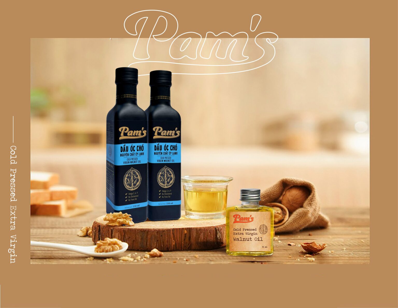
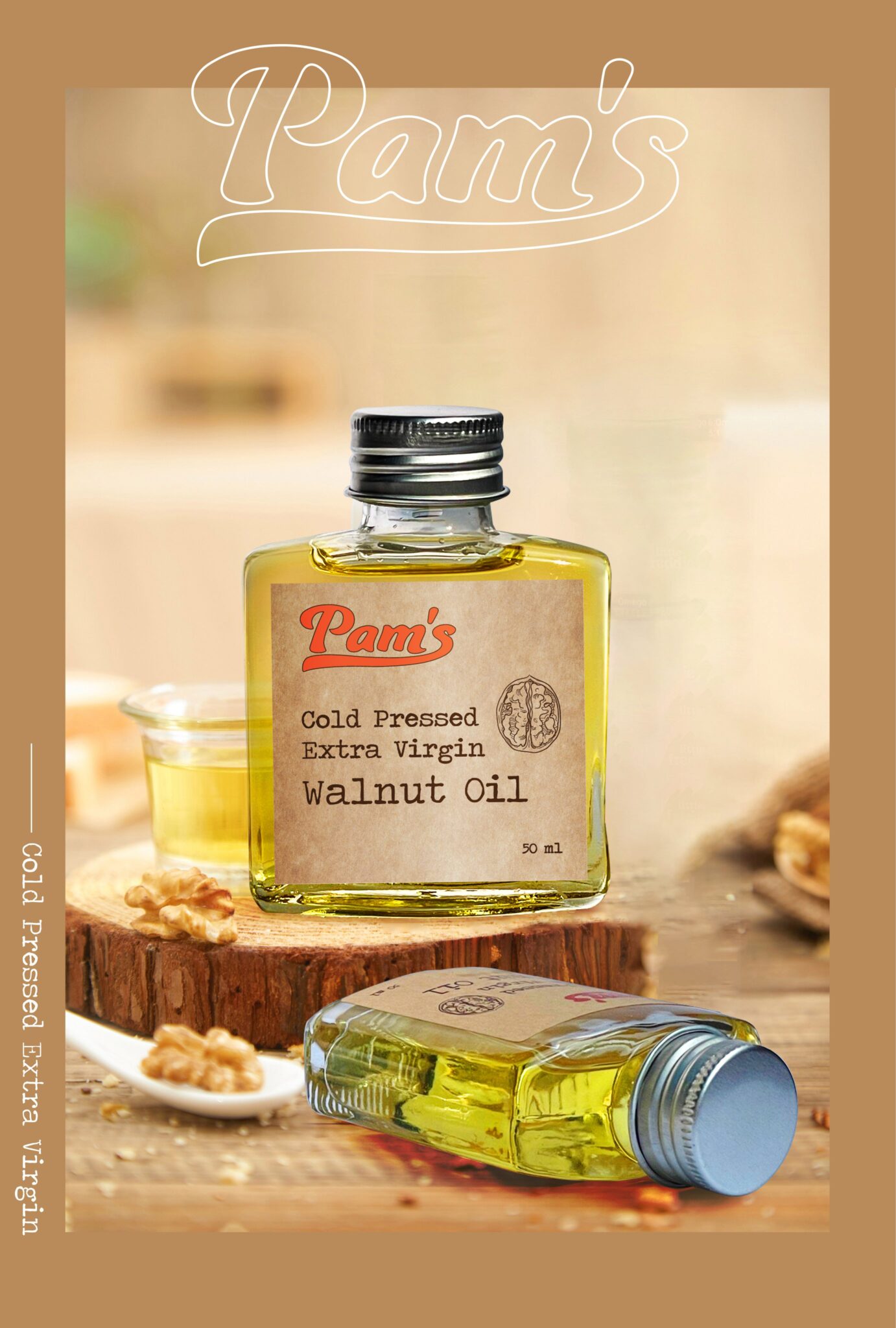
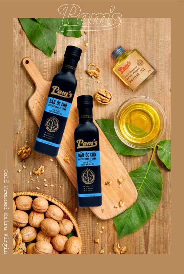
With the trust of the brand, BZC MARKET has undertaken packaging design for Pam’s walnut oil products in the direction of simple, modern, and eye-catching images. Pam’s walnut oil packaging is shaped with a slim bottle format. The dominant color palette used includes blue, black, and brown which are exceptionally associated with nature and relevant to the sustainable development goals of By Tran & Do.
In general, the packaging design of Pam’s walnut oil brings the feeling of minimalism and intimacy through a mixture of composition, shapes, and colors. The information about the volume and nutrients inside are placed in prominent, easy-to-read locations on the packaging to enhance the user experience.
