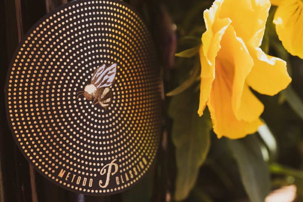
The bee, a symbol of nature, fertility, and industriousness, is the same put in the production of this “short” metodo classico. The graphics play on the optical effect of the concentric circles made in dots, at the fulcrum of which appears the bee protagonist of the label. The name deliberately plays with the location of the drink, suitable precisely for an aperitif.
In this project, the materials play an essential role. The bee is made of double foil @luxorokurz, gold, and bronze, and is worked in embossing. The dots and the logo are also in gold foil. The paper is a Tintoretto Black Pepper, suitable for the bucket ensuring that the label remains intact. Even the most straightforward graphics can become an essential communicative force if embellished with the right materials.


