REFINING AN AMERICAN ICON
Carlsberg Marston Brewing Company tasked Fun to refresh Shipyard, their iconic Portland Maine USA brand, for the UK market. The project required an evolution of their brand iconography on pack and across brand communications, to retain existing equity whilst broadening appeal across the full range of IPA, APA, Lager and alcohol free IPA.
The project included evolving the identity, to increase clarity and shelf presence, and generally boost standout in the on and off trade. We needed to introduce a clearer hierarchy of messaging and create strong style indicators, refreshing the brand overall to appeal to a wider audience.
Shipyard Brewery in Portland Maine, USA is now the state’s largest brewer and one of the US’s fastest-growing and has grown exponentially – in size, value, global reach. But this growth has caused complexity, and over time We saw the opportunity to strengthen this global icon.
The Brief:
We have an iconic brand but need some clarity, as the brand has become cluttered and confused. Our identity needs fine-tuning to help us scale faster across markets, without compromising the recognisable brand assets. Adding new formats and SKUs for new markets had watered down the identity and it was full of inconsistencies, with multiple brand marks and treatments in play and no real clarity on what the ‘master’ brand should look like. We need a consistent, future proofed design system that would deliver a more impactful brand experience.
What we did:
Maintaining the current brand equity was critical in this process to secure the brand’s existing base whilst moving the brand towards a more inclusive audience. The project involved careful refinements to the core brand identity, redrawing and simplifying, creation of multiple packaging formats, secondary packaging and POS materials. Working closely with the multi-agency Carlsberg Marstons team here in the UK, as well as the Shipyard Brewing team in Portland, Maine, USA.
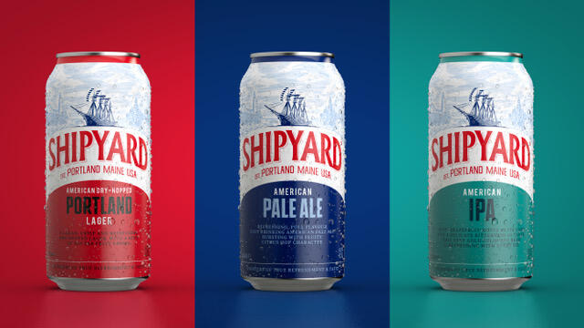
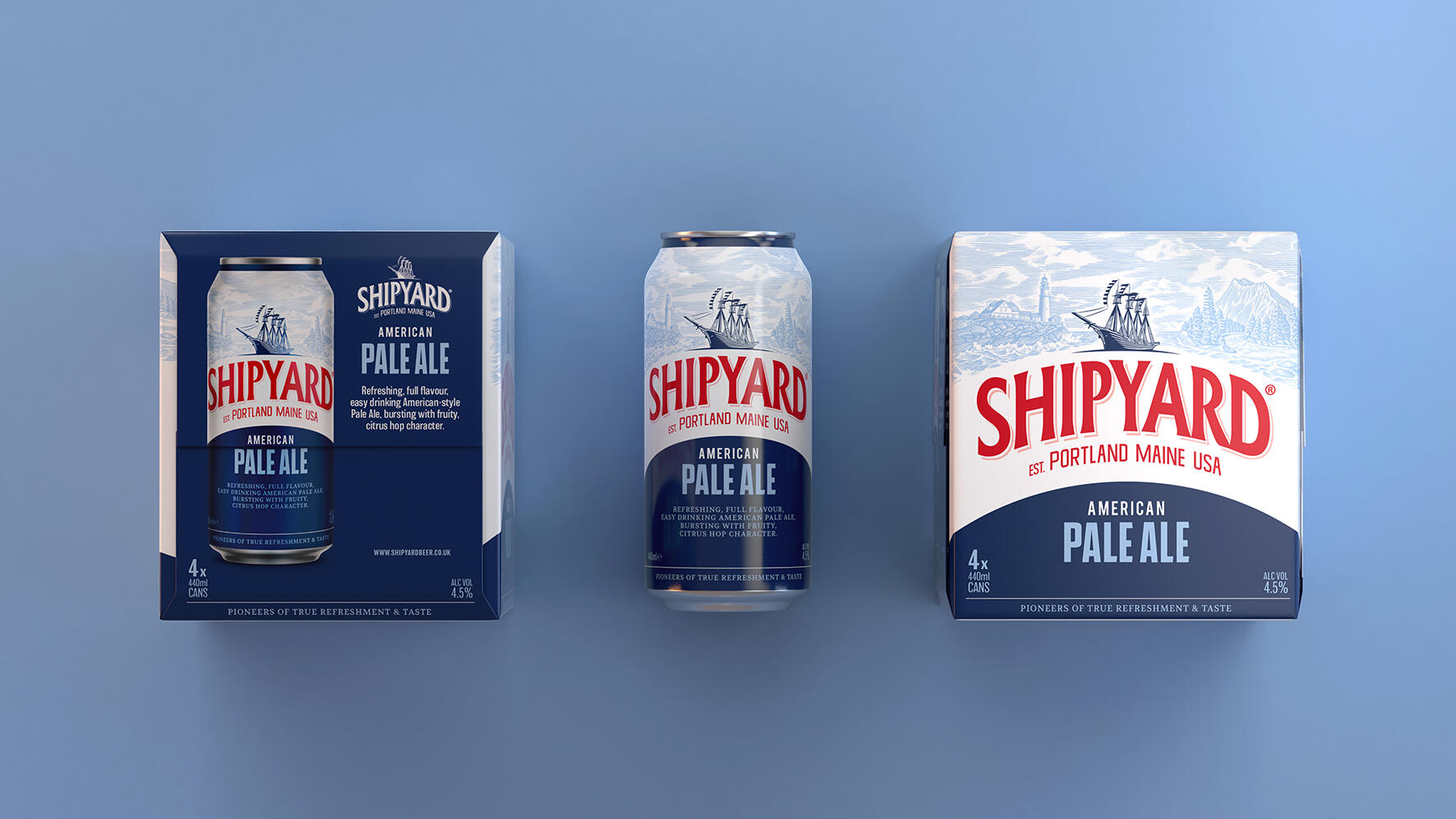
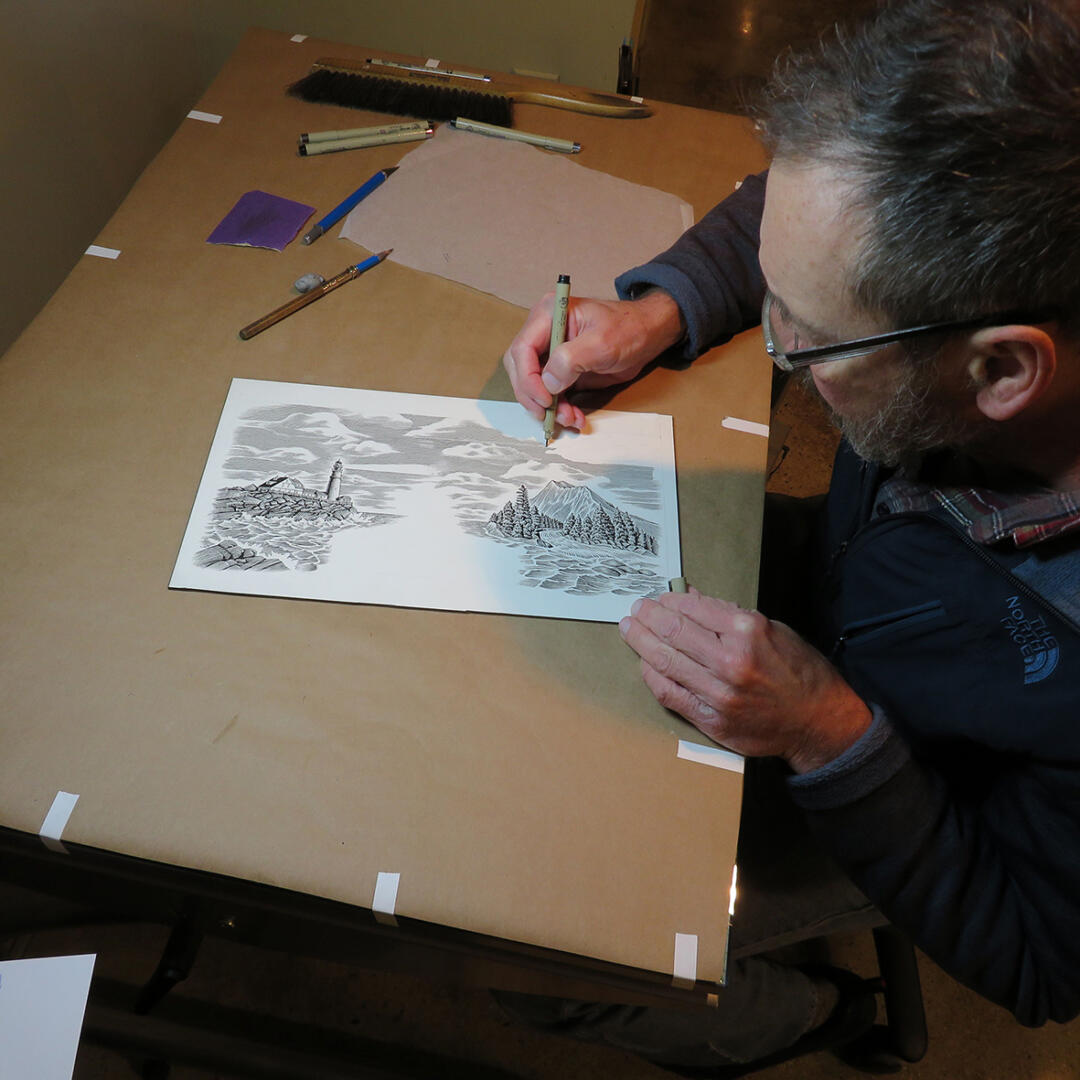
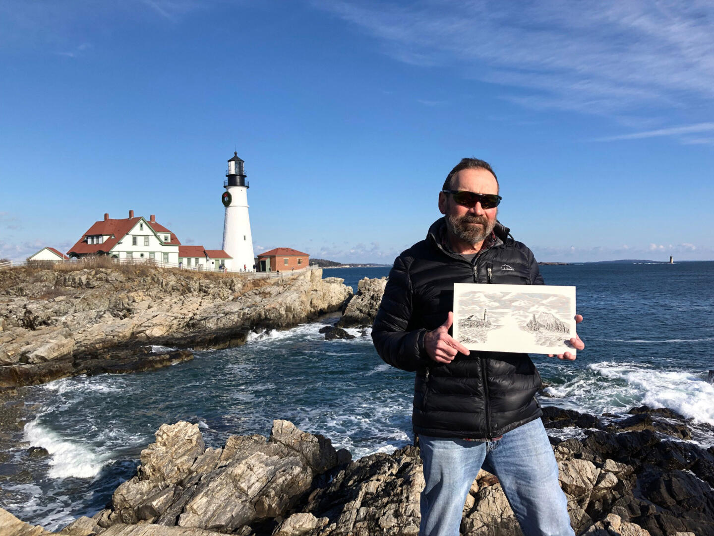
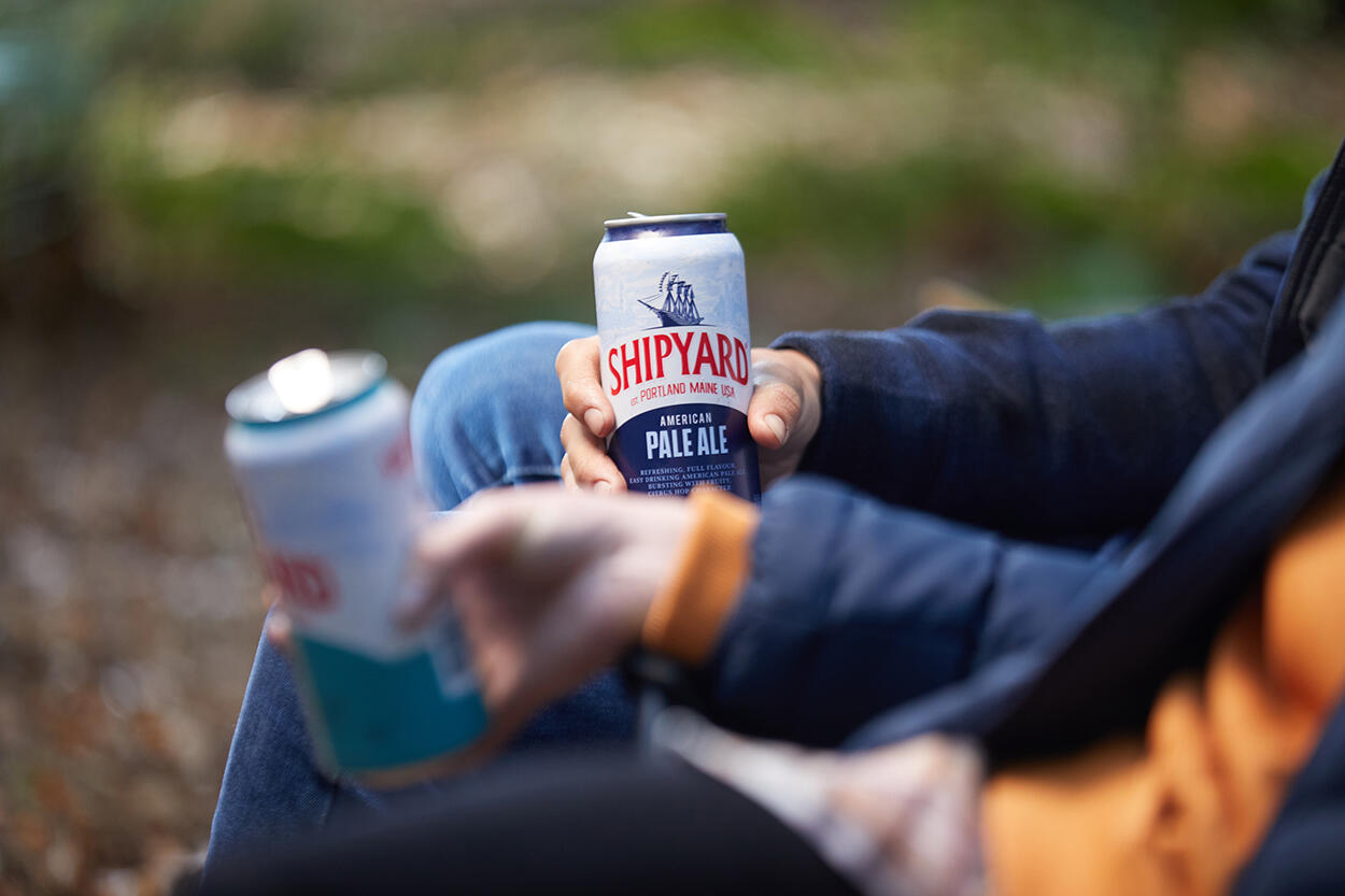
We commissioned the illustration with Portland Maine based illustrator, Bruce Hutchinson, who’s contemporary illustration reinforces the brand’s authentic heritage message across elements. The Federal Jack, Shipyard’s iconic schooner was also tweaked and refined and is now stronger, more contemporary and importantly, reproduces faithfully and consistently across all necessary sizes and applications.
We consolidated the brand mark, simplified the identity to create a consistent and rigid identity. We also remind the illustration. There had been issues with reproducing the illustration across substrates, and also research suggested the consumer was confused as two what the illustration was depicting.
Alongside strengthening the identity for clarity across all formats, we developed clear and systematic design principles, to make the brand easier to spot and the beers easier to shop.
Creating clear rules for logos, typefaces and colours, the design is now unified across multipacks and all their other key sales formats for better recognition and shelf stand out.
Deliverables:
– Re-freshed identity
– Packaging refresh across multiple SKU’s
– Outer packaging for great shelf standout
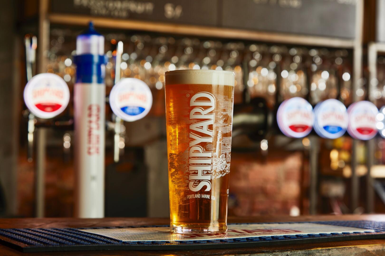
– Pump/Font design
– Glassware design
– POS
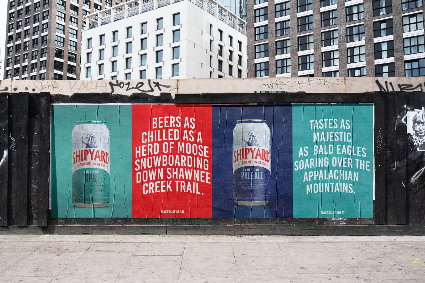
– Tone of Voice