“More than just a beer brand”: Robot Food refreshes Danish cultural icon Tuborg
Robot Food has refreshed the branding for Danish beer brand Tuborg, working to unify and strengthen the entire brand world to ensure its relevance for Danes today.
The Leeds-based strategic branding agency was contacted by Tuborg’s head of brands in September 2020, winning the project following a three-way pitch and working on it throughout 2021. “I think we were in there because they wanted a new perspective on the brand,” says David Timothy, Robot Food Managing Director. “Tuborg is a Danish cultural icon — it’s more than just a beer brand.”
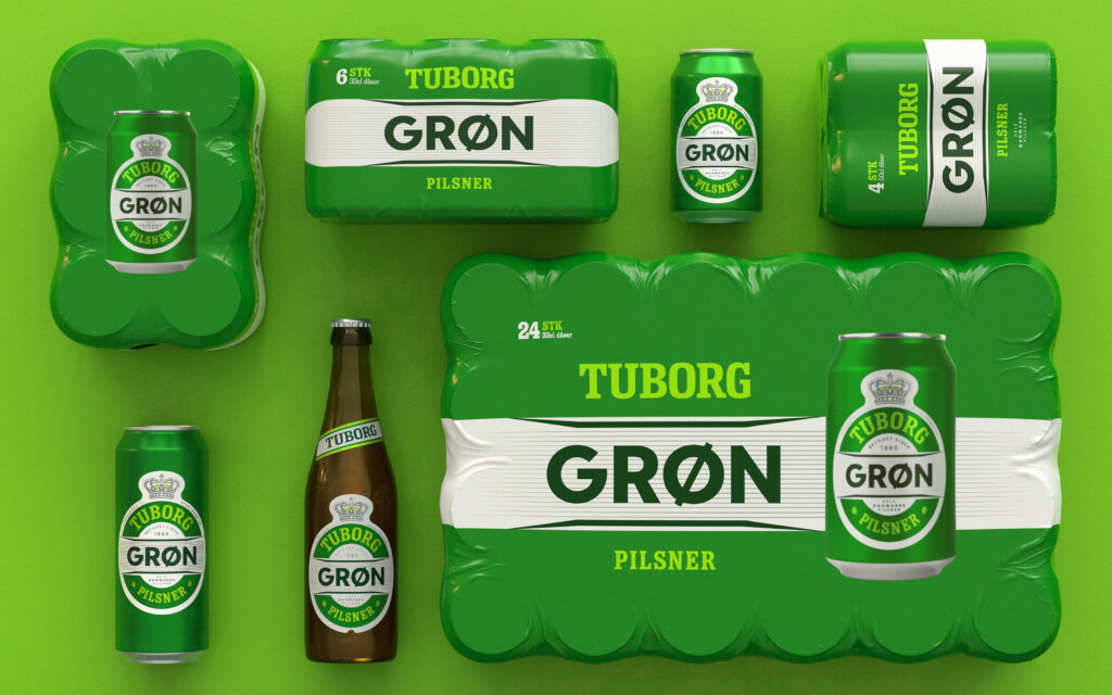
The refreshed designs look to emphasise Tuborg as a “proud parent brand,” as Timothy puts it, harmonising the primary packaging around the brand’s ‘clockman’ device — a well-known icon in Denmark. The agency also introduced a redrawn Tuborg wordmark, which was created with assistance from typographer Rob Clarke.
“By consistently applying these two assets we created headroom to express the individuality and often longstanding personality of each beer, whilst never losing the link to the parent brand,” says Timothy.
Tuborg’s core range comprises four core beers (Grøn, Classic, Guld, and Nul) and two seasonals (Julebryg and Paskebryg) as standard, and Robot Food also worked on designs for three new range extensions: Nul Fruit, Grøn Organic, and Guld Passionfruit. Grøn (or ‘green’, the standard lager) and Classic together equate to around 88% of Tuborg’s sales.
Not just for dads
The brief was centred on making category leader Tuborg more relevant to all Danes today — as well as increasing on-shelf standout and recognition. It was also vital that Tuborg retained its existing loyal customer base, while recruiting new consumers into the category.
Like many beer brands, Tuborg had concerns that it was losing relevance — especially among younger consumers. This chimes with the broader global trend among drinkers aged 18-25 of a more ‘all or nothing’ mentality rather than the ‘little and often’ approach of older generations.
“Lots of new drinkers or potential new drinkers are coming to the category and either choosing not to drink at all or looking at alternatives. Tuborg, like other brands, was losing favour with that demographic” says Timothy. “Drinking the beer your dad drinks can feel like the antithesis of cool.”
Classic Scandinavian design values
Prior to this refresh, Tuborg hadn’t undergone a holistic brand refresh for decades, which had led to something of a mishmash of different styles across individual products, packs, touchpoints, sizes, and variants.
“There’s a sense of classicism in Denmark: if you look at the fundamentals of things like furniture design, the style and aesthetic doesn’t really change much over time” says Ben Brears, Robot Food Creative Director. “You do it once, do it well, then just polish it a little bit.”
Robot Food’s challenge with Tuborg was in navigating numerous different design elements that had varying degrees of resonance with consumers.
Initially, the Robot Food team set about ‘deconstructing’ the incumbent Tuborg designs, looking at everything from shapes to colours, fonts, placement of design elements, and the architecture of individual labels, going on to boil everything down to a ‘kit of parts’.
Once deconstructed, Robot Food examined which elements to amplify and which to pare back to create simplicity and ensure that the strongest, most recognisable and iconic elements came to the fore.
A prouder Tuborg flag
Alongside creating the new packaging design system, Robot Food also built a full brand world for Tuborg that extended across on and off-trade communications, photography, merch, and digital platforms.
The brand world needed to unite the various Tuborg ranges under a prouder Tuborg flag that felt more relevant to modern consumers, while allowing each range to be expressive and distinct to its individual usage occasion.
The brand positioning was based around the idea of “fællesskab”, or community, with the beer shown to play a vital role in uniting people from all walks of life. This was brought to life for the brand world executions through a creative idea that Robot Food dubbed “in the action” – placing the consumer at the heart of the moment through reportage-style photography with an unfiltered, spontaneous aesthetic that celebrates togetherness in a way that’s unique to Tuborg.
The agency also took the brand’s iconic ‘clockman’ asset off-pack for the first time, putting it at the heart of the Tuborg universe and using it as a lens through which to access that sense of “fællesskab”With the ‘clockman’ in place as a unifying and consistent brand element on- and off-pack, Robot Food then worked to amplify the personality of each beer, dialling up the nuances in activations and image styles appropriate to each beer variant.
“Don’t throw the baby out with the bathwater”
Robot Food was aware that as a British agency approaching a Danish icon, ultimately it was about listening to the brand team and the consumers themselves.
“We were brought in to offer a fresh perspective and not be led by what they had before, but you’ve always got to be respectful” says Brears. “A great client is one who’s really open and listens to what you’re saying and loves to be challenged, but who knows the consumer really well and helps you find that sweet spot. For some, these changes might seem minimal, but it was never about throwing the baby out with the bath water. The assets and system we’ve been able to establish helps set Tuborg up for a really progressive future”.
“A good redesign is often about understanding the assets you’ve already got and amplifying them in new ways,” Timothy adds. “Our job is to listen, learn, and understand just as much as it is to come up with interesting creative. That’s when the relationship really works, because the client trusts you to know where you can push it, and also where you have to rein it in.”
Louise Dandanell, Marketing Manager at Tuborg Denmark says, “The past two-ish years have been some of my best at Carlsberg. From the first pitch to where we are today, Robot Food’s understanding of our local needs and vulnerabilities, dedication, craft, and (most importantly) sense of humour have made the process such a joy. It’s very easy for us to be happy clients – every meeting is like spending time with family.”
The new designs began to roll out in Denmark for the core brands from early 2022, and the rest of the packaging designs and brand world elements such as the new photography style, point of sale materials, advertising, and merchandise are currently being rolled out.


