Mol Design Studio is very pleased to present the new restyling work for the packaging of Extra Virgin olive oil from the “Oleificio San Marco” located in Salento at the Puglia Region of Italy.
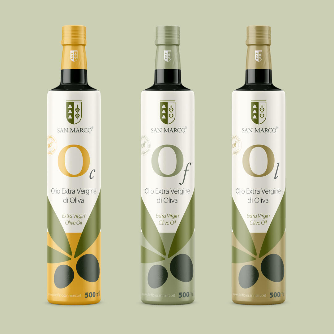
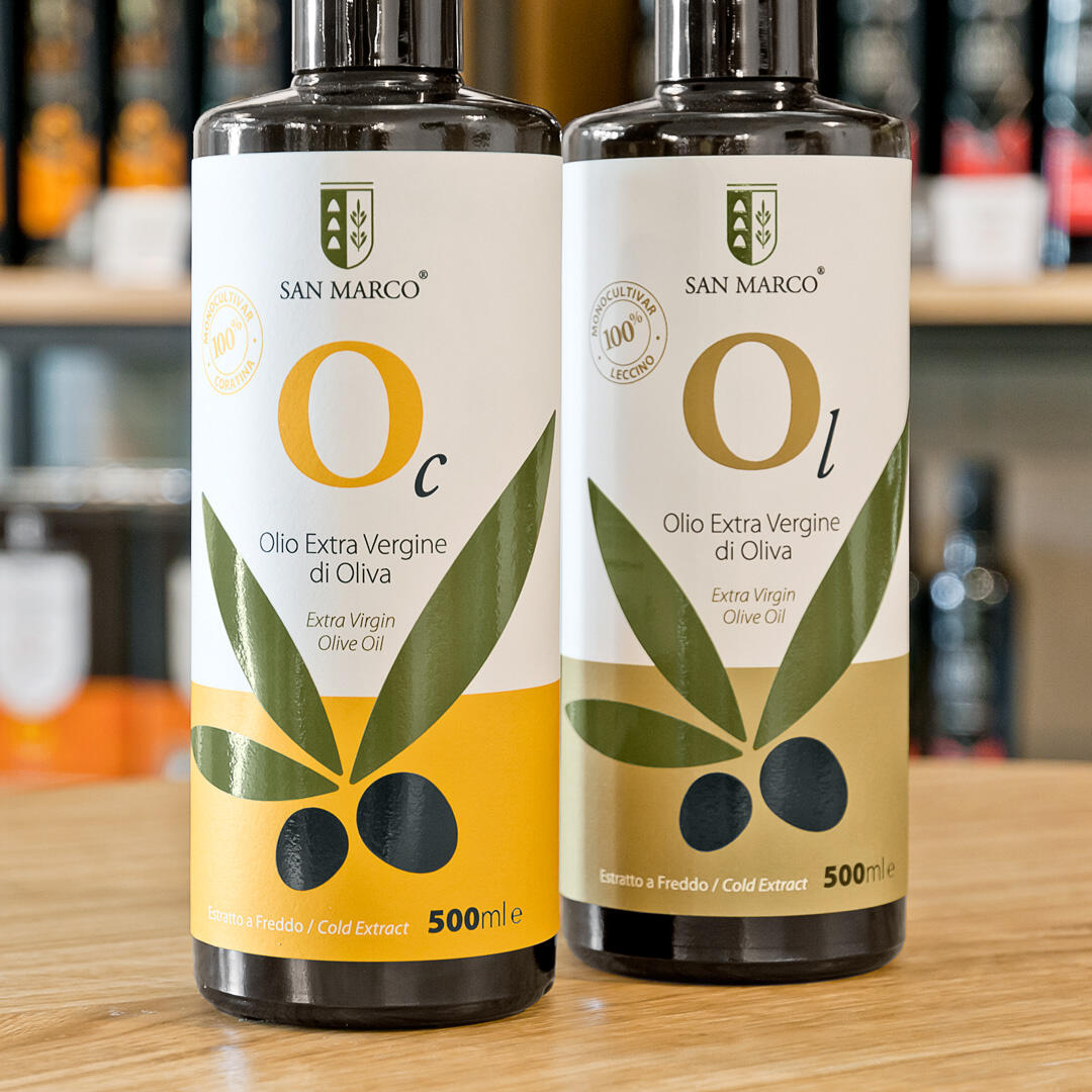
In this particular case, we did a total refresh of the brand because it was a bit old and confusing. The bottles were also very different from the cans and the client wanted to obtain a more professional, unique and modern image. Something that for them wil be “avant-garde” and timeless. For this, the first thing that we did was to create a totaly new color palette that has as its source of inspiration the light brown shades of the “salentine” land, the green and silver leaves of the olive trees and the yellow sun of the countryside.
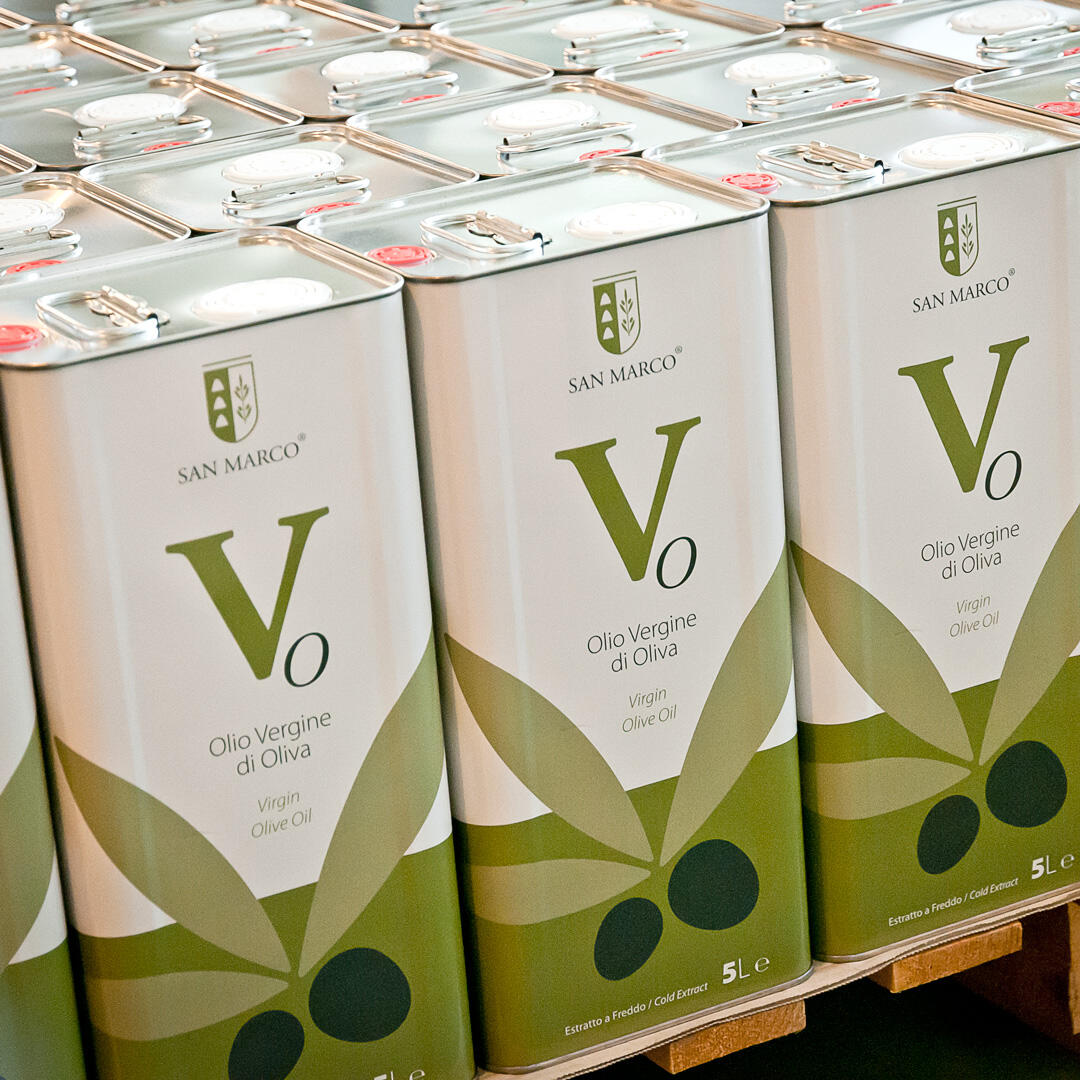
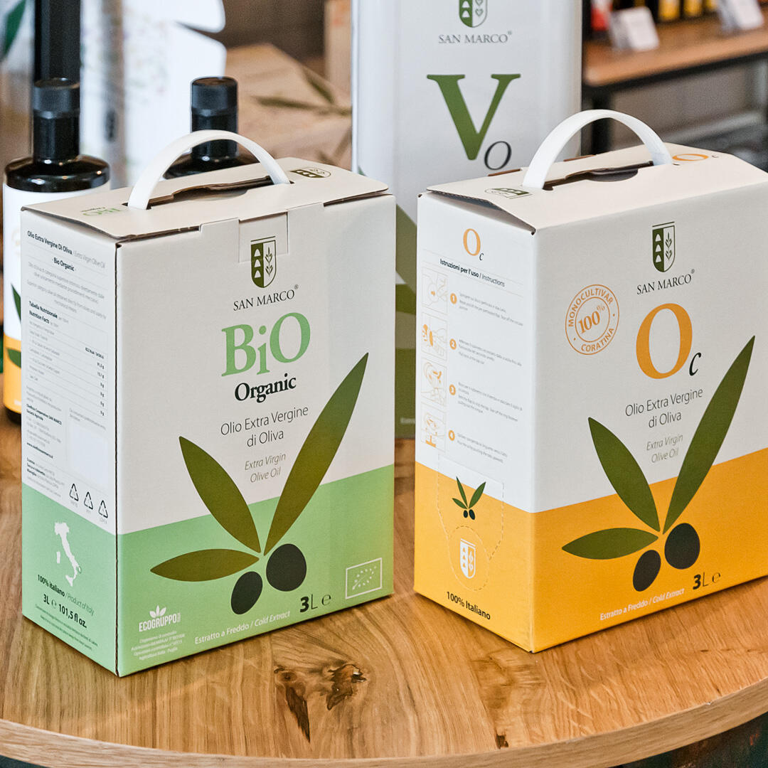
Each color is assigned to a different variety of Extra Virgin Olive Oil. In this case they had five varieties:
- Light Brown for “Leccino” variety
- Pastel Yellow for “Coratina” variety
- Silvery Green for “Favolosa” variety
- Pastel Light Green for the Bio (organic) Extra Virgin
- Dark Gray for the Normal Extra Virgin Olive Oil
In addition to color, for each product was assigned a letter. The “O” stands for “oil” and the cursive letter for the variety. “L” Leccino, “C” Coratina, “F” Favolosa. Finally “Ev” for Extra Virgin.
All these are design considerations that pursuits not only to help the consumer in the selection of products, but also a visual cleanliness in the presentation of the Extra Virgin Olive Oil.
This new image gives to the “Oleificio San Marco” a unique and recognizable presentation in the market.