The Labelmaker: Kamea Selection Wine Label Design
Kamea Selection is the latest brand by Kamea Winery dedicated entirely to their premium wines in portfolio.
We did not want to change completely the existing wine label design. We were looking for an upgrade that preserves the main composition and character of the existing labels but at the same time one that would make them look more serious and luxurious.
This is how we came up with the idea to pay some extra attention to the materials that we used.
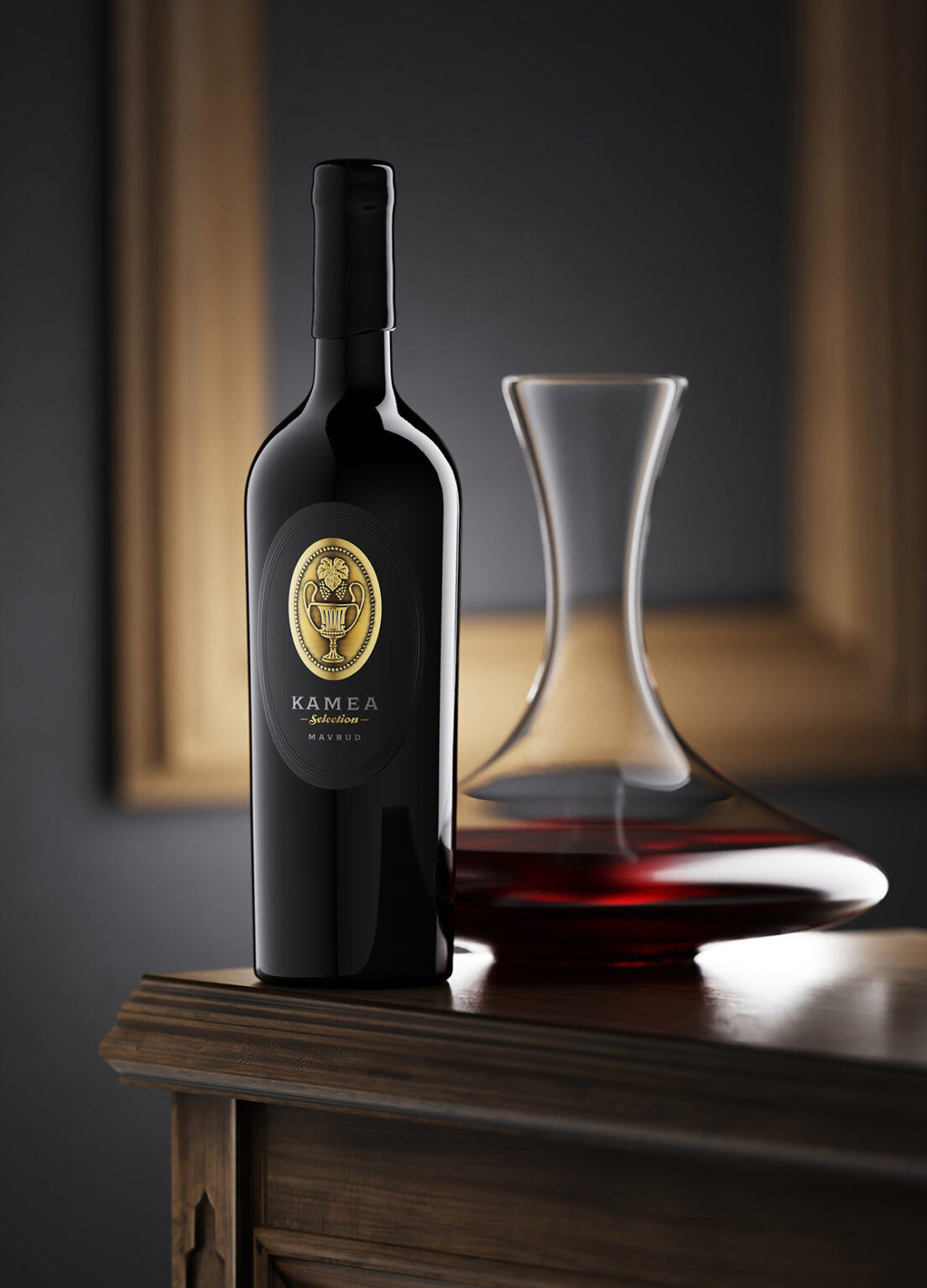
The new design consists of two layers of paper assembled in one label which is new awesome feature delivered by my friends from Dagaprint. The background label is printed on black pulp soft touch paper while the front label is printed on thicker metal foil with very strong and visible sculpted embossing. I also added some hand-made shades around the embossed zones in order to make them pop out even more.
I also replaced the existing thyrsus image with an illustration of an ancient vessel for drinking wine because I wanted to make the new Kamea Selection wine label design look more different and more special than the existing one.
Last but not least, we used the same type of tapered bottle but this time we sealed the wine with cork and instead of a tin capsule, we added semi-matte sealing wax on top.
The result from all this changes is a new wine label design that inherited and upgraded the visual tradition from Kamea’s current labels.
I played a lot with the new materials I used for this project aiming to deliver bolder premium looking design for this amazing wine.