The Unlocked Tradition
Background:
Monteko Winery, nestled in the scenic town of Kratovo, North Macedonia, is a premium wine producer known for its sustainable vineyard practices and meticulous winemaking processes. The winery’s vineyards benefit from an ideal combination of steep terrain, abundant sunshine, and clean air, contributing to the exceptional quality of its wines. Among its offerings, the Monteko brand stands as a flagship expression of the winery’s dedication to craftsmanship and the unique terroir of North Macedonia.
The Wine:
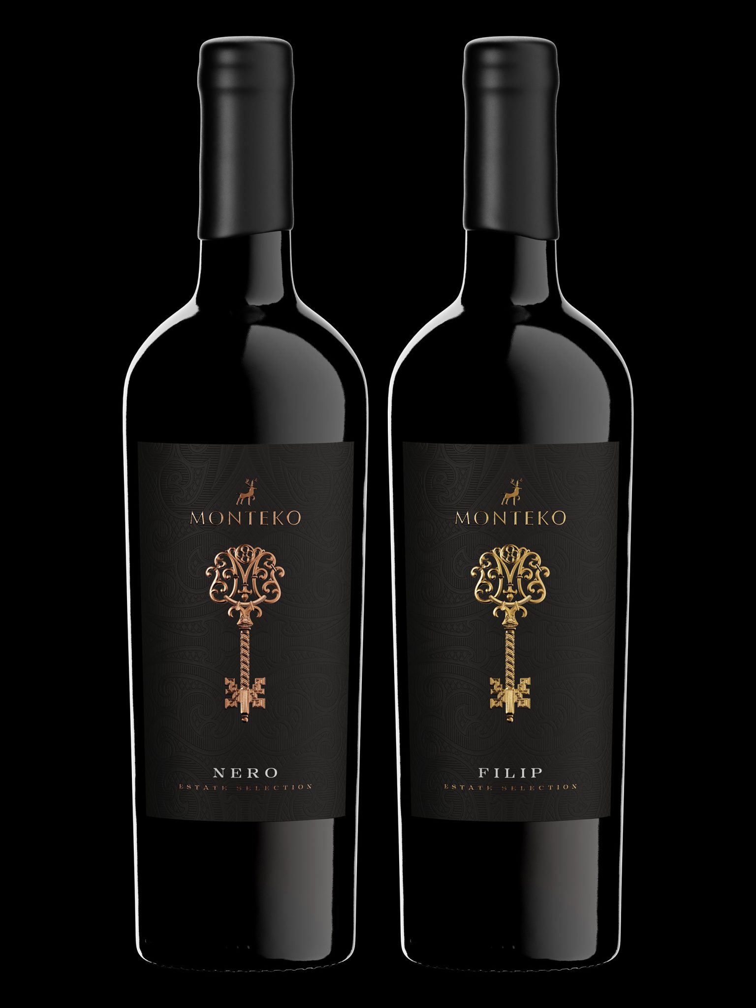
Within the Monteko brand, two standout wines, Nero and Filip, represent the pinnacle of the winery’s red wine segment. These wines are crafted with precision and a deep respect for tradition, positioning them as premium choices for discerning wine enthusiasts.
Design Thinking:
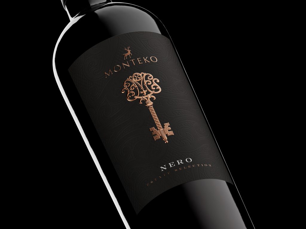
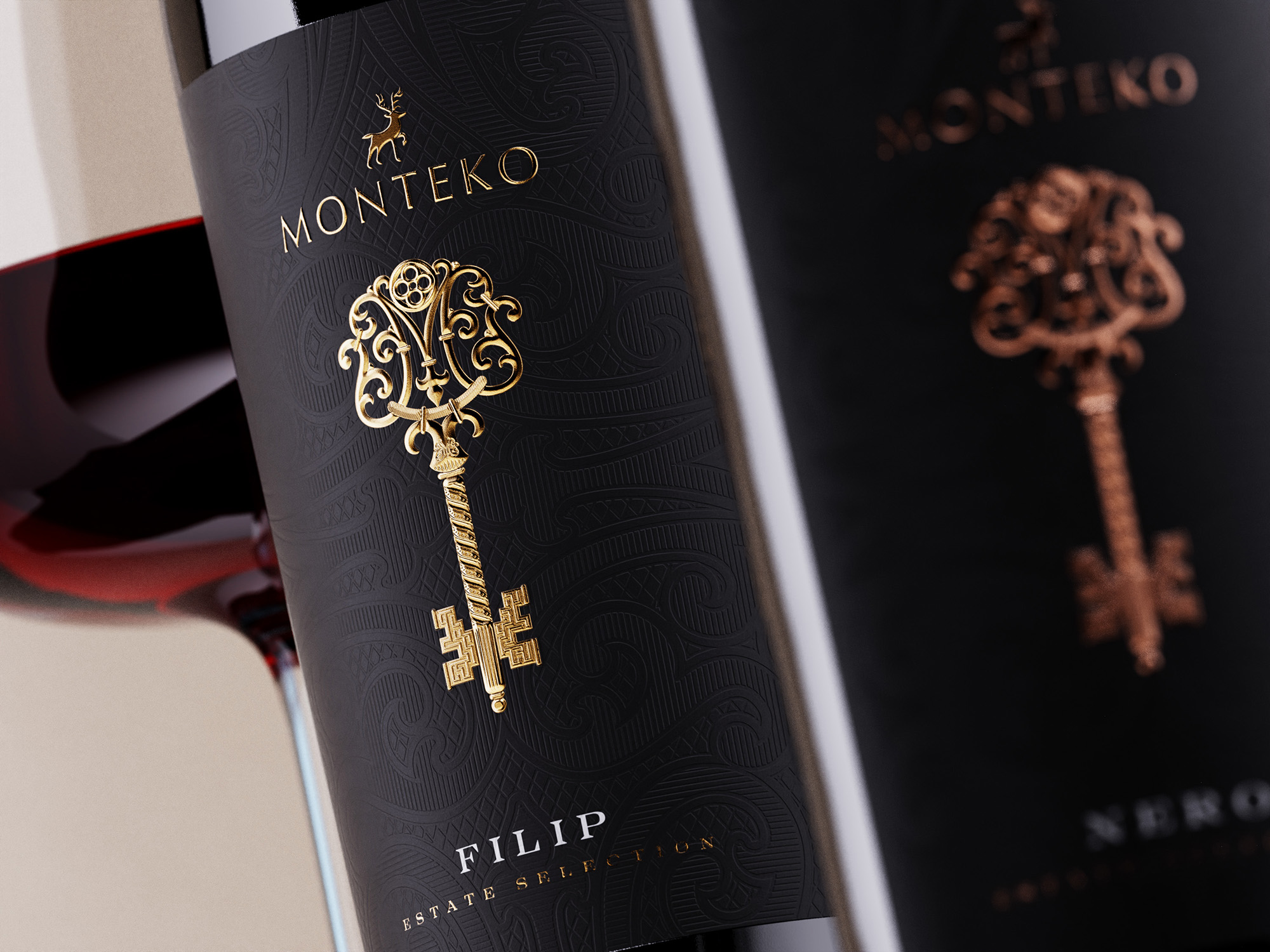
The label design for Monteko wines reflects the same balance of tradition and innovation found in the wines themselves. The design is bold yet elegant, featuring a soft-touch black paper that gives a smooth, luxurious surface. This tactile experience is enhanced by an intricate, debossed decorative pattern that covers the entire label, adding depth and sophistication.
At the center of the design is the Key, the focal point of the label. This key is more than just a visual element; it is a carefully crafted symbol of the brand’s ethos. Exclusively designed for this wine series, the key incorporates a hand-made M-letter monogram at the top, symbolizing the winery’s commitment to both craftsmanship and exclusivity.
Craftsmanship:
The key is a masterpiece of ornamentation, featuring intricate decorations and detailed engravings that elevate it to the level of fine art. A 3D-effect embossing with multiple levels creates a sense of depth, making the key almost lifelike. Micro-engraved textures further enhance its intricate design, while the use of rich gold foil for Filip and warm copper foil for Nero not only differentiates the two wines but also maintains a consistent, premium aesthetic.
Each wine is bottled in a classic tapered heavy bottle, sealed with cork and finished with a semi-matt black wax seal, ensuring the packaging reflects the quality and care invested in the wines.
Print Challenges and Successes:
The label was printed by Dagaprint, a print house renowned for its ability to handle bold and intricate design challenges. Bringing this complex label to life required precision, particularly in executing the debossed patterns, 3D-effect embossing, and application of the metallic foils. Dagaprint’s expertise ensured that every detail—from the smoothness of the soft-touch paper to the gleaming foil accents—was realized to perfection.
Favorite Details:
The standout feature of the Monteko label is the Key, a symbol of quality and tradition. The 3D embossing and micro-engraved textures give it a unique, tactile richness, while the contrast between the gold and copper foils creates a subtle but effective differentiation between the two wines. This attention to detail, combined with the luxurious soft-touch paper and the bold yet elegant design, positions Monteko as a premium brand that stands out both on the shelf and in the glass.
Conclusion:
From its rich wines to its meticulously crafted label, the Monteko brand is a celebration of quality, tradition, and craftsmanship. Each bottle of Nero and Filip is a reflection of the winery’s dedication to producing wines that not only taste exceptional but also deliver a sensory experience through their design. With its masterfully crafted key design, intricate textures, and luxurious packaging, Monteko offers more than just wine—it offers a piece of art, a nod to tradition, and a promise of excellence.