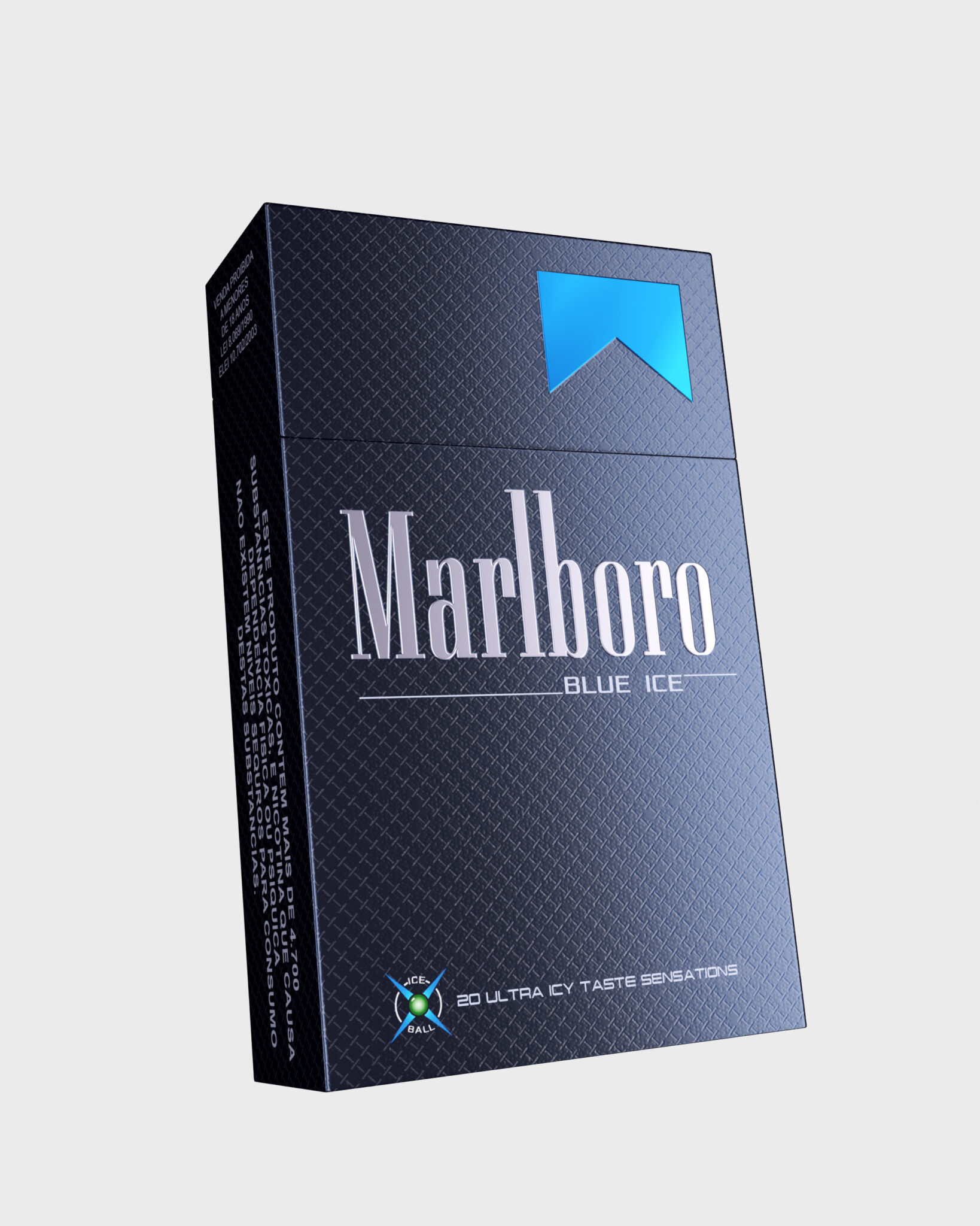
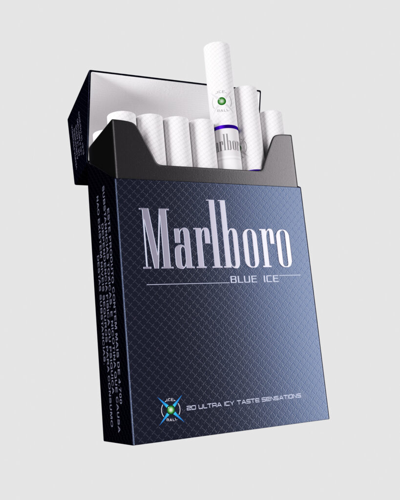
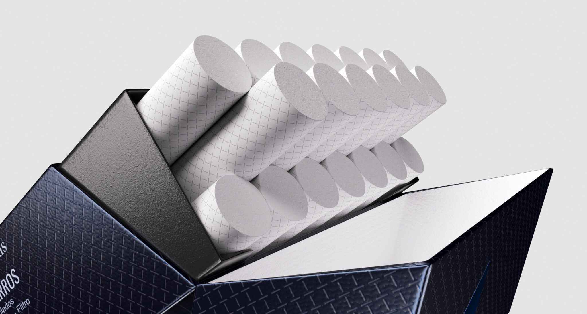
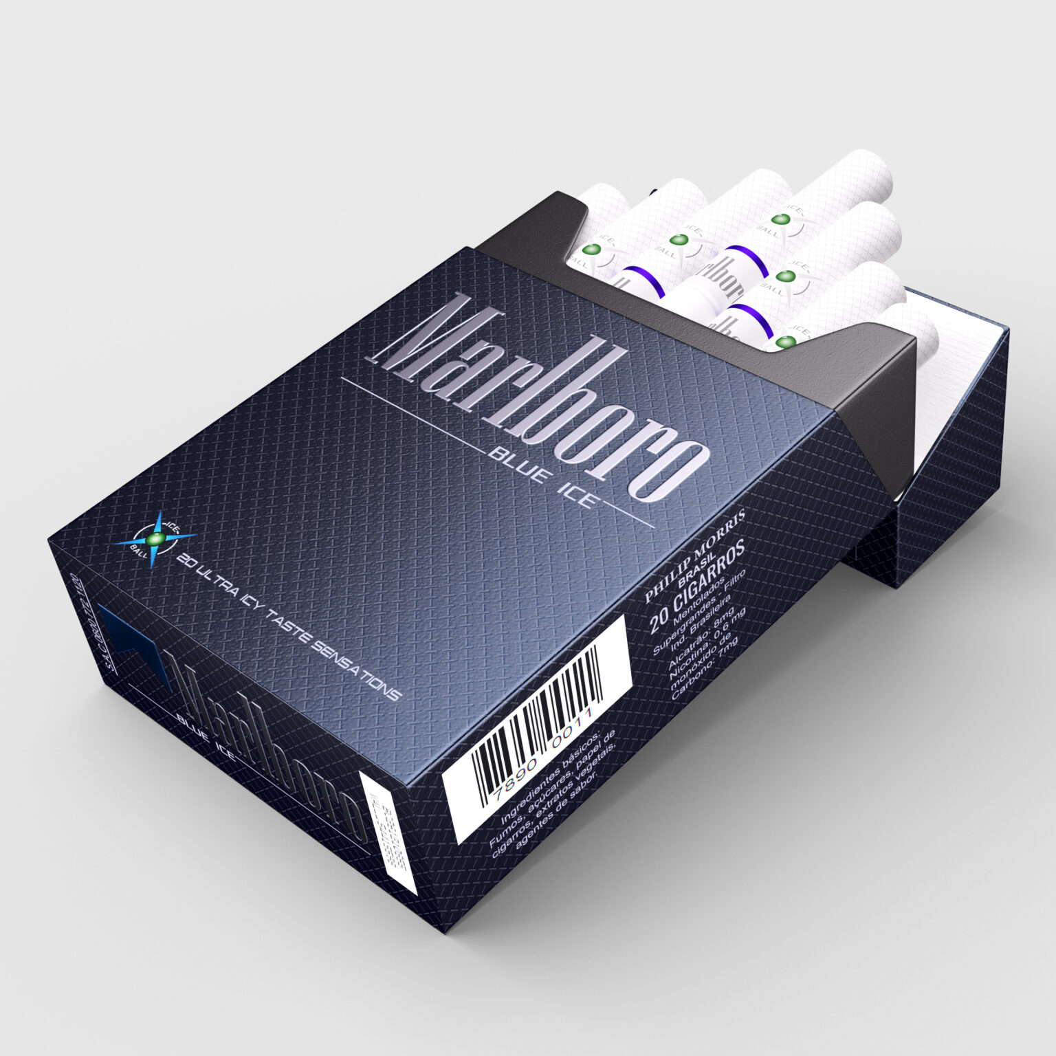
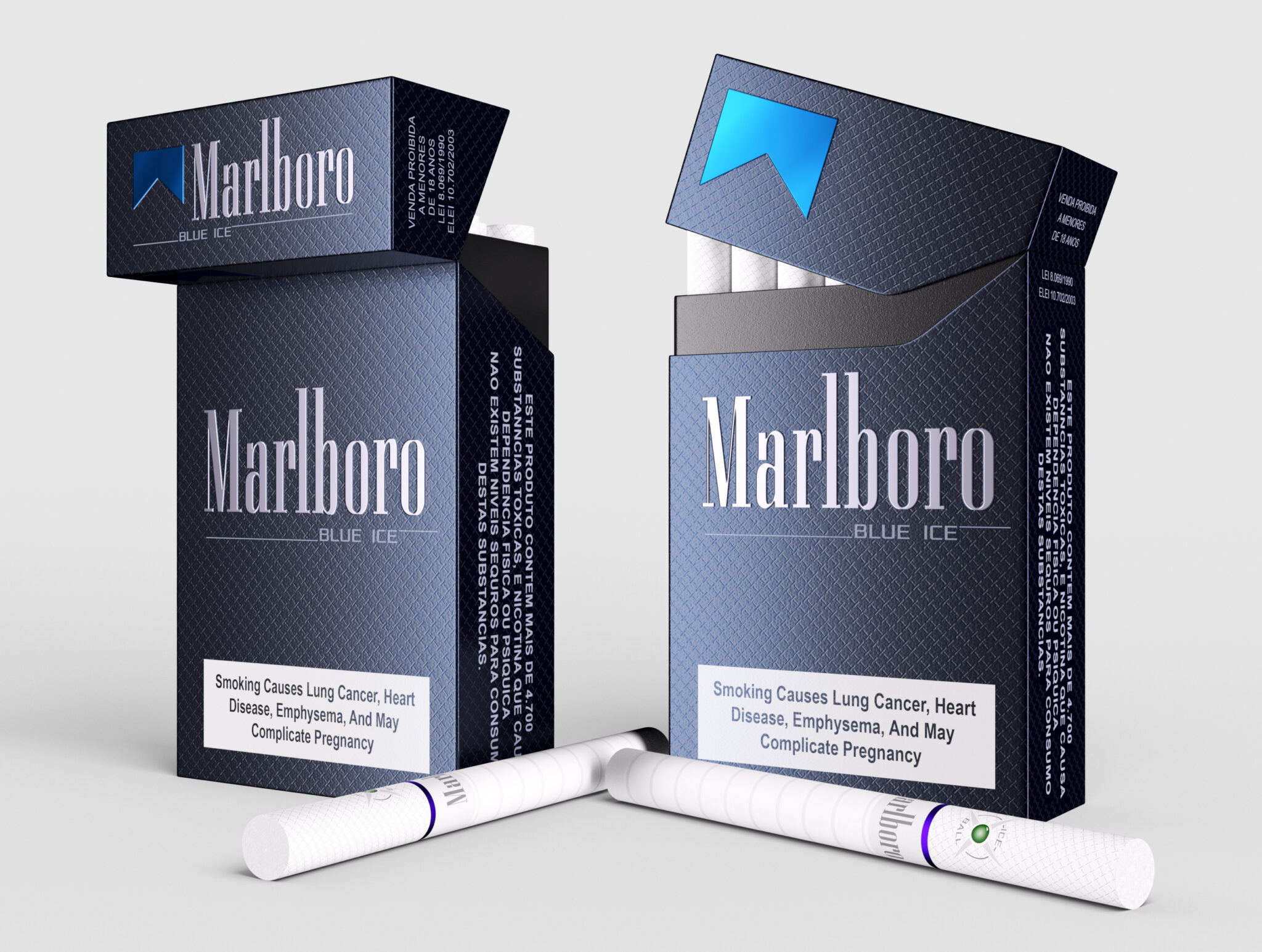
For this project, my goal was to create visually appealing images of the Marlboro Blue Ice packaging. I was particularly drawn to the packaging’s dominant blue color, which represents the “blue ice” flavor of the product, and the intricate pattern on the cigarettes. I wanted to showcase this feature in a visually compelling way. It is important to note that my project is not intended to promote smoking, as I am fully aware of the associated health risks.
To create my images, I carefully examined the existing packaging and focused on capturing its key features, including the dominant blue color that represents the product’s “blue ice” flavor. My aim was to highlight this feature in a visually pleasing manner, without altering the original design or color scheme.
I believe my images offer a fresh perspective on the Marlboro Blue Ice packaging, showcasing the product’s dominant blue color in a visually appealing way without endorsing smoking in any way.
