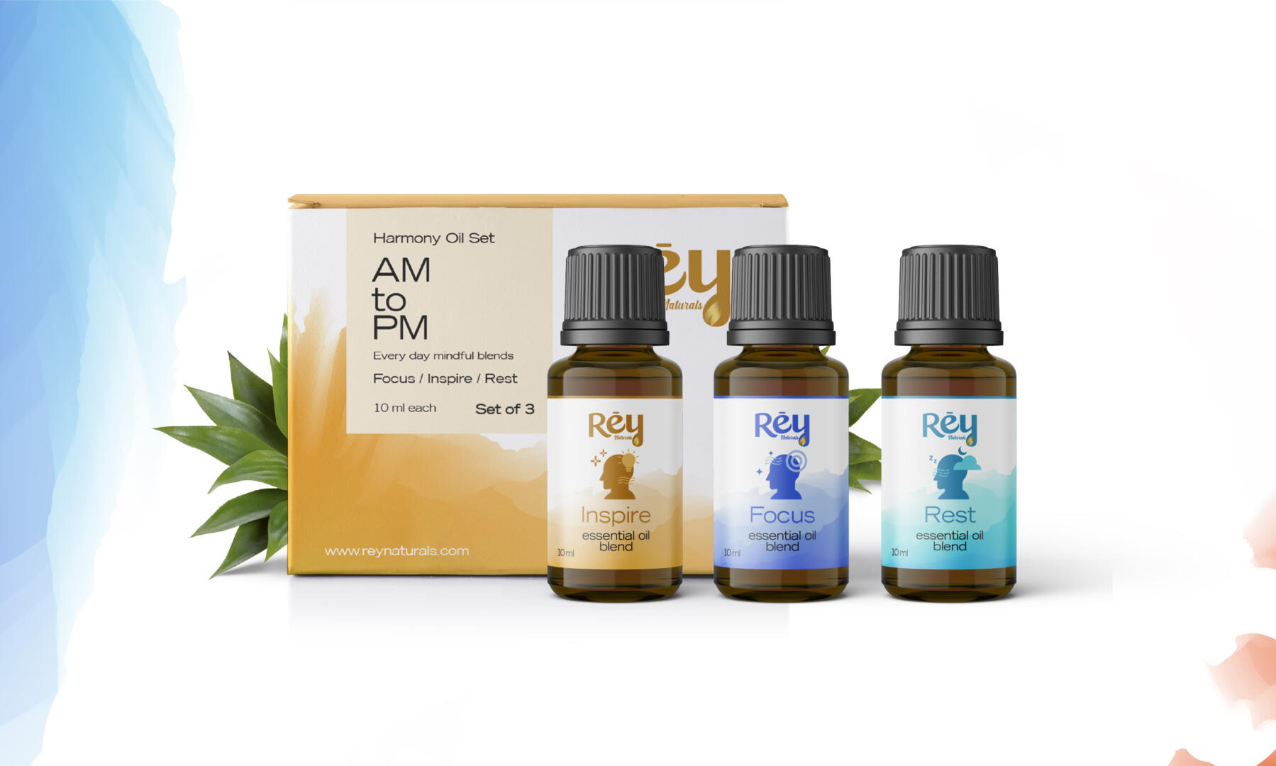
A minimal and aesthetic packaging design for Rey Naturals Essential oils with a textured mountain background looks visually striking and memorable. The packaging design features a simple, clean layout with a white background, textured colour and a high-quality illustration of a mountain range in the background.
The textured mountain range is giving the packaging a tactile quality that adds depth and interest. The essential oil, branding and logo is placed in the center of the packaging design in a circular shape to draw attention to it. The font used for the label is clean and modern, with a sans-serif typeface that is easy to read.
The color scheme is simple and natural, using shades of blue and green to evoke the outdoors and the natural environment. The packaging has incorporated subtle gradients and textured shading to create a sense of depth and movement, making the mountain range appear more realistic.
Overall, a minimal and aesthetic packaging design with a textured mountain background helps to create a sense of calm and relaxation, aligning with the intended use of essential oils. It also conveys a sense of natural purity and authenticity, appealing to consumers who value natural products and sustainable practices.


