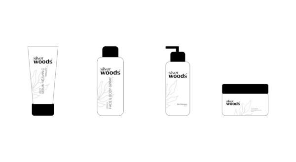
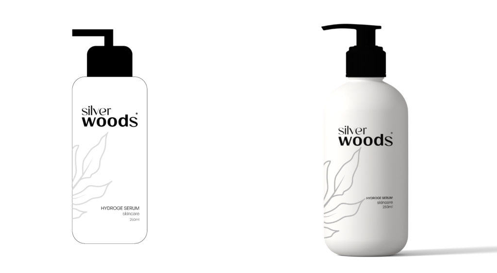
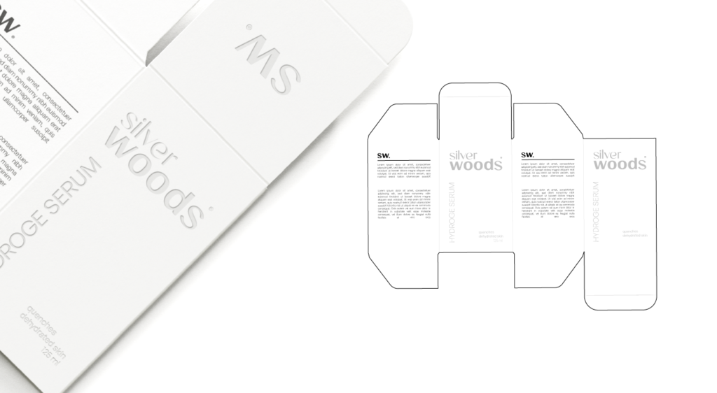
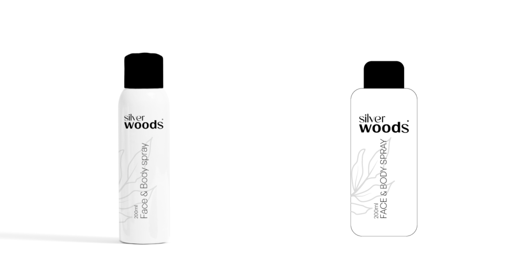
It is a new company in the field of cosmetics, specifically in the field of skincare. They have special and new products for skin care from natural materials, and from this point, the company was named by this name Silver Woods.
The challenge for me was getting this mark strong and clean. I made the logo based on the name Where I used the name SILVER, and it reflected the spirit of softness and femininity on it. And in the word wood, the power of the word was used to denote itself, with the addition of the letter S of silver to break the rigidity of wood.
In the visual identity, he relied on an important element, which is the tree branch, to indicate the nature of the products. I relied on black and white and their gradations to give a sense of cleanliness and clarity.


