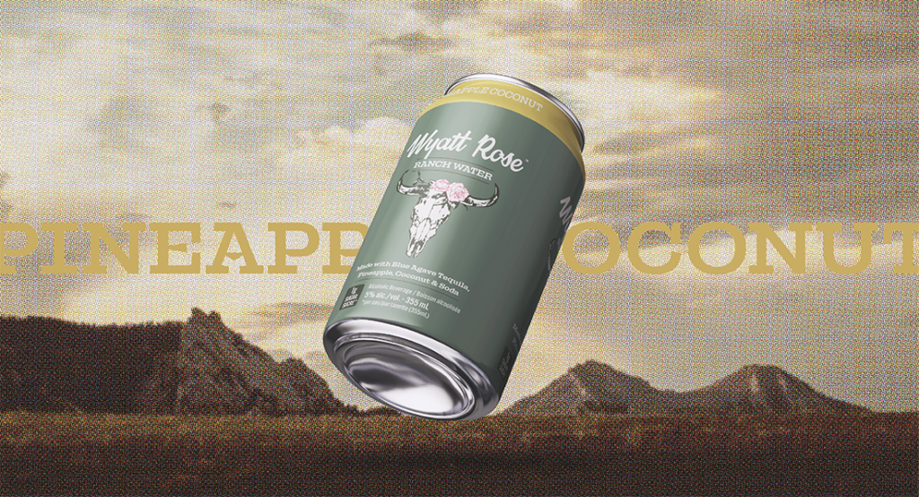
Working with the good people at Georgian Bay Spirit Co., I was tasked with designing new visual branding and packaging for a new-to-market product—Wyatt Rose Ranch Water.
Inspired by the Great Prairies of Western Canada, we developed the colour palette consisting of neutral greens with pink highlighting, a contemporary script wordmark that pairs nicely with an equally contemporary slab typeface and suggested custom illustration for the can artwork. I took the project from initial concepts to revisions and finally handed over polished concepts to the Georgian Bay team to take the project to the finish line.
A truly collaborative effort that resulted in a terrific product—both look and taste.