Porêves – Franco-Vietnamese cosmetic brand
ABOUT
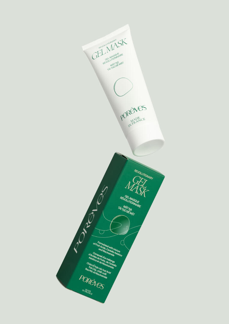
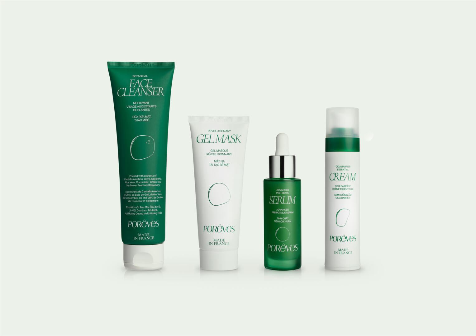
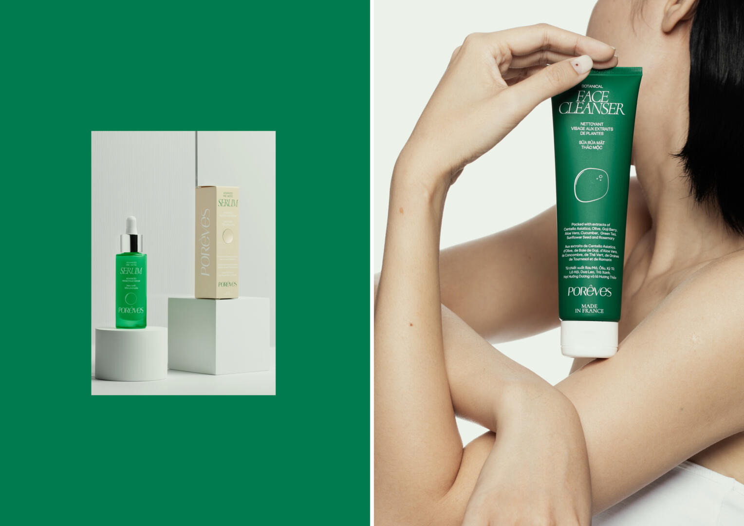
Porêves is a Franco-Vietnamese cosmetic brand specialized in the skin needs of Asians especially Vietnamese. Porêves was founded with the mission to be a bridge between the advanced French skincare industry and the medicinal heritage of Vietnam to develop protective, nourishing and unique solutions for specific skin problems. We accompanied Porêves for the development of their visual identity and its deployment on its first 4 first products: a face cleanser, a gel mask, a serum and a cream. For each product, we created and laid out their primary and secondary packaging.
ISSUE
One of the main challenges was to graphically translate the hybridity of Porêves:
- it is the result of a cultural mix;
- and also a fusion between French know-how and Vietnamese natural heritage.
The visual universe of the brand gravitates and plays between a scientific and vegetal aesthetic.
SOLUTIONS
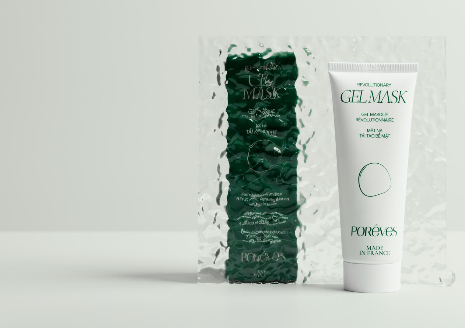
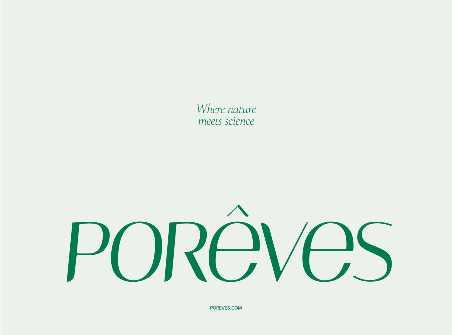
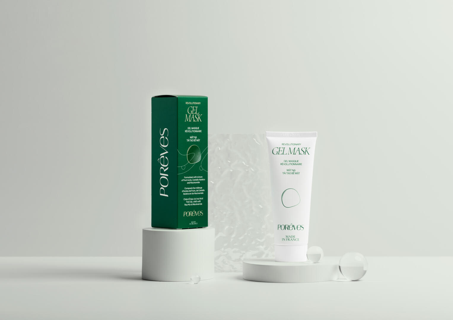
The scientific aesthetic translates into simple choices. We have opted for a clean layout and a clear information hierarchy. The typography used for “current” text is Be Vietnam (coincidence? We don’t think). Designed by native Vietnamese, it is perfect for an optimal reading experience for both French and Vietnamese text. To contrast with this lineal, the Cormorant typography is used for the name of the products. With its serifs, it gives a certain idea of French elegance. To make the link with the natural aesthetic of the brand, the letters have been tightened slightly and offer a more floristic appearance.
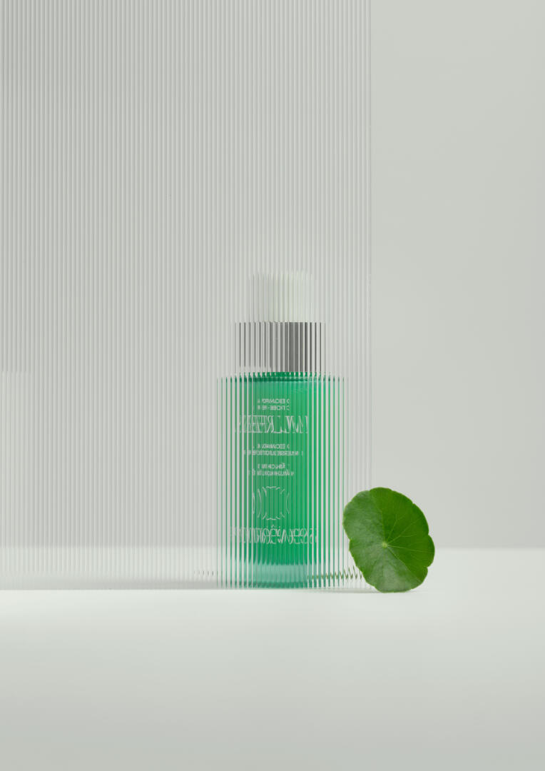
Graphic elements have been designed to accentuate the plant/foral dimension. On the secondary packaging, there are lines and circles that could evoke skin tissues and cells. This is an index given by the brand on the real action of its products: Porêves regenerate and hydratate Vietnamese skins. Also, each product is symbolized by a drop. This graphic element is impactful and its treatment is halfway between an echo of science and a pearl of water streaming over the plants of Vietnam.
Porêves is tinged with green. This green has the particularity, depending on the light and its support, of symbolizing plants as much as innovation and research. The color palette is completed with white, other shades of green, and beige.
With all these elements, Porêves takes on an authentic, refined and innovative image as a brand that cares about excellence in cosmetology and cosmetics.