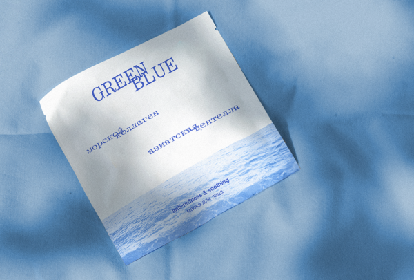
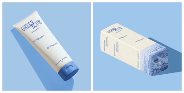
Concept package of skin care cosmetic line
The primary purpose of brand is to use natural ingredients – treasures of the ocean and earth. Naming reflects this idea – green for the earth and blue for the ocean
The visual metaphor is mixing ingredients together to create perfect skin care, that’s the reason why words are connecting with each other in this non-commercial project I used 2 fonts: Kommuna and Helvetica.