Oma Care Branding / Packaging
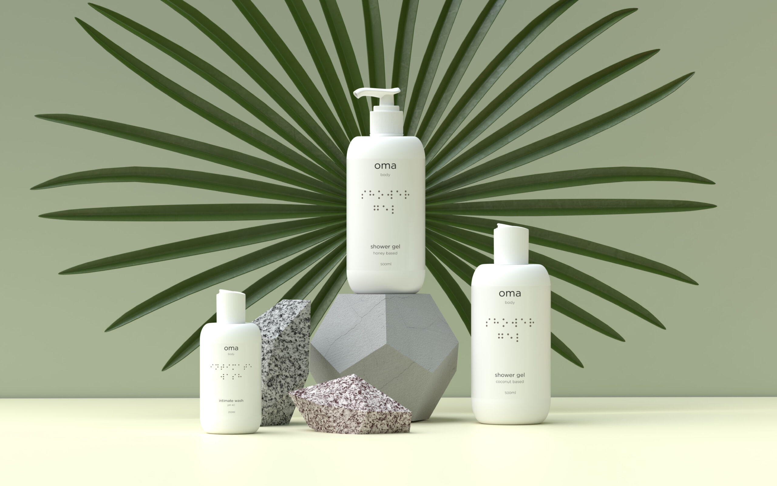
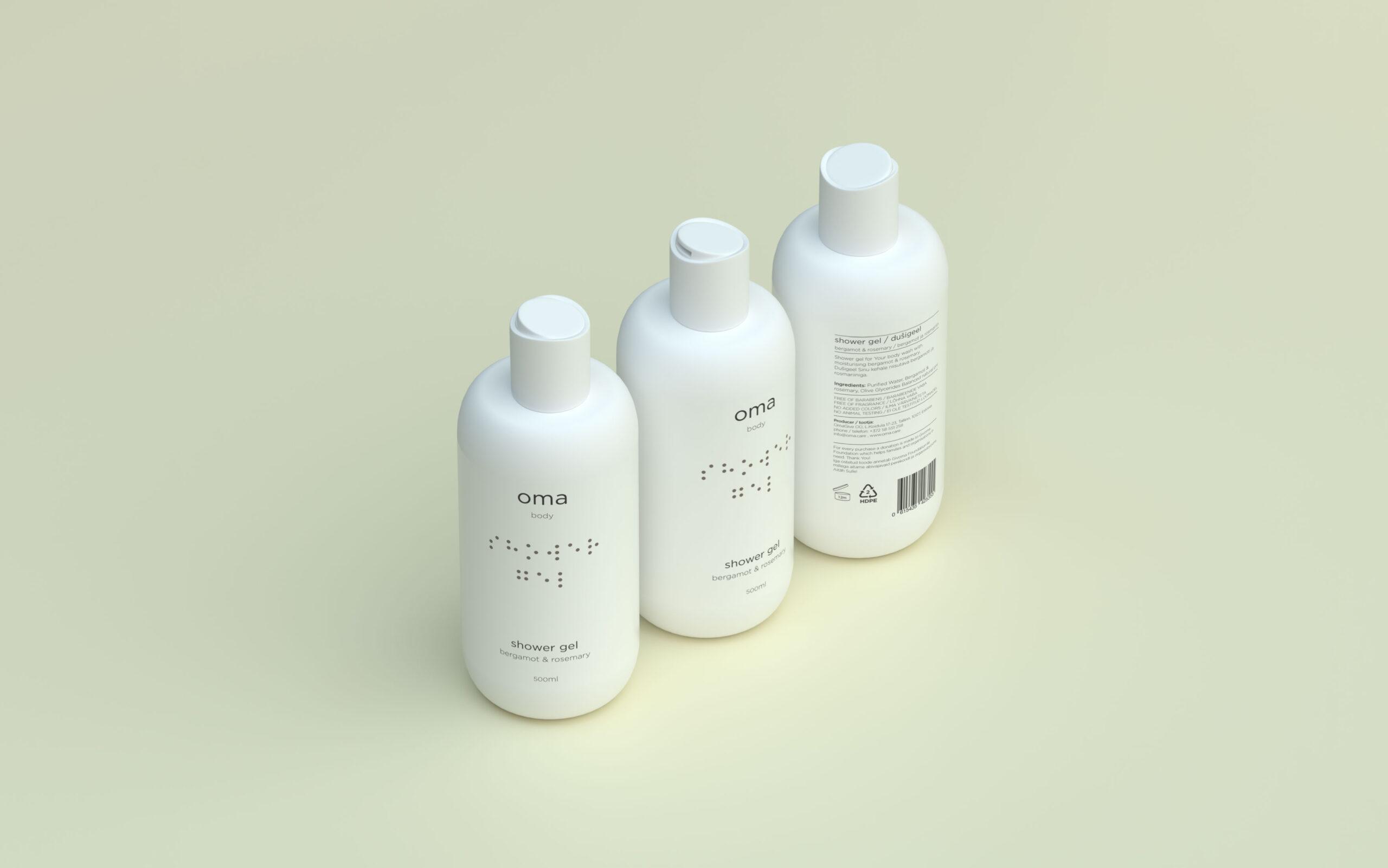
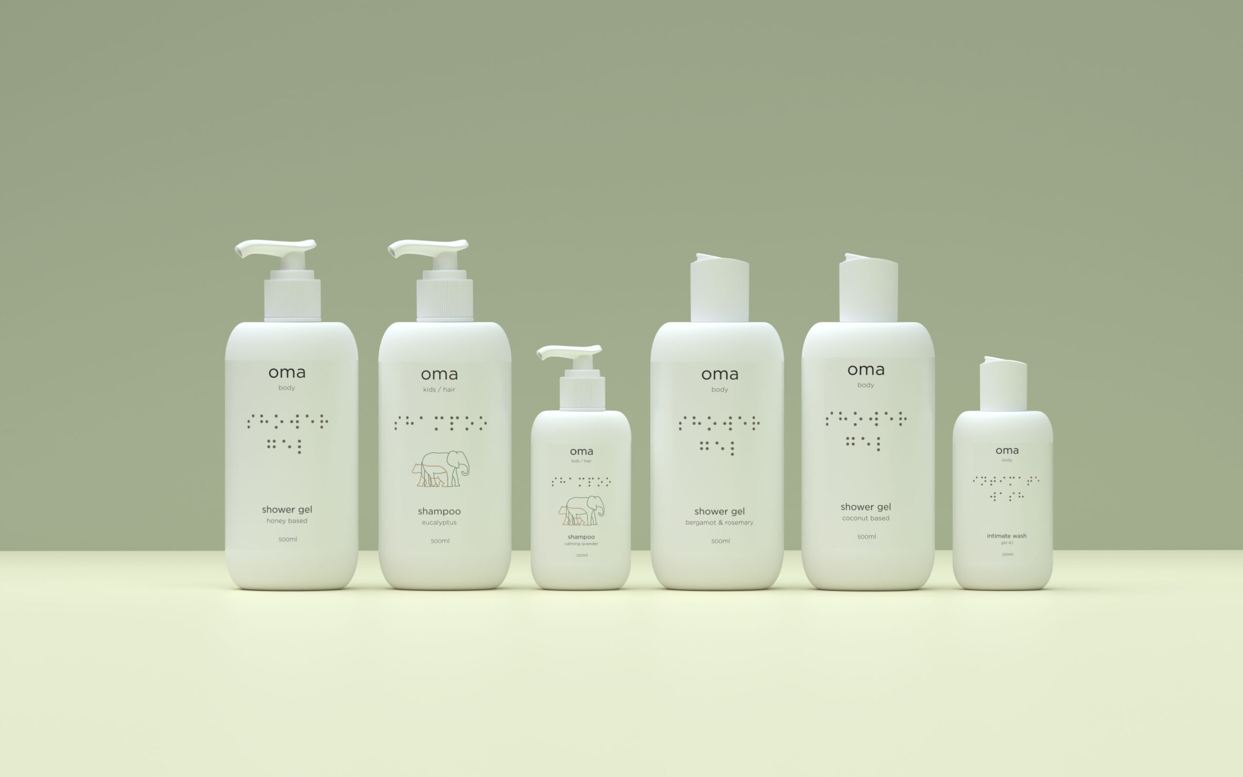
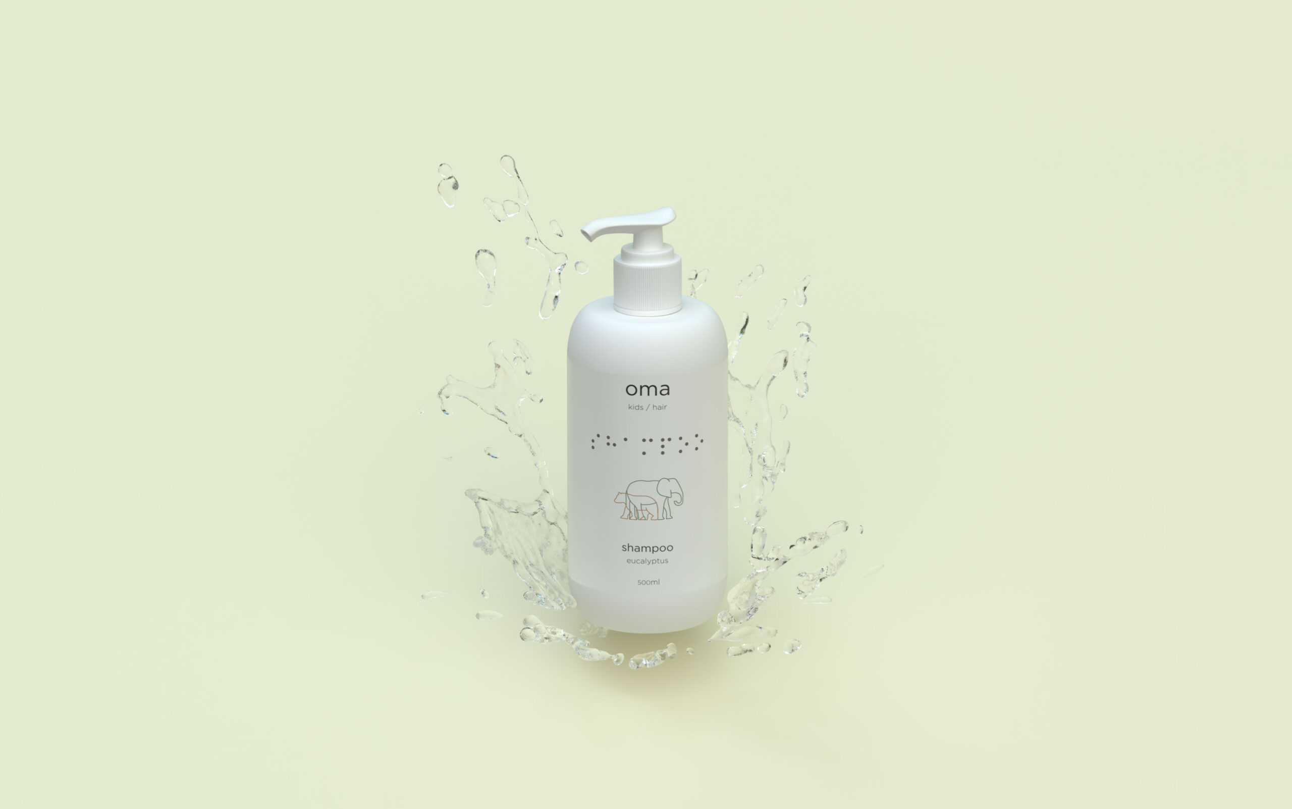
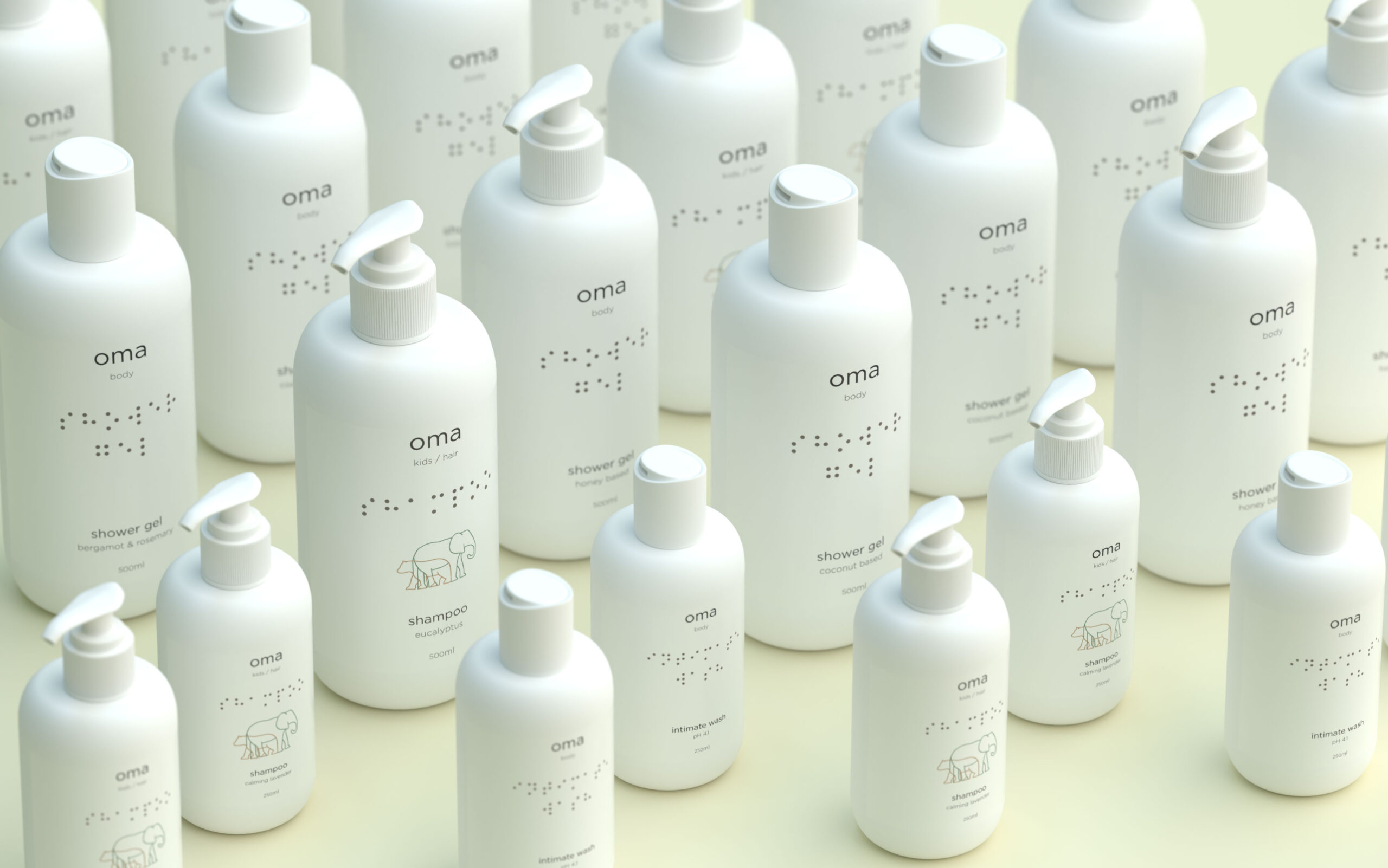
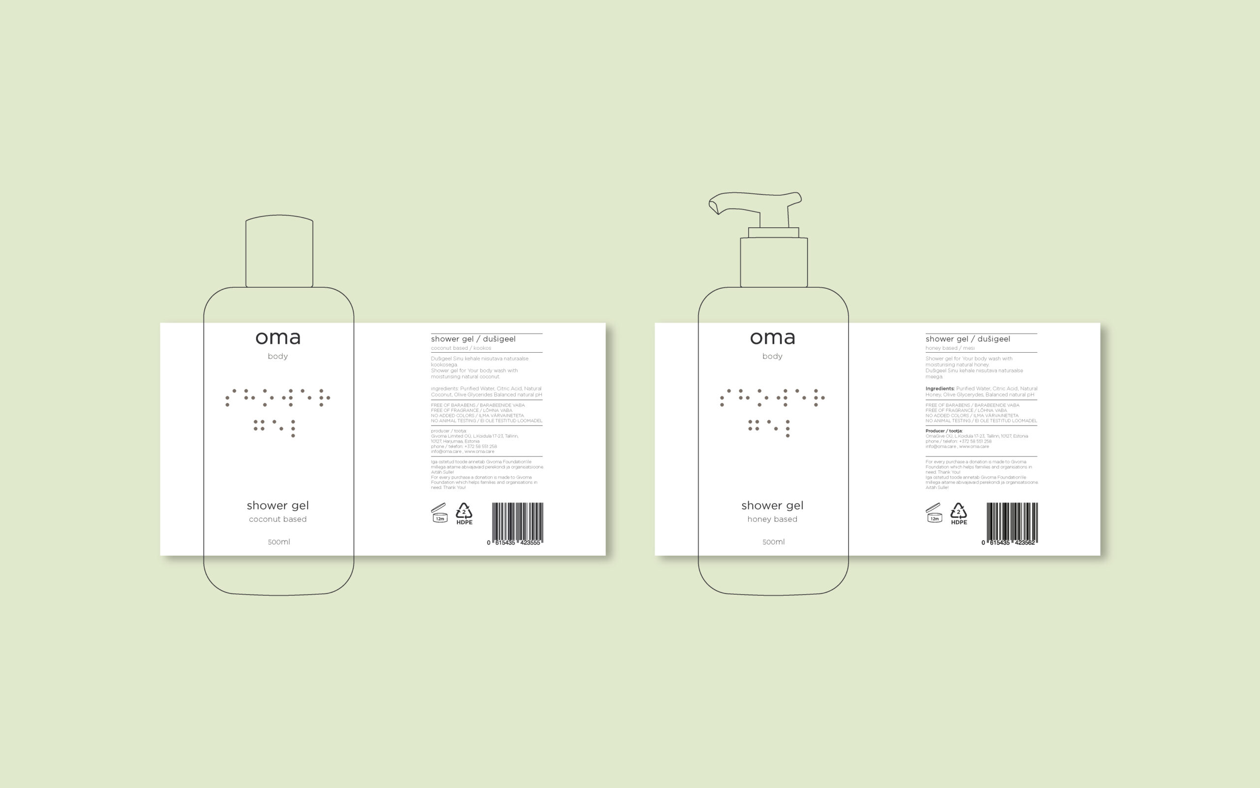
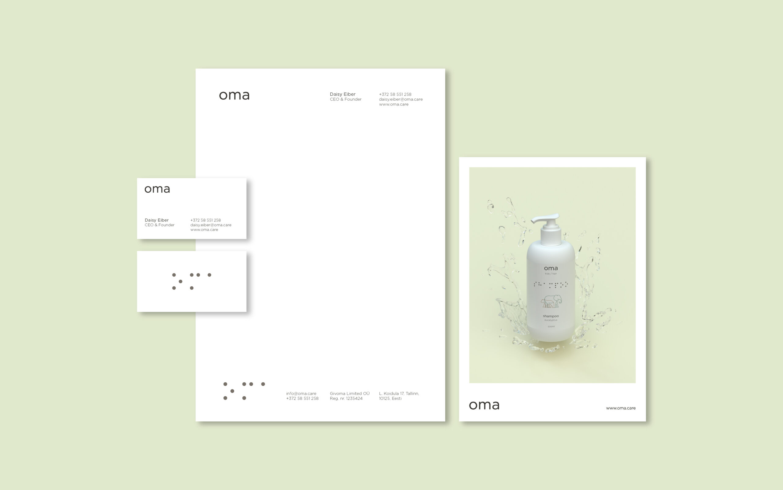
The visual identity for Oma Care was created by design agency No11. The visual identity harmonises with the Nordic minimal aesthetic that’s intrinsic to our designs. While creating the branding we put a lot of care into designing a product that would enhance any environment it is put into, so that when guests come you wouldn’t have to hide your Oma Care products deep into drawers but could leave them beautifully on display. In the ethical centre of Oma Care lie compassion and inclusivity so in accordance with that we have used Braille on every product.
The mission of Oma Care is to create a sustainable & organic home and body care line that would be free of any unnecessary chemicals and would use only the highest quality raw products. They are in constant development in search of the best possible products that take care of our needs as well as take into account the needs of the environment.