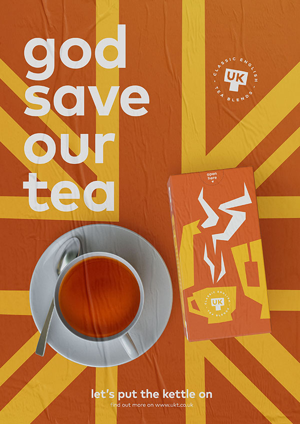
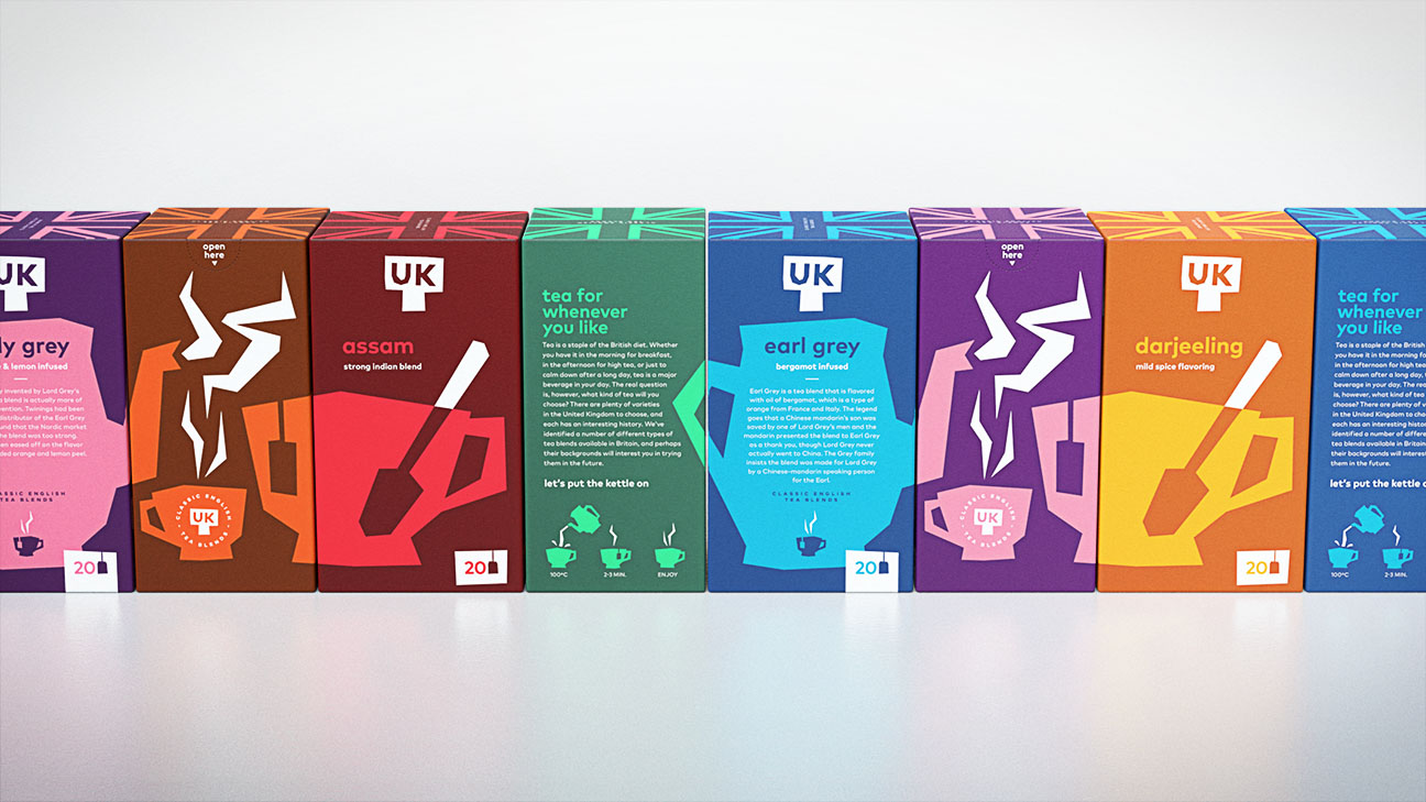
This UKT (United Kingdom Tea) brand is a perfect exercise in the creation of a design that is flexible in both the packaging as well as the derived communication tools. The result is a fresh and colourful design that can be easily adapted depending on the particular flavour and the medium in which it is used. The “hand-cut” paper look allows for the use of bold and striking colours; linked to any particular flavour. This makes the brand look fresh, vibrant and appealing to a younger audience and at the same time, maintains an organic appearance.