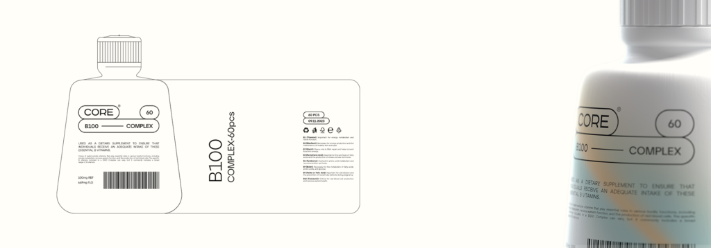
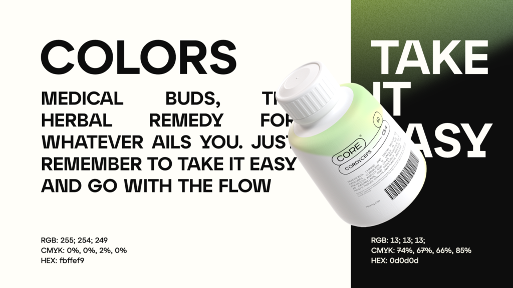
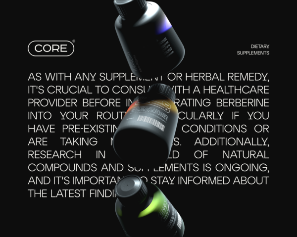
CORE’s packaging design is a visual feast, carefully curated to capture the attention of the young, dynamic audience it targets. The company embraces a distinctive approach with a two-color palette that serves as the foundation for its product packaging. The chosen colors reflect the brand’s identity, embodying energy, positivity, and a forward-thinking attitude.
The primary colors, often vibrant and bold, create a striking contrast that immediately draws the eye. This deliberate choice not only ensures visibility on the shelves but also establishes a strong brand presence. The duality of the color scheme represents the balance CORE seeks to achieve between science-backed formulations and the vitality of youth.
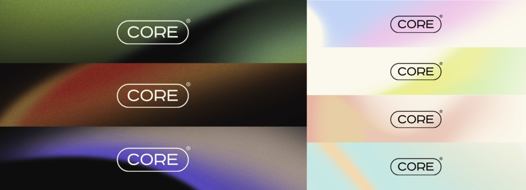
However, what truly sets CORE’s packaging apart is the ingenious use of gradients. Each product line features a variety of gradients that seamlessly blend the two main colors, creating a spectrum of hues that mirrors the diversity of the products within. These gradients not only add a dynamic visual element but also convey a sense of fluidity, suggesting adaptability and innovation.
The gradients on the packaging are purposefully chosen to align with the nature of the specific supplement. For instance, a product promoting energy and focus might feature gradients that transition from invigorating yellows to deep, focused blues. On the other hand, a relaxation or sleep aid product could showcase gradients that shift from calming greens to soothing purples.
This thoughtful use of gradients serves a dual purpose: it not only distinguishes different product lines but also communicates the intended effect of each supplement. The packaging becomes an artful representation of the product’s essence, allowing consumers to make quick and informed choices based on visual cues.
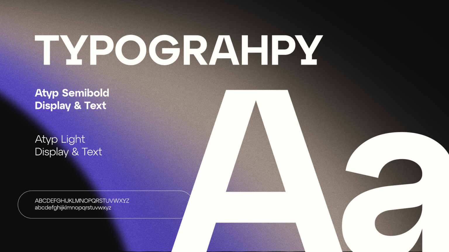
Beyond the color palette and gradients, CORE’s packaging design incorporates modern and minimalist typography, ensuring clarity and ease of readability. Icons and symbols are strategically placed to convey key information at a glance, promoting a user-friendly experience.
In summary, CORE’s packaging design is a symphony of color and gradients, a visual celebration of wellness and vitality. It captures the spirit of the young demographic it targets, making the process of choosing and using supplements an engaging and aesthetically pleasing experience. With each product telling its unique story through carefully curated hues, CORE’s packaging is not just a wrapper but a canvas that brings the brand’s vision to life.


