Alright, in this Curator’s Insight, let’s grab our metaphorical hard hats and explore this unique liquor packaging by Bai Xinglong Creative.
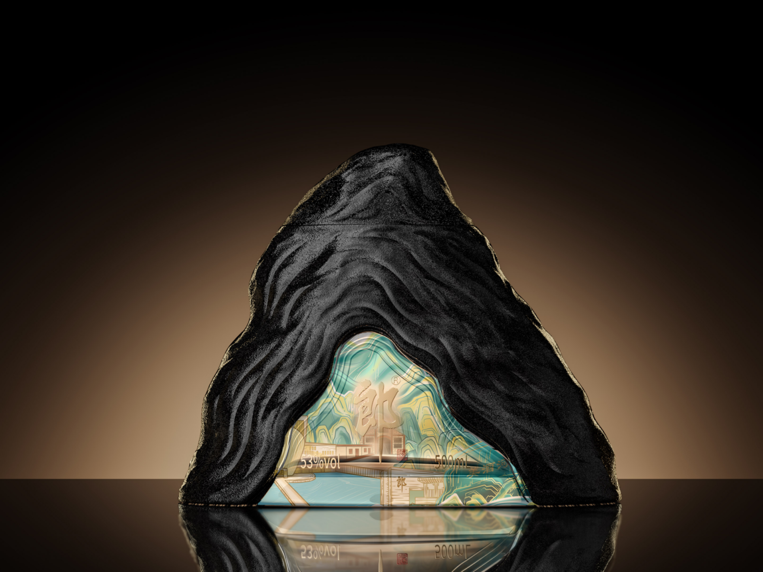
This design definitely takes the cake (or should we say, cask?) for originality! The cave-shaped bottle is a bold choice that instantly grabs attention. It evokes a sense of mystery and history, perfectly capturing the “profound culture of liquor” the designers aimed for.
Imagine this bottle on a shelf – it looks like it just emerged from a hidden cellar, its contents waiting to be unearthed. The “rock texture” adds another layer of intrigue, suggesting a connection to nature and the slow, patient aging process the liquor might have undergone. Maybe the top of the bottle could be sculpted like a stalactite, adding another cave-like detail. A textured label could resemble ancient cave paintings, hinting at the liquor’s rich history. Even the box it comes in could be designed like a rough-hewn cave entrance, creating a truly immersive experience.
While the rock texture sounds cool, it might be a tad tricky to hold. Perhaps a smoother, matte finish could maintain the cave aesthetic while being more user-friendly. The label design should be clear and informative, even with the cave theme going on. After all, we still want folks to know what delicious beverage they’re about to uncork!
This is a truly creative and eye-catching design that stands out in a crowded market. It successfully tells a story through its shape and texture, transporting the drinker to a world of aged spirits and hidden treasures.