THE TASK
In our 2nd project working with Hazelnut Farm, we worked on creating a packaging design for their new brand of healthy candies. We had two main objectives in mind when approaching the design. The first was linked with the target audience for this product being considerably young. The second was based on the nature of candy products, being an item that is usually purchased based on impulse. When combining the two previously mentioned aims it was vital to us that the packaging will be flamboyant both in its use of colors and in the artistic illustrations which are the main focus of any design.
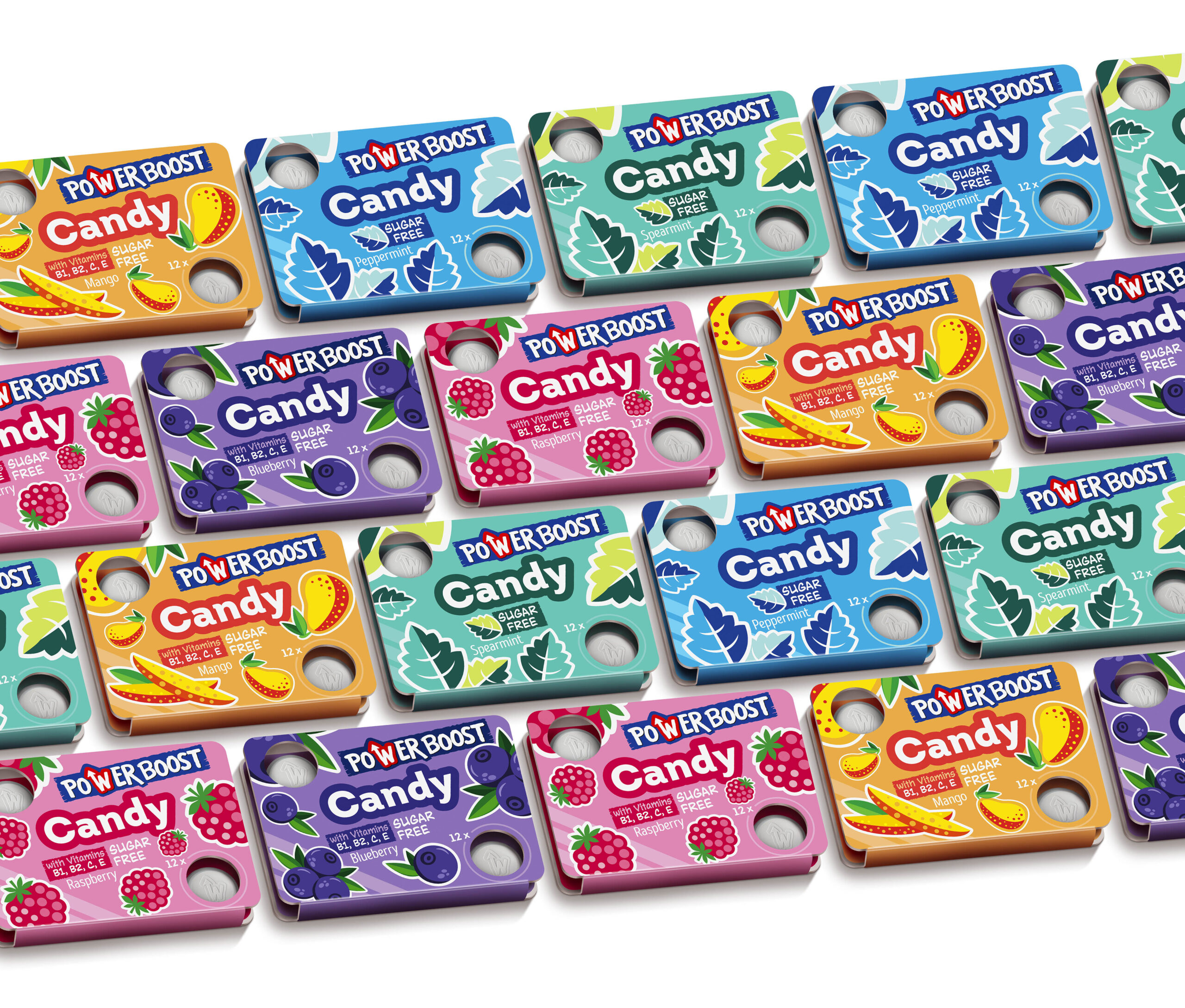
THE EXECUTION
In total the product was in need of 5 distinct designs for each candy flavor. For the 3 fruit flavors, we chose to apply dazzling yet not overpowering shades of orange, purple, and pink, representing the mango, blueberry, and raspberry candy flavors. Each of the designs for the fruit themed products featured a highly stylized depiction of each fruit. The fruit illustrations strike the perfect balance of being on the more abstract side when comparing to typical illustrations while maintaining that the customer can still easily discern which exact fruit is depicted on the packaging. Moreover, the fruits are positioned fluidly on all corners of the design, straying far away from being confined to a static stance on only one area of the package while simultaneously seeming more animated, thus standing out further. Similarly, the other 2 flavors of spearmint and peppermint also clearly depict their individual flavors, with the lighter spearmint adopting a softer shade of blue. In contrast, the heavier peppermint applies a dark ocean–like color of blue.
The text was also one of our main priorities in this design, due to the Power Boost brand ultimately being built on health-related benefits. We made sure the text clearly notifies consumers that each product is completely sugar-free, with the text being placed specifically in the front of the packaging, while on the fruit flavors details of the vitamin that can be found in each fruit lay beneath the “No Added Sugar” text. The name of the brand “PowerBoost” was purposefully positioned to tower over all components of the design, assuring not only a purchase but brand awareness.