Gishi – Bringing Wellness to Life with Bold Packaging Design
Introduction
Gishi is a forward-thinking wellness brand that offers fungi extract gummies, aiming to enhance the everyday lives of its consumers. These gummies are infused with health-boosting mushroom extracts, providing natural benefits in a convenient, enjoyable form. As a brand, Gishi sought to redefine how consumers perceive wellness products by focusing on both functionality and aesthetics. Our goal was to create a packaging design that not only stood out but also aligned with the brand’s modern, vibrant, and health-conscious values.
Concept Behind the Packaging Design
The concept behind Gishi’s packaging design was to make wellness fun, accessible, and appealing. We wanted to transform the idea of taking supplements from a routine task into an enjoyable, daily ritual. The design needed to be bold enough to grab attention on store shelves while being approachable and friendly. By integrating unique colors, playful illustrations, and a memorable logo, we aimed to reflect Gishi’s mission of making wellness not just about health but also about joy and lifestyle.
Solution
To achieve this, we focused on creating a strong, cohesive visual identity that revolved around three main elements: color, typography, and iconography. Each element was carefully chosen and designed to resonate with Gishi’s target audience and reinforce the brand’s image as a trendsetter in the wellness industry.
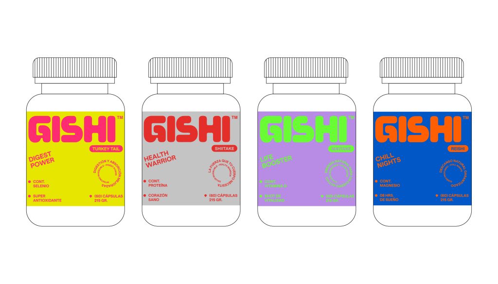
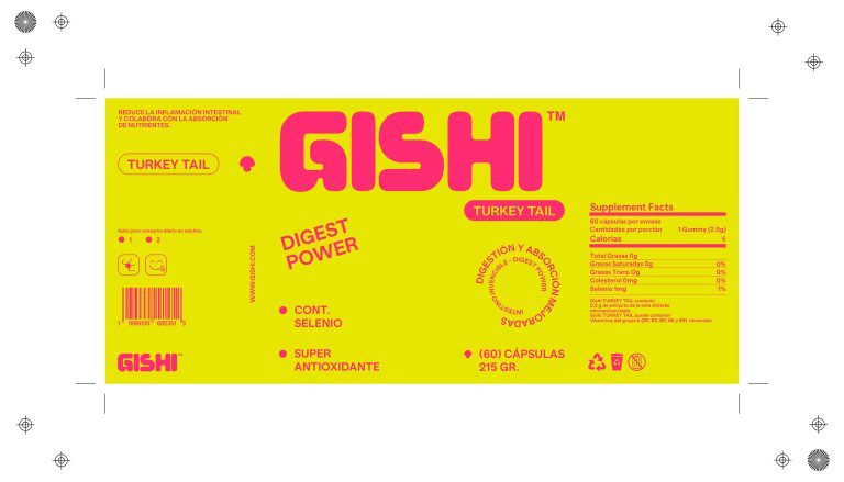
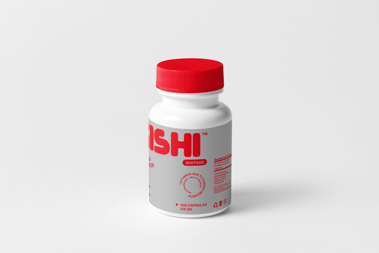
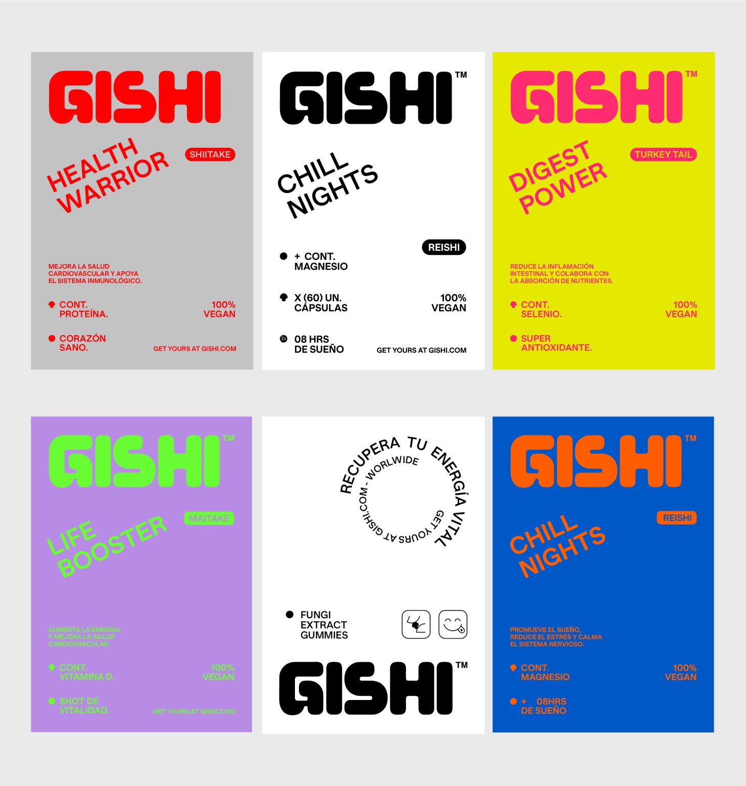
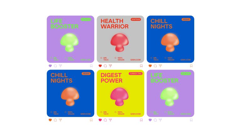
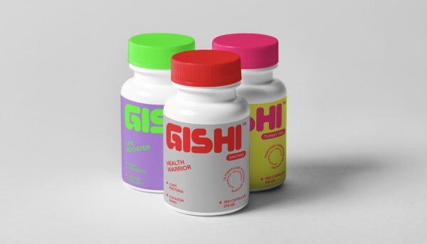
- Color Palette: We assigned a distinct color to each type of mushroom extract, making it easy for consumers to identify the different products at a glance. The vibrant colors added energy and excitement to the packaging, while the use of black and white elements provided a sleek, modern contrast.
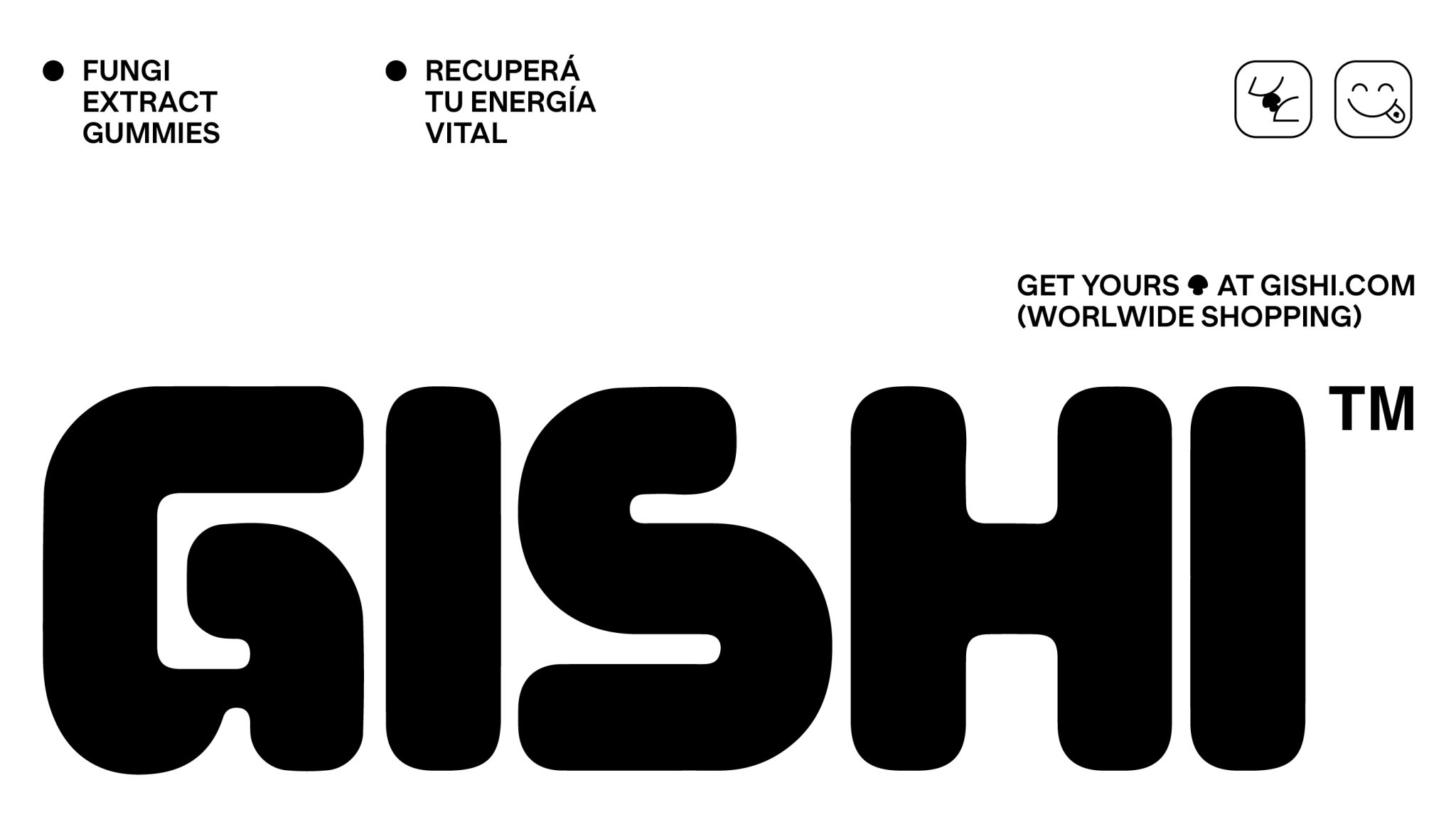
- Typography: The typography choice was minimalistic yet playful, utilizing Banana Grotesk by Monkey Type Foundry. This typeface’s clean lines and subtle quirks added to the brand’s approachable feel. We also incorporated slightly angled titles to make certain text elements pop, enhancing visual interest and engagement.
- Illustrations and Icons: We designed a series of playful illustrations and icons that complemented the packaging. These elements not only made the design more dynamic but also served to visually communicate the benefits and fun aspects of the products, making them more relatable and desirable.
The Technique Used to Design the Packaging
The packaging design was developed using a blend of digital illustration and graphic design techniques. We started with concept sketches to explore different styles and layouts. Once the overall design direction was established, we moved to digital mockups, where we refined the details, such as color application, typography placement, and illustration integration. We used Ilustrator to ensure the designs were scalable and adaptable across various packaging sizes and formats.
We also conducted several rounds of prototyping and testing to see how the designs looked and felt in real life. This iterative process allowed us to fine-tune the designs to ensure they not only looked great but also communicated the brand’s message effectively.
What Is Unique About Our Packaging Design?
The uniqueness of Gishi’s packaging design lies in its ability to combine vibrancy with simplicity. By using distinct colors for each mushroom variety, we made the products easily navigable and visually striking. The playful illustrations and icons added a sense of fun and approachability, which is often missing in the wellness industry. Furthermore, the clean, modern typography ensured that the packaging remained sophisticated and professional. This balance between playful and polished is what sets Gishi apart, making the packaging not just functional but also a fashion statement for health-conscious consumers.
The Results
The new packaging design successfully captured the essence of Gishi’s brand and vision. It stood out on store shelves, attracting attention with its bold colors and playful illustrations. Early feedback from consumers was overwhelmingly positive, with many appreciating the clear, visually appealing differentiation between products. The branding and packaging design helped Gishi establish itself as a fresh, modern player in the wellness industry, attracting a loyal customer base who not only enjoyed the health benefits of the gummies but also loved the look and feel of the products.
㋡ Brand Studio: https://www.behance.net/blas-studio
✜ Art direction & Graphic designer: Milagros Malone https://www.behance.net/malone13 & Cindy F. https://www.behance.net/cindy-dg