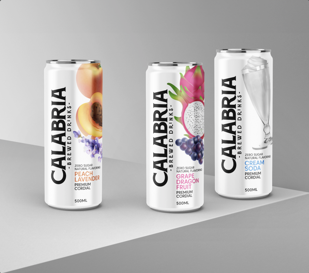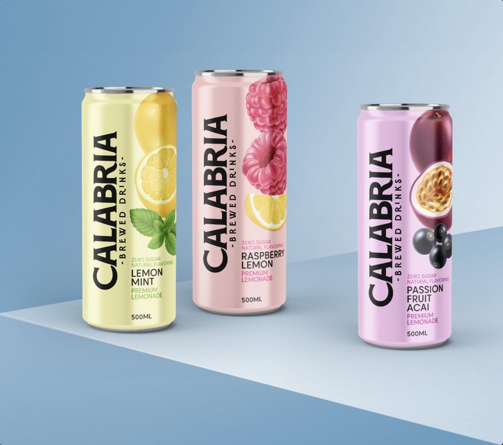
In the packaging design process that we started with the Cordial and lemonade groups, we gave the category variants with background colors. While we used the common off-white tone for Cordial, we differentiated the lemonade group with pastel tones that match the content color. We achieved maximum visibility by positioning the logo and visuals vertically.