Overview
Dukkan is an online brand based in New York that aspires to be the ultimate destination for lovers of Arabic cuisine, bringing the essence of the Middle Eastern market (‘Dukkan’) experience to the heart of a bustling metropolis. We wanted every element of Dukkan’s brand to feel like an authentic invitation to step into a place that resonates with the warmth and richness of home, reflecting our culture and culinary heritage.
Challenges
With New York’s crowded brand landscape, standing out required a deep cultural connection and vibrant identity to catch the eye amidst the competition. Our design solution was to blend authenticity with visual boldness, showcasing Arabic culture in a way that feels both familiar and distinctive.
Design Solution
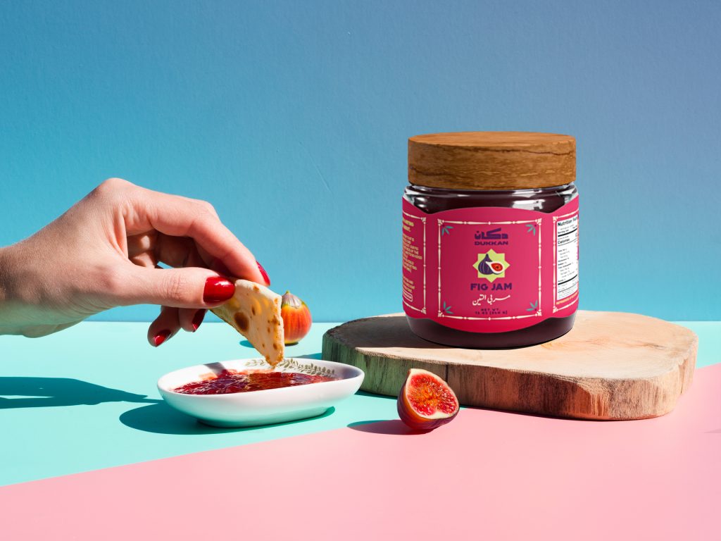
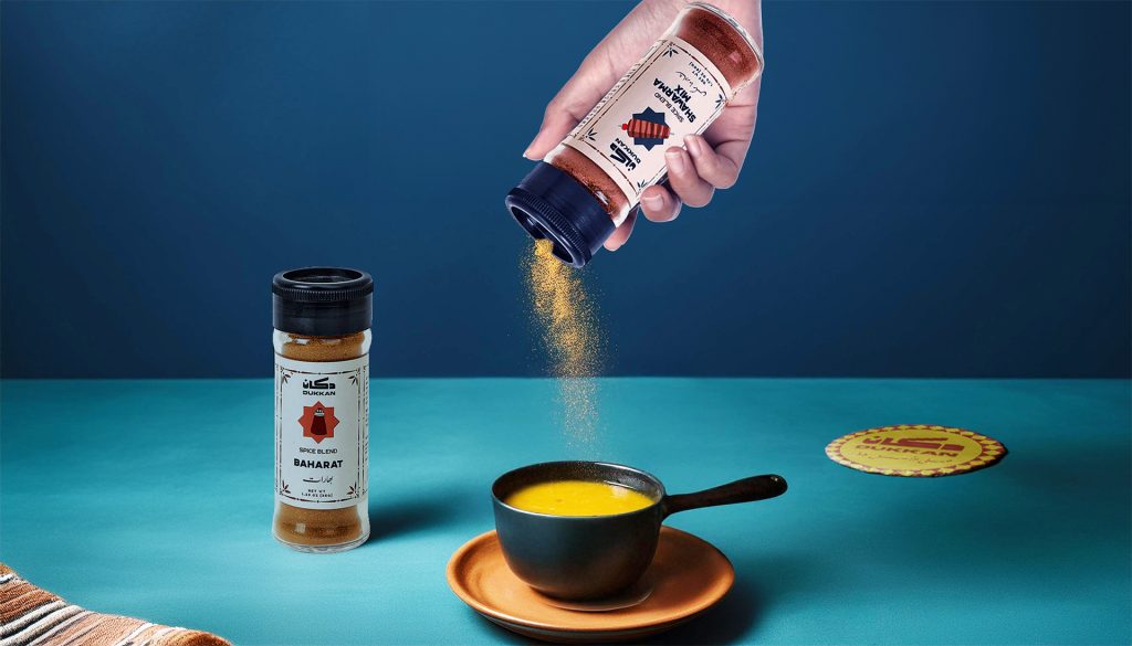
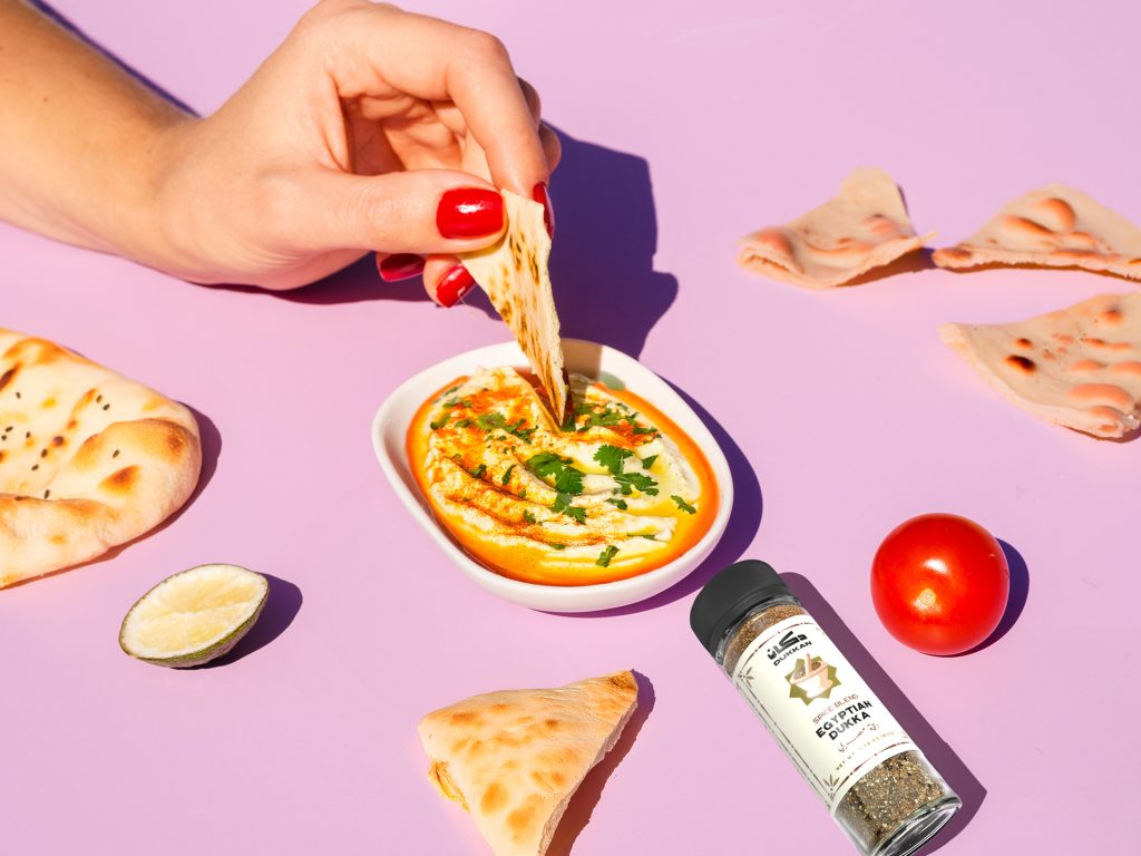
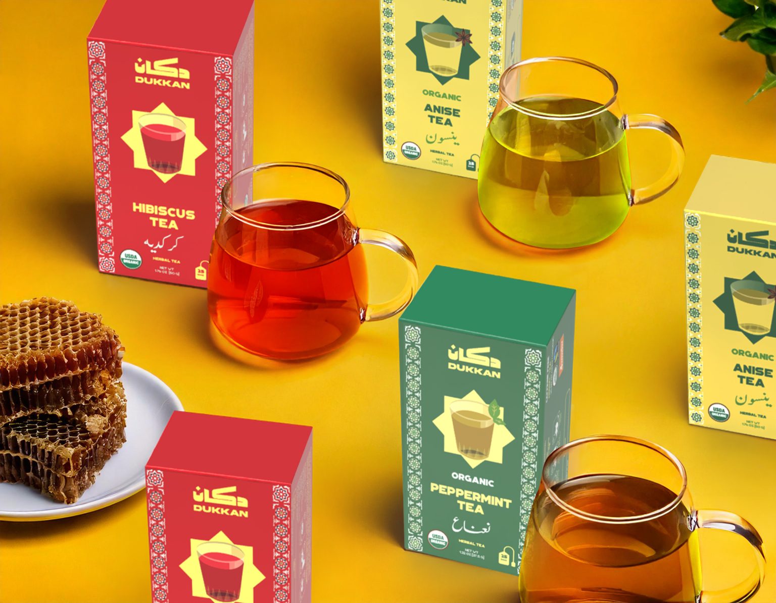
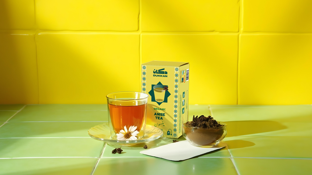
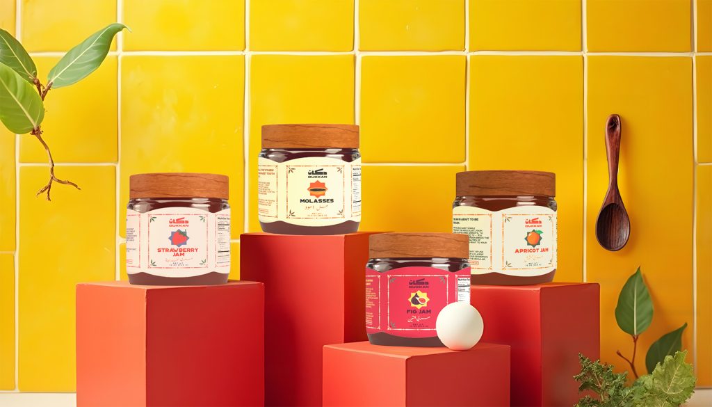
For Dukkan’s visual language, we chose Kufi script for its bold, traditional form that commands attention on supermarket shelves. The typography is balanced by vibrant colors to draw in the viewer, and complemented by patterns inspired by traditional Arabic art, adding layers of cultural depth and familiarity. Additionally, we utilized a Farsi-inspired Arabic script for a refined accent, and paired it with a clear, bold English font for easy readability.
Impact
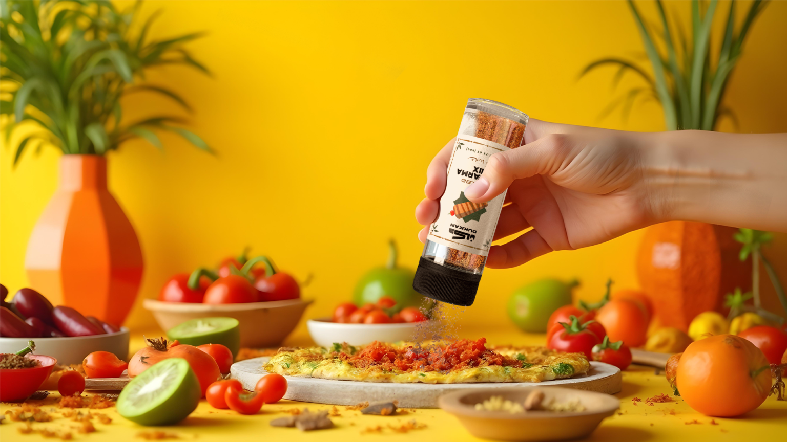
The result is a brand that feels rooted and dynamic, where every touchpoint— from packaging to digital presence—invites audiences to experience Arabic culture firsthand, as if they’re stepping into a familiar space filled with authentic flavors and stories.

