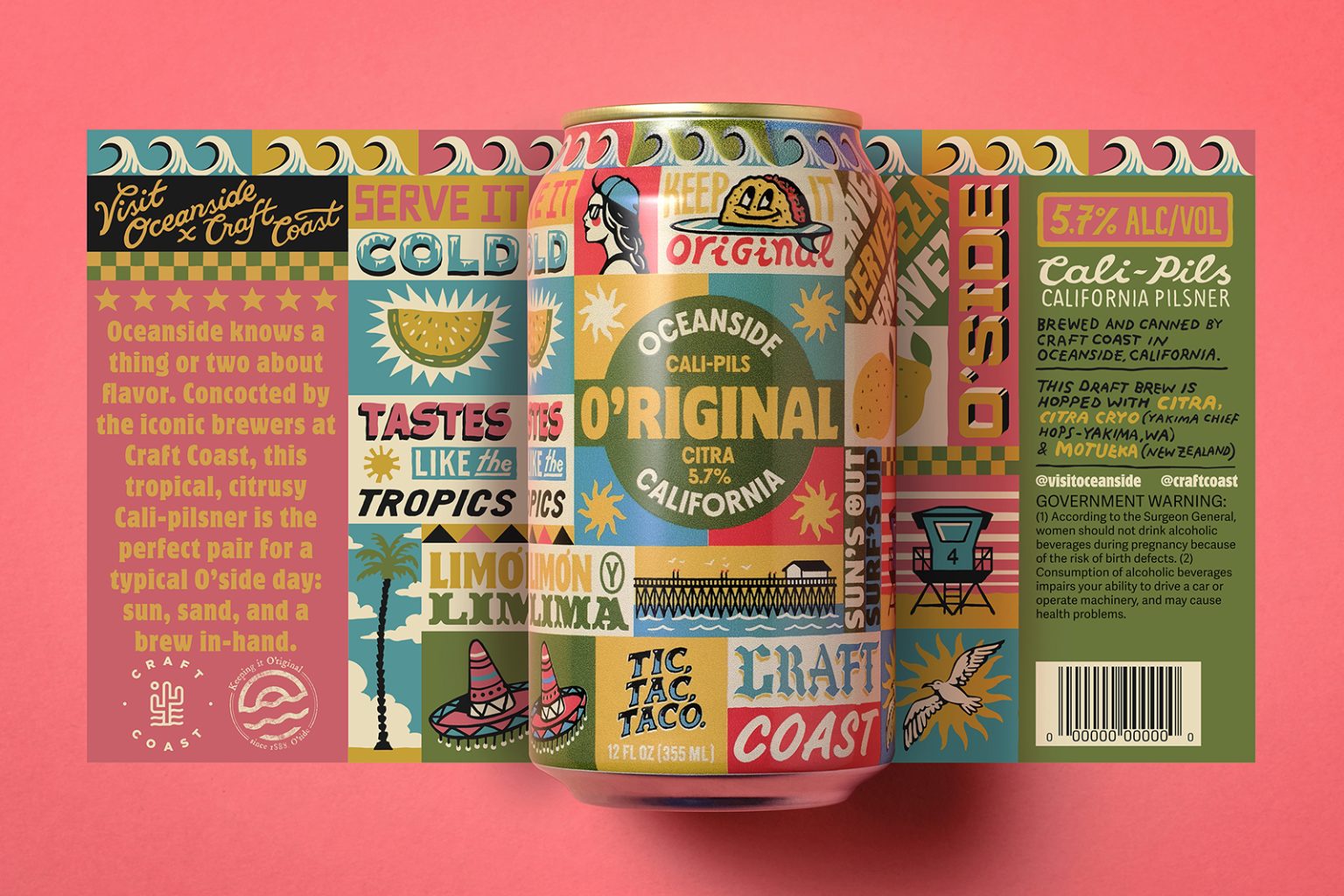
The O’riginal Cali-Pilsner is a co-brand between Visit Oceanside ( California ) and local brewer Craft Coast. The design draws inspiration from type and graphics found in authentic Southern Cali taco stands, which offer a feast of typography. In visualizing the destination, Oceanside’s iconic wood pier is front and center, along with a warm taco chilling on a surfboard. All told, the label is a discovery map of sorts.
The solution is an eclectic mix of type—a running, drinkable narrative of the place—true to form with hand-painted menu boards. Each piece of type is a distinct little story, starting with Serve it Cold, Keep it O’riginal. The design offers playful depth to the place and a mouth-watering invitation to explore O’side.
Illustrator Pedro Oyarbide was brought on to execute the concept. He created layers upon layers of texture and personality with endless experimentation in style and color—all of it custom, hand-drawn type. He infused incredibly good energy and a truly unique perspective.
The color palette is as vibrant and flavorful as its namesake city. The yellows and greens of citrus are the self-selecting base hues. Sunshine and blue skies came next. Hot pink set it all off with a tasty, local flair. This hue became the background for product photography, masterfully crafted by San Diego photographer John Schulz.
The overall aesthetic and vibe of the art shape the experience of that first sip, with flavor profiles and graphics delivering a true O’riginal.


