BOO
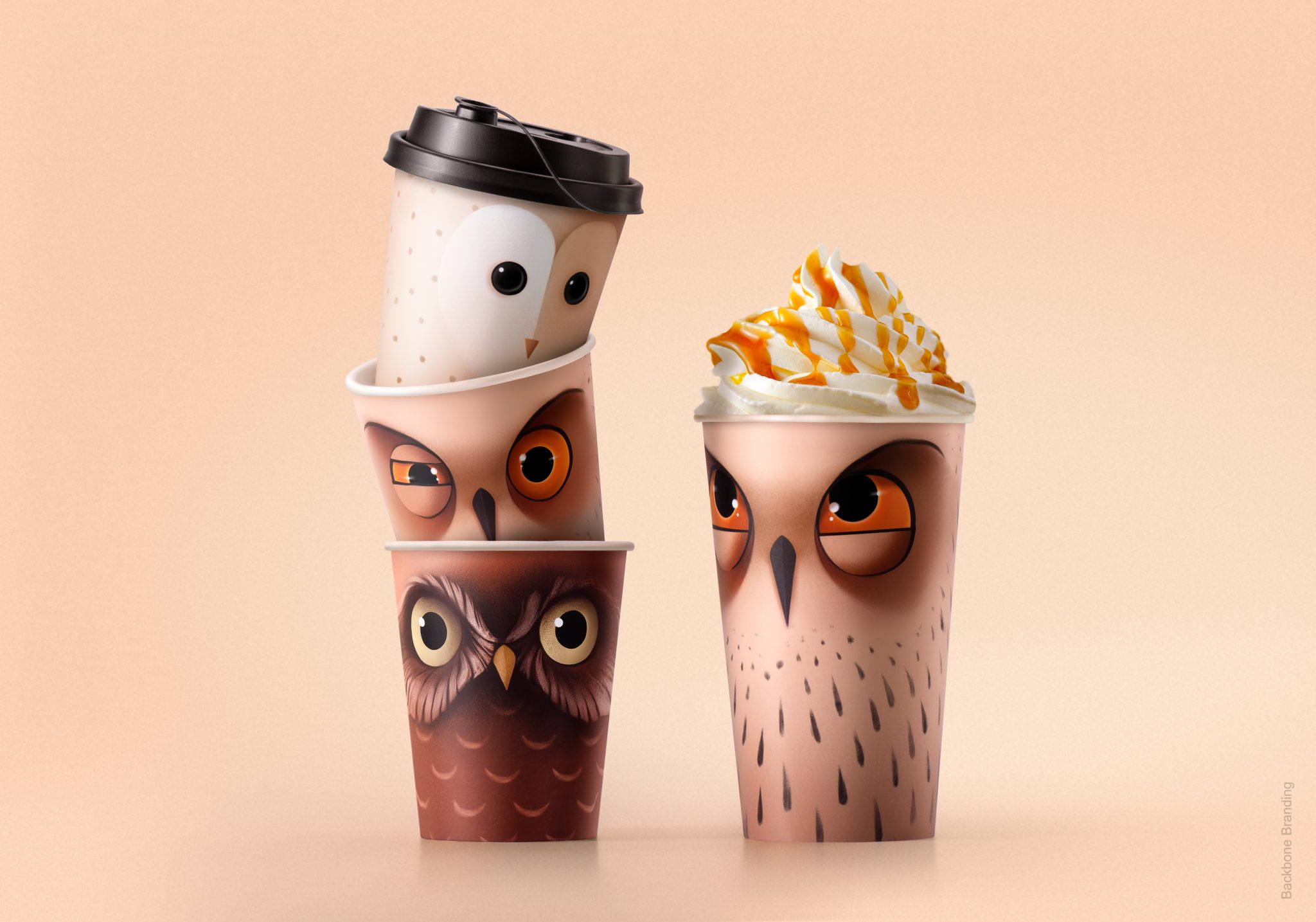
The Royal Armenia coffee packaging has long featured an iconic owl illustration, leading people to affectionately refer to the product as “boo” (meaning “owl” in Armenian). Acknowledging the cultural significance and the strong bond people have with this emblematic brand character, we strategically decided to leverage this insight for the refresh of the packaging for both coffees and iced teas.
Our approach was rooted in the physical qualities of an owl, leveraging its nocturnal nature as a symbol for the coffee’s invigorating effect in keeping people awake.
We reimagined the owl, giving it a more modern and emotional look, and introduced two new owl characters to enhance the brand’s visual appeal. Our strategy involved turning the word “Boo” into a typographic logo, where the two letters “O” were artfully placed above each other, reminiscent of the wide-open eyes of an owl that has tilted its head.
In line with the owl theme, we carefully selected colors for the cups and the owl’s eyes, matching them to different times of the day when the coffee is sold. This thoughtful color scheme not only adds aesthetic cohesion but also reinforces the brand’s connection to the owl’s nocturnal symbolism.
The entire redesign, encompassing the visual elements and the typographic logo, aims to build a cohesive and emotionally resonant identity for Royal Armenia’s “Boo” coffee venture. This project not only rejuvenates the packaging but also aligns the brand with the owl’s symbolic qualities, creating a memorable and distinctive presence in the coffee-to-go market. By formalizing the cultural reference through the sub brand “Boo,” we not only preserve the beloved owl illustration but also further enhance its role as a central and iconic character in the brand’s narrative.
Muse Award (2 platinum), Pentawards (bronze)


