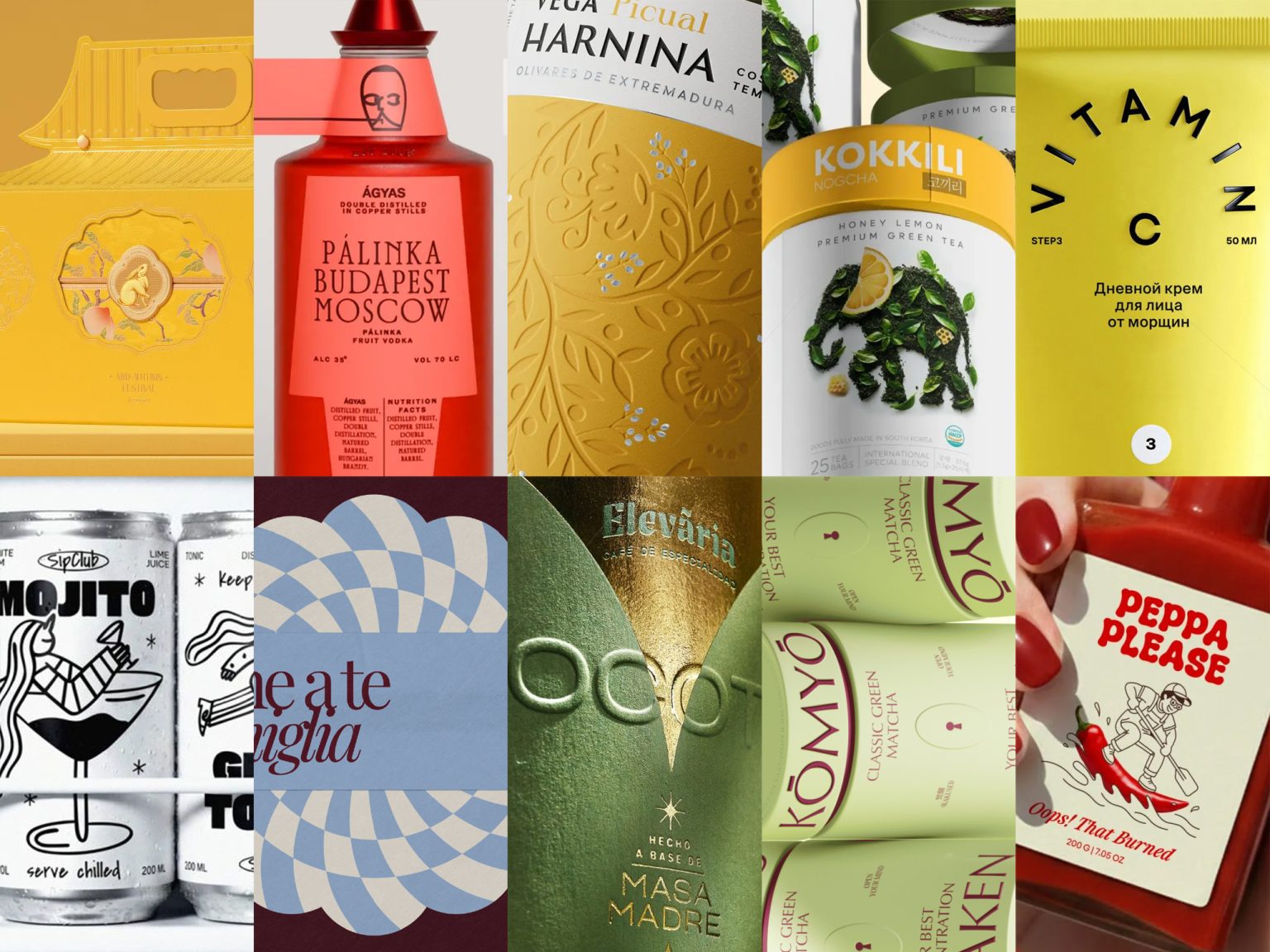

Welcome to Issue #139 of Packaging of the World. This edition features ten packaging projects that stand out for their clarity, creativity, and smart brand thinking. Each design shows how strong ideas and thoughtful execution can shape a product’s visual identity.
These projects are already getting attention across social media. Follow us on Instagram, Facebook, and Pinterest to keep up with current packaging trends and fresh creative work.
Have a project you’re proud of? We’re always open to submissions from designers, studios, and brands worldwide. Whether it’s your first time or you’ve submitted before, simply sign in or create an account to share your packaging design with our global community.

AOVE Vega Harnina designed by Eva Arias
Vega Harnina’s packaging translates regional heritage into a refined visual identity rooted in place and craft. Drawing from Extremaduran folklore, the design reinterprets traditional floral motifs and weaves them with olive branches, creating a graphic system that directly connects culture, land, and product. The balance of ornament and restraint reflects the brand’s premium positioning without excess, allowing simplicity, texture, and symbolism to carry the story. The result is a contemporary yet timeless expression that honors tradition while elevating the brand’s gourmet olive oils.

Likato Skincare designed by Veronika Levitskaya
The LIKATO packaging redesign creates a cohesive, scalable visual system that balances brand consistency with modern freshness. Playful, distinctive typography gives each product line its own personality, while bold accents and ample negative space provide clarity, rhythm, and shelf impact. The refreshed design preserves the brand’s DNA and logo, delivering a flexible framework that can grow across multiple lines, making the brand instantly recognizable and visually engaging.

Elevaria Chocotón designed by Cristian Valverde
Elevaria Café’s “Chocotón” packaging combines elegance and restraint to convey premium quality. Deep green hues with subtle gold accents create a festive, sophisticated tone, while clean typography and geometric motifs balance tradition with contemporary appeal. The matte and metallic finishes add depth and craftsmanship, letting the product remain the focal point. The design positions the seasonal offering as refined, timeless, and visually distinctive, embodying quiet luxury without overt ornamentation.
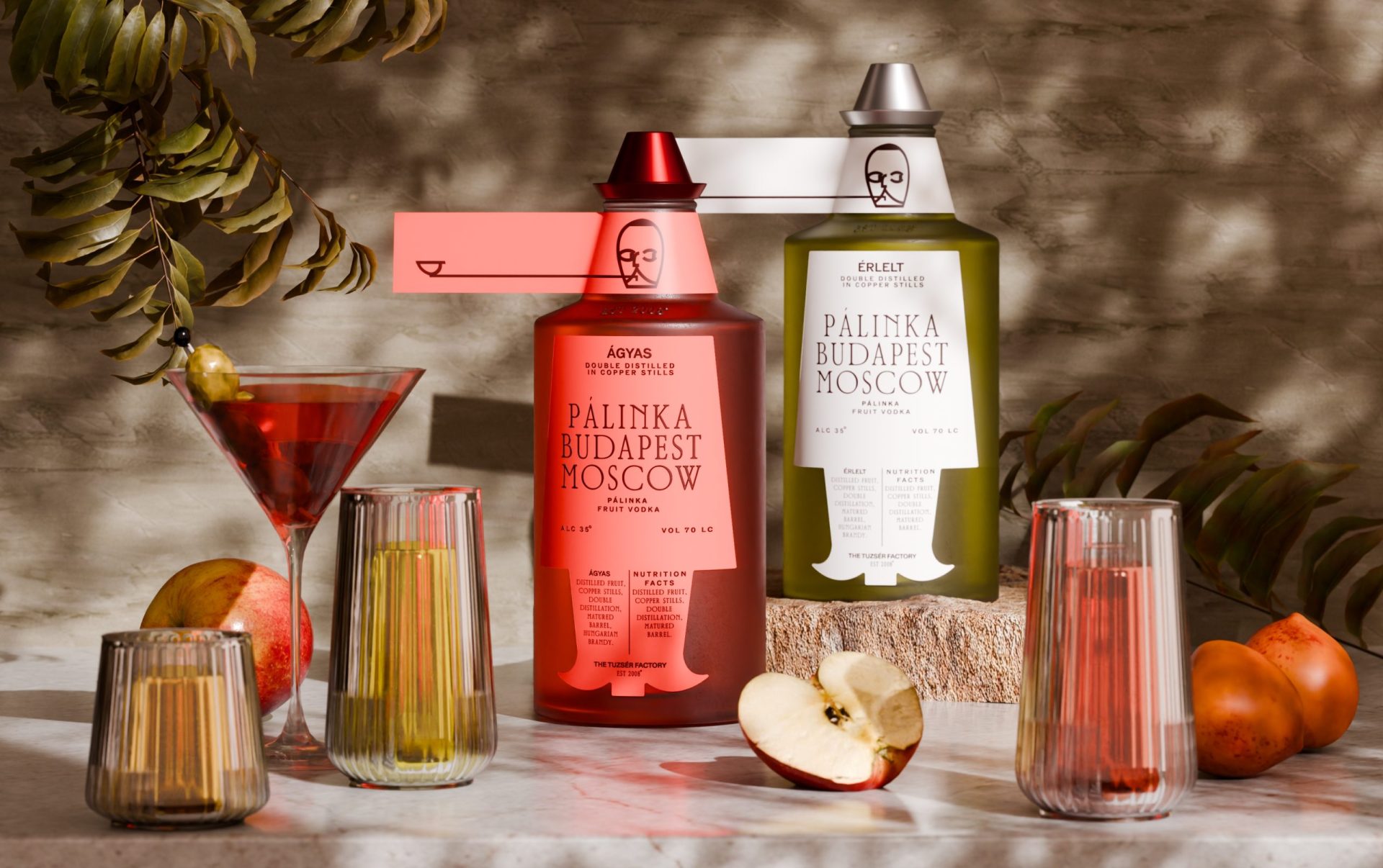
Hungarian Brandy Pálinka designed by Evgeniya Tsoy
PÁLINKA’s packaging captures Hungarian tradition through bold silhouettes and culturally inspired details, creating a visual identity that is instantly recognizable. The design integrates symbols of local heritage, reflecting the spirit and authenticity of the brand while celebrating the ritual of enjoying fruit vodka. Minimalist yet expressive, the packaging connects product and culture, giving the brand a strong, distinctive presence on shelf.

KŌMYŌ designed by Yana Dudkina
KŌMYŌ’s packaging transforms its premium matcha into a visual exploration of mindfulness. The keyhole motif serves as a portal to three states: AWAKEN, BALANCE, and CLARITY. Each expressed through distinct color coding. Minimalist typography and a cohesive iconography system reinforce the concept, unifying the brand’s identity around the philosophy of “inner light.” The design balances elegance and conceptual depth, turning packaging into both a functional container and a symbolic experience that communicates the brand’s thoughtful, premium positioning.

Anche a te e famiglia – Christmas Cookies designed by Cromia
“Anche a te e famiglia” reimagines cookies packaging with playful humor and festive charm. The design uses rigid boxes, inserts, and coordinated wraps inspired by the cookie silhouettes, creating a cohesive visual system. Warm, nostalgic colors and clean layouts highlight witty statements, while tactile textures and geometric patterns evoke handcrafted quality. By blending tradition, humor, and thoughtful visual identity, the packaging transforms a familiar holiday ritual into a memorable, engaging experience, making the product both functional and delightfully expressive.

Peppa Please Hot Sauce designed by Studio Shri
Peppa Please’s packaging turns bold flavour into a playful visual statement. Clean layouts, high-contrast visuals, and a vibrant colour palette give the hot sauce a modern, energetic presence, while expressive typography adds personality without clutter. The design balances cheeky humour with clarity, making the product instantly recognisable on shelf. Subtle details and minimal structure convey approachability and authenticity, reflecting the brand’s fun, confident, and spicy character.

Kokkili designed by De Icebreaker Creative Studio
Kokkili’s packaging embodies quiet strength and mindful calm through a muted color palette and thoughtful visual language. The elephant motif, carrying tea leaves, symbolizes patience, care, and gentle confidence, reflecting the brand’s philosophy of slow, intentional tea rituals. Clean layouts, subtle details, and balanced composition convey richness without overwhelming, creating a premium, serene presence. The design translates the experience of tea—warmth, depth, and comfort—into a visual identity that feels natural, grounded, and reflective, positioning Kokkili as a brand where strength and elegance coexist in perfect harmony.

Imperial Garden designed by googol
Imperial Garden’s packaging transforms classical Eastern motifs into a contemporary visual language. Imperial yellow backgrounds and hot-stamped gold details bring palace walls, birds, and flowers to life, merging tradition with modern design strokes. Silhouettes and branching patterns create depth and movement, while the composition balances elegance and immediacy. The design translates centuries-old aesthetics into a tactile, everyday experience, positioning the brand as both culturally rich and visually striking, with a distinctive identity that commands attention on shelf.
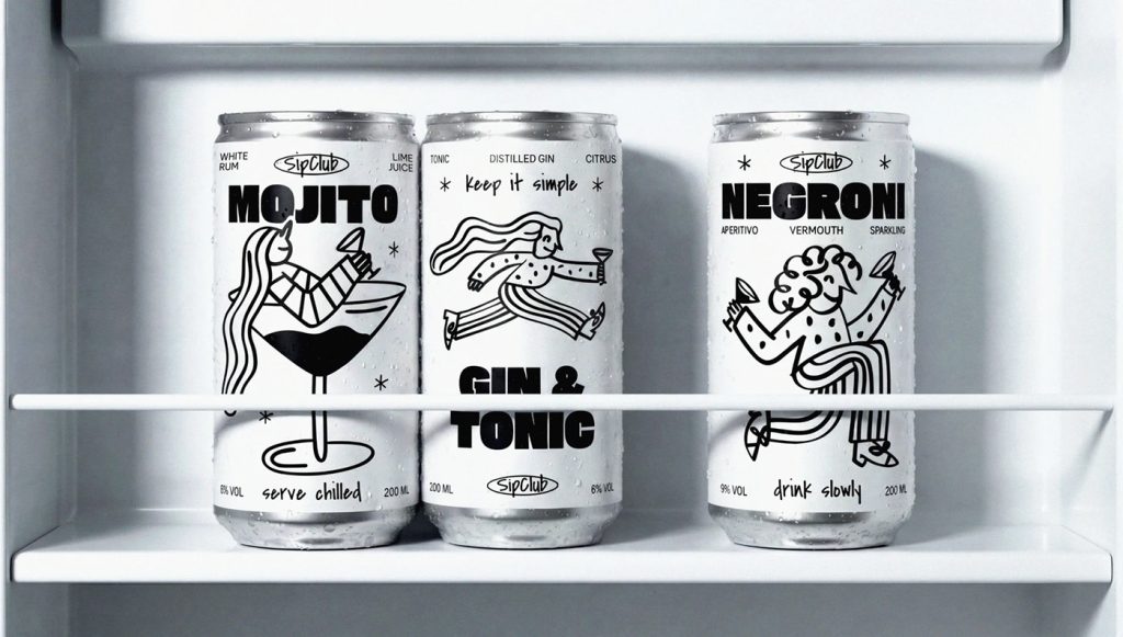
Sipclub Cocktails designed by Yuliana Pakhomova
The packaging uses playful, dynamic illustrations that capture characters mid-movement, giving each flavor its own personality while maintaining a cohesive visual style across the range. Bold, structured typography balances the lively drawings, keeping the design modern and approachable without feeling chaotic. Together, the cans form a unified set that encourages collection and social interaction, positioning the brand as casual, friendly, and visually engaging, perfectly tuned for social settings while retaining a distinct, contemporary identity on shelf.
 monther al omari
 43oz
43oz lilyz design23
 Modern Theory
 Eighteen Brand Studio
 Bhumika Singh
 MohamedMashaly
 Pixels Studio
 Gulya
Gulya UPRISE
 Lizaveta Kharitonyuk
 Bonsanco Creative Studio
 DesignRepublic
 GIRAFA STUDIO
 PiotrWisniewski
 Sophiagdotcom
 CreativeWise
 SoreThumbStudio®
 Modern World Studio
 Palashcc
 Valérie Colace