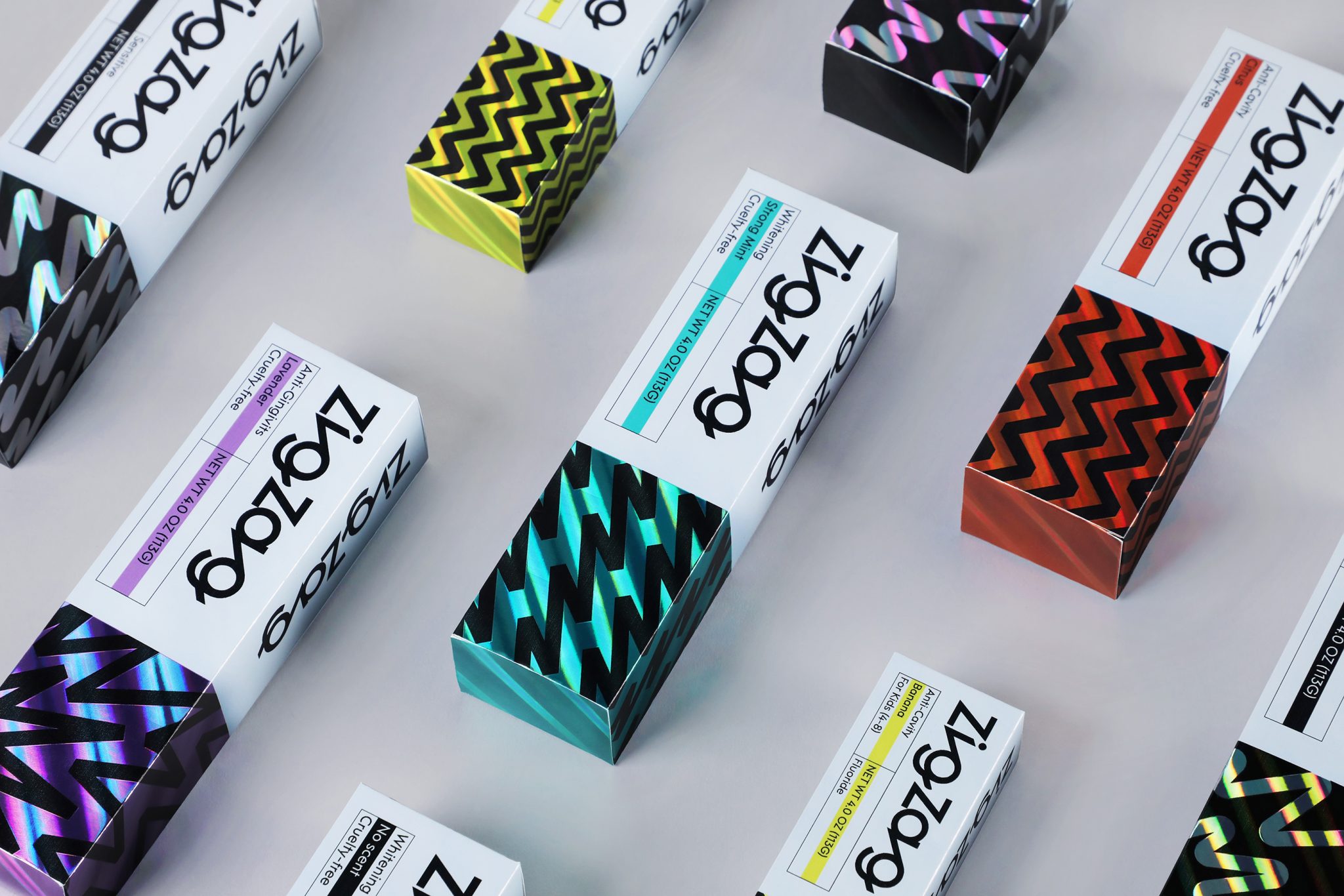

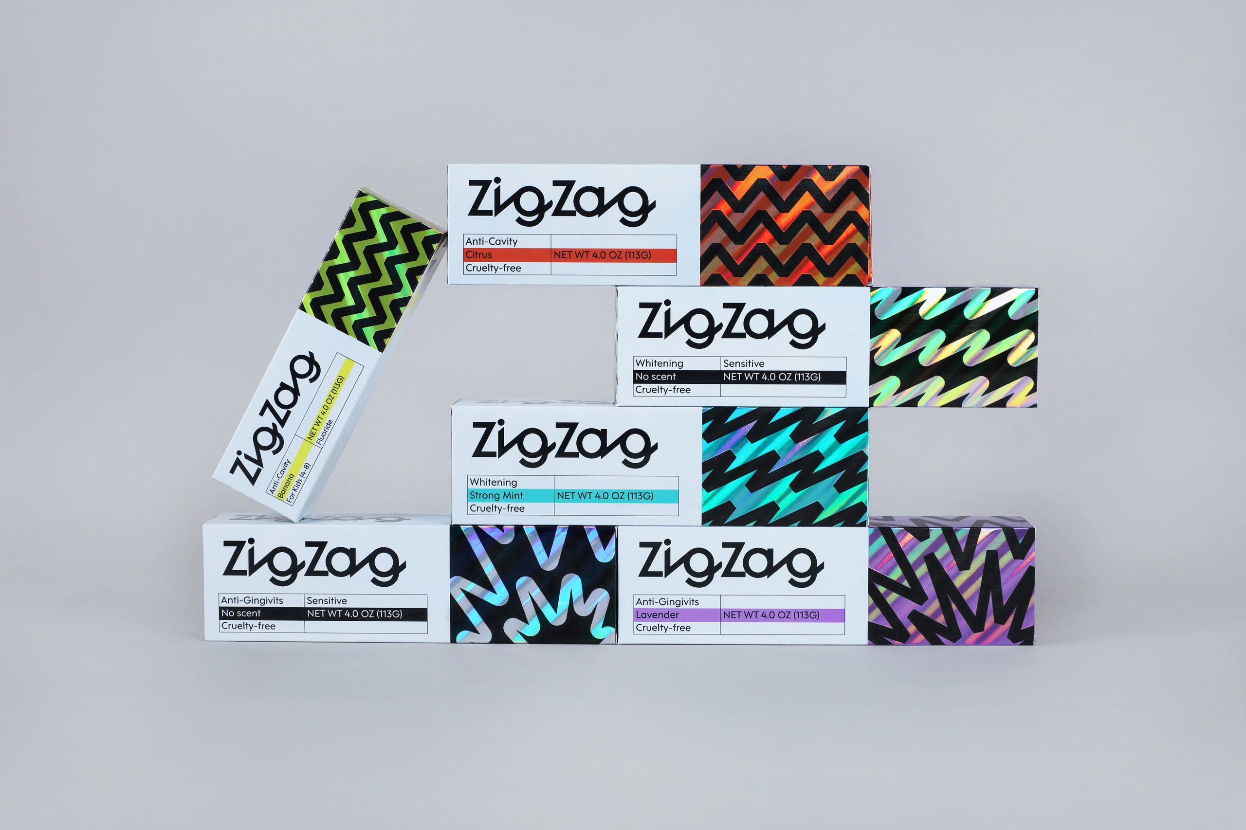
ZigZag reimagines toothpaste packaging as a bold visual system rooted in the product’s own physical behavior. Inspired by the sharp Z-shaped motion created when toothpaste is squeezed from the tube, the identity transforms a brief everyday gesture into a structured graphic language based on movement, rhythm, and energy.
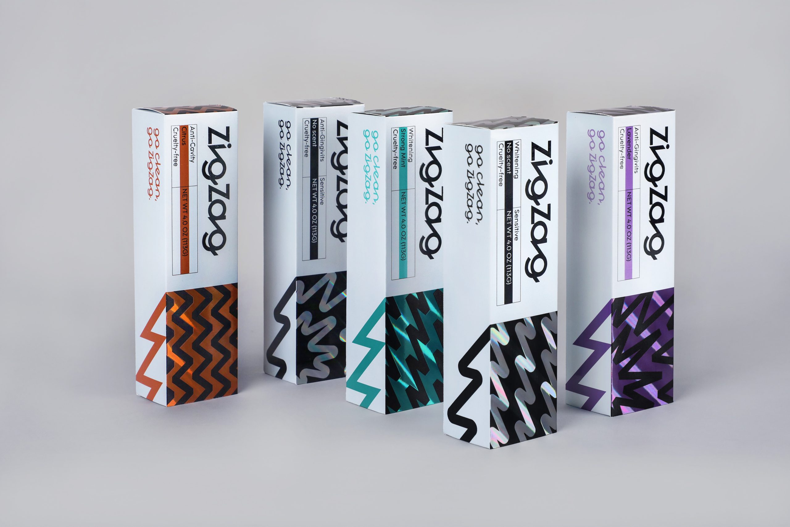
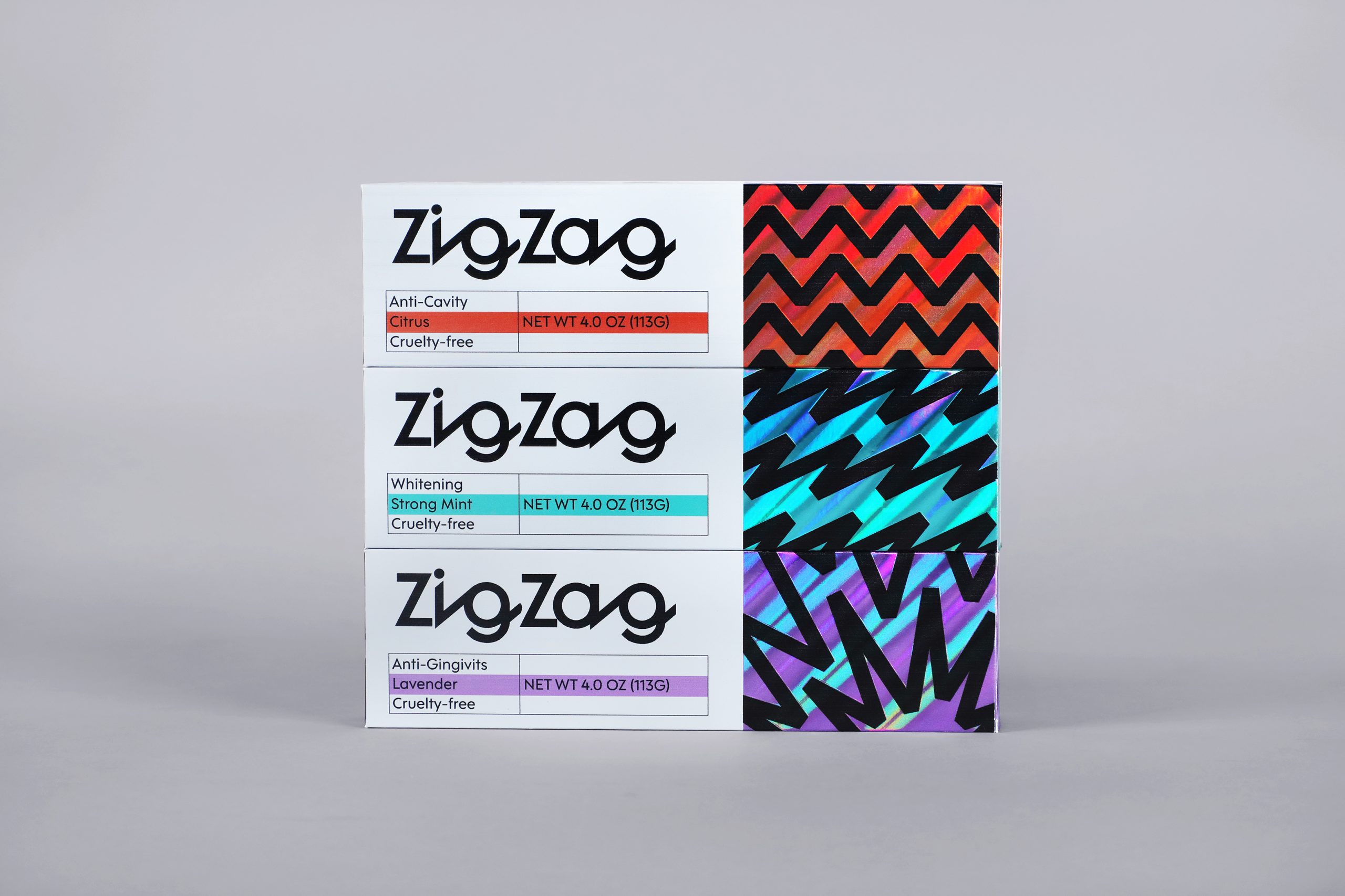
Rather than relying on conventional dental imagery, the packaging uses the zigzag form as its core design element. Each product variant interprets the shape differently—fluid, angular, dynamic, or rhythmic—allowing functional differentiation through geometry instead of icons. Color works as a secondary navigation tool, helping consumers identify flavors and formulas while maintaining a cohesive system.
A key feature of the design is the controlled use of holographic foil. Instead of serving as decoration, the foil functions as an optical device that expresses freshness, cleanliness, and vitality through shifting reflections. As the viewing angle changes, the metallic surface animates the zigzag motif, turning the package into an interactive visual experience.


 monther al omari
 Alexander Skurihin
 Studio K95
 ARMBRAND
 Richa Rai
 houseoferas by Miti
 Agence des Coteaux
 Kushi Eaknath
 Ann Treasa
 Xiao Ning
 krrrrrllii
 babyage
 Deep
Deep Atiq Alam
 TUERCA Studio
 neo creative studio
 Pinot Agency
 Pixels Studio
 Anastasia Cherepanova | xtramez
 awaiskhadim
 Studio Be Design
 Belova Oksana