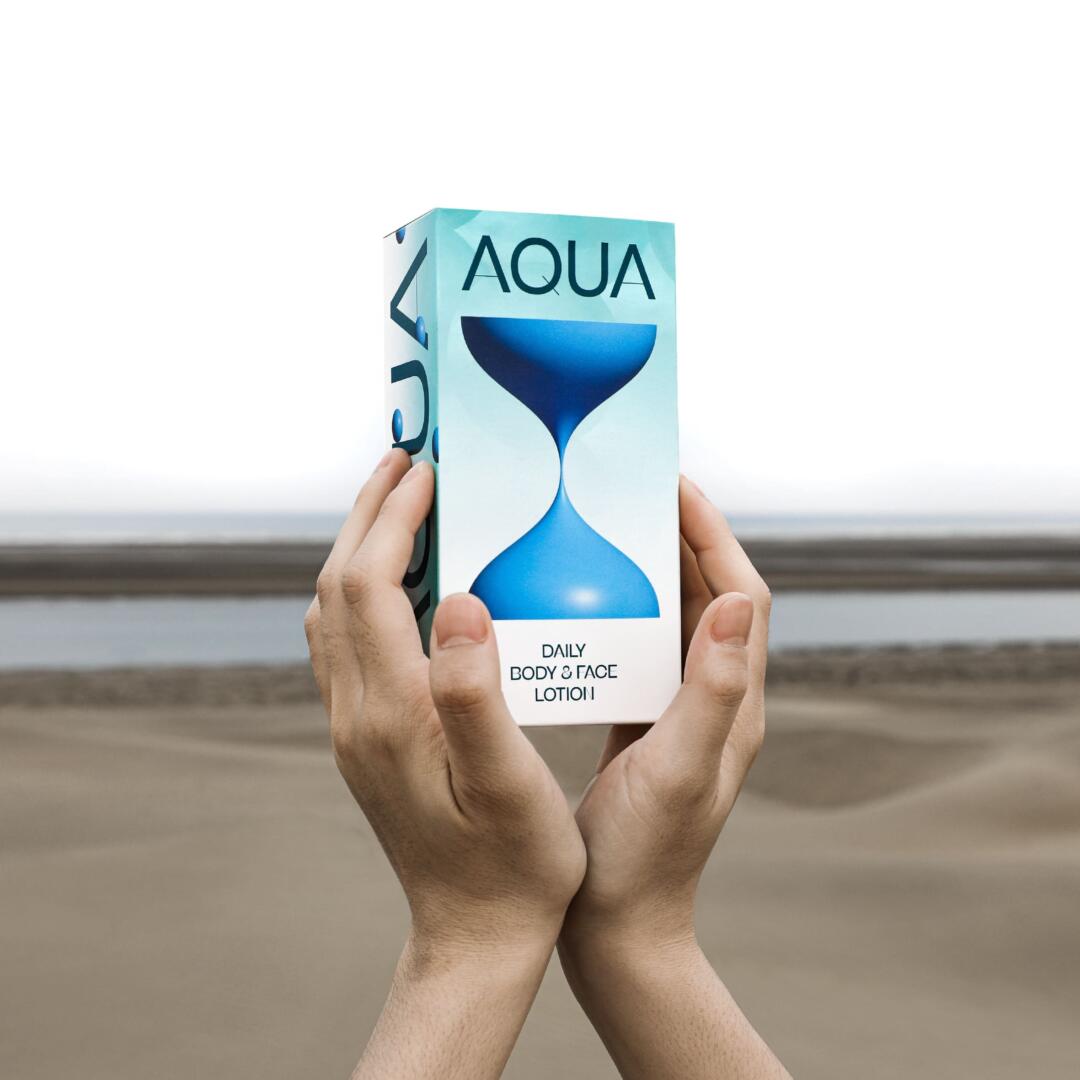
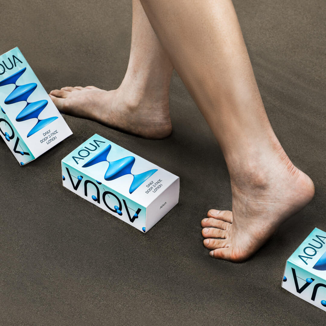
Echoes the texture of lotion and traces the visual effect of water. AQUA’s packaging uses the art form of liquid dripping and its own milky white appearance, showing how moisturizer is applied to our body and face in daily life. By simulating the use of stop-motion animation, a single element is divided into two elements, giving a sense of rhythm. It is packaged as a set of four different products ranging from simple to complex.
The use of color is based on water, while the lotion is changed from milky white to water blue, giving people a moist and refreshing feeling, and it can be used by normal or oily skin. The transparency of the base color shows the lightness of the product, as if the bright sun is shining on the lake, and the feeling of the lake is crystal clear.
POTW Curator’s Insight
Kudos to the designer for turning the packaging into a tactile journey, for transforming skincare into an art form, and for reminding us that design isn’t just about looks; it’s about sensations. It’s about capturing the feeling of wellness and renewal in every drop, every touch, and every shade.