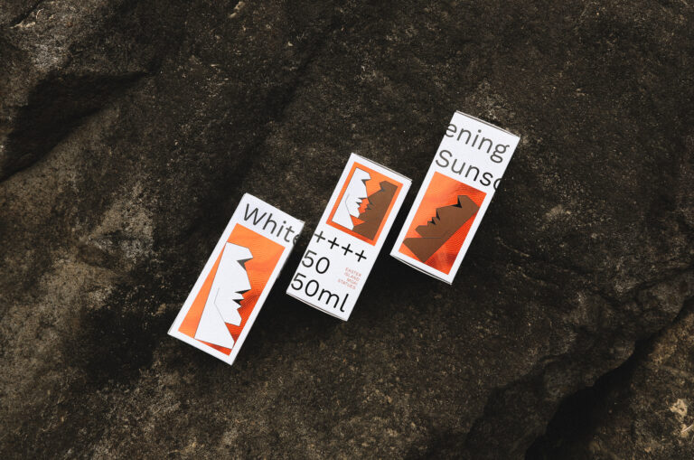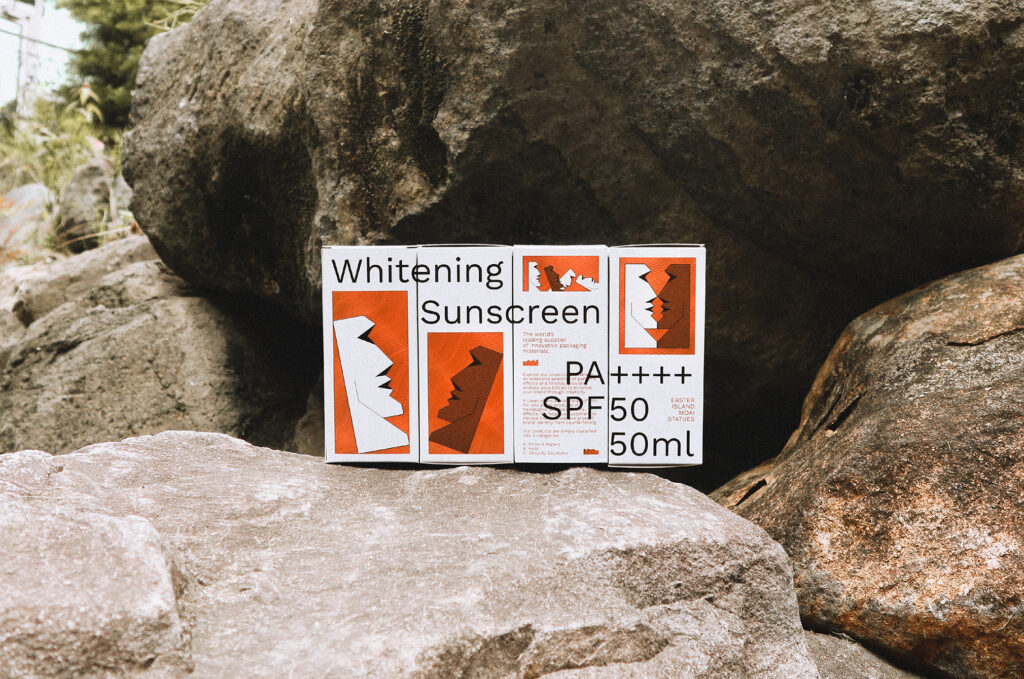
The design is inspired by the Moai from the Easter Island functionality-wise. We personified the Moai, which has been exposing to the sun for centuries, to create the differences of skin colors before and after using our products. Since the Moai is visually connected to the concept of an island, the stereo relief on the packaging is made with a sparkling effect to symbolize the waves, while the color orange stands for the sunlight. As a whole, it creates a seascape while moving.