
ABOUT THE PROJECT
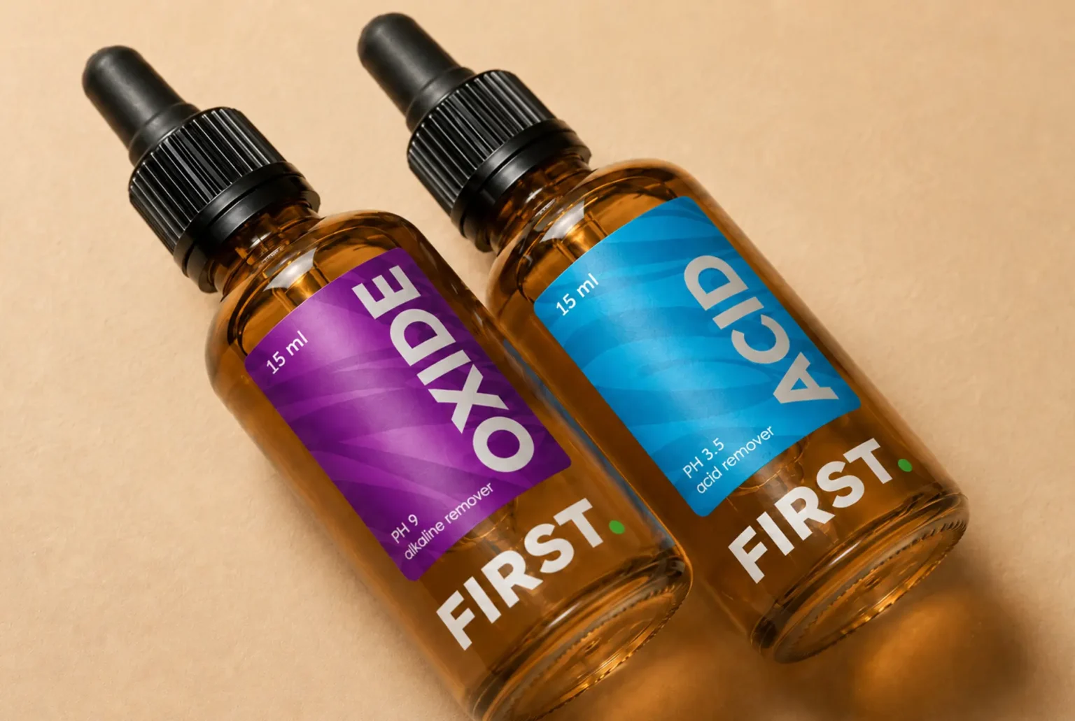
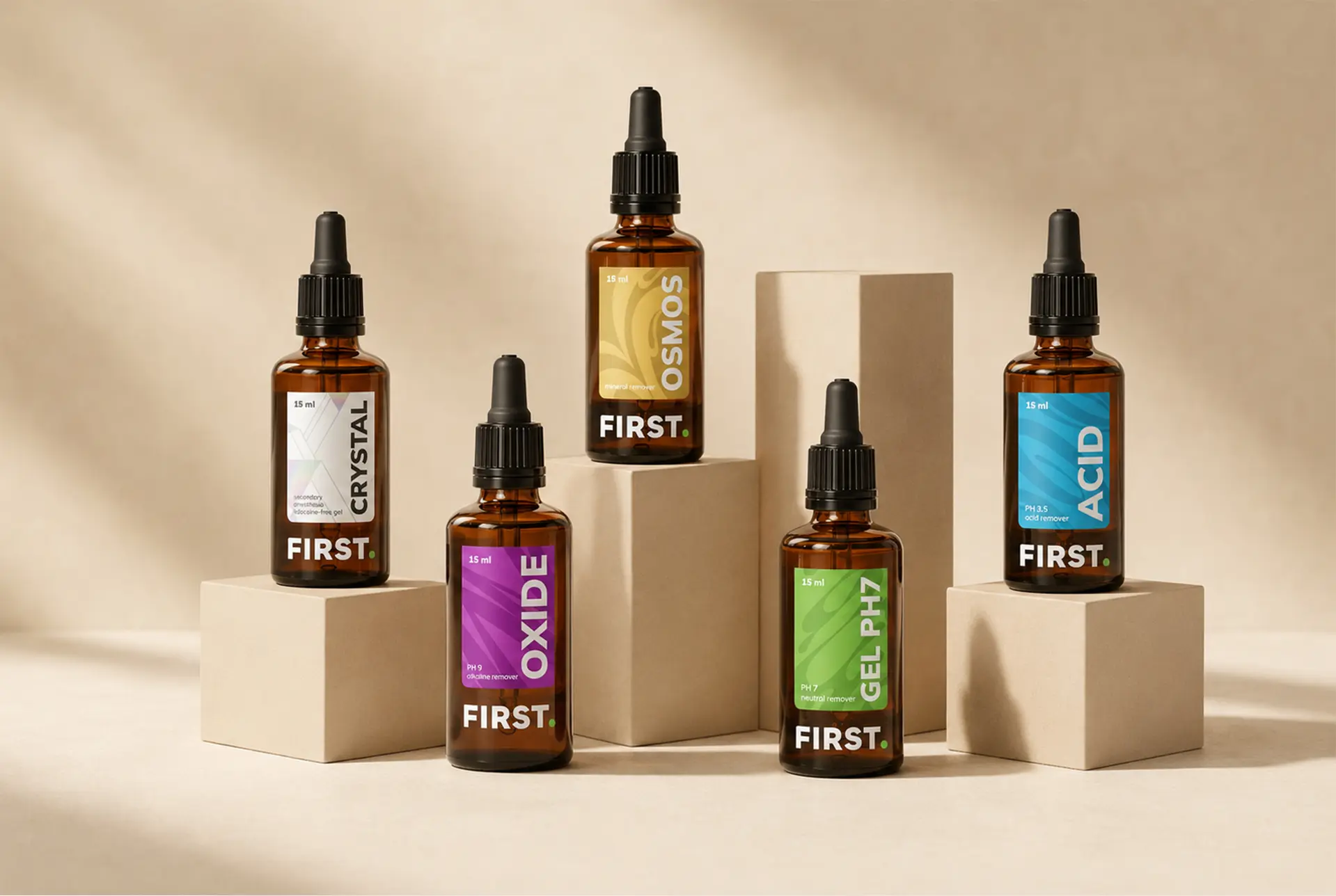
FIRST is a professional care brand developed for products used during and after tattoo removal procedures. The product line includes acids, gels, oxides, crystals, and moisturizing balms, each requiring clear identification, professional credibility, and a precise visual system.
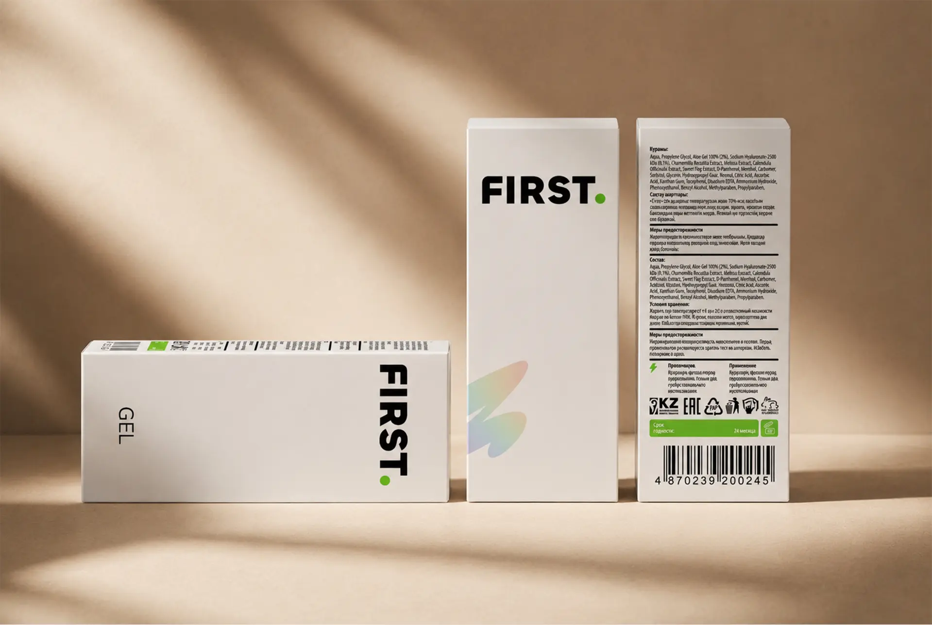
The project focused on creating a brand identity and packaging design that would combine medical accuracy, technological clarity, and trust in the product. The packaging had to look professional, structured, and easy to navigate, while remaining visually distinctive within a specialized category.
PROBLEM AND SOLUTION
Products used during and after tattoo removal procedures require a high level of clarity and confidence. The packaging system had to separate different product types, communicate their purpose quickly, and create a sense of safety, control, and professionalism.
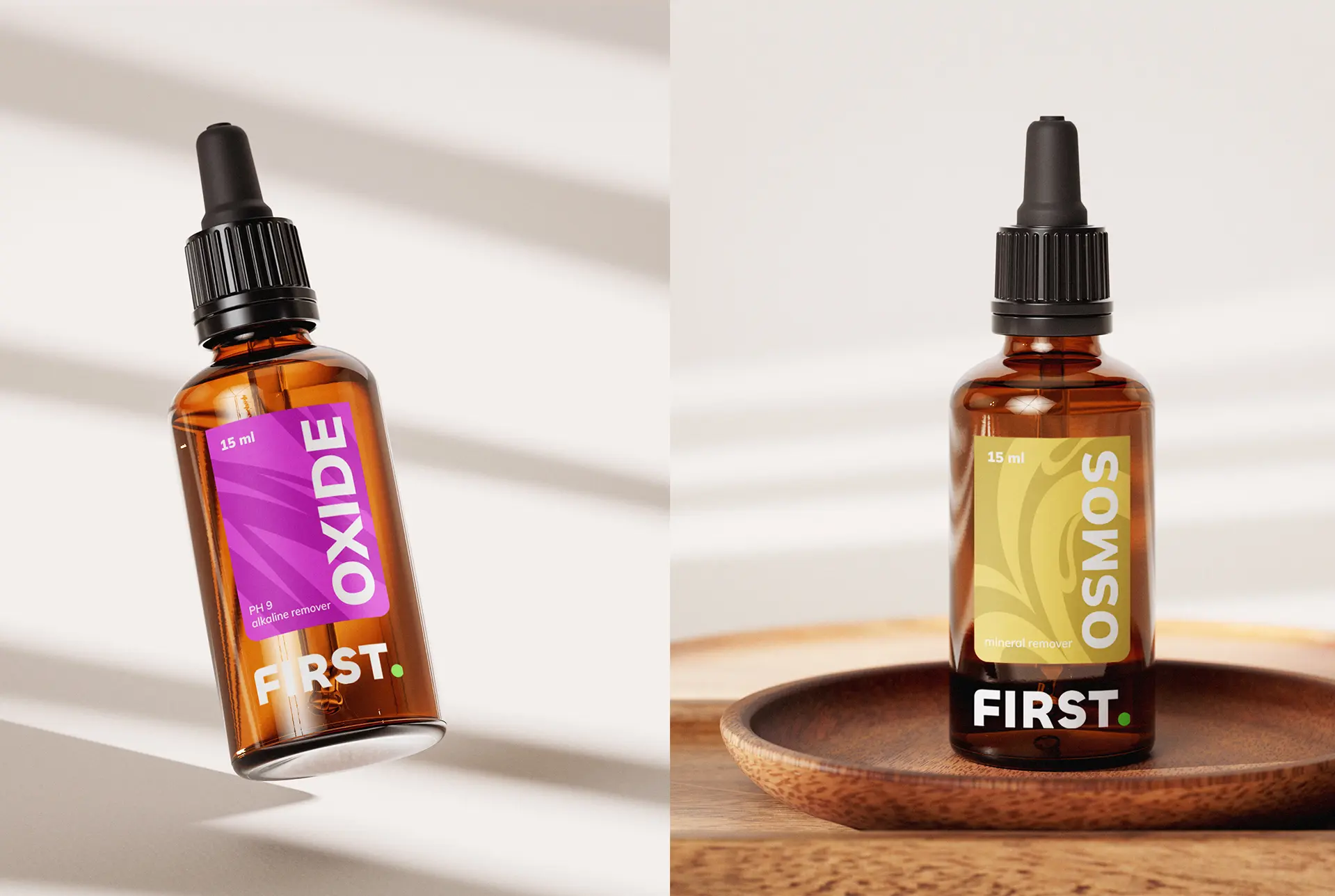
The visual identity of FIRST is built around a clean typographic logo, a restrained black-and-white base, and bright accent colors used for product differentiation. This contrast creates a clear hierarchy on the packaging and helps each product stand out while remaining part of one unified system.
Each product type received its own color code and graphic treatment, making the line easier to navigate for professionals. The label design combines bold vertical typography, concise product naming, and structured information blocks, reflecting the technical nature of the category.
The overall packaging system was designed to be scalable, allowing the brand to expand the product range while keeping a consistent and recognizable visual language.
RESULT
A complete brand identity and packaging system was created for a professional line of products used during and after tattoo removal procedures. The final design gives FIRST a clear, confident, and specialized visual presence, supporting product recognition, professional use, and future line expansion.





 NEV
NEV Stefano Bracci
 Alina
Alina monther al omari
 Lizakjx
 JOAOMARCOSDESIGN
 alchimistestudioParis
 Harriet Neild
 octavio rojo
 宏洛图品牌设计HONGLT
 DESIGN CONCEPTS
 Alexander Skurihin
 Studio K95
 ARMBRAND
 Richa Rai
 houseoferas by Miti
 Agence des Coteaux
 Kushi Eaknath
 Ann Treasa
 Xiao Ning
 krrrrrllii
 babyage
 Deep
Deep