ABOUT THE PROJECT
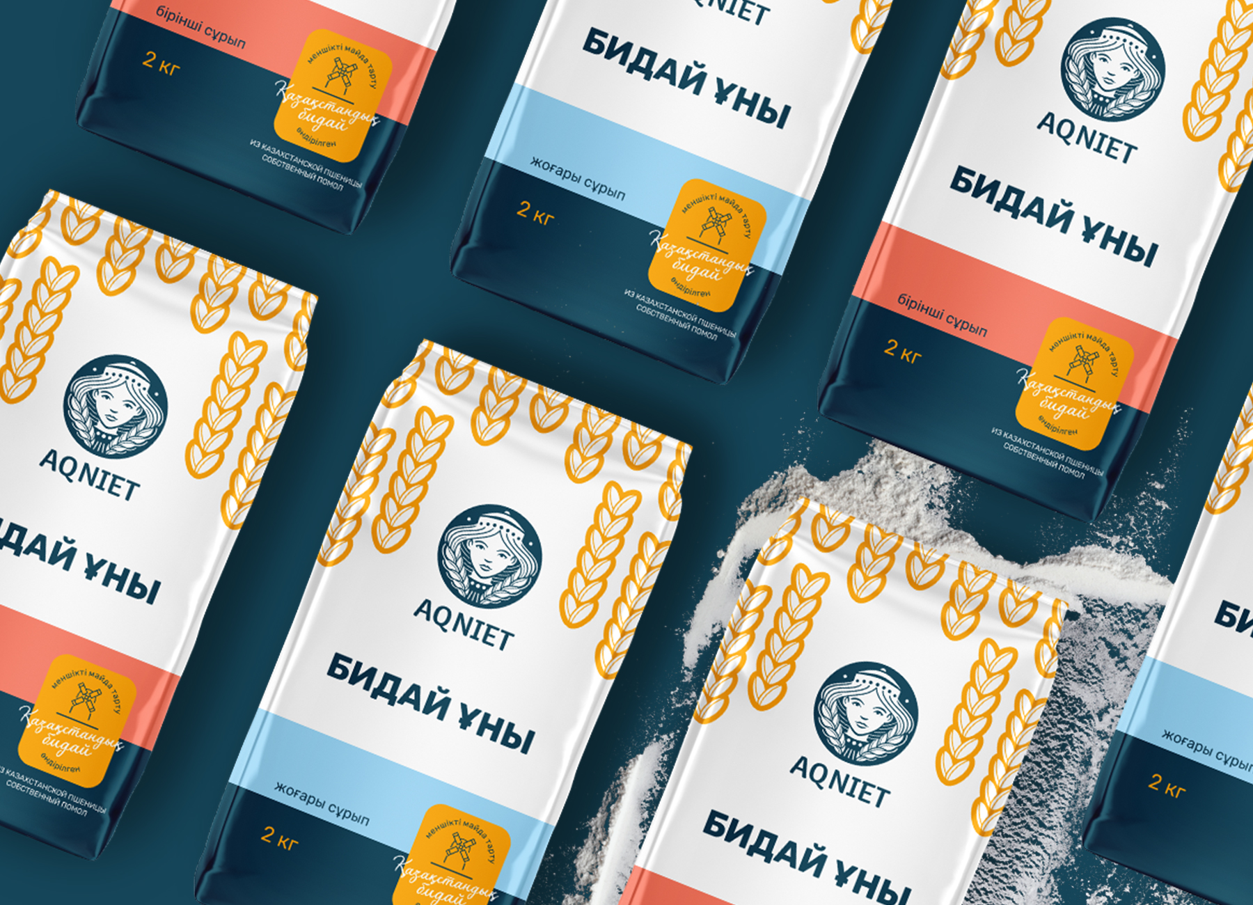
The Aq niet brand, which has been present on the market for a long time, had a noticeable, recognizable image among its loyal customers. However, despite this, its ability to attract new customers and enter new markets was severely limited due to ineffective packaging design. The main problem was that the packaging did not reflect the essence of the brand, did not convey its unique character and advantages over competitors. There was a feeling that the name could be changed to any other, and this would not affect the perception of the product. The design did not fulfill its main function – to inform the consumer about why the product is special and why it is worth choosing.
PROBLEM AND SOLUTION
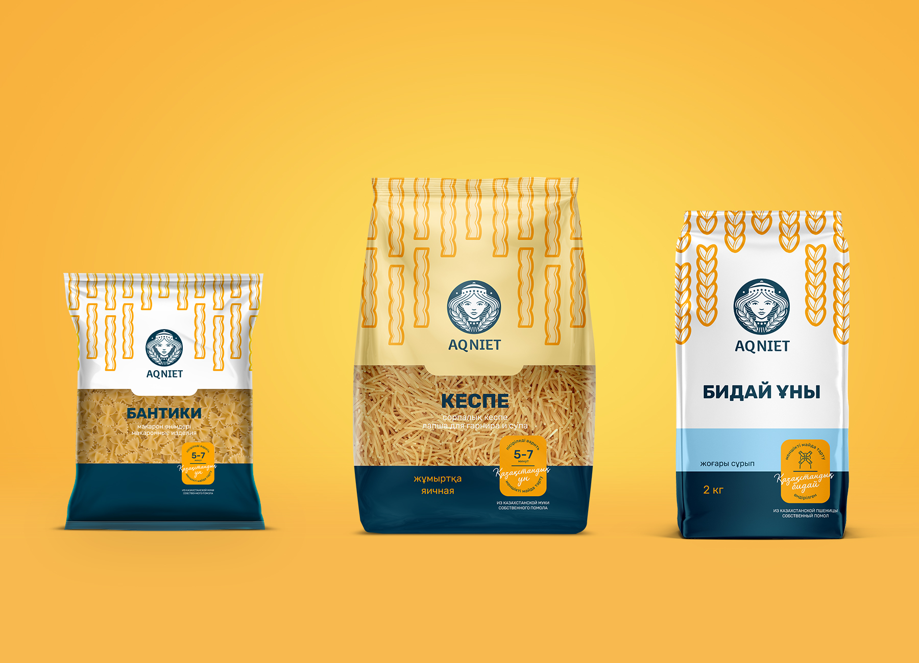
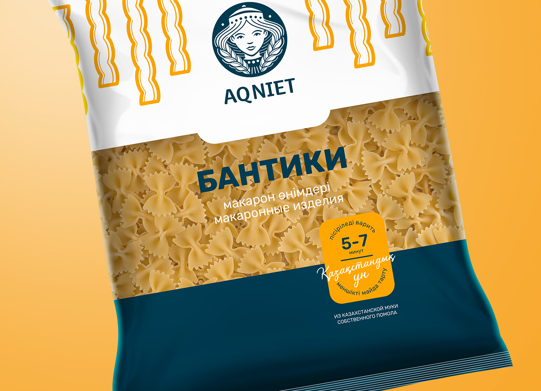
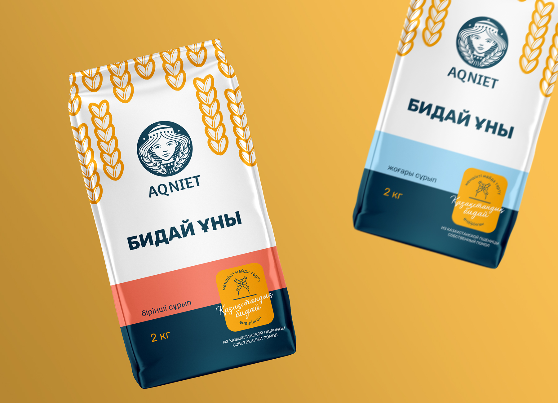
Our agency has made significant changes to the visual identity of the Aq niet brand, focusing on improving the logo and creating a more attractive image. With the advent of a stylized image of a girl with ears of corn in her hair, the brand received a unique and memorable image that is easily recognizable. Now the logo takes up more space on the packaging, which helps to attract attention and remember the brand among consumers.
Products in the new packaging now instantly stand out on shelves thanks to a more visible and attractive design. Benefit areas have been highlighted at the bottom of the packaging to help consumers quickly understand why they should choose this product. The introduction of differentiating colors for different types of products makes it easier for consumers to differentiate and select the right product from the line.
RESULT
The improved design immediately led to increased efficiency and visual appeal of the brand, which translated into successful promotion in the market.