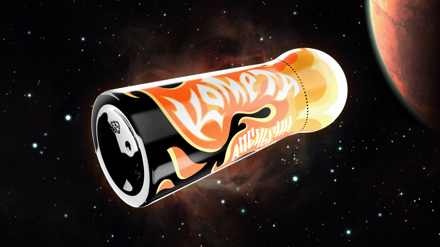

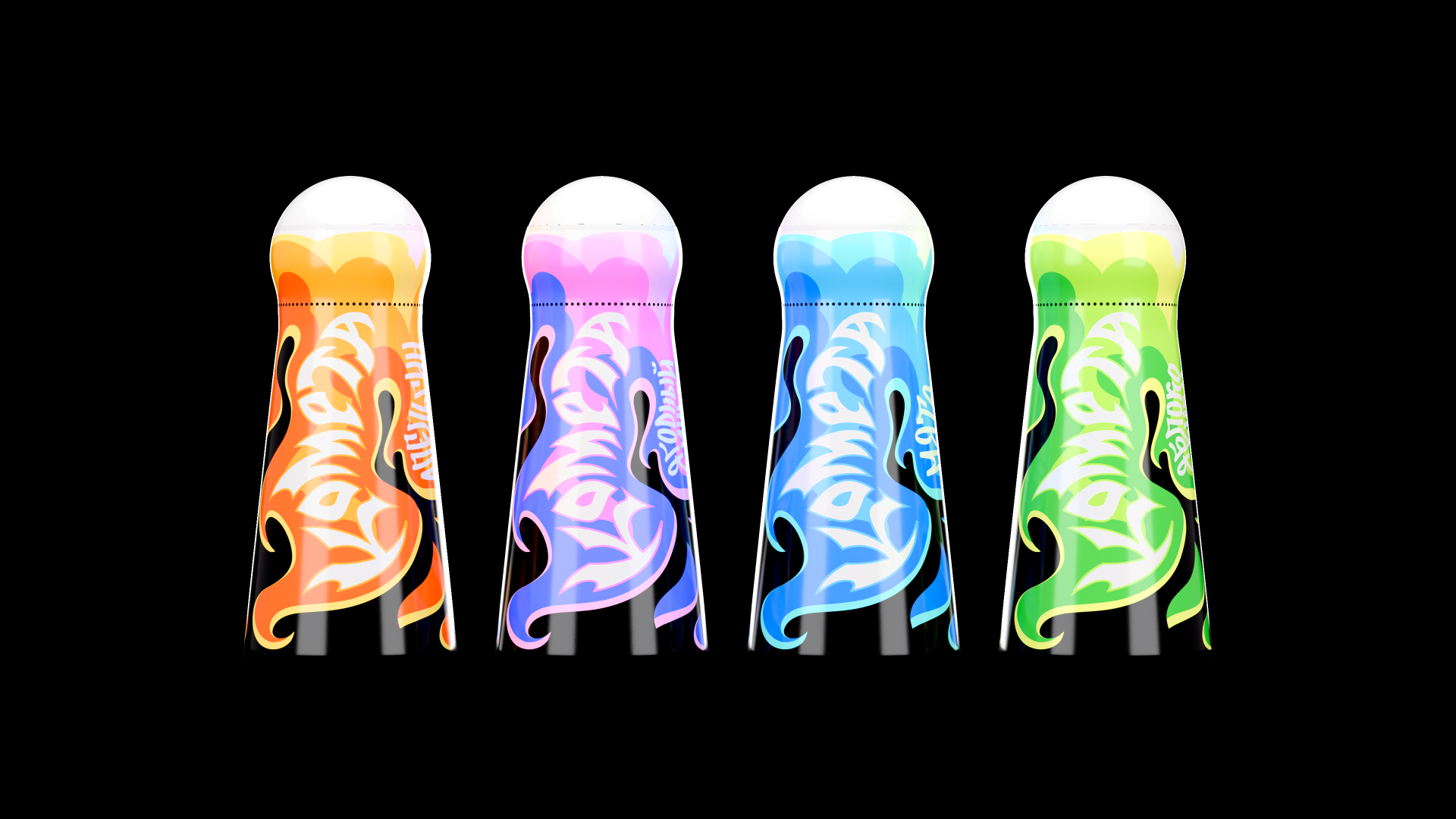
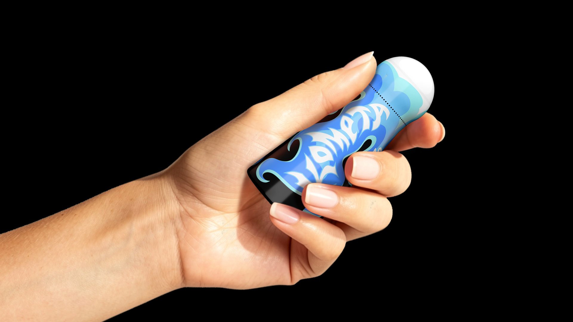
Comet is a brand of energy shots. The packaging’s core concept is based on the metaphor of a comet in flight. The bottle transforms into a bright, glowing tail, while the rounded cap embodies the celestial body, together forming a silhouette that reads instantly as a comet cutting through space.
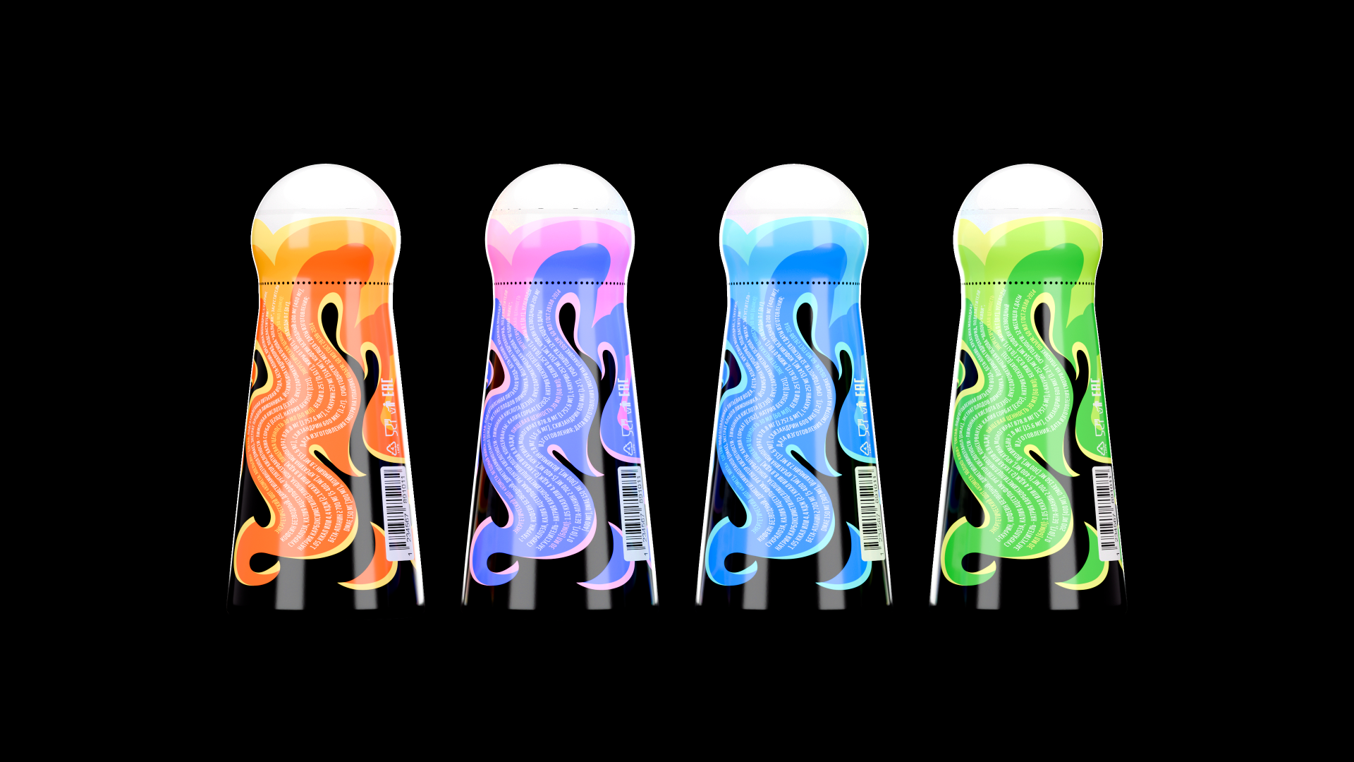
Each SKU carries its own distinct color scheme, making the lineup visually rich yet cohesive.
The dynamic design embodies the brand’s tagline — “Explosive energy in every shot.”
Design by Kate Reichel, 3D renders by Kate Reichel




 Derrick Lin
 monther al omari
 43oz
43oz lilyz design23
 Modern Theory
 Eighteen Brand Studio
 Bhumika Singh
 MohamedMashaly
 Pixels Studio
 Gulya
Gulya UPRISE
 Lizaveta Kharitonyuk
 Bonsanco Creative Studio
 DesignRepublic
 GIRAFA STUDIO
 PiotrWisniewski
 Sophiagdotcom
 CreativeWise
 SoreThumbStudio®
 Modern World Studio
 Palashcc
 Valérie Colace